Thursday Night Monoprints

Upon a friend’s recommendation, I signed up for a monoprint class.

A what??

I know what a monoprint is, but I have never, ever done one.  So, per instructions, I bought a gelatin plate and a roller.  Then I showed up, wearing old clothes and an apron, and really, not knowing what I was going to be doing.

The instructor, Alison, was great.  She had a package of materials for everyone, nicely presented, and I felt like I was going to open one of the most exciting presents ever.  She also told us a lot of stuff – but better, she showed, and we did.  And here are the results.

Now I know how to do a monoprint, and boy, did I have fun!  I’m so glad I followed up on my friend’s suggestion.

Mesa, Sunrise: Practice!

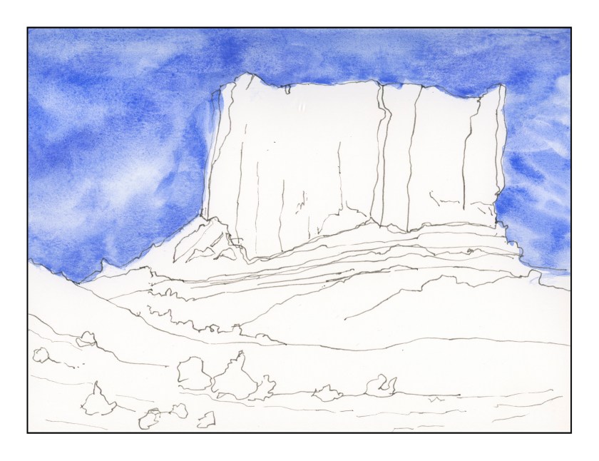
Every artist practices.  Pianists do scales.  Painters paint.  I, on the other hand, have never been fond of practicing anything because I always want to do.  However, I am finding myself rather stumped at the moment, and have decided I do need to practice.  I need to practice brush strokes and colors.  I realized this after I lay down this wash for the mesa and lower portions of the painting, which for now are at a standstill.

Looking at everything, I am thinking about two things.  What colors should I use?  What brush should I use?

Colors don’t require a brush choice, so I have dabbled with reds for the mesa, as you can see below.  There are combinations of Burnt Sienna, Quin Gold, Yellow Ochre, Raw Umber, Organic Vermilion, and Pyrrol Orange.  Doing these early in the morning, I didn’t label them.  That’s okay, because  I know the colors I used, and I will check them out during daylight.

Next, I need to decide on a brush.  I am inclined to go with a flat, so I can draw straight across to show the sedimentary layers of rock.  Those I will get to sometime tomorrow and then choose colors and – yes! – practice making some strokes and mixing the colors strong enough to make some good contrasts, too.

Mesa, Sunrise

For the next week, my schedule is a bit different.  I have to be in to work 30 minutes earlier than normal, so I did this quick sketch in my Stillman & Birn softcover book.  The ink is iron gall.  I tried to keep the lines minimal, enough to capture important elements of the landscape, but not so much that they become dominant or what will (eventually) hold the image together.  Hopefully I will be able to work on shadows and light, working to good contrast.  I seem to need lines – I am comfortable with them – that are clearly visible.  Interesting to find out how we all work, eh?

Neighborhood Tree

This is from my Stillman & Birn soft cover (blue) sketchbook with 180# paper. A part of me likes the thing, and another doesn’t. I’m not sure why.

Anyway, this shows what I am trying to do . . . establish shadow, play with color combos or swatches. I used all sorts of brushes on this. In general, it is overworked, and the trunk looks like some tree has landed on an octopus. (Poor octopus!)

This is the final product, with some work on it . . . The contrast is a bit better, but it still looks pretty much in the same key to me – in other words, the grey scale is pretty much the same to my eye when I see it in color. In B&W it is still not quite what I would like to see.