Bee & Borage – First Colors

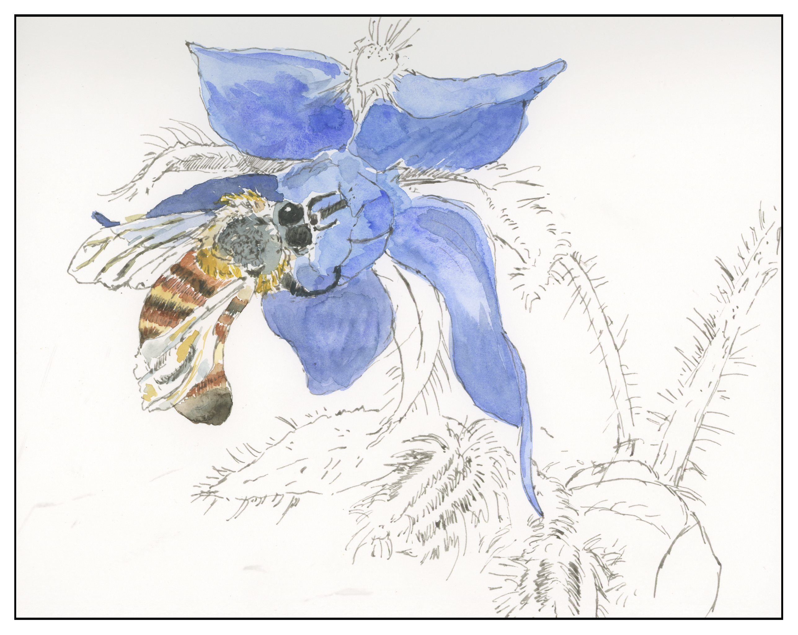
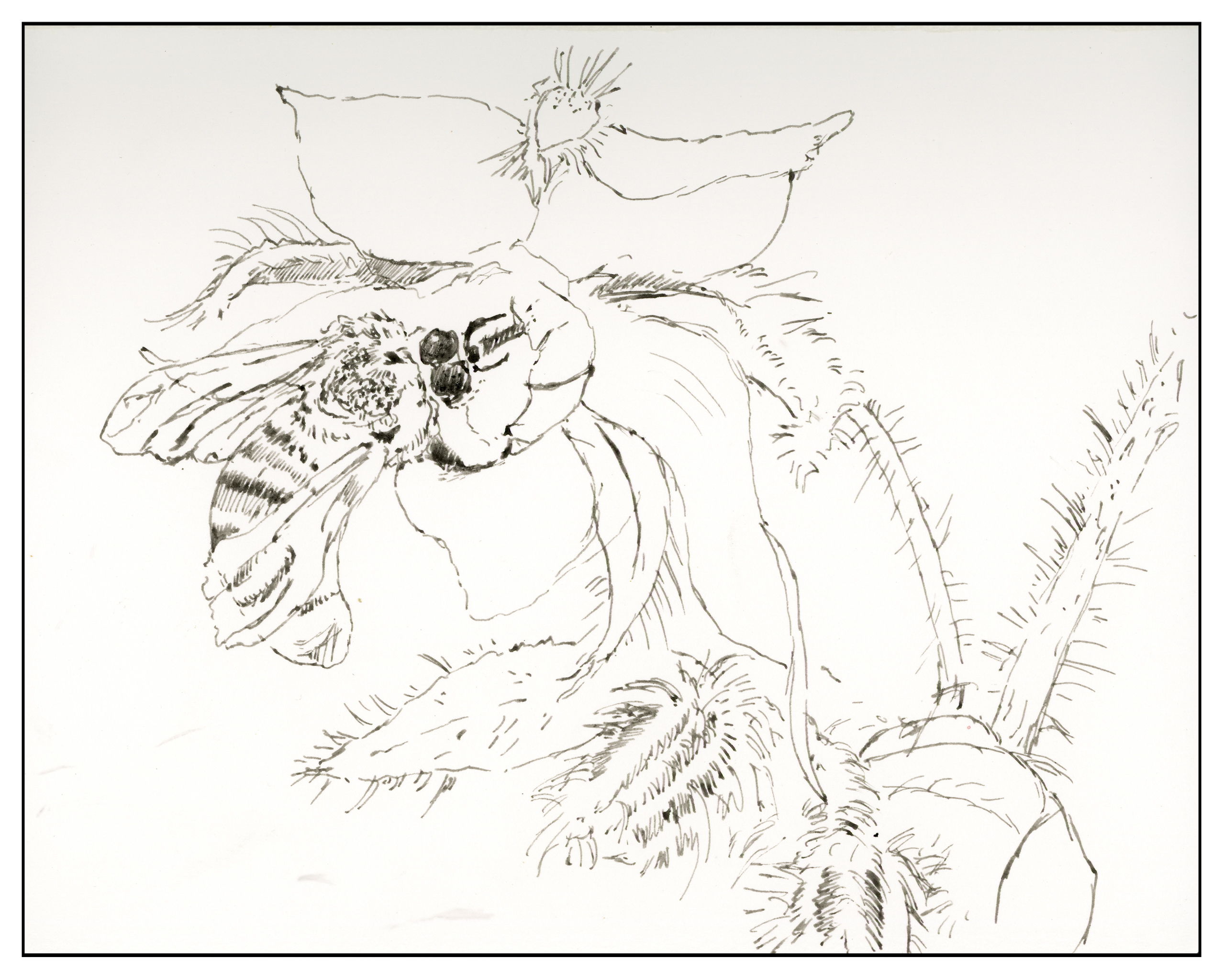
I did this first layer of colors in the gloom of the evening, after work.  I was tired but had played out some of the painting earlier in the day in between whatever I was doing.  I used a small brush and deliberately tried – and will continue to try – a delicate approach.  Both the bee and the borage have a lot of fine hairs which I want to express and preserve.  Looking at the scan shows a need for contrast in the center of the flower, along with on the bee’s back, behind the eyes.  In these areas, I will be working on glazes to create better contrast, and I hope a better sense of depth.  As it stands now, the whole painting is rather flat and nondimensional to my eye.


Bee & Borage – The Sketch

I am trying to do something everyday when it comes to drawing or painting. Some days only allow for morning time, and that is when I did this drawing of a bee in a borage plant. Today, I used a dip pen, my ca. 1810 pewter ink well, and iron gall ink. I have never drawn a bee before, and using a dip pen and focusing on the shapes, rather than what I think I see (thank you, Sharon, for that great advice!), produced fairly decent results. I’m rather afraid to draw anything that requires a bit of realism as I really doubt my abilities to do this. Practice is needed here!

Borage is a lovely plant, covered in fur, with beautiful blue flowers. If I recall, it is an invasive plant, and one best kept contained in a pot. I had some in my dog free zone (DFZ) this summer amongst the lilies.

As an aside, I’m getting used to using a dip pen, which is really a rather nice skill to have as I don’t have the big blobs I used to get; I know when to refill the well and dilute the ink with water. Something we don’t think about in this day and age of non-dip pens.

Sunrise, Mesa

I’ve been sitting on this picture, doing some research before finishing it.  By research, I mean watching videos on painting the red rocks of the American West to figure out colors, practicing with colors and washes, and finally, practicing with blues over the colors. as this mesa has a lot of shadow areas.

Above, color practice.  I used Pyrrol Orange, Organic Vermilion, Burnt Umber and Burnt Sienna for most of the reds and oranges.  The grey-green is a combo of Sap Green, Cobalt Green, and Payne’s Grey.  The blues are Ultramarine and Cobalt.  And below, the final result.

This is perhaps the first “researched” or “practiced” painting I’ve done.  I usually just go-with-the-flow.  The pay off is pretty good.  I’m still not really sure if this sketchbook is good for anything “serious” but it did a good job in the end.  It is really curly paper when it dries!