Pen, Ink, and Watercolor with Claudia Nice

I have always liked pen and ink combined with watercolor.  The contrast between the two can be art in itself, or the two can work together, each enhancing the other.  I came across this book by Claudia Nice, Creating Textures in Pen & Ink with Watercolor, quite some time ago.  It’s detailed and it has some exercises with suggestions as to what to do and notes as to what she did to create the effects.  Some are just ink and colors, others involve traditional “helpers” such as alcohol or salt to achieve results.

Yesterday afternoon I was in an antsy mood, but didn’t want to paint in my usual splashy style, but wanted some “containment” if that makes sense.  I wanted something requiring a degree of precision.  Ink is always the answer there.  Realism, too, is not where I wander naturally, so Nice’s work and exercises always have a magic to them.

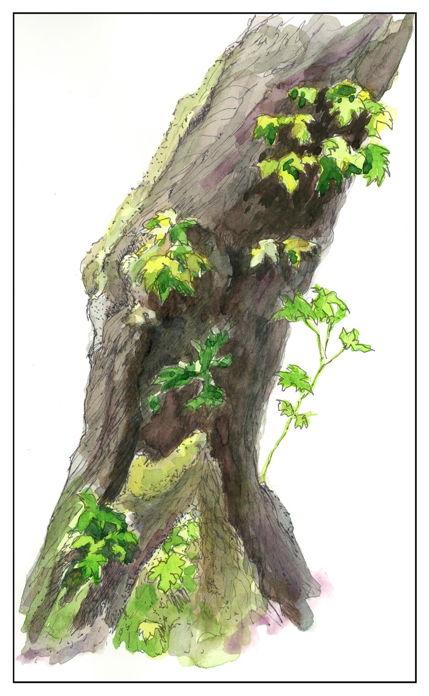
The first I chose was her “Old Broadleaf Maple” – detailed, subtle.  And a tree.  I love trees!  This is my rendering of her example.


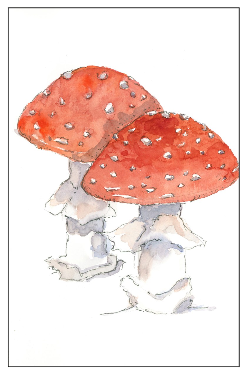
The second one I chose was a fly agaric mushroom.  I have seen only one like it in my entire life – and even then I am not sure it was the same mushroom.  I was hiking up in the Rockies in Colorado, up high, and came across some huge, red mushrooms, the kind you see in fairy tales.  Wanting more colors than the tree, the red hues of the mushroom were perfect.

The beauty of Nice’s work is that while it appears easy, if you are doing the study, you focus on the small things as well as the overarching picture.  By nature, I am not detailed oriented, and for me, it is a different way of seeing and doing something.  I am always pleased with the results when I take my time.  The biggest challenge is to take these studies to my own world, outside the pages of the book, and look for the details on a plant or whatever, decide what to keep, what to discard, and so on.  It is hard work worth every minute!

Somewhere in Wyoming – Notes to Myself

Broken bones aside, I want to paint.  Moving house to accommodate workers over the next two weeks aside, I still want to paint!  I tell you, chaos exudes in my studio at the moment.  Most of the shelves are empty, books are packed up, art supplies are vanishing hither and thither, and I feel like I am living in a tornado – and will be for a while as repairs are underway in the back half of the house as floors are replaced, walls painted, bathrooms repaired and updated.  It’s really a mess.

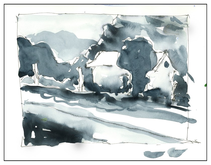
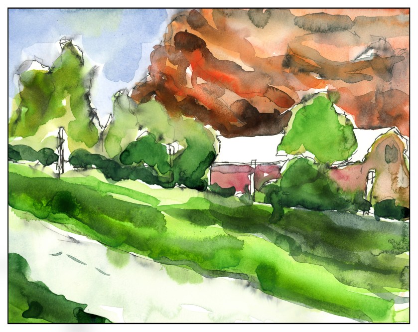
This morning, I finally found some time to do a few things with this painting.  Choosing colors and values with swishes of watercolor across the ink drawing showed me I had non-waterproof ink on the paper.  Oh, well,  such is life.  Here are this morning’s labors – in a monochrome study and some colors for consideration.  Messy but useful, like my house.

Notes:  In future sketches, have a margin for testing colors or shades.  Move house to left.  Tree and mountain in background too close to same tone.  Don’t use water soluble ink!

Notes:   Use a margin around edge of painting to test tones or shades.  Barn / house move to left.  Trees – need some variation in color compared to grass above road.  House too similar in color to red rock mountain behind.


Somewhere in Wyoming

Last summer we spent a couple of weeks traveling around the western part of the US, visiting states such as Wyoming and Arizona and Utah.  Open space, loneliness, long drives through incredible country.  This is a photo I took out of the car window on the way from Laramie, WY, to Grand Teton National Park, where we stayed for several days.

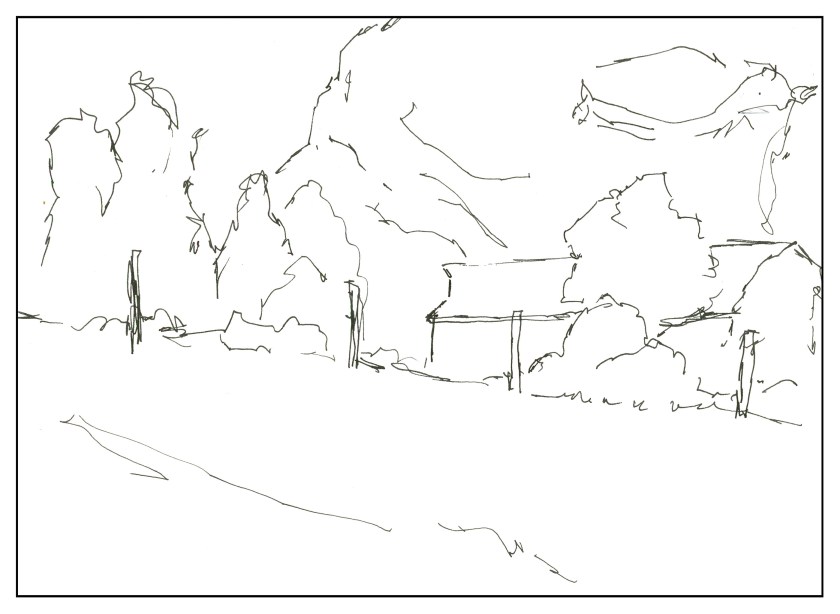
I pushed the colors in post production, to pull out greens, reds, and blues.  The view of the house / barn was fascinating – and I expect the view from it is even better, rather than zipping by in a car.   Anyway, I’ve decided to do some sketches, in ink then color, and hopefully an unlined watercolor based on elements of this photo.  Below is this morning’s sketch.