Isolette II / Apotar 85mm f4.5

Image of an Isolette I, Agnar Lens, from Wikipedia

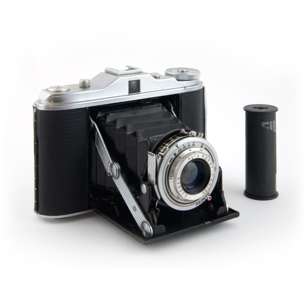
The Agfa Isolette was made over a number of years, sold in the US under the Ansco brand, and is a rather nice camera overall. The issue many of the later ones have is the fact the bellows have deteriorated. Apparently the later models had plastic bellows which developed pinholes and creating, of course, light leaks. I bought my Isolette II from Certo6, from whom I have purchased a number of vintage folding cameras and accessories. I have never been disappointed with the quality of cameras I have from Certo6, so here is a plug for Jurgen Kreckel!

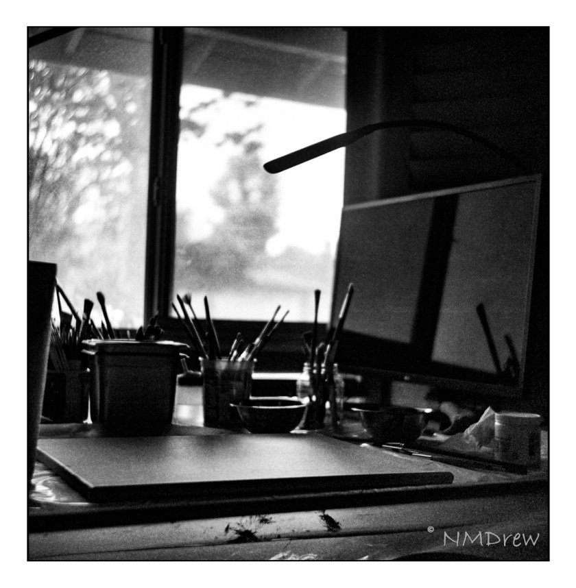
I don’t know about you, but I wander around with my interests – sometimes sewing or knitting, painting, spinning, then on to photography or drawing. It varies, in part with the weather, in part with my mood. Photography has taken a long time out of late, but with summer coming in and a pleasant spring ending, I decided it was time to re-evaluate and re-explore photography. So, with a new-to-me red skinned, black bellowed Agfa Isolette II, a roll of 120 Ilford XP2 Super 400 film, I spent a day wandering around the house and neighborhood, guestimating exposures as well as using a light meter. I got the images back a couple of days ago. All were usable, but below are the best of the lot (I think).

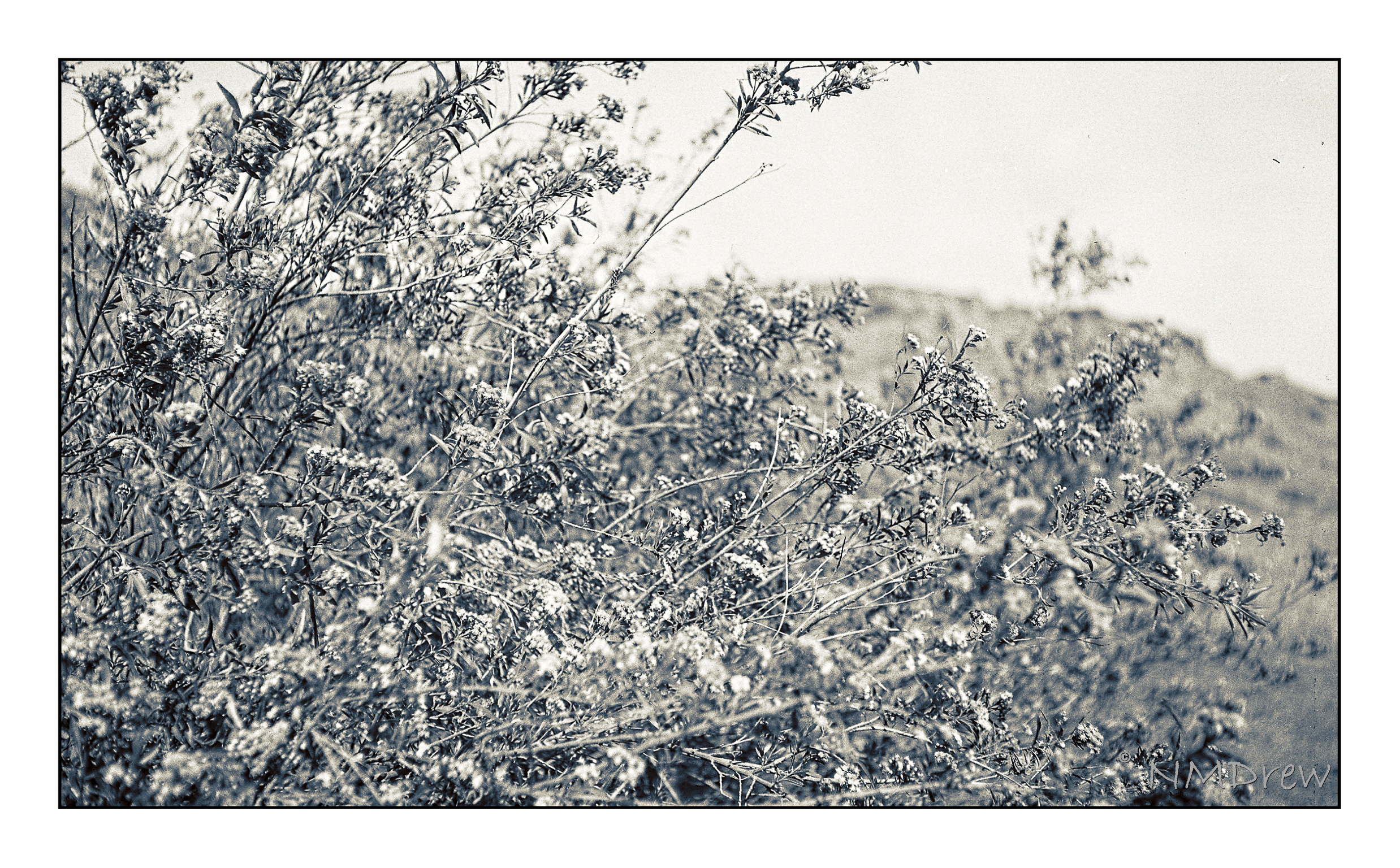
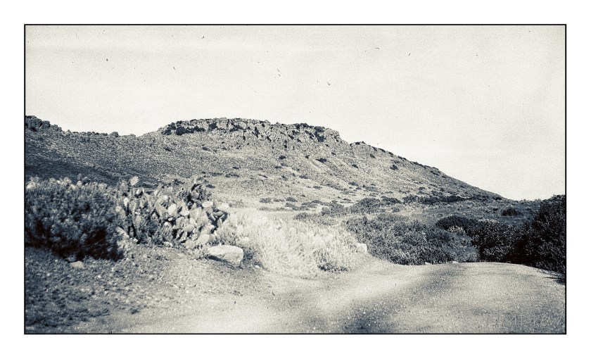
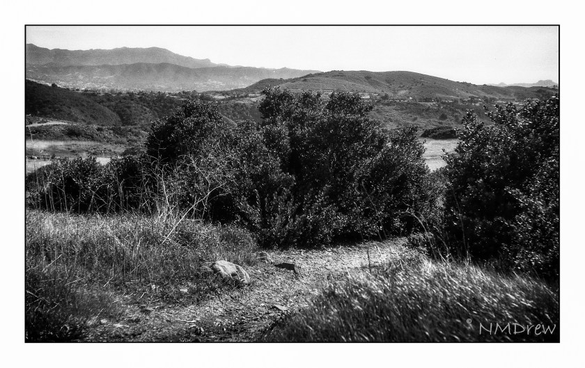
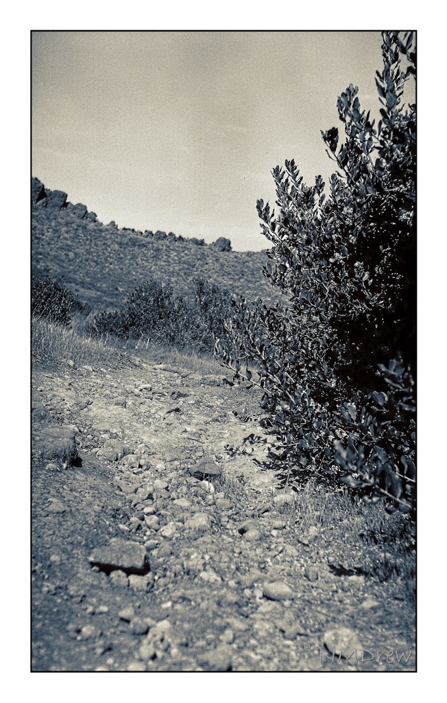
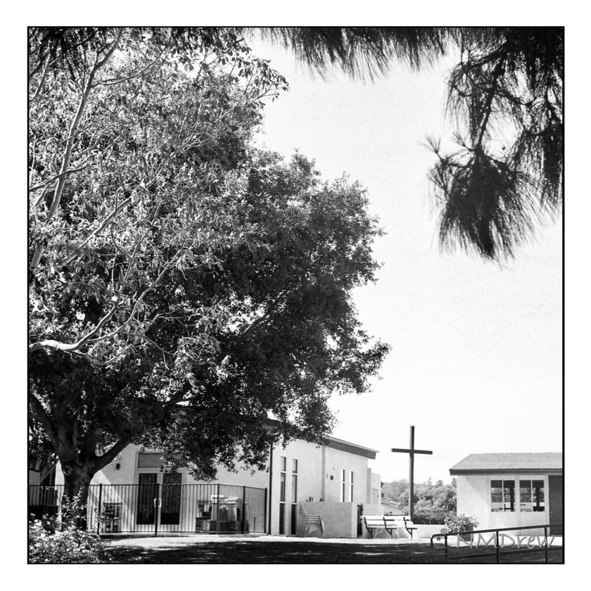
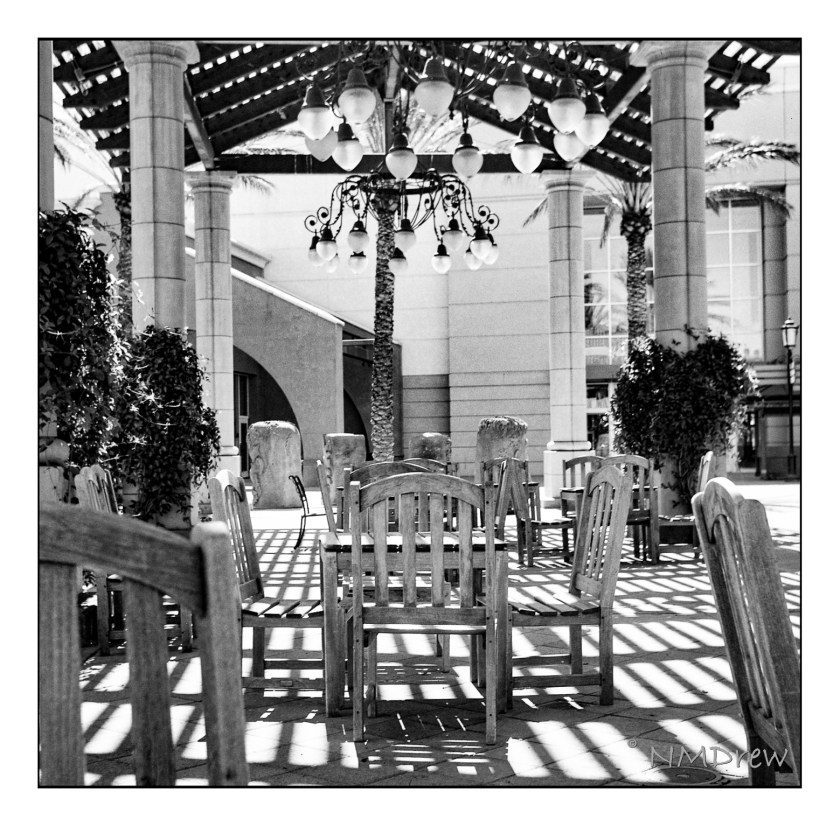
Up front, these photos are not SOOC – I did work on them in post. The Apotar lens is not in the same league as a Tessar, but it is a rather sweet lens. I think the issue more than anything could have been my fault in exposure. The details visible are the result of editing with LR and such, working to bring out detail, increasing contrast, and changing the image to meet my desired goals. Altogether, I like being able to take a folding camera with me – I had it in my pocket while I was oot-and-aboot.

Sunflowers
Empty Field
Church School
Patio Seating
Sunflowers and Sun Flare
Ready to Work
Tree Textures
Dill Flowers

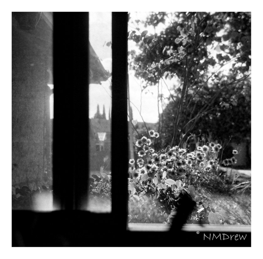
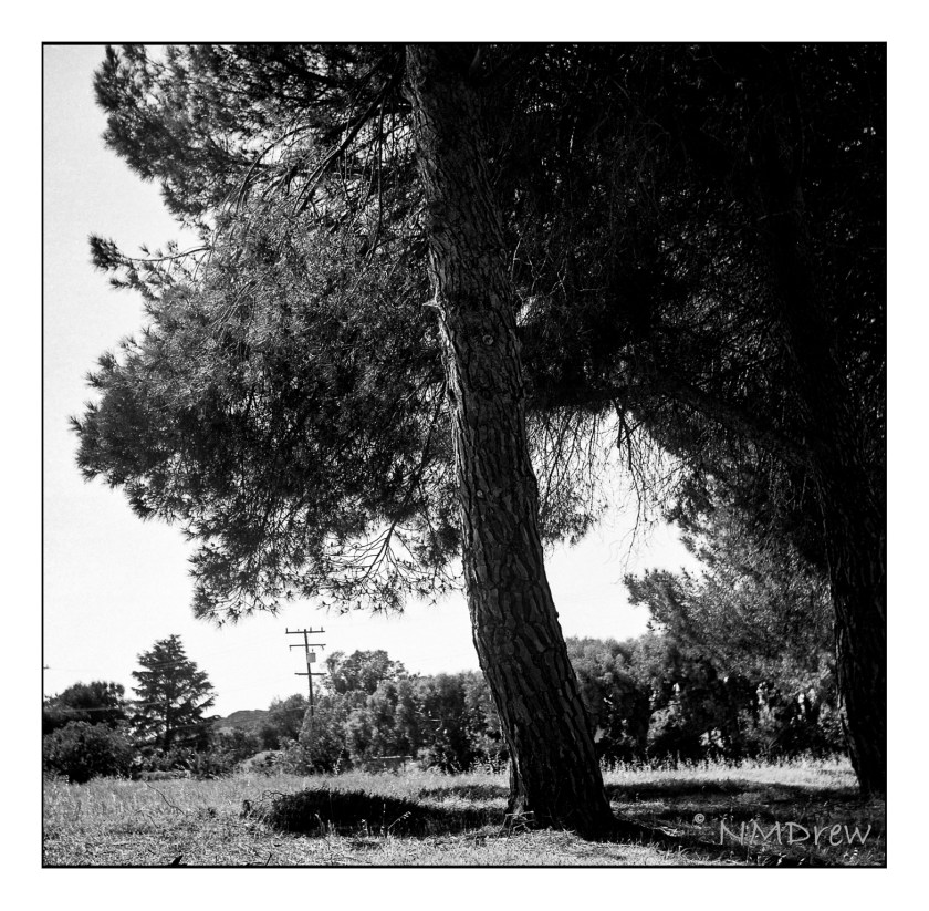
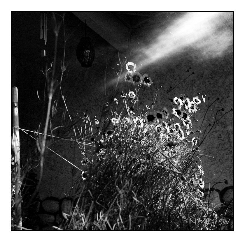
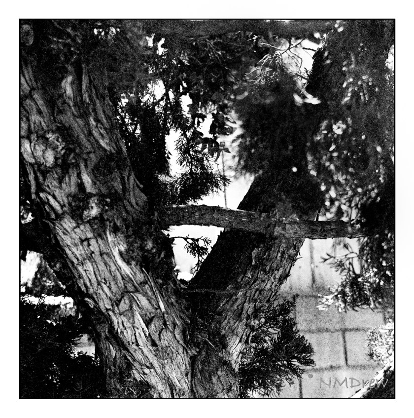
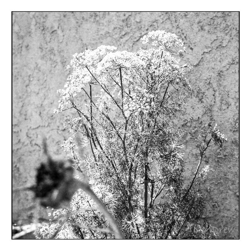
The Apotar lens is uncoated (I believe) and as a result is prone to flare. You can see it in one of the sunflower pictures. I did not use a filter at all. In particular, I think the last one of the Dill Flowers would have benefited from a yellow, orange, or red filter; the dill flowers are yellow and similar to the foliage of the plant. When I looked for pictures to make, my goals were to look for small details, such as the dill leave, strong contrast, as with the trees, and texture, as in the bark.

Altogether, the camera worked beautifully, was simple and direct. Aperture, time, and distance all need to be determined by the user. I used the Sunny 16 rule for the most part and guestimated the distances. Outdoors the usual exposure was f/11, 1/100, and about 6-20 feet (2-6 meters). Inside, most likely f5.6, varying distance, and about 1/50.

The Olde West

Living in California meant traveling across country to move. We did this when I was 12, and I did it as an adult in my 30s.

Driving through the vast reaches of this country always amazes me. First, it is just BIG. Open miles of open land, a house or ranch or roadside attraction.. Huge mountains seen across miles. Winding roads where dust behind you flies in a cloud as you bump along, looking for rocks and holes. Freeways, local highways, dusty country lanes – this is what I enjoy when I travel. This fall we plan a trip across northern Nevada and into Utah, when the weather is cooler, and perhaps we will even enjoy colored leaves at the higher altitudes.

Awhile back I loaded up one of my old cameras – a Voigtlander Bessa RF 6×9 with a Heliar lens, ca. 1935 – with Ilford Ortho 80 Plus film. I forgot about it until I opened the back of the camera and slapped it shut as quickly as possible. As the camera only gets 8 pictures per roll, I lost a few – like 3. One image was too dark for use. But, the remaining 4, while not great, were fun to manipulate in post.

The Ilford film had just been released, so I bought a few rolls to test out. In my 35mm film camera, it worked beautifully, but my exposures were marginal in the 6×9 at best. I worked on them a lot to bring in discernible contrast – most were over-exposed. The lens on the camera is a beautiful Heliar, but my guestimates with 80 speed film were too high. As well, I used no filter since I don’t own one to use with the lens. So, above, a test shot to look at contrast – white flowers on dark green foliage. I created a preset in On1 Camera Raw that I liked; it brings out the details but doesn’t create too much contrast.

This photo makes me think of old dirt roads and stagecoaches jouncing along – like you see in 50s movies! The image got a light leak, but the details of the distant mountain – Mount Clef – and cacti are worth a look

Again, more detail and a bit of LR dodge-and -burn. This is the dried landscape nearby. When the winters are wet – which ours was not this year – the grasses and mustard can grow up to 8 feet. Easy to get lost in, but don’t – stick to the paths or ticks and other critters will get you.

Backcountry is beautiful and dangerous. I remember turning back here – a rattler was basking in the sun. That’s another good reason to walk where you can see ahead of you!

So, a bit of my West with my old camera and newer film and technology. The Voigtlander did not let me down, nor did the film. I am looking forward to taking this camera with me up to Morro Bay next week – along with more modern cameras – and out to Nevada and Utah. More Olde West to come!

More New Tricks

Now that social isolation is lessening and classes can resume in person, albeit with masks and social distancing, I have taken on colored pencils and acrylic painting. To say I have been having a blast is an understatement. Of the two, the painting class is more “me” but the colored pencil class is an adventure into unknown territory.

Colored pencil drawing seems like a logical next step to graphite (pencil) drawing, and in a way it is, and in a way it isn’t. With graphite, shades of grey is what makes the picture. With colored pencil, pencils become almost more important because color, pencil type, and techniques used to create effects in the painting / drawing are considerably more complicated than graphite! So, here are some more colored pencil drawings I have done.

Moving on from colored pencil, my acrylic painting class began last week. I chose “intermediate” as “previous painting experience” was the only requirement. Since I paint with watercolor and gouache with some success, it was a logical choice. And what a wonderful group! Many people have been taking the same class for 4 years – quite a tribute to the teacher. The class is not structured, so subject matter is up to the individual. This doesn’t mean a lack of instruction, but what it provides is direction from the student and help in the process. It works for me.

Years ago, like 40 or so, was the last time I worked with acrylics. I didn’t like them at all. However, today my attitude is a lot different. I have time, motivation, and the opportunity to learn from many resources – teachers online and in person. My sister also paints with acrylics and she has been very helpful with all sorts of information and such.

This was my first acrylic painting. I brought it to class with the underpainting done. I used a Daler-Rowney Acryla 3 set with about 10 colors. My approach was quite trepidatious! I pretended I was painting with gouache, which helped, but my fear was destroying brushes and having paint dry in seconds. Neither catastrophe occurred. I used Canson XL paper as the support, taped to a bit of gator board.

The next one, above, is a rendering of a photo I took while walking along the bluffs in Carpinteria, north of me along the coast. I did this on Fredrix, a canvas pad which is primed. I gessoed it, and like the paper, taped it to gator board. Here I used matte medium only, and the result was a really pleasurable application of paint – it was fun to feel the paint get all squished around with the brush. The canvas surface, too, was a pleasure to work on. Once off the gator board, the Fredrix is really like a canvas off the stretcher bars.

For this image, and the one below, I followed a couple of videos by Will Kemp on YouTube. The one above I only used water to thin the paints; the one below was only matte medium. The supports were canvas panels, 8×10, pre-primed but re-primed by me.

Comments from those who have seen these apples like the apple in the lower painting best, but the background in the upper painting best. I agree.

This is my latest painting. It is from a video I watched by M. Stewart on YouTube. The video is an hour long, filled with information and funny comments. I think I learned the most with this video insofar that there was more time and more detailed instruction. The simplicity of Kemp’s videos of the apple helped me get ready for the complexity of the Stewart’s video – both are excellent teachers.

Tomorrow . . . I think I need a bit of a break from painting, but I do plan to continue working on art as much as possible every day. However, sewing does call, and so does the beauty of the outdoors, and . . . life is too full for only one thing!

So, You Don’t Need That Leg?

Having worked in the medical field, roaming through the emergency room and surgery, on and off varied floors, I am always interested in learning something I don’t know about things medical. Today I came across this video on YouTube, from the channel “Townsends” – purveyors of re-enactment clothing and utensils, and just a wonderful channel for learning all sorts of things.

Today, I watched and learned all about the St. Augustine, Florida, Spanish Military Hospital of 1784. View the video to find out just what amazing things were going on in 18th century medicine . . . if you were Spanish, you were lucky. Doctors had to be educated, licensed, and show they were still competent every 5 years to maintain their right to practice. Elsewhere, your life was at risk if a “doctor” touched you. Learn about bullet removal, amputation, trepanning, patient care, sterile and antiseptic bandages, post-op care, and more!

If you are in St. Augustine, FL, here is the site for the Spanish Military Hospital Museum and here is the website of Townsends. Enjoy!

The Purist Leaves Town

We all have prejudices for or against something. For me, my prejudice is what is labeled “mixed media” in artwork. It brings to mind things I don’t like, much less understand, to be “art” – and that is pretty narrow-minded, I admit. I think of “art” as being pictures of things I can relate to, things I love, and bring a visual beauty with them, even if a bit disturbing. For instance, I find Picasso’s “Guernica” to be quite disturbing – it’s not a pretty painting. The subject matter and colors are not “nice.” But, what is said and expressed in paint is the point.

Truthfully, I would rather look at a landscape versus a bloodscape any day. Google “landscape” and all sorts come up – sadly, in my opinion, many of them are really gaudy and unattractive. I prefer ones with more natural colors, ones which play with light, ones that catch a mood, such as fog or bright sun and a whipping breeze.

Fine Arts Museums of San Francisco, Public domain, via Wikimedia Commons

Above is a painting by Lucy Bacon, an American artist. I’ll put her paintings up on my wall any day.

So, back to the “purist” in me. Merriam-Webster defines a purist as “ a person who adheres strictly and often excessively to a tradition” – and that is me in the world of art. (It also applies to usage of language, but I am all for its development and change – but that is another story!) For me, this means if you use watercolor, you only use watercolor. Oil paints? Only oil paints. A painting is a painting, and not a mish-mash of collage, ink, paint, etc. Pretty limiting view, eh?

So, enter a book I bought back when it first came out, back when I had no time, no studio, little experience, and the aforementioned attitude. The book is Creative Colored Pencil Workshop by Carlynne Hershberger and Kelli Money Huff. Back in 2007, it didn’t teach me what I wanted simply because I was not ready for it. Today is another story, and to be truthful, I am so glad I kept this book. It is opening my eyes to other ways of creating a drawing or a painting by demonstrating, though clear exercises, what can be done beyond a “pure” medium.

I started their exercise using watercolor and colored pencil. The study is a frog in a bit of shallow water. Step-by-step instructions. I did this exercise years ago, liked the result, but the purist in me was not happy with mixing the two together. Now, having started using colored pencil on a “serious” level, I appreciate the underpainting of the watercolor before the surface addition of detail in colored pencil.

I scanned the original line drawing from the book, enlarged it, and then used Saral transfer paper to draw it onto a piece of Arches CP 140# paper. Initially I thought of using HP 140#, but changed my mind. The third picture shows the green watercolor laid in on frog and water plants, as well as varying blue watercolors for the pond. From there, browns and reds were added to the frogs body. These were all the watercolors used, essentially providing an underpainting for the colored pencils.

After the watercolor was done, the blues of the watercolor were covered with blue pencils. The same for the water plants, but greens instead. The frog itself remains untouched by colored pencils – that is for later! The pencils I have used so far are Prismacolor Premiers that I chose to meet my own taste. The book suggests colors for pencil and for watercolor, but after having given up the desire to create an exact duplicate of a study, I felt free to choose my own!

Current status of frog painting in watercolor and colored pencil. More to come!

The final picture in today’s post is the last one. Obviously, more work needs to be done. I hope to finish this fine fellow soon, but over the next couple of days other activities call.

Meanwhile, the purist is leaving town. The perfectionist has already left.