Every Monday afternoon I meet up with a class in oil painting. I paint oils at home, too, and they take far longer to dry than ink or watercolor. Hmmm. I really do miss those two quite a bit, so today, before class, I decided to do two quick sketches and use a bit of watercolor.
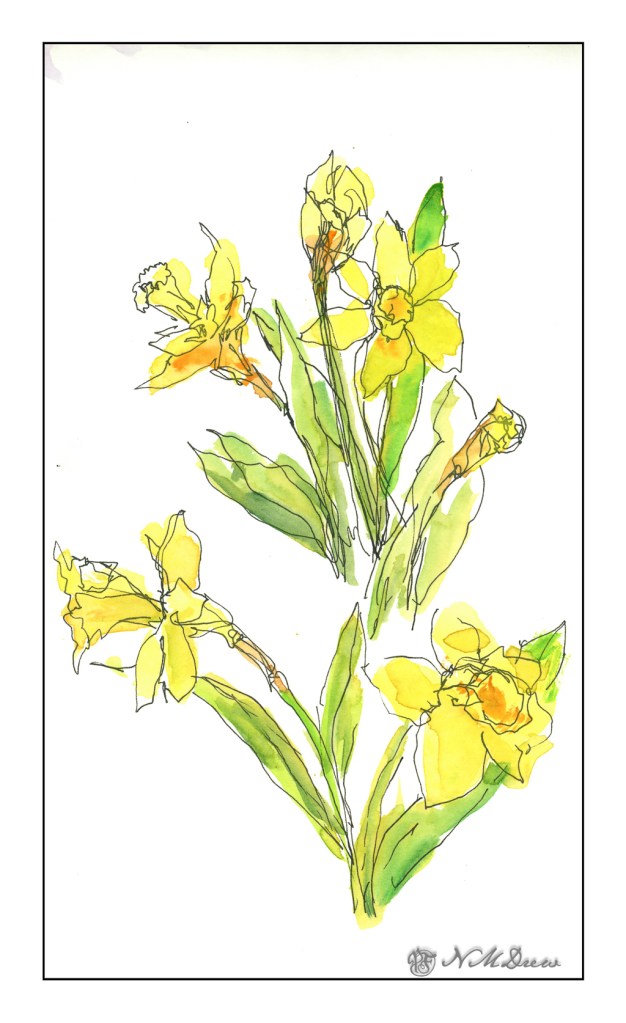
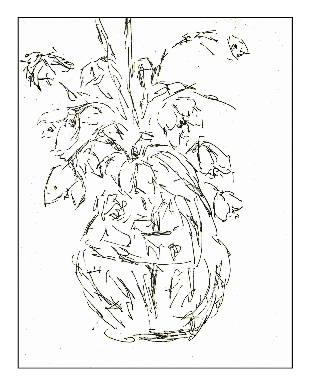
The first was daffodils – obviously! I have several in pots, some blooming and fading already, and others sending up leaves and stems and buds. Spring flowers for sure. I have some freesias which are just beginning to bloom, so perhaps some of those later on.
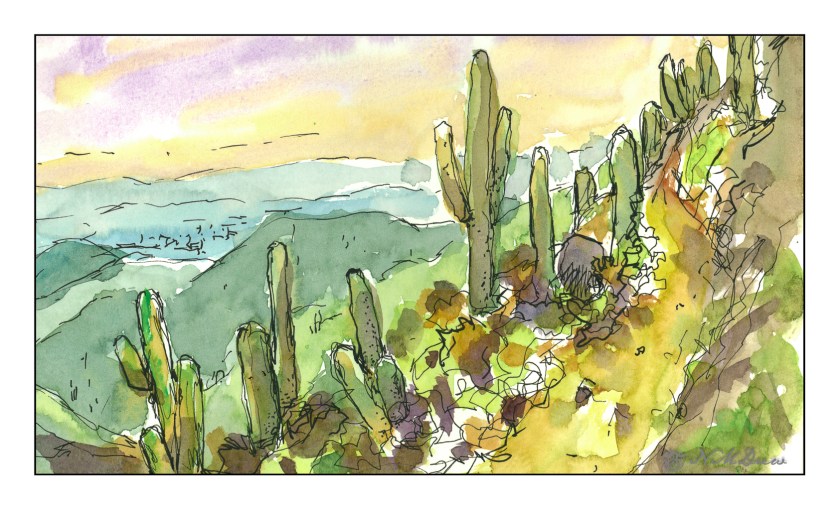
And then some saguaros from the Sonoran Desert. Sunset is always fabulous in Arizona, and here we are overlooking the metroplex that is Tucson / Phoenix in the distance. I am still amazed by these wonderful cacti – so tall and elegant, and silhouetted against the sky they are even more amazing.
These past several days just seem to have been filled with stuff that needed doing, not necessarily things needed and wanted. Getting taxes done, going to the dentist, etc., are not my ideas of a Fun Life, but things Needing to be Done.
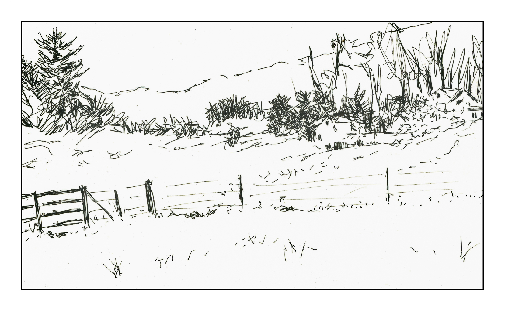
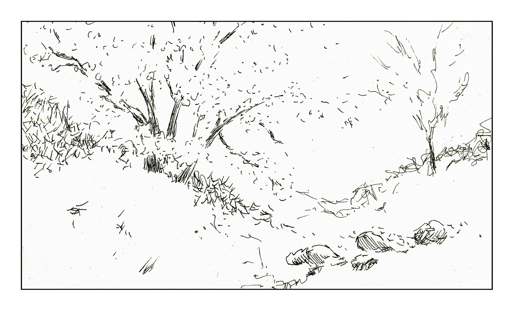
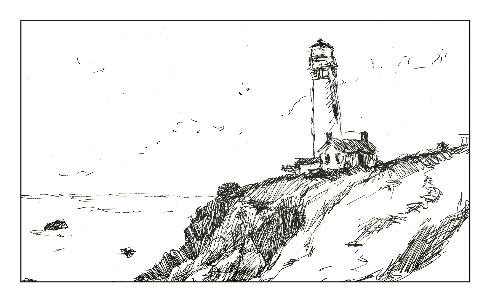
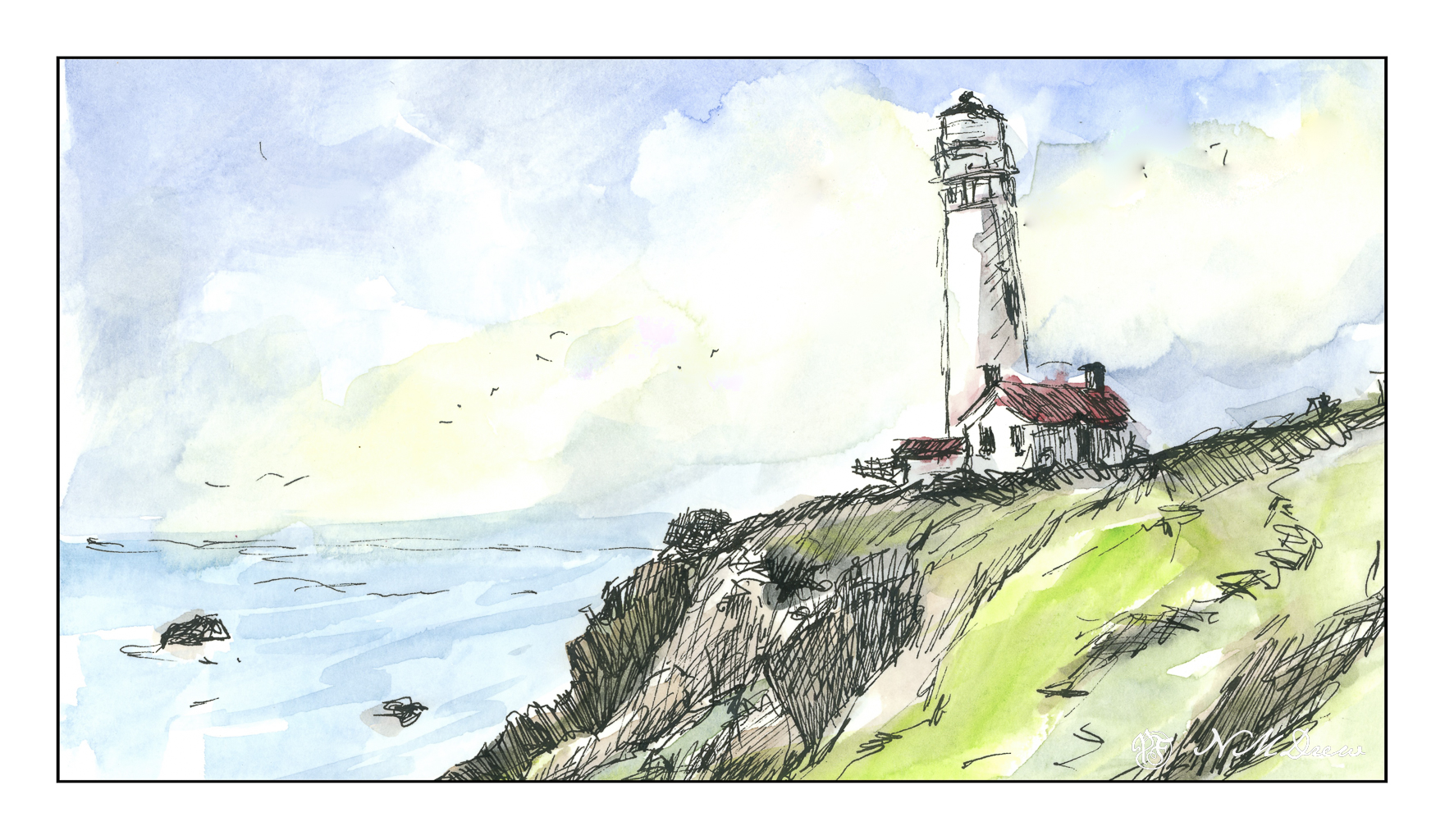
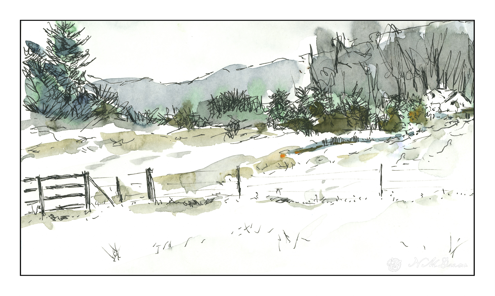
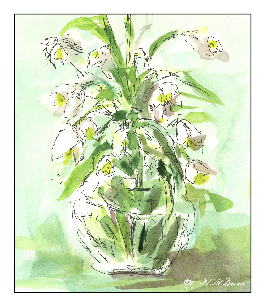
Despite duty, I have been putzing around. I realized that I don’t have a fountain pen and permanent ink for drawing any more as I lost a pen somewhere – which, no doubt, will soon be found as lost objects always are once replaced – and used up all my waterproof fountain pen ink. I now have a new drawing pen, a $17.00 job from Amazon with an extra fine point, and some of Platinum’s Carbon Ink, which is a long time favorite of mine for drawing. My Not Taken Vacation sketchbook was easily accessible, so off I went to the sunny patio to do some drawing. I used a few reference photos for ideas, and then began with ink and pen.
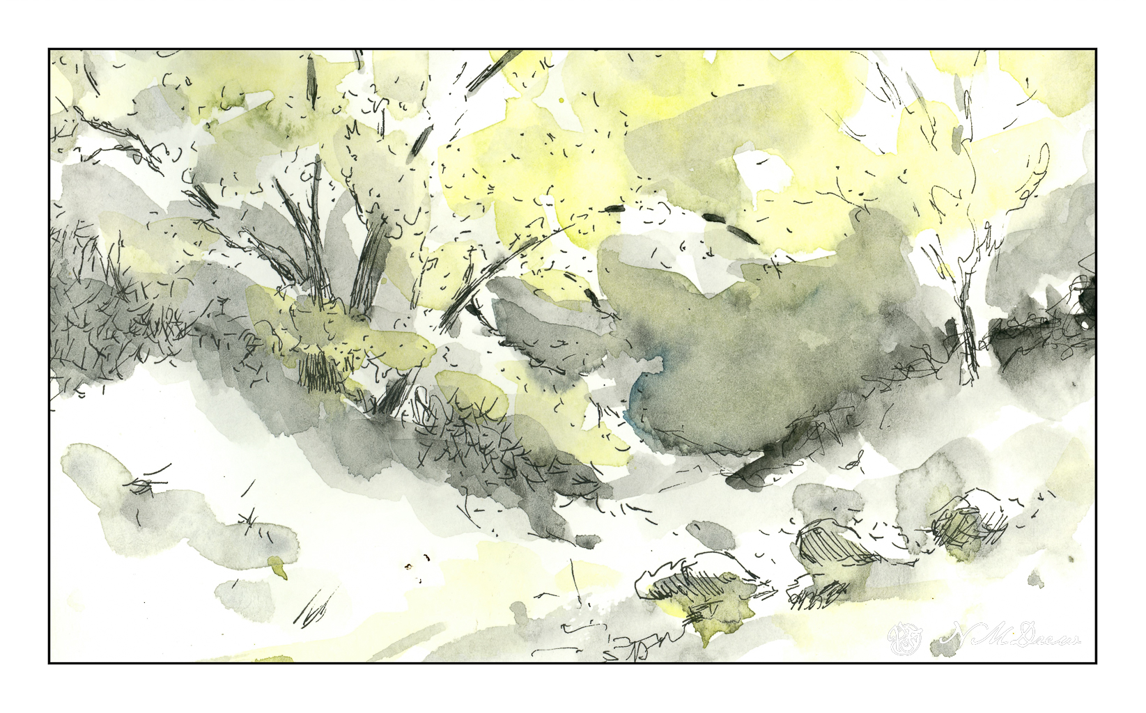
I chose to draw some snow drops in a vase, Pigeon Point Lighthouse here in California, a little cleft in the landscape, and a wintry farm somewhere. From there, my box of Schmincke pan watercolors, some water, and a brush. All this was sort of awkward as I have not done ink and wash for a bit, but it always feels so good to just sketch and paint, more so when it is out on a sunny patio on a beautiful spring day between last week’s rains and this weekend’s expected downpour.
I am quite pleased with my inexpensive fountain pen which came with the fillable screw adapter I prefer to cartridges, and coupled with the Carbon Ink, I think I have landed a rather happy combination for my drawing pleasure. Hopefully you like them, too!
As someone who has used water-based media for years – watercolor, acrylic, gouache – I am used to using just one brush for the most part, or two if I need a different quality. A round, a flat. That’s about it for watercolor or acrylic or gouache. Of course, different sizes matter as far as what I am painting, but with a couple of good brushes, much can be accomplished. I just take my brush, swish it around in water, and then on to the next color.
Oil painting does not allow this. To clean a brush means to work at getting it clean, and that work is best done at the end of a session when all is ready to be set aside. This means cleaning the brushes in mineral spirits to get rid of the oil. This is done after wiping excess paint off and discarding the rags or towels. After the mineral spirits comes a bar of soap and hot water. Squish and swish the brush in the soap, rinse. Repeat if necessary. Set aside to dry after reshaping the brush, and you are ready for the next session.
I have done a bit of observation and a bit of reading about brushes. Some oil painters say you never need to wash your brushes, just clean them off by wiping and using some mineral spirits. For me, this is a disaster in the making. My habits are to use the same brush with rinses in between, and oil painting does not allow for this – at least, not the way I paint.
The classic picture of an artist is with his handheld palette, beret on head, easel in front of him / her, and multiple brushes being held in the hand holding the palette. It makes sense! Brushes with different colors, different values, different shapes to create different strokes. I watched a lot of oil painters, and some do hold multiple brushes. Some even go so far as to have the same brush in 3 editions – one for light, one for medium, and one for dark values, with other brushes exclusively used for blending. Recommendations for brushes are also as varied as how and what to do with brushes – what shape, what size, what material, how much to spend.
Well, for now, I need to focus on clean brushes. Mud was a very common byproduct of my earlier days in watercolor, and now I have to fight the same problem with oil painting. I need to retrain how I use brushes altogether. I have also found I need to determine what kind of brush I like. Watercolor works with both soft and stiff brushes, depending on desired effect. Soft brushes are the best, IMHO, for gouache. Acrylic, like watercolor, can vary with the need of the painter – hard, soft, round, flat, filbert, fan. Right now, I prefer softer brushes for oils, but I know that this will change as I become more comfortable with the medium.
Meanwhile, I think cheap brushes for 3 values will be my default for now – and it won’t be easy!
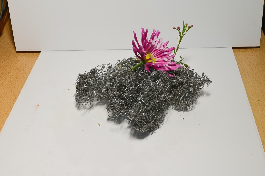
Focus stacking – also called focal stacking, photo stacking, and who knows what else – is taking a series of images of one object and focusing at a slightly different distance from the previous photo. From there, you merge all the images to create one highly detailed image.
I’ve done this before using a manually focused set up, but after looking things up, it turns out the Nikon Z6ii has a built in focus stacking set up where everything is automated. It doesn’t take very long. I decided to try it out, following instructions on YouTube. They were easy to follow. My parameters, if you are interested, were as follows: 100 images, set apart by “1” in the Nikon menu, and an interval of “1”. What all this means, no idea, but I did it, and in a few minutes I had 100 images. My lens is 50mm at f/8.
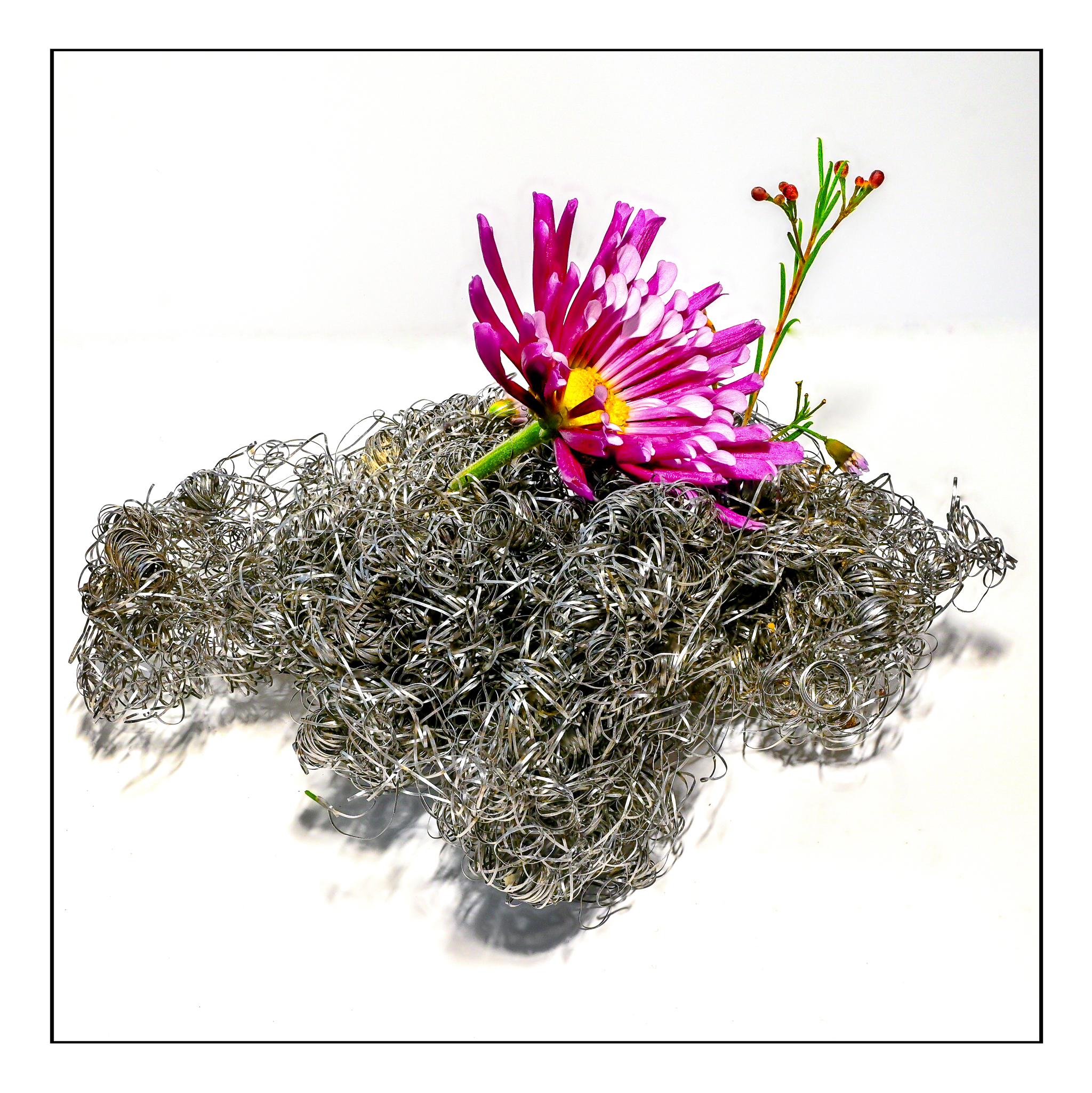
Zinnia & Steel Wool
This is what the original stacks looked like after using Zerene software. Zerene is a software I have used years ago, and it works great. It takes a bit of time, but I think a dedicated program helps a lot. Photoshop does focus stacking as well, and so does another program, Helicon, but this requires an annual license or a lifetime license, and comes with various grades of licensure. For me, Zerene is just perfect for what I want to do.
First of all, if you want more detail of the above picture, click on it and enlarge as big as you can get it. You will find the little hairs on the zinnia stem as well as flaws in the photo stacking, but it is worth looking at methinks.
Obviously I did a bit of post production! I had to use the spot fix in LR and On1 to get rid of the line where the 2 pieces of foam board met up. I also had to get rid of spots and splodges. I increased the exposure a bit, upped the whites, blah, blah, blah. Let’s just say it took some time, but made me think that perhaps investing in a light box might be a good idea. I tried to make this look as nice as possible without going nuts and getting picky to the point I was ready for the zoo.
Kris over at Wicked Dark Photography does a lot of outdoor focus stacking of small things, like moss or mushrooms, and her lovely work made me realize there is a lot more potential here than getting nice photos of things to sell on eBay. Kris’s work as a photographer just really appeals to me as she knows a lot about nature, enjoys trees and water and even spiders (which I like outdoors and not enlarged!) and small plants. I look forward to her weekly posts as she is often out on an adventure with which I can travel along, especially on her videos.
Color always fascinates me, and two modern painters, Richard Mayhew and Wolf Kahn, are masters of it. They pay tribute to the natural world with their colors and whether or not the landscape is based on reality doesn’t matter. The subject matter and the colors are the point, just as the squares and rectangles of color are of such importance in the work of Mark Rothko.
For this study, I looked at several of Kahn’s pastels of trees and woodlands. His color choices range from contrasting and bright to subdued. Sometimes the trees are distinct from the background, other times almost camouflaged into the surrounding foliage. I decided to continue using linseed oil here and soft colors to see what I could do with blending and creating lines for tree trunks within the the woodland while keeping the visuals of Kahn’s woodlands in mind.
This was painted in one sitting, and as the paint was damp and pliable, it was fun to move it around, wipe some off, add more, and then use the brush to create lines and dots to suggest trees and leaves and open field before entering the woodland. As I painted, I realized that I could place lighter colors in vertical strokes between darker areas to create tree trunks. I used short horizontal strokes to suggest foliage.
Again, I painted on the linen-textured Canson XL Oil-Acrylic paper. Linseed oil allowed for easy movement of the paint. And, again, this painting has been taking forever to dry out in my chilly garage, but I scanned it anyway, and cleaned up the glass afterward.
I really like Kahn’s work, especially in his later years. I also want to explore color as Mayhew and Rothko have used it. Besides exploring colors, exploring the subtleties of one color and its variants within a given area will be fun. Mayhew and Rothko will be fun to emulate, as has Kahn, because the experience of copying is a form of exploration that adds to knowledge by doing, and that, to me, is the best part of all.