As I mentioned the other day, I have been thinking about the bold washes as done by the British artist Edward Seago. He grew to adulthood in rather interesting historical times and while living contributed to society as well as the art world in many different capacities. As a watercolorist, he creates complex scenes with a broad swaths of paint. While not a great reproduction, at least in my opinion, here is Seago’s watercolor “The Hill Copse”.
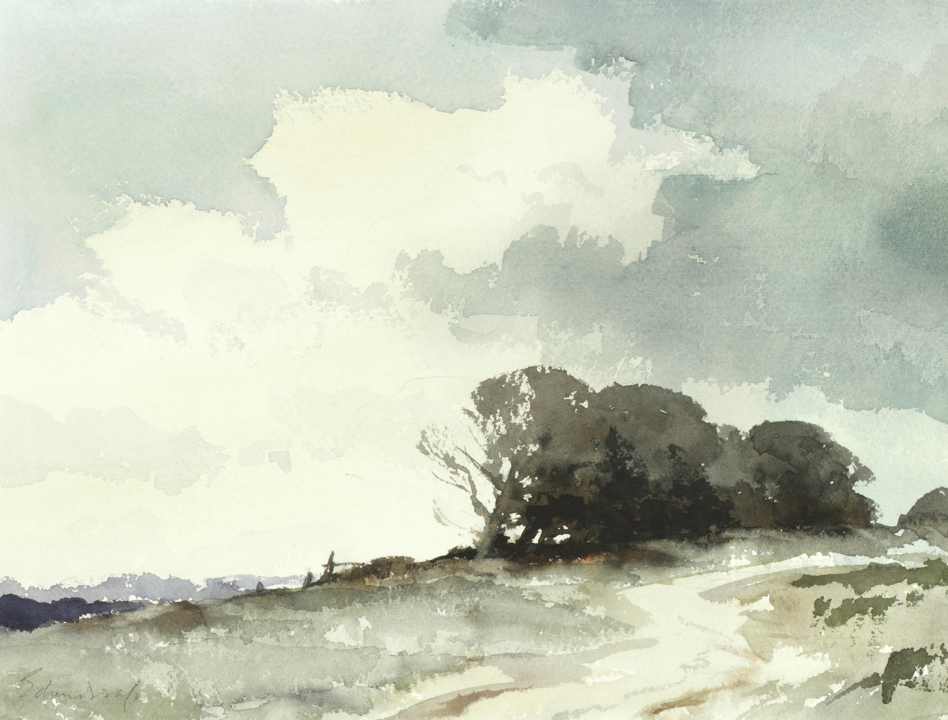
You can read a bit about it at Bonham’s, which is where the above image is located.
This is a very monochromatic painting, but I expect the original was more rich in color than is shown. During Seago’s time, many colors used fugitive pigments, meaning they fade with time. Today’s watercolor manufacturers still produce colors which can fade, but many employ chemistry that is labeled as “permanent” and so do not use the original pigment formulae.
Two good examples of fugitive colors are rose madder genuine (made by Winsor Newton) and alizarin crimson. The rose madder genuine is still available, but it is important to know it can fade to a dullish brown. Many old colors are like this, and while lovely, makes one pause to consider when painting. I have this paint, and it is one of the prettiest pinks – and have dyed yarn and fabric with rose madder that I have grown – but fading is also part of its characteristics.
But I digress. I chose this painting because of the elegant simplicity of the washes to capture complex shapes. The sky is dramatic, the sandy track uphill to the copse, the sense of distance to the left – evident to the eye, and painted with amazing simplicity – suggestions of reality rather than a more complicated syntactically correct visual statement (hahahaha).
I interpreted the colors I thought would work here for my own “master copy” and chose ultramarine blue, cobalt blue, burnt sienna, burnt umber, yellow ochre, cadmium yellow, and Hooker’s green.

Obviously, there are differences in Seago’s painting and my own, but I do think I managed the overall simplicity of the washes and colors. As with all watercolors, white paper is left for brightness and interest, and wet-into-wet was done along with wet-onto-dry. To keep things simple and think about the shapes prior to plopping down color was foremost in my mind, but at the same time I considered the original painting an pondered the techniques used by Seago while painting.
This is quite the challenge for someone like me! But, fun was had, and I think I will continue to both reproduce some of Seago’s work as well as reconsider how I paint new subject matter.
Master copy, watercolor, Hahnemuhle 140# / 300 gsm CP paper, 9×12.