After a busy several days, including the winding down of my summer painting classes, I needed to do some watercolor and landscape painting! Oil painting and portraiture require a lot of focus, but it is so restful to just think about colors and shapes, as I do in watercolors.
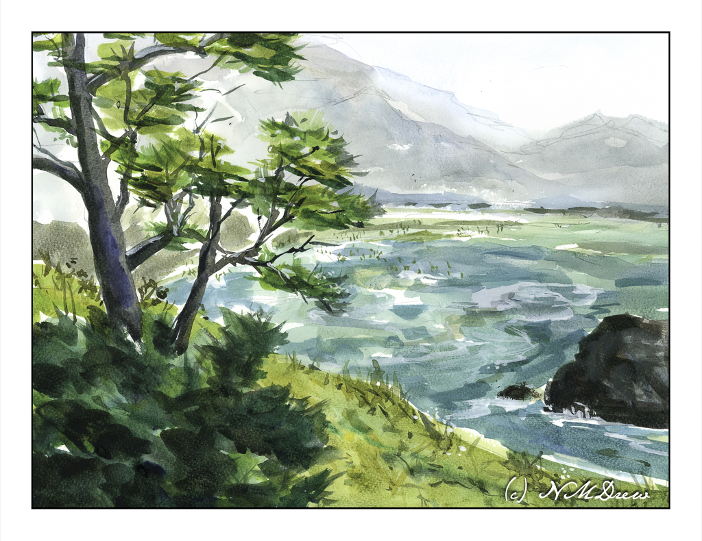
This painting is inspired by travels along the Oregon coastline. I tried to capture both the color of the sea as well as the mistiness of the distant mountains. The little dots representing a beach filled with people was a bit inspired because I needed to do something with some empty space in the middle. Nothing like being the god of your landscape, eh?
Watercolor, St. Cuthbert’s Mill Bockingford paper, 140# CP, 12×16.
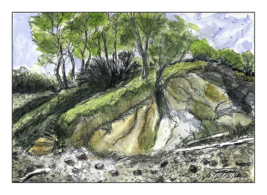
Rocky coastlines are always fascinating because the first time I ever saw the ocean was along a wide, sandy beach with gentle waves. Not so here! You can see the debris – fallen trees stripped to bare logs, rocks, erosion. You can only imagine what it is like during a storm.
Years ago, we drove up the California coast, heading into Oregon and points north. It seems once you hit the central coast, about 100 miles from where we are, the coastline begins to change. Highway 1 leads into Big Sur, that fabled and beautiful land, and it is here you see rugged cliffs. Then, north of San Francisco, you move into the wide beach sands of Stinson Beach and move further along to the rugged Mendocino coast and then beyond. This picture is based on a photo I took there years ago – no idea where we were, but it was stunning.
I bought the Pentax 17 half-frame camera soon after it came out. And only a couple of weeks ago did I finally finish the roll and get it processed. I scanned the film myself – the first roll in what seems ages – and it took me awhile to get familiar with my film scanners. I have a Pakon 135 which I use with my very old XP eMachine laptop, and my newer Pacific Image PrimeFilm XAS scanner which works with Windows 11.
Pakon 135 Scan
The above image was done using TLXClient (the professional part of the Pakon software – may have the name a bit munched), a part of the Pakon software. It is limited in size for the final scan. I used it with scratch and dust removal along with whatever else was in the arsenal. The image was a tad dark so I lightened it a bit in Lightroom. It has a warm cast which is very nice to the eye.
The above image was scanned as a negative – not a negative turned positive as the Pakon does. From there I converted it to a positive image using Negative Lab Pro and the “Cine” color interpretation. It is a lot colder and more blue of an interpretation. I rather like it. Post-processing of film images is a lot like painting – you can interpret things as you wish.
I used the Pentax 17, one of the two newest film cameras manufactured in the past couple of years. It is a simple camera which uses zone focusing but is automated in a lot of ways which make for some fun times. What I have seen so far in image quality is pretty good – and when you remember to take the lens cap off, you get pictures, too! (There is a light on the viewfinder which blinks at you if you have no incoming light – but I forgot that!) The biggest thing is that this is a “half frame” camera, meaning instead of one image, you get two. Thus, a 36-exposure roll should net you 72 images.
Image quality has been discussed back and forth for different film sizes, so I will leave it to you, dear reader, if you want to find out more. The link above takes you to the Ricoh website for the Pentax 17, and if you use the tabs on the web page, you will get a lot of information. I think the pictures I got look great – when I remembered to do things right! Using the Pentax 17 is easy and fun, and its compact size makes it easy to take with you.
Today I had planned to go to my painting class but when I got out of my car for a dental appointment this morning, I felt a sudden stabbing pain in my hip. So, I am staying home and have an appointment with my orthopedist tomorrow – this is just too weird, and having worked ER and radiology for years, it is a bit scary. Better safe than sorry.
To amuse myself, I scanned some long overdue photos from some Fuji Pro 400H color film I took sometime ago and had processed. Truthfully, most of the photos were rubbish and rather horrid. I thought this photo matched my mood – gloomy, dark, and definitely not one of sunny cheer, which is what this day started out to be! Instead, the humor of it all – or perhaps irony – is here in this photo . . . because I have photographed this little creek in a local park and can honestly say I have seldom gotten one I really like. Sort of matches my mood.
Agfa Isolette, Fuji Pro 400H film, scanned on Epson V600.