Once more, it is hot and sticky, but not as miserable as yesterday. Today, I am a bit more energetic but still not running around in the 90F and then some heat. And I am in a far better mood, too! No flies. No mosquitos. And a replacement package for the stolen one arrived today. Now, September is here, and though summer is not yet over, Labor Day (American holiday always on the first Monday of the month) is, for many of us, the official end of summer.
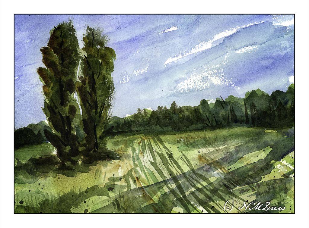
The end of summer means the fields are mown, crops and hay gathered in. Tracks and stubble leave lines behind in the shorn meadow. Heat, light, late afternoon.
That is all that this painting about. I did it after the one I posted the other day and, as with the other “Two Trees”, I am happy with the results here. I like the long shadows in the lower right, but if they are realistic or not is not the point – they just make for a bit more of an interesting picture!
In landscapes, you are the goddess of your painting!
With little to do other than post about flies (see yesterday) and gripe about the heat and a missing package, it is always best to move on to things which please you the most. For me, it is waterolors and landscapes. These are two things that usually give me a lot of delight and certainly act as a balm when I am feeling really pissy!
Okay. Heat doesn’t do me well, so I have the air conditioning on and the house has cooled down from 81 F to about 76 F. The latter is manageable. Lots of water and electrolytes, too. And then, watercolor and color and trees and skies and the feel of brush on paper. Even better, a painting I like, and a second one, which will posted after this one.
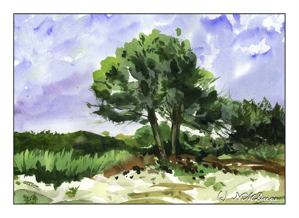
I am not really sure what to write about this painting. It is pretty simple. It is a simple scene of trees sits on the edge of a sandy bit of land and is backed by a few distant trees, grasses, and shrubs. The palette was simple enough. I worked to make my painting simple, too, and focused on shapes and contrast as well as recall of some lessons learnt from classes. I think it shows summer, too, and a bit of the sultriness I am feeling – humidity, heat, balmy. And very lazy.
I don’t like flies. I have a couple buzzing around. Mosquitos are worse. So, in my irritable mood, a few poems recognizing the fly, for whatever reason!
The Fly – by Ogden Nash God in His wisdom made the fly And then forgot to tell us why.
The Fly – by William Blake Little fly, Thy summer’s play My thoughtless hand Has brushed away. Am not I A fly like thee? Or art not thou A man like me? For I dance And drink and sing, Till some blind hand Shall brush my wing; If thought is life And strength and breath, And the want Of thought is death, Than am I A happy fly, If I live, Or if I die.
Summer Serenade – by Ogden Nash When the thunder stalks the sky, When tickle-footed walks the fly, When shirt is wet and throat is dry, Look, my darling, that’s July.
Though the grassy lawn be leather, And prickly temper tugs the tether, Shall we postpone our love for weather? If we must melt, let’s melt together!
Summer is ending, but birds sing, bees buzz, flies annoy, the beach beckons, and life goes on!
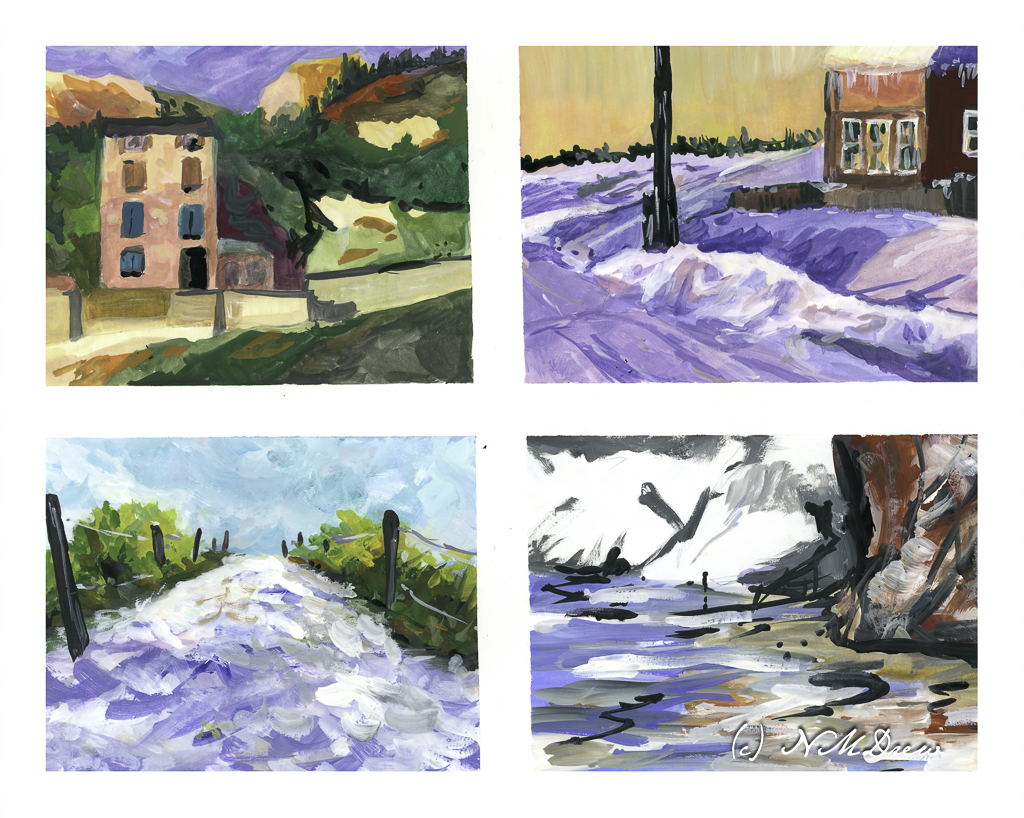
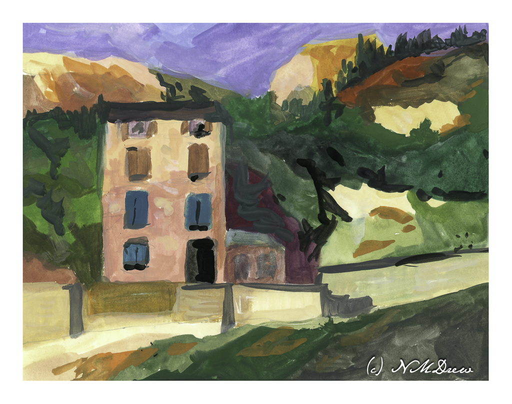
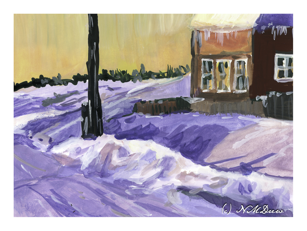
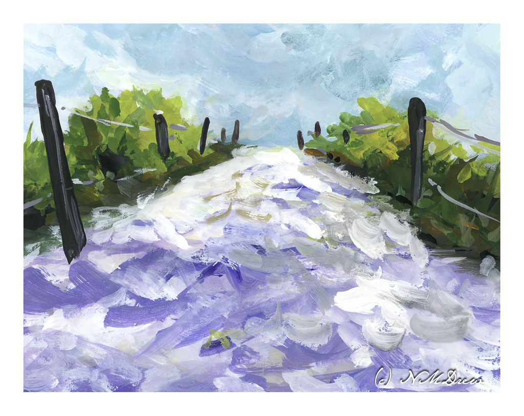
Today I set another painting goal: contrast. This means working toward bright whites and dark darks. Catching light is what art is all about, at least in photography and more realistic painting. I tend to struggle with contrast, more so when the colors are very similar. Today I decided to work on the light-dark contrast, but in the near future, monchromatic studies in black-grey-white and in variants of tone will be done.
Today I chose a white, multi-media paper with a very smooth surface. I blocked off 4 rectangles on a 10×14 sheet of paper, so each rectangle is about 4×6. This is the single sheet I used.
This is the first painting I did. I looked to have a shadow on the lower part of the building and the upper part in sunlight. The same for the various bits of light and dark rock and walls, or whatever they are, to give a sense of a strong light, perhaps from a late afternoon.
This painting was a bit easier to do than the first – I was warmed up. Here, I wanted to catch bright snow and shadows on snow and buildings. I used titanium white for the really bright bits of snow alongside the road. The contrast is much stronger than in the first painting, but the real challenge lay in capturing the snow – which is white – in shadows. I also put in some icicles on the building, which was rather fun!
Moving from the dead of winter in the middle of nowhere, I now went for a bright day in the Caribbean. White sand, bright sky, brilliant light, strong shadows. I think this worked out fairly well and am rather pleased with my contrast.
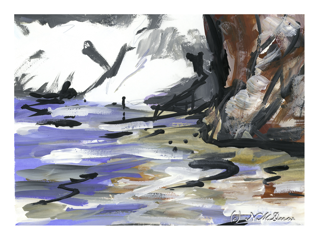
And this one? A crazy bit of abstraction of a beach, reflections in shallow water, and bright white cliffs in the background. I did this just to be “painterly” and use up the paints left over on my tray. Playtime with a bit of success.
Today’s activity accomplished what I wanted to do – strong contrast in different settings. There is a challenge in gouache insofar that colors are a bit odd in some ways. I played with colors as I mixed them trying to get a color you might call a “rosy glow” that could portray the golden light of a late afternoon or early evening. A strong white, too, with very little if any color added, was used for the cliffs and sand. More than anything, the experience of working on a lot of little paintings turned out to be a bit of fun because each painting had a slightly different area, or areas, of brightness and darkness.
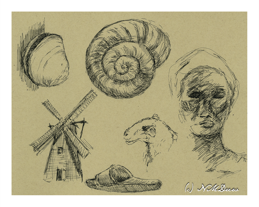
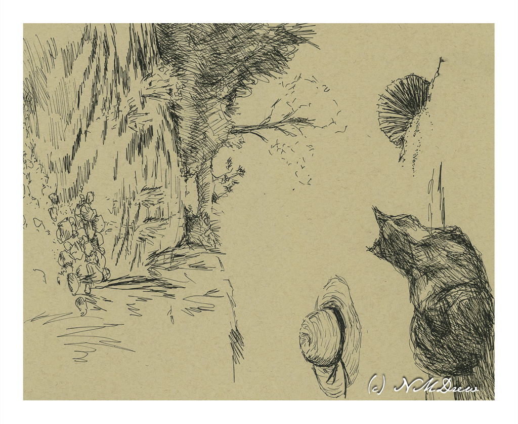
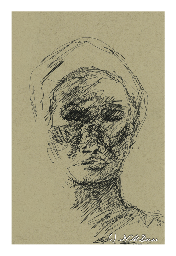
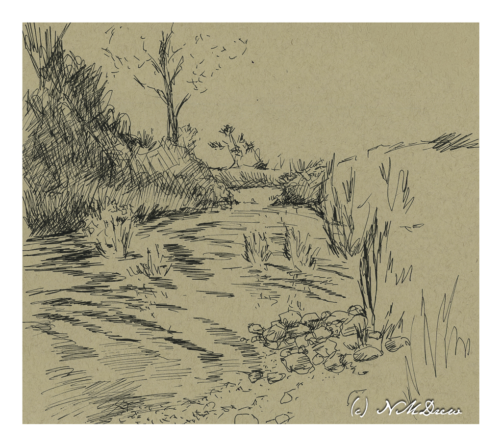
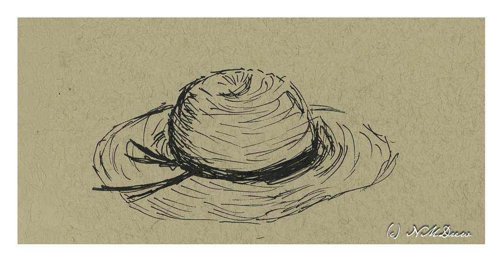
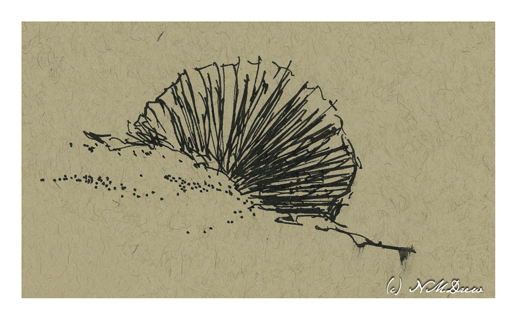
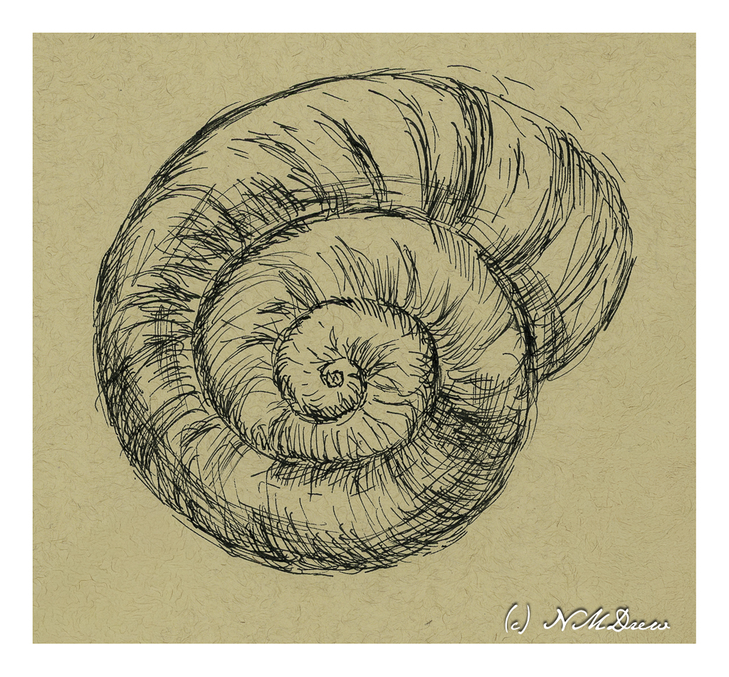
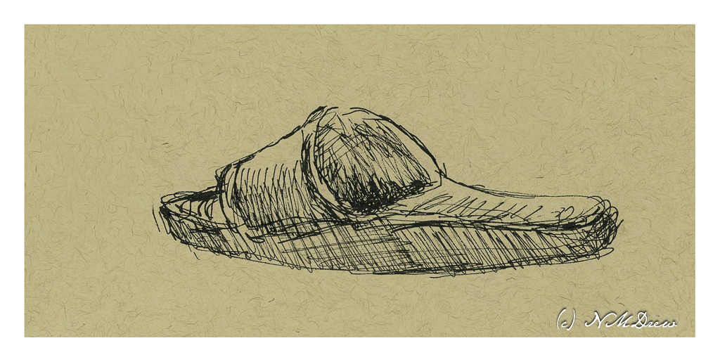
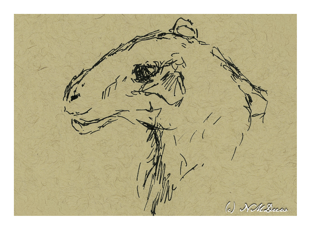
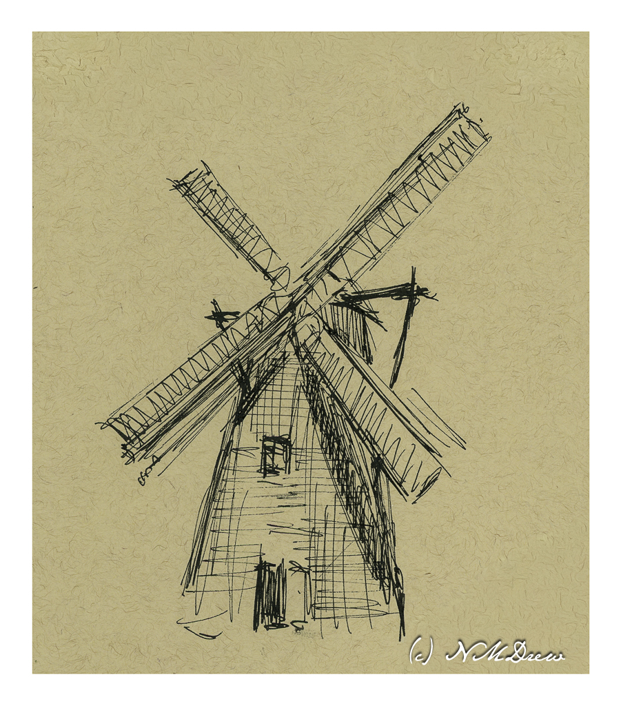
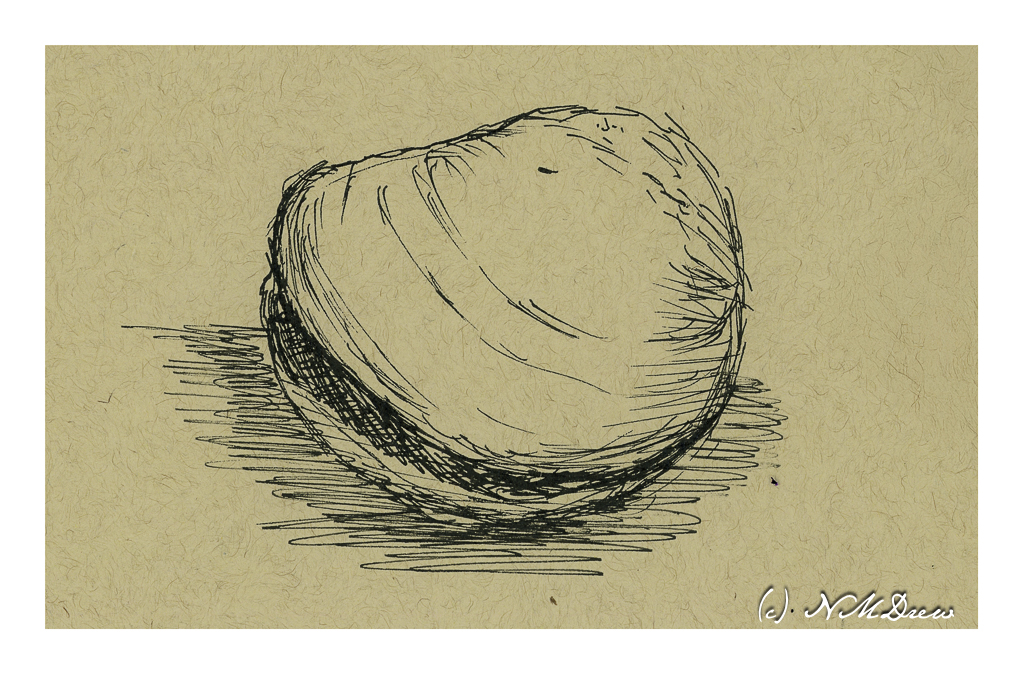
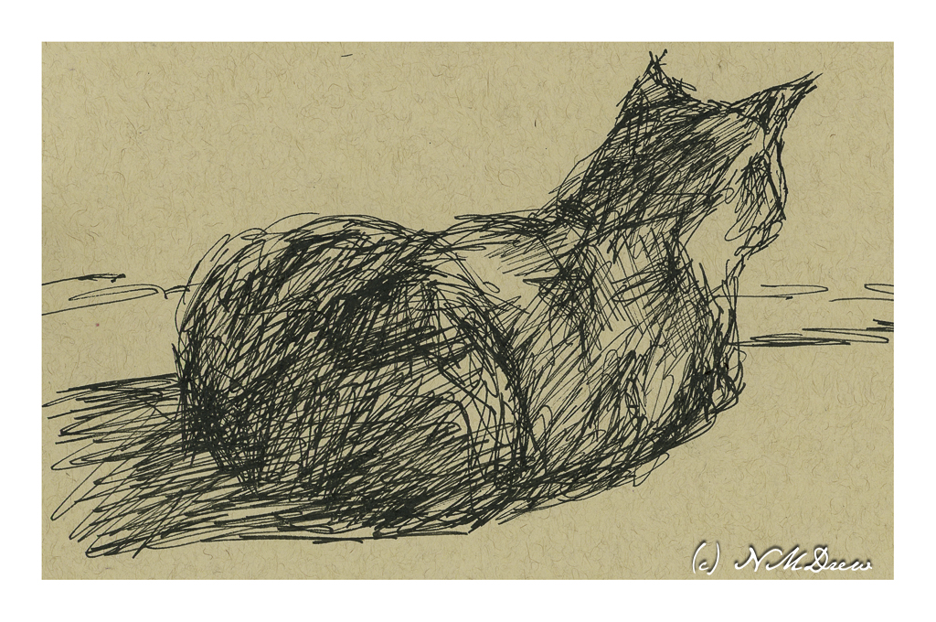
It’s over 90 F / 32 C today, muggy, and to do more than move around, even with air conditioning (which is not on at present), requires more energy than I want to spend. So, sitting at my computer, I decided to find pictures of things to draw.
My choice was carbon ink in a fine nib pen with a flexible point and the tan, toned paper I have been using for gouache. I get to sit still, cruise for a subject, and then scribble on smooth paper with a responsive pen. If you use pen and ink, you will know the pleasure it provides!
Above are my sketches. One piece of paper, both sides. Tan toned paper by Strathmore. I really like this paper.
I don’t think there is more to say other than it has been a very pleasant afternoon scribbling away. Each sketch is done freehand, no pencil prelims under the ink. Shapes and shadows and direction were all attempted to be expressed simply through the ink, hatching, dots, lines, etc.
Strathmore multi-media tan paper, 11 x 14, Platinum Carbon Ink.