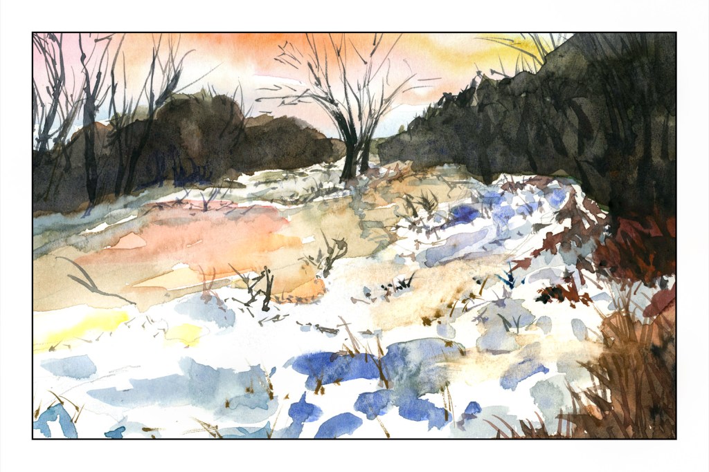
Nothing great . . . 6×9 on Strathmore Vision 140# paper.
What is the purpose of this sketch? First, trying to lead the eye to the two trees on the opposite river bank. Second, trying to reflect warm and cool light on the snow and ice of the river.
Problems? Paper is not great, but good for these kind of studies. Also using different paints – Schmincke pan paints, which are more saturated than the travel paints I used the past two days. And, as always, my sense of perspective is off. I am not quite sure why and it really bugs me!! Oh, well, perhaps one day I will find the answer to that problem.
Thinking about the atmospheric perspective, it seemed I needed softer edges in the distance. So, I wet the paper, blurred it a bit, and smeared a light mess of a blue-grey to give some distance. Then I took the painting into LR and decided to adjust the vertical perspective a bit, tilting the picture back a bit, and then doing a “smart fill” in the areas left white by that adjustment.
Don’t know if it improved the picture, but I think it might have as I often feel as if I am falling into my painting from above – sort of like a bad dream.
Another sketch, and I found that my little travel palette needs some alizarin and perhaps a violet to work to my advantage. Cad red and ultramarine are rather limited when it comes to violets and lavenders, which are colors I really needed here. So, besides practicing painting, I am finding colors I need to add. Granted my travel palette is one I tucked away and resurrected, and I think I know what most of the colors are, but it is a bit of an insight, too.
Crocus flowers come in all shapes, from pointy to gently curved. These are sort of pointy petaled. Because they are so low to the ground, one usually sees them painted from a higher vantage point, but in profile I personally like them even more, especially as light is filtered through their petals and leaves and surrounding vegetation.
A goal here was to focus on light – coming from upper right – and then some negative painting.
I have been waging a bit of a mental war with myself, and the monkey mind is everywhere and nowhere. Now, though, after devoting myself to several days of following exercises on painting rocks and rugged coastlines with a Shari Blaukopf class, I have at last decided to make watercolor my main medium. Acrylics just do nothing for me, but there is a small love affair beginning with oils. I take an oil painting / acrylic painting class on Tuesday afternoons, and that is where I will continue oils while pursuing watercolors with more focus and less of a scattered approach.
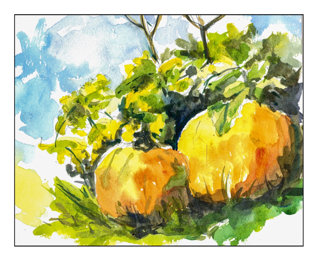
Watercolors have always held sway as a “first love” – partly because they are easy to clean up, partly because they are devilish hard to master. So, with the decision I made this morning, I have decided to try to do a watercolor every day, even if just a small sketch before I begin my day. Today, pumpkins.
I just put some water in a cup, took out a small travel palette with a few colors, grabbed a brush, and started to paint on some student grade paper. Nothing serious! But, at the same time, some thoughts in mind: contrast, hard edges, lost edges, verticals and horizontals, light and shadow, focal point.
Not a great beginning, but fun. Maybe I will paint it again tomorrow . . .
I am kind of a cheapskate at times, especially when it comes to paying for educational experiences. Too many times I have been disappointed by the experience, especially when it comes to art classes. Cost vs. course value and content are a big issue for me, and more often than not I am very disappointed.
One person, though, from whom I have taken online courses, and who has never disappointed me, is Shari Blaukopf. She is a Canadian watercolorist with quite a following – her workshops are always sold out – who provides economical and informative online classes in various subjects. Subjects have included snowy urban scenes, wintery scenes, flowers. Her courses last from an hour or so to more, depending on how you do them, for very good prices of about $30 US. I ain’t complaining!
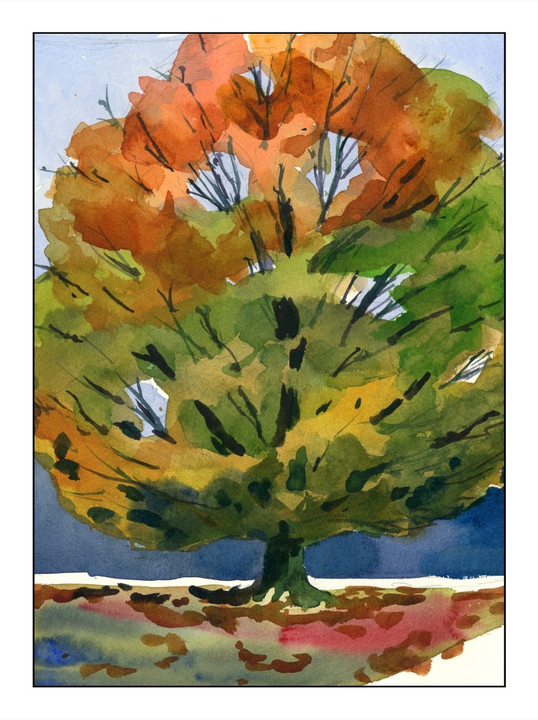
Let’s begin with her most recent course on trees throughout the seasons. I think this is one of my favorites. What did I learn? As a dabber – tiny brush strokes – this class was perfect for me. I got a better grip on painting foliage, not a leaf at a time, but as color masses. Most instructors will tell you “paint foliage as a mass of color.” Okay, clear enough, except it doesn’t really sink in well for me. Shari’s method of drawing an outline of the areas in question is brilliant, and a lightbulb-going-off-in-the-head experience for me. My samples from this enlightening experience gave me quite a bit of pleasure.
While she is painting her tree she says that midway through, when the tree is just a bunch of colors, she begins to wonder if it is going to get any better – and it does. My own thoughts were the same, but continuing on, the results were pleasing.
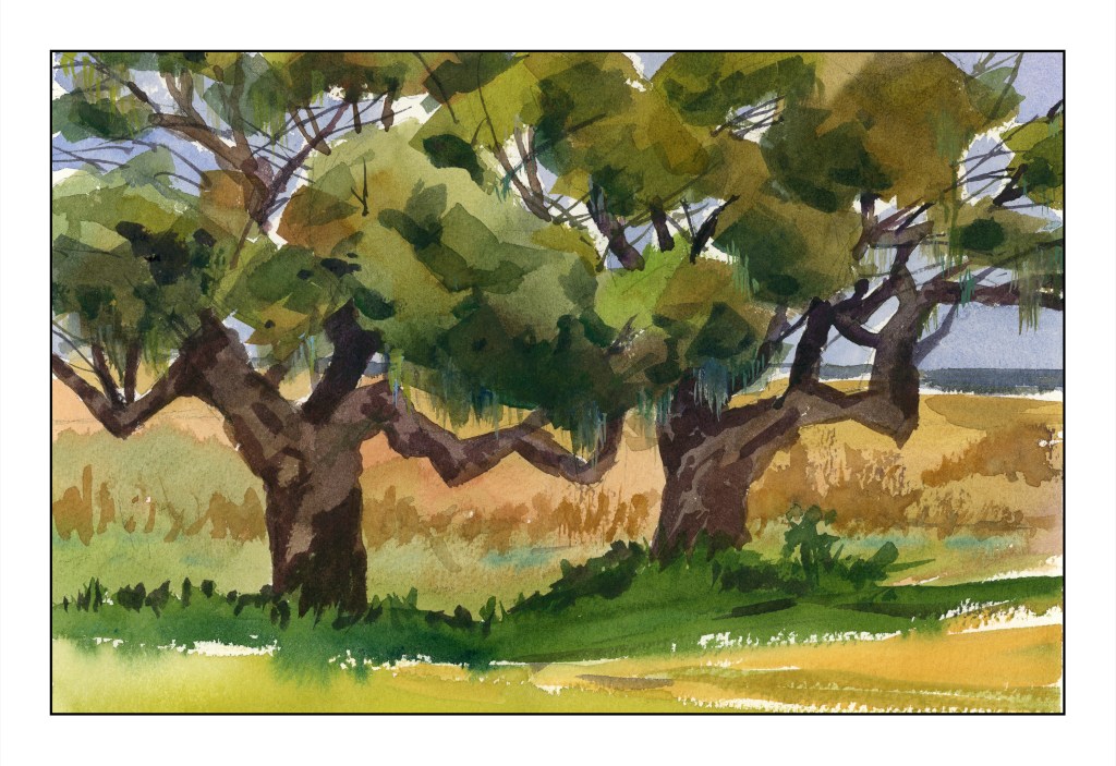
These southern live oaks (above) were also done with masses of color, but a bit more detail. The maple tree was a great segue into the oak trees.
The standard or classical “way” to do watercolor is light to dark. I have followed this “rule” with mixed success, and as a little automaton, I do what is “expected” far too often. However, Shari often does the sky, then darker areas, or outlining certain areas with color.
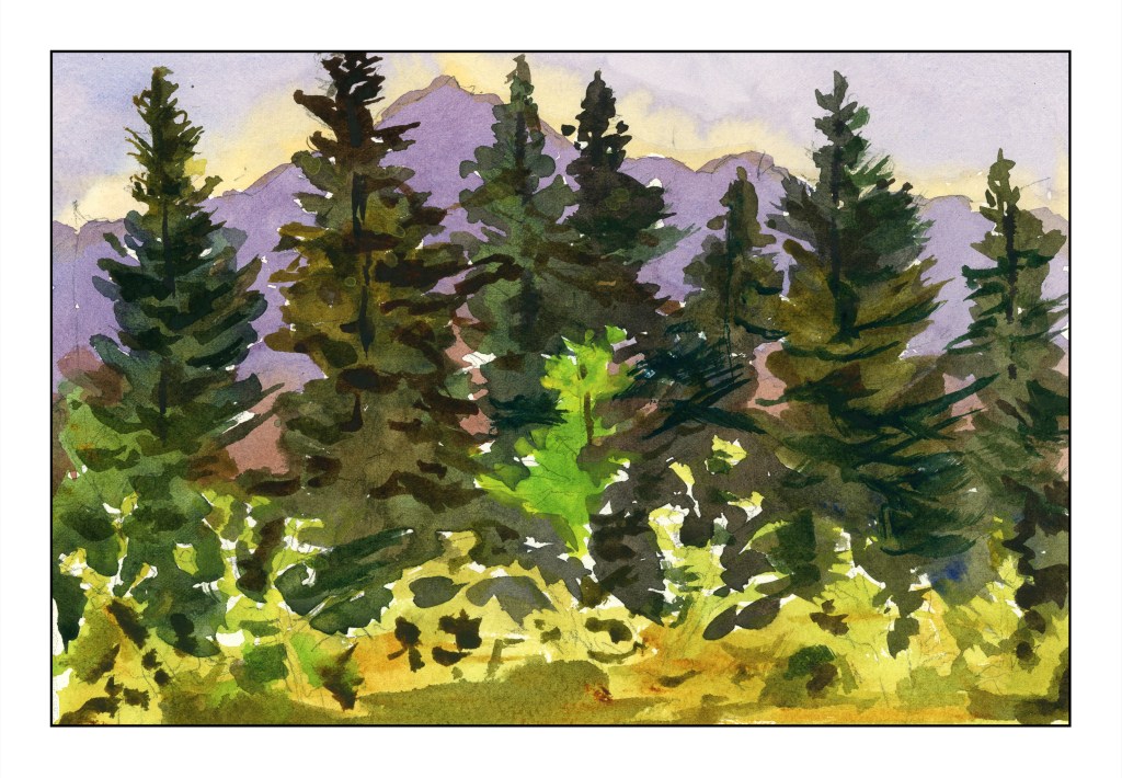
Above was the very first tree study – a vast area of pine forest against a mountain and sky. Sky and mountain were both worked around a lot of the treetops. From there, the very dark pines were painted with the lower edge of lighter vegetation done last.
What?! That is the “wrong” sequence!
Working around the trees leaves areas of white paper, and this this gives a sparkle to the end painting as well as keeping colors more pure and fresh. Painting around the bright green tree was also a challenge – and to remember it was there. Shari had to remind herself, and did so as we moved along. I didn’t quite succeed, but caught myself in time.
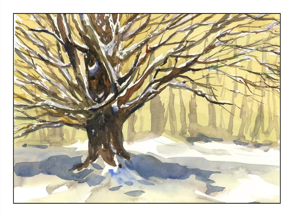
This snow-laden maple – the brightly colored one from earlier, now in winter – was the last study. No frisket was involved to leave the snow fresh on the tree. Instead, hints on how to leave snow areas apparent in the drawing – put a dot on the snowy areas to remind you – worked very well. I’ve done such things myself, but it is a good reminder of little tricks.
In many ways, this winter tree was perhaps the most challenging of the studies because so much advanced thinking was involved in the journey to the final result. Snow on so many tree branches was sort of a logistical nightmare, but oddly enough easier for me than masses of colored leaves. Titanium white covers up a few mistakes, too, where the snow was painted over. Blue, too, was added very lightly to make shadows on the snowy branches, giving more dimensionality than without that subtle touch.
Shari even returns to her trees to add a bit more here and there to improve them. I like these little forays into imperfection or dissatisfaction – so many workshops don’t show these little bits of humanity.
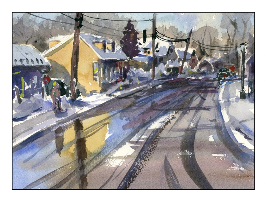
If you like watercolor, need some good instruction, and are on a budget, Shari’s classes might be the answer. She doesn’t teach you the basics but assumes you know how to do washes and use colors and what a paint brush is. Her classes range from pretty straightforward to more sophisticated and complex subjects. No matter what, she leads you through the process quite nicely. For example – buildings terrify me. Perspective is not my forte and suburbia throws it at you from all directions. But, I did this, and learned that even I, who has no depth perception to speak of, can actually produce a painting with buildings!
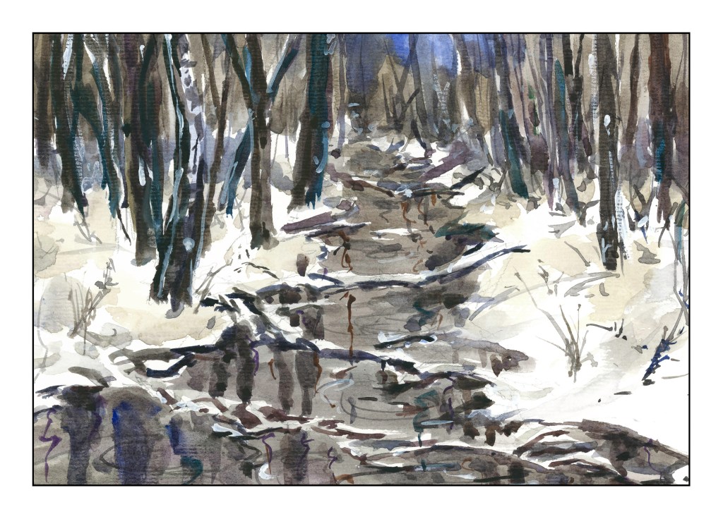
I managed to produce the above – albeit with some glitches – by following her along with her “Urban Winter” class – which you can find here. Check out her work and courses – I don’t think you can find better value and better education almost anywhere. And as a final plug, here is my painting from her course “Winter Woods and Stream”.
And, for my own frugal heart, Shari offers course bundles that discount her already fabulous prices a bit more. Check her courses out and sign up if you are interested. Some courses allow you to upload your work – the later ones in particular. She always leaves feedback, too, even a bit late as she travels a lot. The personal touch is so nice, and being able to see what other students produce is good, too.
The “beer” side of this blog is building a car – and the progress is slow, but steady. He also has some 3D printers and has made a number of cool things and useful things. But, his heart of hearts (at the moment) has been craving a CNC machine. A CNC machine is a machine that allows complex machines to be tooled using a computer. To learn more, click here!
CNC machines cost money. Personal ones are easily a few thousand dollars, and good ones probably even more. So what is a boy to do?
Enter the 3D printed CNC machine, built from scrap and extruded plastic filament.