Paper & Hyacinths (or Gladioli?!)

These paintings serve two purposes. First is to check out two different 100% cotton papers and decide which has a better feel to it when it comes to handling copious amounts of water. Second is to take a color on a long journey down a sheet of paper, adding similar colors for variety as I go along. I did it in both.

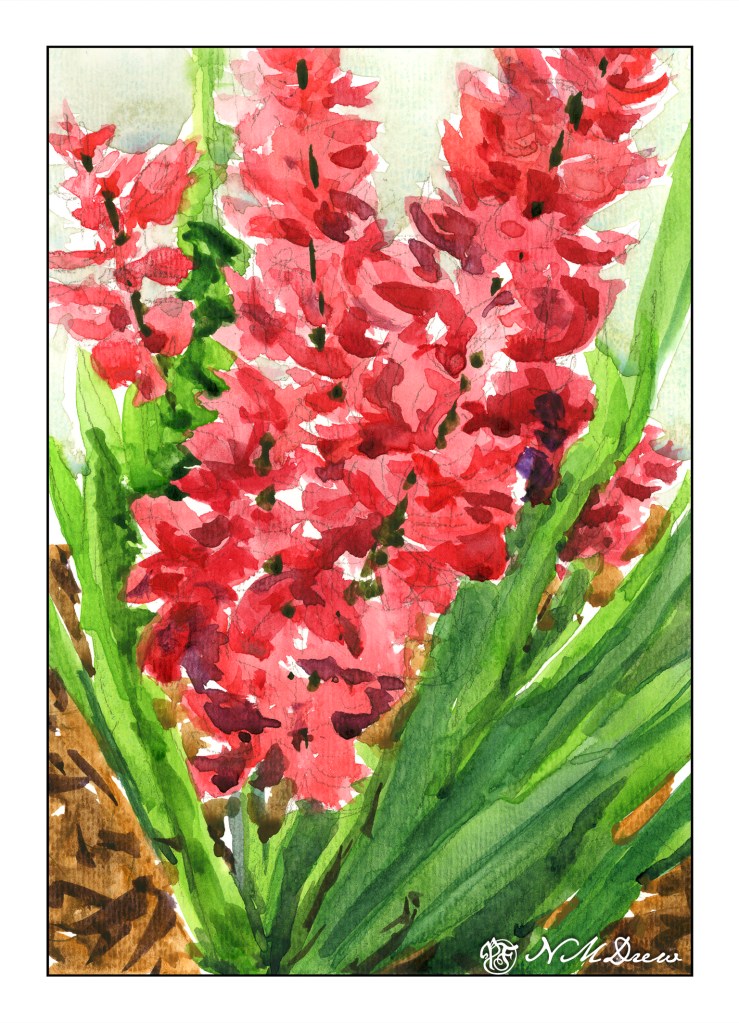
This is done on ArtBeek paper. I consider it to be a student grade paper even though it is 100% cotton. I like it as it has a nice absorbency but it is not up to snuff to my preferences. It is good for studies, though, and a very affordable and nice paper. I prefer it to Strathmore or Canson watercolor papers – they don’t come close as far as I am concerned. This paper has a texture imprinted on the front, but the reverse side is smooth. This actually makes it a good paper for gouache as well as value studies with pencil. No complaints in general.

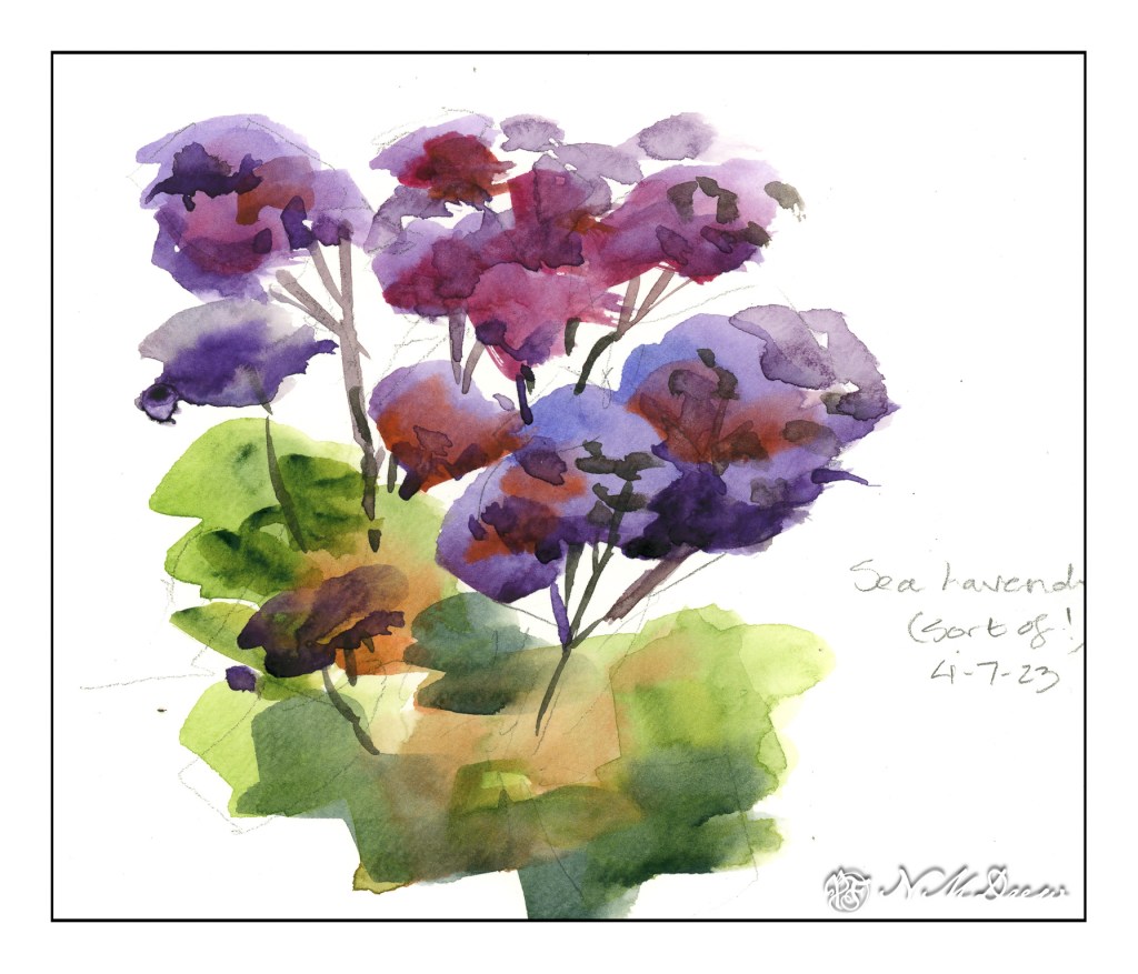
I mixed together alizarin crimson and some other red to try to get a pink – big failure there, so I ordered some Opera, which is a rose pink of a definitely pink leaning. I worked a bead of color down for leaves and flowers, adding different colors to vary the major color. From there, once the flowers were dry, I added darker values with thicker paint.

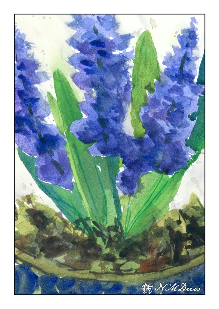
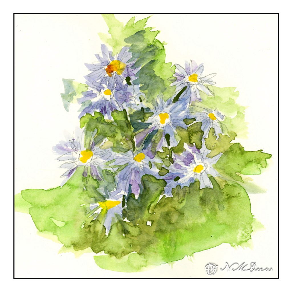
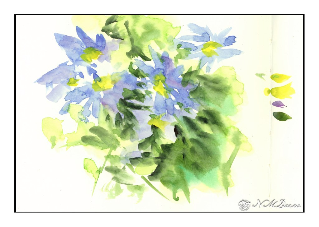
These hyacinths are not as appealing to me as the pink-red ones (which could be gladioli, too!), but the paper is. The paper is extra white Fabriano 100% cotton 140# CP paper. It connects with the paint more readily and there is a sense of contact and control that I don’t feel with the ArtBeek. This same feeling comes with Arches and Kilimanjaro (from Cheap Joe) watercolor papers.

As with the pink flowers and leaves, I worked beads of color down and added various colors as I moved. I started out with a blue that I think is too dark now, but that is part of experience. The same techniques as the pink also applied – dry the painting, add darker colors, creating some sense of depth and detail.

I tried to keep each painting pretty direct as far as colors, not adding too much in the way of glazes. I also worked on negative painting, painting the background around the flowers and leaves.

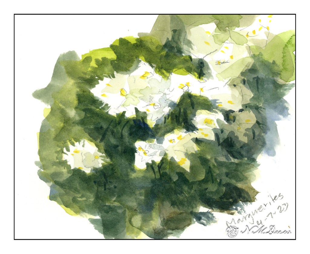
The past two days’ studies of flowers in sketchbooks were rather precious. Fussy, annoying. That, though, is the purpose of sketchbooks in many ways, as well as memories of places visited or developments of ideas.

Both paintings are 9×12.

Mas Flores

Today’s post is batch of flowers done in a Hahnemuhle Watercolor Book instead of the sketchbook for yesterday’s post. Today I am using a “real” watercolor sketchbook that has watercolor paper in it. I could work with a lot more water without getting blooms or having the paper buckle as in the other book.

I also used tube paints that were on my palette, but found that the paint, having been there for awhile, was very dry. It was difficult to pick up paint in large quantities – just like on the pan paints. To fix this, I put several drops of water on each color and let it sit for awhile – maybe 10 minutes. Misting water on doesn’t suffice – I needed a small flood!

One thing I have done here is to focus on negative painting as well as carrying a plane of color with varying colors along the page. I tried to work light to dark, but other times I worked around the light areas to give them shape. All this is play, experimentation, just doing and then observing, thinking about what I did and what I want to do.

Outcome? Thoughts? A few of my own:

  • quit dabbing!
  • use really wet, saturated paint
  • use paint more directly without glazing
  • values

None of these are any good. They show my painting faults to a glaring degree. However, as practice, it will do very well.

Well, gotta run!

Les Fleurs Sont Belles

Yesterday was one of those days where everything else got in the way of painting. Today is one of those, too. However, painting shall prevail!

I have a lot of different paper and sketchbooks, but I have decided that I do want to have a sketchbook going all the time and to use it when nothing else seems to be do-able. This book is a book more for ink and pencil as the paper is very smooth and has a creamy color. For watercolor, I want more texture, and a different type of paper altogether, but it is a sketchbook, and that means it is a playground. So, I played.

Until you try something, you don’t know what will happen. Same with this sketch book. I sat on the concrete of the patio and looked around at the potted plants. Here, rosemary and milkweed mixed together.

Behind the rosemary and milkweed is the beginning of a giant sunflower plant, one which I expect to grow about 10 feet tall!

Felicias are always fun to find in pots as they droop over the edge and provide a lovely accent to anything they are planted with. The ones above were done with a pencil outline and the ones below just rather free-form with the brush.

I like these felicias a bit more as they are less constrained and stiff.

Finally, one of the last daffodils of the spring. I focused on the leaves and flower shape, trying to keep the flower simple but expressive. The dappled light and shadow on the leaves, and their shadows, especially caught my eye.

Besides just being a study of flowers, I decided to be minimalist with art supplies out on the patio and use this as an opportunity to see just what few things might make for a nice plein air kit. Sitting on the concrete was rather chilly and hard on my old bones. I brought out my camp stool, and that helped, but then I didn’t know where to put my water or pan paints as nothing nearby was convenient. What to do? Well, I did stick things on the ground, but my u.go pochade box will be the next addition to the adventure.

What a fun way to pass some time in the sun! We are hitting some nice weather – in the upper 60s to mid 70s F – before it plummets to 55 F or so later on. And, time to work a bit on plein air – the less I have to lug around the happier I am, as long as I like what I do where I am – and that means liking doing, not just making pictures I like!

In the Alabama Hills #1

A decidedly more fussy painting than I usually do, but is also a fairly chromatic painting. The primary colors are yellowish greens and grays. More color planes with a few more details.

In a lot of ways this was a more “serious” painting than my trees of yesterday. I plotted more. I did a sketch, a value study, and carefully placed my lines and considered the composition. Steps were thought out on how to approach the painting process itself since there is a lot of plain, white paper left in varying spots.

First step was to lay down a light wash of a neutral color, painting around the white areas at the tops of the plants and a few areas of the rocks. Then, light colors of the plants were added to remind me where they were. In general, I worked light to dark – standard watercolor – but then more intuitively I moved into dark areas while other areas were still covered with the first wash. I needed to establish values and found this worked out fairly well.

Another thing I took into consideration was the paper. This is the 100% cotton student paper I have, and I know it cannot handle a lot of water. Consequently, my washes were not wet and sopping. The light washes I applied were watery, but before picking up the watery wash from the palette, I squeezed or blotted the extra water from the brush, picked up the wash, and then applied it to the paper. It worked as the paper did not get really wet.

The rocks were hard to do. Part of me wanted to be fussy and detailed – hence the dots on the rocks and boulders closer to the viewer – and other parts just wanted to use planes and strokes of color to express their dimensionality. That is something I will try on another version of this painting and on paper that can handle a lot of water.

So, the planes of color continue, even in a more complex painting. I rather like this one as the backlit plants are so pretty, whether painted or in real life, and the pathway itself is alluring. Nothing like a hike in the desert . . .

Color Planes and Disaster Recovery: Orchard, Road, Windbreak

Yesterday I posted a hill that was a color study. Today I am posting trees and a road as large planes of colors. Green is green, but there are variations. The trees on the left are different greens than on the right, and so is the brushwork. The center is a rather yellowish grey road. The shadows, too, are a bit different, with the ones on the left are more blue than on the right, which have more green.

The painting started out with my using my the Schmincke half-pans on a large painting for the pans. I struggled to get enough color to begin a wash and resulted in blooms and cauliflowers everywhere. The whole beginning was a major disaster and I was not happy. Then I pulled out my usual large palette with tube paints. Start the painting over on a new sheet, or try to rescue it? I decided to apply some life saving . . . .

The sky was a big cauliflower. The trees on both sides of the road were big cauliflowers. I began with using clear water to wash away as much of the cauliflower lines, blending the paint into the surrounding color. This ended up with some lifting of color and some stripey areas, but that was not a bad start.

The next step was repainting the sky. It started out a nice light color but with another layer of color it got darker. Then the trees. Each layer became darker although I did manage to save some lighter areas. This was annoying, but then I decided to re-watch Shari Blaukopf’s “Trees Across the Seasons” to see her tree painting technique. It really helped.

My crime in watercolor is a lack of patience. That is what happened with this painting – my frustration using the pan paints made me impatient. I just want to get in and paint – I don’t want to pre-plan, do value studies, etc. There is a place for spontaneity and a place for patience. Outdoors is for spontaneous painting with drawing and thought; in the studio I want to be more deliberate. I made the choice to use tube paints, and be more patient.

The end result is not too bad. The original is darker than this one, but that is the beauty of digitalization – I can fix things. I use it in my photos, and I use it when I post my paintings online. Is this wrong? I don’t really know, but as far as I am concerned there is nothing unethical about such manipulation. If I were selling prints, I would be working to make sure the prints were good – just as in a photo – removing spots, augmenting colors, etc. Having worked awhile in the printing industry, this is the norm to produce modified images. Digitalizing a painting lets me crop and frame and sign it, too.

Besides helping me make a painting look better, it also allows me to see it differently. A monitor makes everything more clear, and that includes mistakes like weird shapes and splatters that I don’t notice in the original. Seeing such things is a learning experience in and of itself.

So, color planes and shapes, getting rid of cauliflowers, learning that half-pans are not best for my way of painting large, and fixing a painting that could have just gone into the scrap paper pile. Altogether, a good experience.