The Illusion of Spontaneity

Spontaneity in watercolor is and is not an illusion.  For the beginner, it looks spontaneous when you watch an adept painter at work.  For the beginner, you realize what is looking spontaneous is not because you cannot replicate what the adept creates.

Nearly everything requires practice – practice leads to skills that lead to mastery.  I should know this.  My problem is my impatience and my tendency to not focus.  In today’s world it is hard to find time to focus and means a deliberate choice to make time.  Rather than fritter away time putzing aimlessly on the internet, it is better to take that time to do something which will hone my skills a bit.

Frustrations with Contrast

Sunday, 3 September 2017

It’s sort of a quandary.   Should I blame myself, the weather, the paper?

First, we have been housebound, not by hurricanes, but by interminably hot and stinking weather, weather so fiercely hot that heat stroke is easy to come by.  Temperatures have been soaring to 112 F and 30% humidity – for a desert gal, this is not fun.  Dry weather and moderate heat is okay, but living in the darkened house, in a house filled with air conditioned air, and melting outside, is getting old very, very fast.  Tempers are short around here, and hopefully the weather will break tomorrow with 85 F and begin to cool.  I hate being inside and being inactive.  I don’t belong to a gym, but it is too hot to go for a walk or a run, probably even in the middle of the night.  So, it pisses me off!

Next, I am impatient and annoyed – a lot because of forced inactivity because of this disgusting weather.  This doesn’t help when watercolor paper needs to be used up for practice, but the sizing is so crappy it buckles and creates weird areas that show poor quality – and possibly poor quality control.  And the practice itself is hard to do – in part because of my monkey mind and my need for some good aerobics to rid myself of the wiggles so I can focus.
Oh, poor me!

But now that I’ve bitched a bit, maybe I can look back at what I am doing . . . working on my ever-present nemesis:  contrast.
Monday, 4 September 2017

Okay, I got over myself.  I tell you, though, that a week of unrelenting heat and humidity of 110 F and 35-100% humidity is not fun.  Today, humidity has dropped because of rain, the temperature is down to about 85 F.  I am in a much better mood.

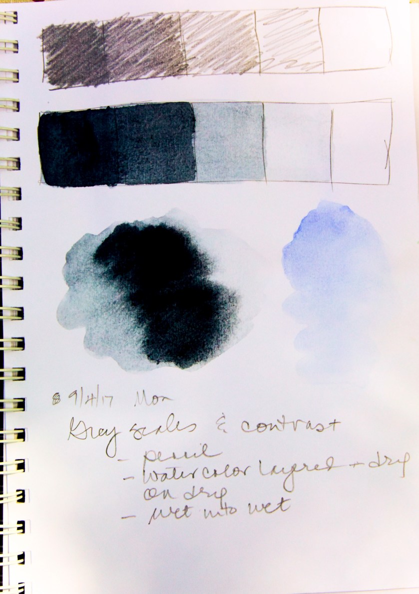
Yesterday, I walked away from my abominations, knowing full well that contrast was the real issue I have.  Like I have said many times, I am drawn to color.  Color.  COLOR!  I don’t like doing the “basics” in knitting (i.e. swatching) and I have never given much credence to monochrome studies, even though it has been stated and re-stated multiple times.  Finally, I gave in, and did some grey scales in pencil and watercolor.  In watercolor I did some wet-into-wet, and then layered washes.

And finally I did a watercolor.  The grey-scale study was invaluable – lesson learned!
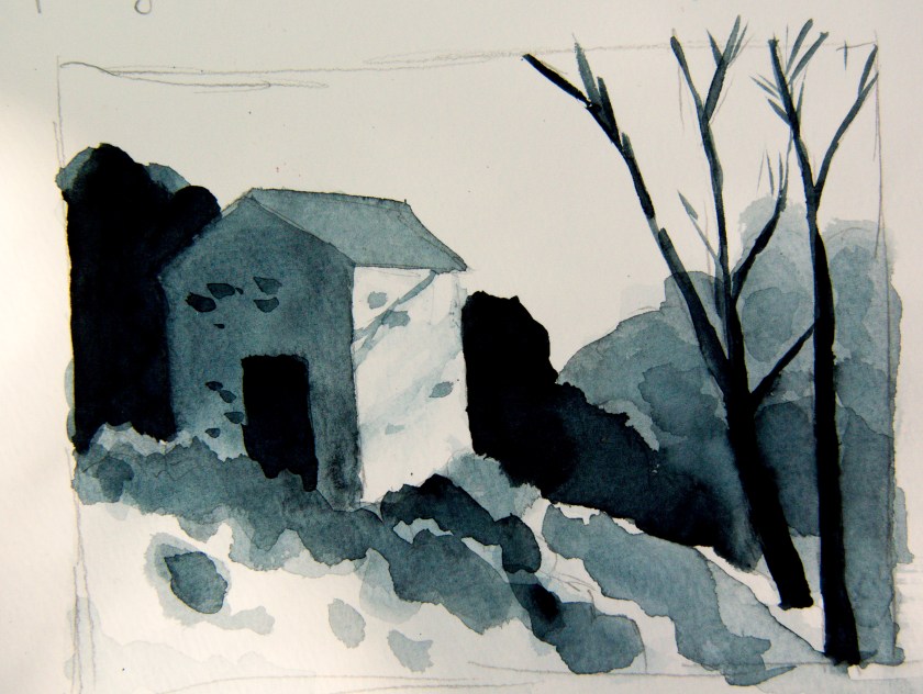
There are parts of the preliminary drawing and final grey-scale study which are good, and some which are bad.  I followed a video on YouTube by Paul Talbot-Greaves that was very clear.  He has a few others I will look at as well.  Seeing something done always helps me to learn.  A book is good, but watching the steps a painter takes is even better, especially when recorded and you can go back again and again to do the studies.

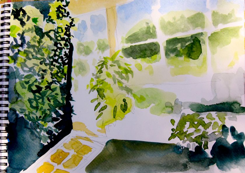
The steps I took here began with a simple light wash over all parts of the building – very, very light – into a lot of other areas in the picture.  Then I did some medium layered dry washes, just to do them.  These are on the bushes and foliage behind the two trees on right.  the building had wet-into-wet, moving it into the bushes in front of the door.  At this point, I had my white and middle value established, so I thought it would be fruitful to do the very darkest areas next.  I think it was a good idea as it then allowed me to then return to shades between the whitest and darkest shades.  This study was in Payne’s Grey on a student-grade Strathmore paper.

I also found another video, but cannot find the link for it.  There was an excellent suggestion of creating a grey scale, and holding it against colors as you paint.  What shade is your yellow or red?  That will help with the contrast.  Right now, let’s see what I can do with a few colors . . . this is gonna take a lot of discipline!  But, I am doing it, which is more than I was a few weeks ago.  Yay!

The World Beyond

On the rim of the Grand Canyon, the Colorado is a thin line leading to other worlds.

Originally I had mislabeled this as from Mesa Verde (that Southwest just all looks the same! – not!), and then looked again. That is one of the troubles with film . . . you have to use your memory – not your memory card – to recall where you were.

This is a small panorama using Kodak Ektar 100 and the Olympus XA4 point-n-shoot. And, it is the Grand Canyon with a snaking view of the Colorado far below and beyond.

The View from Above

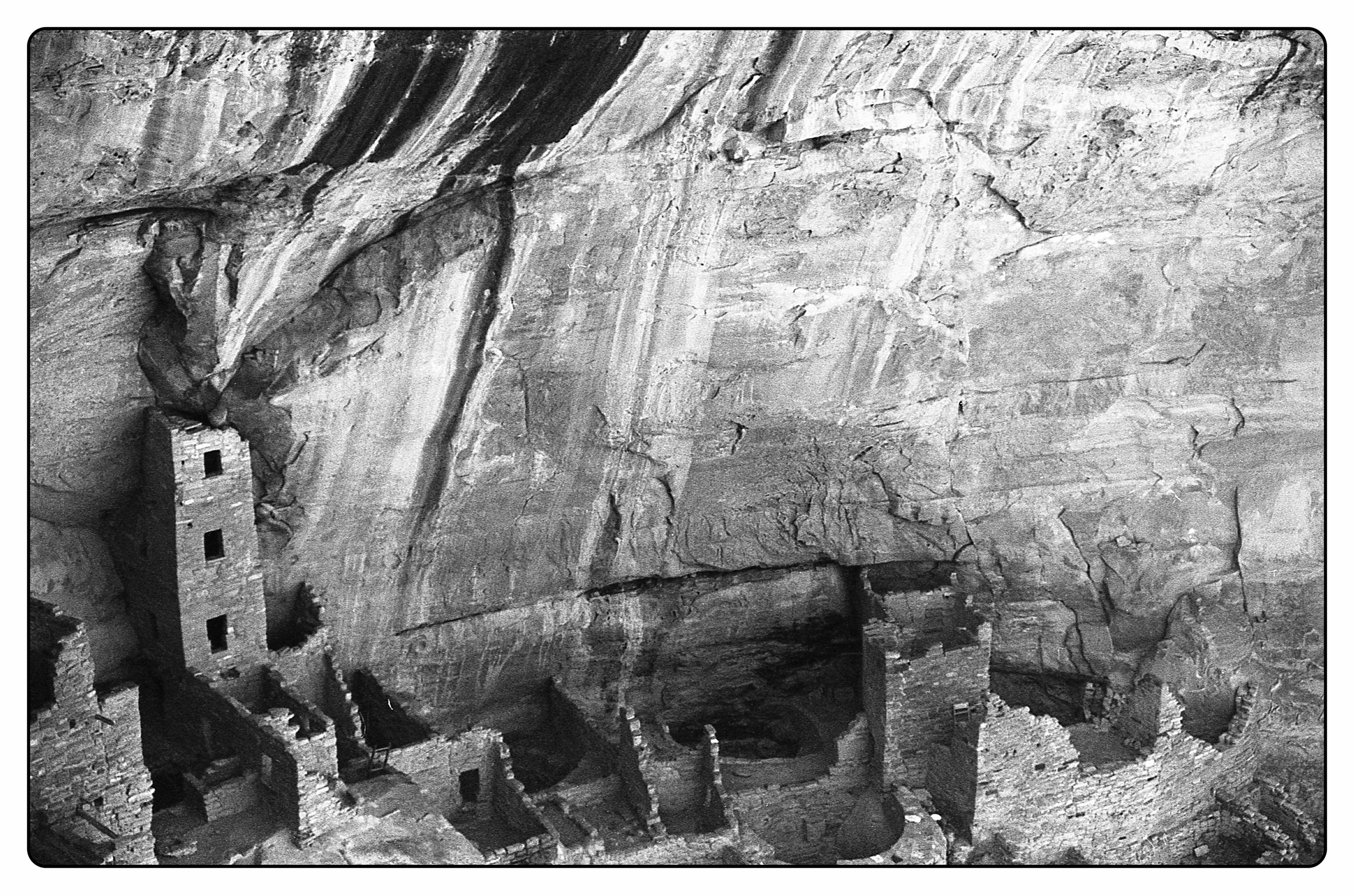
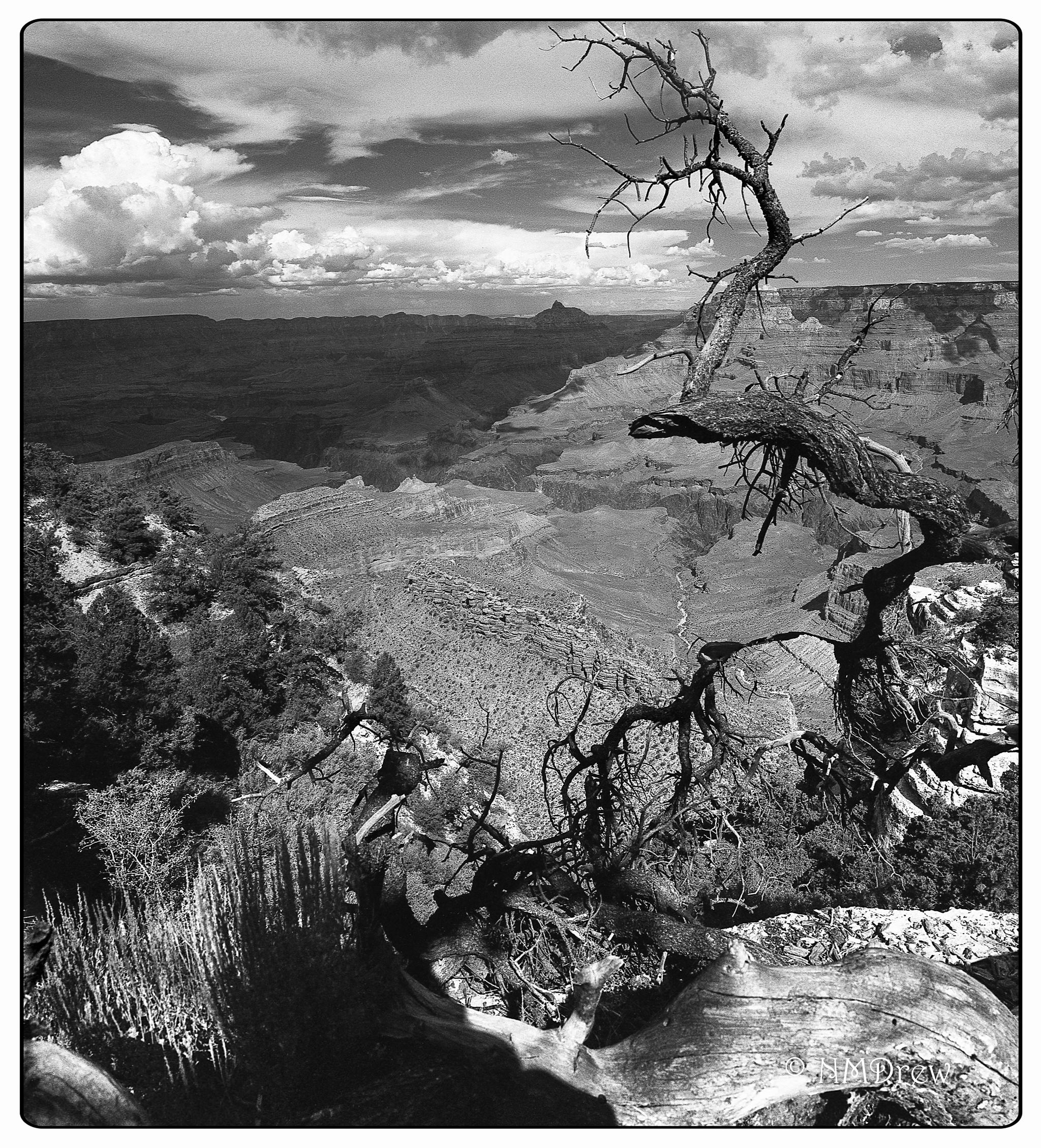
This is just one of many images shot with black and white film produced by the Japan Camera Hunter: JCH StreetPan 400. I used both orange and red filters, and the success shows in good contrast, for both long and short scale. The Oly OM-1n and 50mm lens are a wonderful travel combo – small, lightweight, and well made.

This is one of the cliff dwellings found in Mesa Verde National Park, in the Four Corners area, in Colorado. We spent a couple of days there, enjoying the rich history and beauty of the area.

The Southwest in Black & White

The last few days of July 2017 and the first few weeks of August 2017 were devoted to a family trip, leaving California and thence traveling through Arizona, Colorado, Wyoming, Utah, Nevada, and home.  In that time period we covered about 4000 miles, spending 2-3 days in each place.  There were four of us – my husband’s parents, my husband, and myself.  It was a family trip, to see places never before seen, as well as to see places where family ancestors lived and worked – specifically, Ft. Laramie, Wyoming.

On this trip, there were two photographers – my FIL and myself.  Tom has a Nikon D810 and D610; he brought the D610 along and shot numerous images, which I hope to see soon!  Myself, I brought along more toys than I should confess to, but enjoyed using all of them.  In particular, I brought along a new-to-me Olympus OM-1n, an OM 50mm f1.8 MC, and the OM 35-70mm f3.5-4.5.  Each has a 49mm diameter, so I also brought along UV, polarizing, orange and red filters, and used the latter two to see how JCH StreetPan 400 would work as landscape film.

It was gorgeous!  Combined with the Oly, I was incredibly pleased.  StreetPan comes in both 35mm and 120mm, so a lot of people will be really happy.

What I like about the StreetPan is that it is contrasty, yet has a good, long grey scale.  The orange and red filters helped to make the skies pop, and the landscape.  I didn’t have to do too much in post, perhaps modifying highlights and blacks to meet my own (artistic?) desires.  Detail was good, too.

The image at the top is a panorama I stitched together in CS6; below are individual images which can give you a good idea about the beauty of this film for landscape.  These scenes were shot in the Mesa Verde National Park and the Grand Canyon National Park, both in Arizona.


Too often, black and white landscapes don’t interest me, and the reason is the difficulty in differentiating small details.  Dramatic landscapes don’t have to look dramatic, but they need something to make them dramatic.  This can mean contrast, composition, and a number of other elements.  In all honesty, I do not consider myself to be a good black-and-white photographer simply because I find it difficult to think in terms of value.  I see color before I see anything else, and certainly my gaudy photos show this tendency.  Therefore, using the filters and an already contrasty film produced a number of photos that pleased me no end.  This experience is whetting my appetite for more!