Yosemite: Reflections at Mirror Lake

This is a view of Mirror Lake in Yosemite National Park and some artistic license with color thrown in.  Here, I used a sumi-e brush and watercolors.  Yes, lines.  No mud.  This is the first picture, other than my pencil cup, that I really like since I started this project.

I began with a photo, then drew in some lines, used the ink brush to create the bones.  Then it sat overnight and in my sleep I imagined how I would paint it.  Parts worked out, parts didn’t.  After the colors were applied, I went back with my sumi-e brush and redid some original strokes and then added others to create contrast and so on.  Colors include phthalo blue, indanthrene blue, organic vermillion, hansa yellow, quinacridone gold, Hooker’s green, carbazole violet, cerulean blue, and ultramarine blue.

Logitech Mouse in Red

This is perhaps one of the first paintings – sketches? – that I have done since re-visiting watercolors a few weeks ago that does not depend on ink lines to make sense of what it is.  It’s still floating in space, as the shadows are not especially strong.  There are a few things I like here.  One is how there is a highlight in the read of the mouse.  Another is the central brownish panel on the side of the mouse, which is a mixture of carbazole violet and Naples yellow.  The black outline of the mouse is in Daniel Smith’s Genuine Sodalite, which I picked up some time ago.  It’s a rather nice blackish color.  The blues in the background / foreground are from Daniel Smith’s Lapis Lazuli Genuine, which, like the sodalite, I picked up on a whim.  It will be interesting to see how these two paints work.

I also set up my studio palette the other day, choosing a variety of colors to fill my Quiller palette.  I did a color study and labeled all my colors, except one, which I think might be yellow ochre – or not!

Apple Apocalypse

Up front, not too thrilled with these apples.  I was working on trying to get an apple to look like an apple in a painterly manner, hoping against feeble hope that I could make them look like apples without the lines.  Didn’t work.  On the other hand, mud is not present, and there are some nice bleeds of color.  I worked too wet, which is also why a lot of the problems exist.  I wonder what apples will look like in a year . . .

Setting Up a Palette

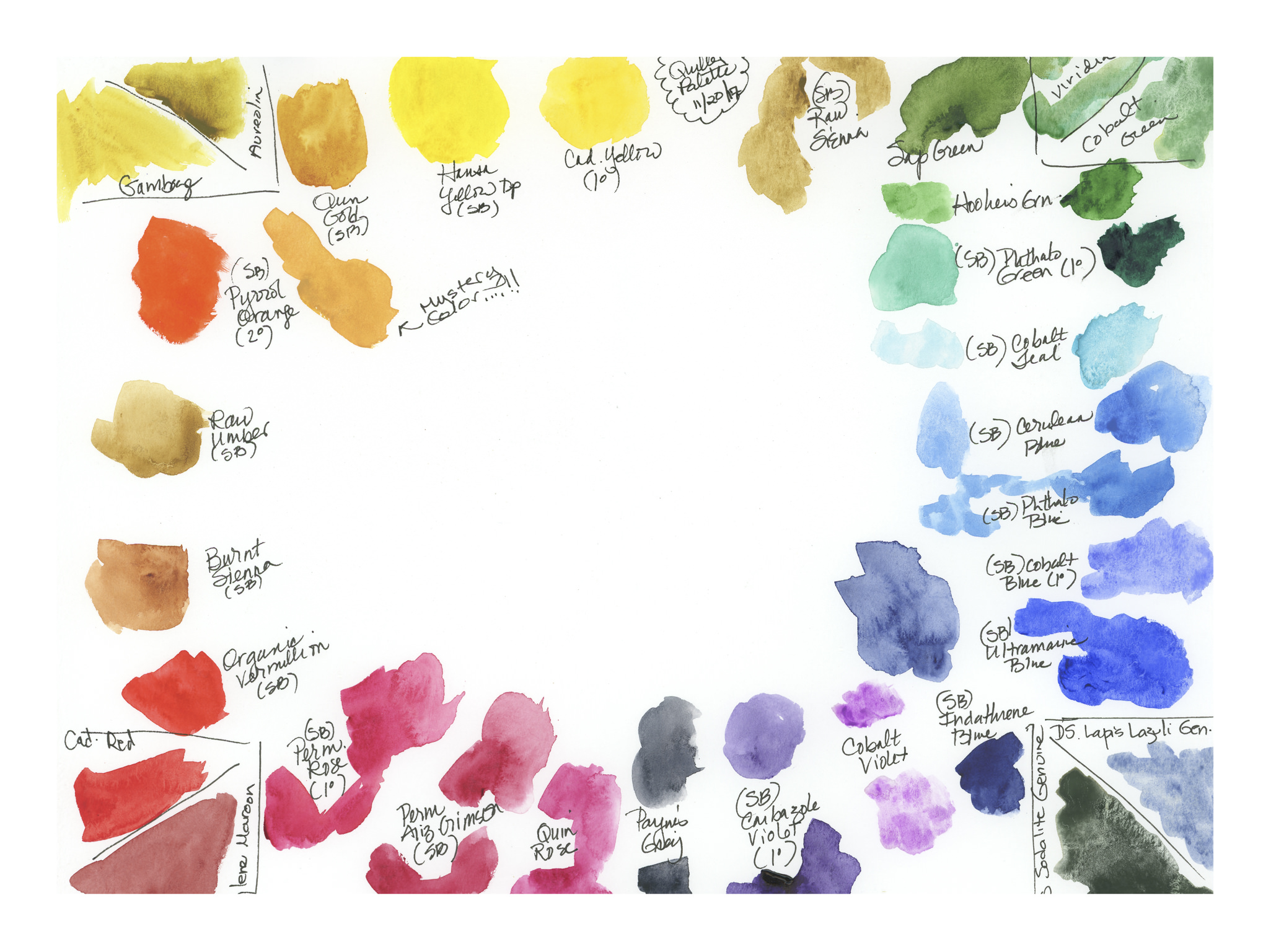
I have a Quiller palette from years ago that was a complete mess.  Cleaning it up took a bit of time and effort, especially as it had not been used for years, and the paints were ancient.  Most likely, the colors could have been retrieved, but as I wanted to start fresh, I cleaned it up – not an easy task!  I soaked the palette to loosen old colors, and for about 2 weeks kept adding water to a particularly stubborn well, until finally the colors all came loose.

I filled it up this afternoon after considering the colors I have on hand, and the ones which I am currently using in a travel palette.  I decided to use the 18 colors I have in one travel palette, and then add others.  Some colors are totally new to me, such as the quinacridone colors (gold, rose), some cobalts (violet, teal, green), and newer variants of old standbys.  When putting in the colors, I found one that I had not labeled!  A mystery color – but it might be a yellow ochre, though it does not quite seem right.  Kind of funny since I was so meticulous (ha!).

Other new colors include indanthrene blue, which is a rather interesting and intense dark blue, rather an indigo, along with a couple of Daniel Smith real stone pigments – lapis lazuli genuine and sodalite genuine.  Old favorites are also present, such as the cadmiums, Hooker’s green, and Payne’s grey, along with the umbers and siennas.

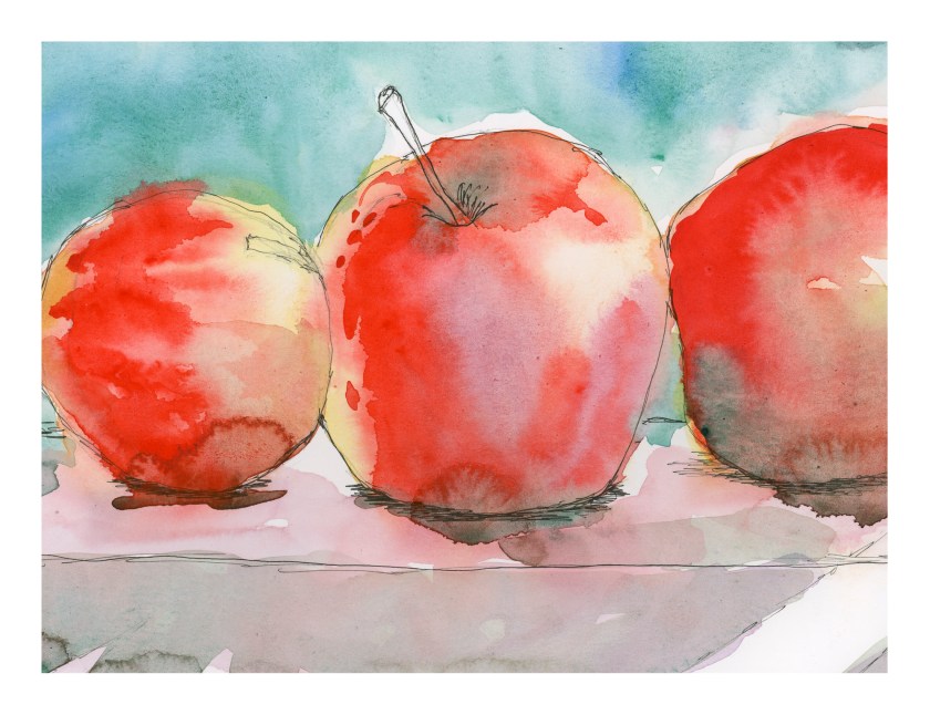
It was time to put together a larger palette for the studio.  Travel palettes are small, and not really conducive to studio work, which for me means a lack of freedom and a more stingy approach to color and water.  Travel palettes have limited space, but room to play is always welcome!  The Quiller palette is generously sized and has plenty of wells, which makes it a particularly attractive one for me.  Additionally, the wells are set up to indicate primary and secondary colors, with room for other colors in between, as you can see below.