During Days 13 – 19 of #WorldWatercolorMonth2019, I got really busy! So with no further ado, paintings.
13. Glassy
I wanted to catch the reflections of the clouds in the smooth water of the lake. Not sure if it worked – the photo showed perfect sky-clouds in the foreground.

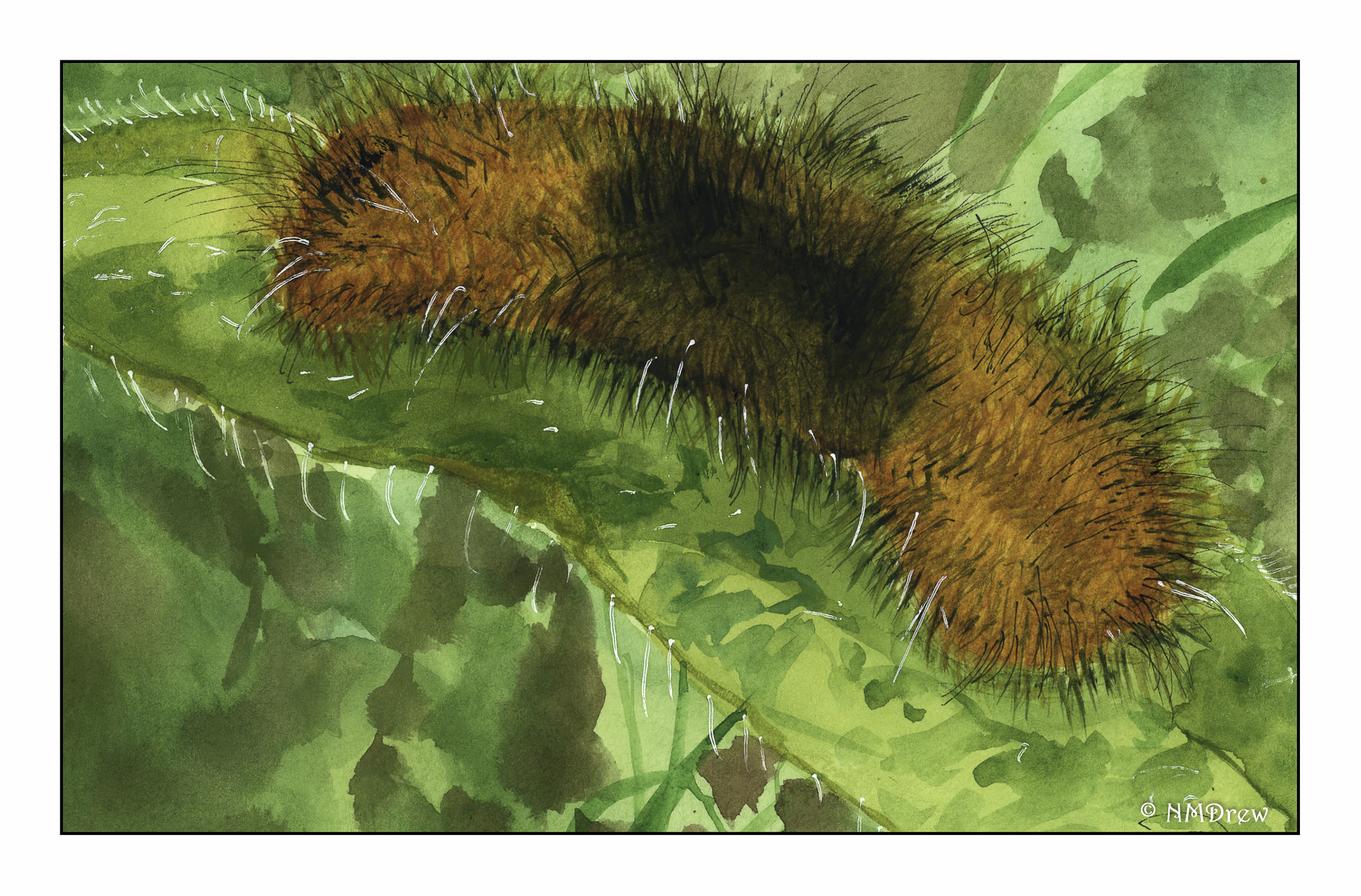
14. Furry Things
When I was a kid, furry caterpillars were our friends. Cats, too. Furry enough for all.

This kitten is from a YouTube study / practice by Maria Raczynska that I followed. It was a lot of fun!

15. Monochromatic
In the heat of summer, it seemed a monochromatic scene had to be a cold winter’s day in the mountains.

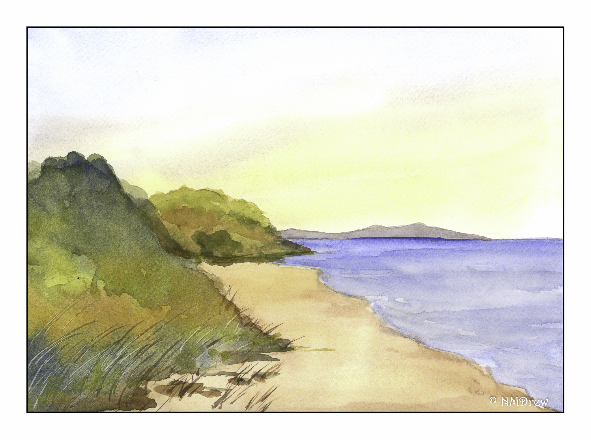
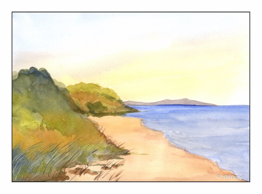
16. Relaxing
I thought a lot about this prompt. Many things came to mind that I enjoy, but I realized that the beach, in all forms of weather, is one of my favorite places to relax. Not being especially good at blending sand colors, I referred to a book by Geoff Kersey called Watercolour Seascapes. His book is a series of studies that demonstrate specific watercolor techniques and employ a limited palette. The first painting is from the study I did from his book and the rest are varied places. The last painting is one I did from a photo I took several years ago of a beach here on the Central Coast of California, either Refugio or El Capitan beach. Smooth sand and sunny days or a rocky shore and a cold, rainy day – both great ways to relax along the seaside.


17. Music
Balalaika and Blue Tit.

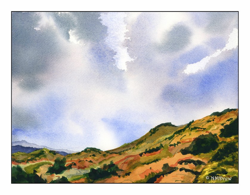
18. Clouds
California is an endless blue sky at times. Other times, the high clouds of the rainy season and the sun are blocked by low-lying coastal fog. When the two compete, the sky is endlessly changing and fascinating.
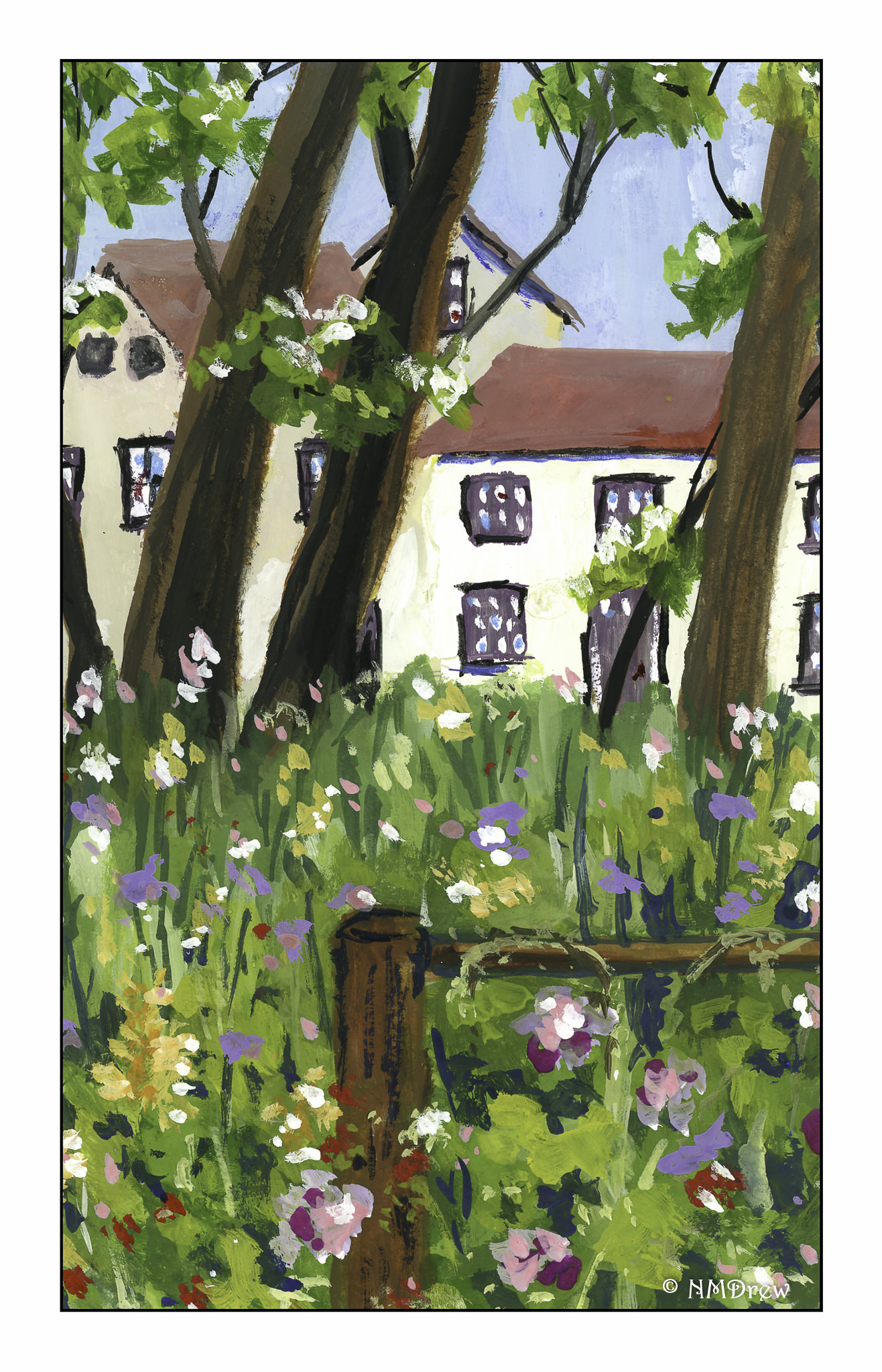
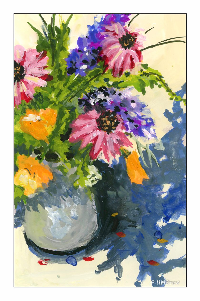
19. Splashes of Color
As we move through #WorldWatercolorMonth2019, I am alternating watercolor with gouache. Both need different techniques. Gouache, being opaque, opens a new world as layers of paint can be built up and one color can be covered by another whether it is light or dark. Mistakes can be hidden! Watercolor requires more forethought and has more happy – and unhappy! – accidents. Here, the opacity of gouache allows for splashes of color and a more impasto and impressionistic use of paint.

World Watercolor Month 2019 is proving to be very rewarding. I am focused on painting, which is one of my retirement goals. Learning and developing my skills and knowledge of water media is expanding, and though I produce a lot of dreck, I see improvement in many ways. To me, the biggest one is that I am beginning to anticipate my approaches to varied areas of a painting, thinking ahead as to how I can accomplish what I want to see. That’s good news. I know what I want to produce – that is, the kind of paintings I like, and which I think are expressive of my thoughts – and while I am a long way from it, I can also see myself moving forward to accomplishing my “artistic vision” as it were.