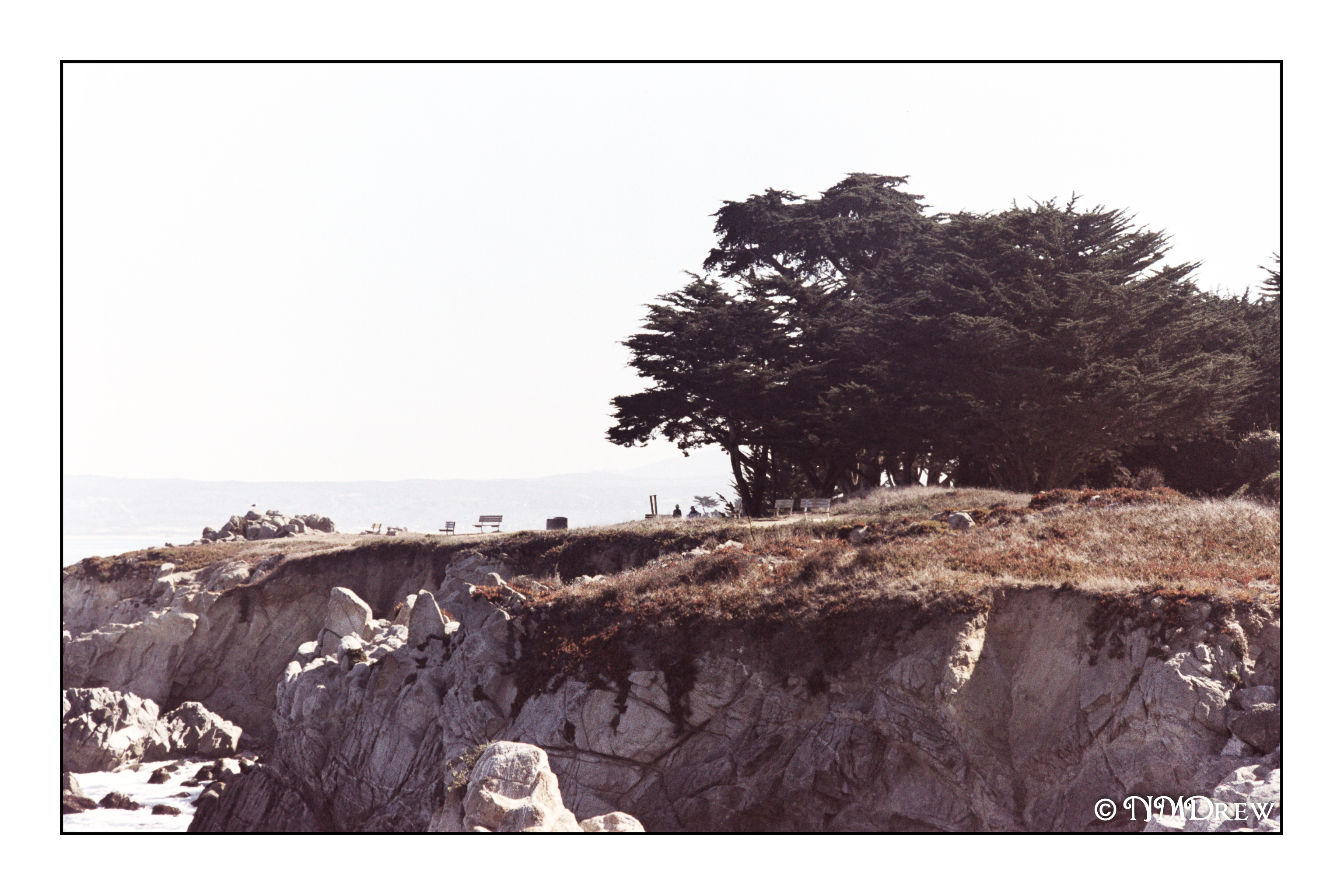
My old, creaky bones don’t give me the pleasure of playing on rocks any more, much less climbing over fences to get to them. I rather envied these kids! There is something so enticing about perching above a clear bit of ocean – here, the Monterey Bay – and peering into the water below. Fish, anemones, kelp, rocks. Tide pools have the same fascination. As this neck of the bay is protected, the waters are clear and pristine. Wildlife, above and below the water, is readily seen.
Toity poiple boids all poiched in a twee, toity poiple boids all choiping at me!
These guys were all lined up on the rocks, not trees, below the bike path in Pacific Grove. No idea what they are but they created lines and patterns, rather camouflaged, which took a bit to discern initially.
The day after we came back from our jaunt to Monterey I spent editing negatives I had processed while I was there. I scanned them and imported them into Lightroom. The film was Lomography’s Metropolis in 35mm, and I found it interesting to use, rather enjoying the colors it produces. Chances are I will order some more. For the most part, I did little editing in post as I liked what i saw, but a few had weird schmutz on them, probably bubbles that got trapped as the film was developed. Spot removal!
The process of editing images makes me look at them more closely. I worked hard to make some good pictures, and overall I was pleased with the roll. After a day of gardening and cleaning and just organizing life after the chaos of 4 days away, I sat down and just blobbed by watching various YouTube videos. They all seemed to be ones on photography. They included Ted Forbes’ channel and his “assignment” of a month using one lens length. I also watched Frederik Trovatten’s “Shoot Like . . .” series on Vivan Maier, Robert Frank, and Joel Meyerowitz. Totally by accident I came across a video about the Japanese photographer Miyako Ishiuchi.
Up front, I have never really “gotten” photography as an artform for myself. Watching Ishiuchi, I did. She explained her first three series and it made me think about photography as a theme to express emotions by focusing on one thing. That is about as easy a way to explain it. Watching Forbes’ video on one lens length helped me focus (sorry for the pun! Not!) on emotion – which one? – and one lens. Narrowing things down here. Trovatten’s vidoes provided interesting insights on how or why or what various photographers do and did.
Creativity is something that is difficult to find at times – that is, being creative and producing an artwork that is satisfying to me on many levels. These include emotional, intellectual, and proficiency of whatever medium I am using. In general, I can take a decent photo, but I have never been what I would consider to be a creative photographer. I don’t set up still lives or seek out a theme to explore. I like the technical things, such as exposure factors and what I want to see in an image, but I don’t “do” a series of anything. I love landscapes, but the heat limits my wanderings. The pandemic curtails too much travel or traveling with a chauffeur to do a safari.
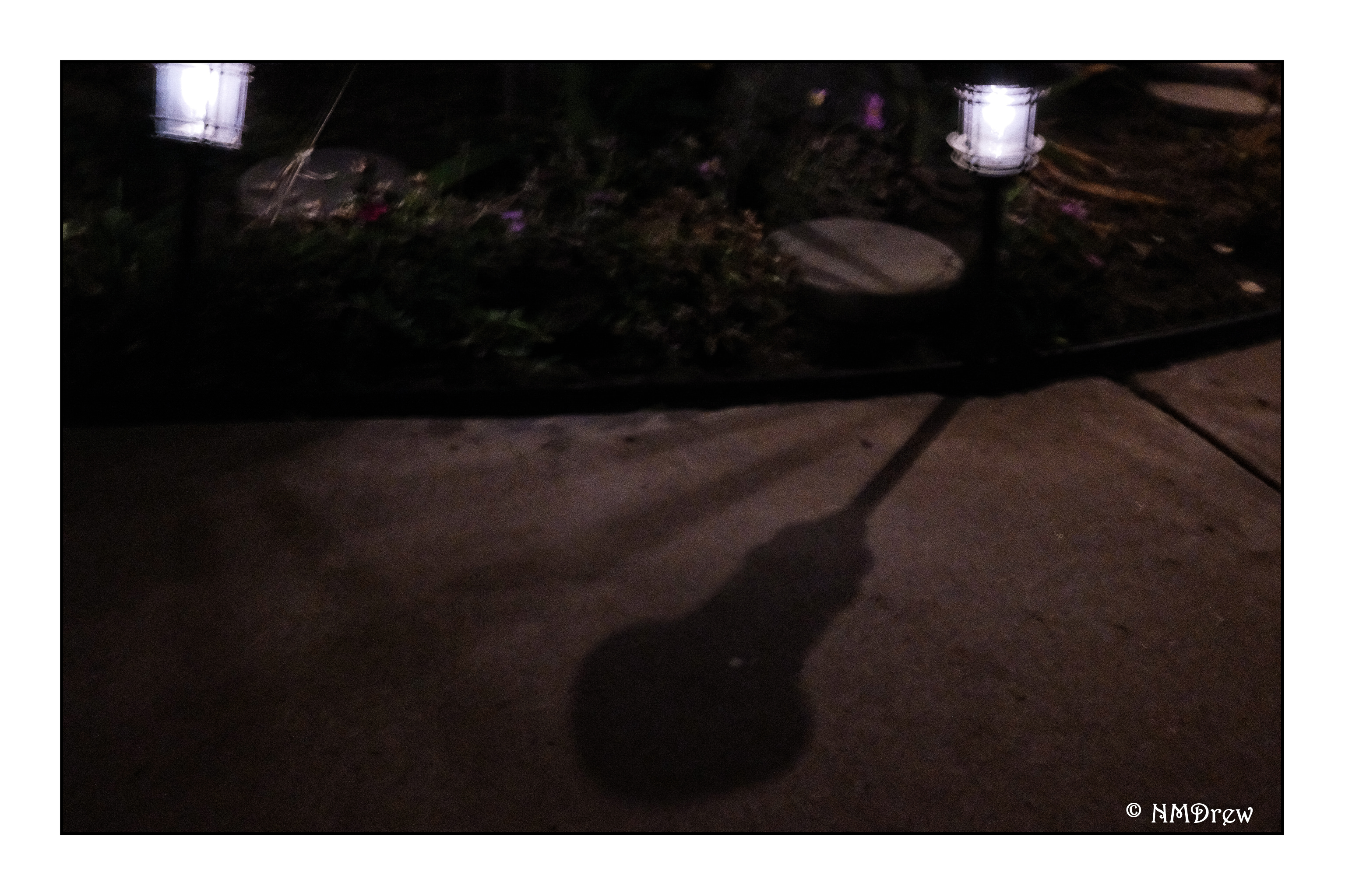
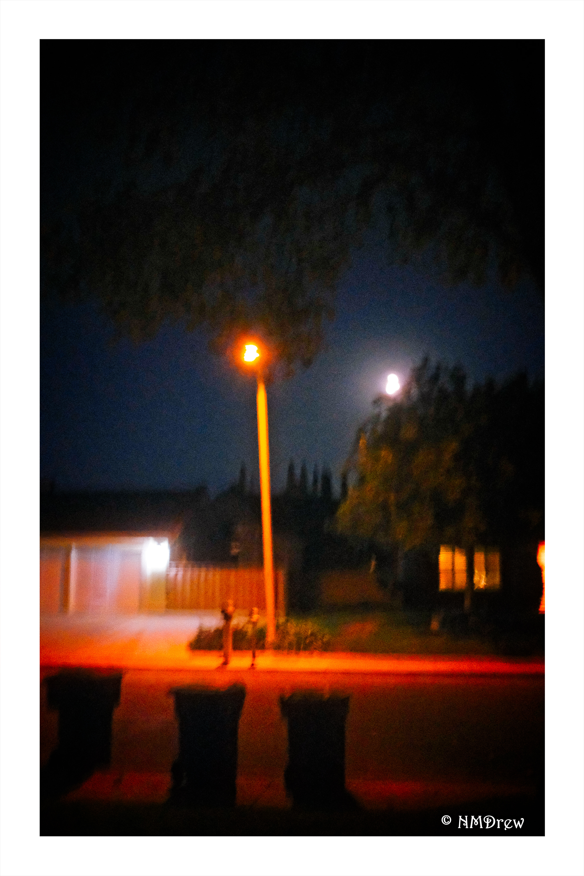
Yesterday’s video watching pulled a lot of things together for me in the area of making photos. Theme, single lens length, mastery. While I plan to continue to try my daily painting, I am also going to begin a month-long study of image making with a single lens length. The lens will be a 35mm. The Fuji X100V is a fixed lens length at 23mm and a 1.5 crop factor, equating 35mm. I have a 35mm series E lens for my Nikon film cameras. It will also work on my Nikon Df full frame. There is a lot of choice here with what I have. The theme that catches me the most is one that has intrigued me the most over the past several months: my neighborhood at night.
I live in the suburbs. It is a nice neighborhood with nice people, curving streets, greenery, a park with a creek. Nearby is a college. A small strip mall is within walking distance. I consider all these to be within the parameters of My Neighborhood.
I went out last night with this thought in mind, using the X100V, iso set at its highest and the rest on automatic. Everything was done handheld. I will need a tripod. I will need to use flash at times. This will be a great way to dig into the menus of the X00V as well as learn how to use it on a deeper level. And I will need to dig out a tripod and a shutter release cable. These same things will need to be applied to my film cameras and other digital critters.
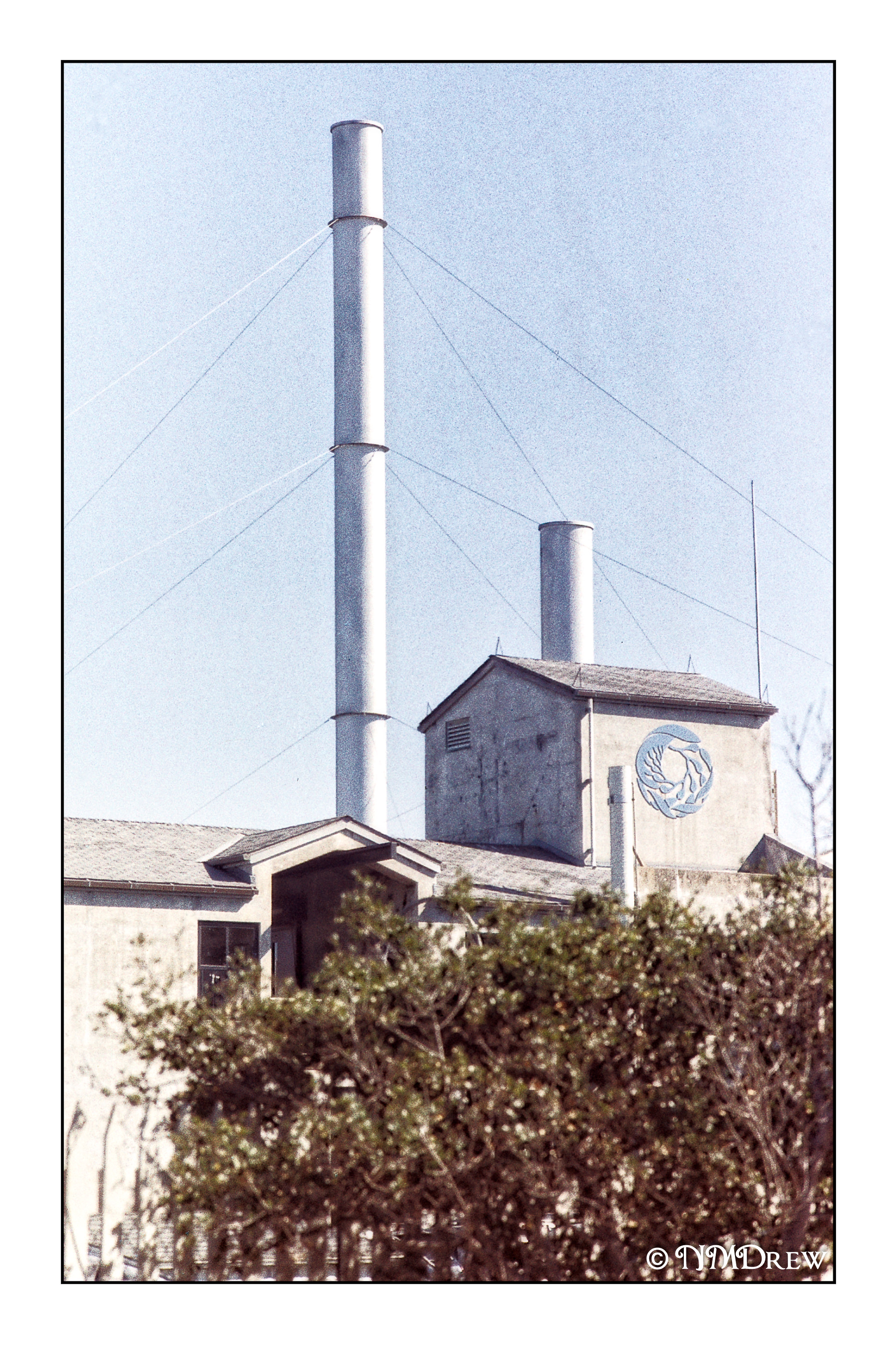
Anytime you are in Monterey, CA, you need to get to the aquarium. Going in and looking at the exhibits and sea life is the whole point, but the coronavirus has ended that pleasure. Instead, we got to see it from the outside, like little kids looking in a window, but the windows and doors are shuttered.