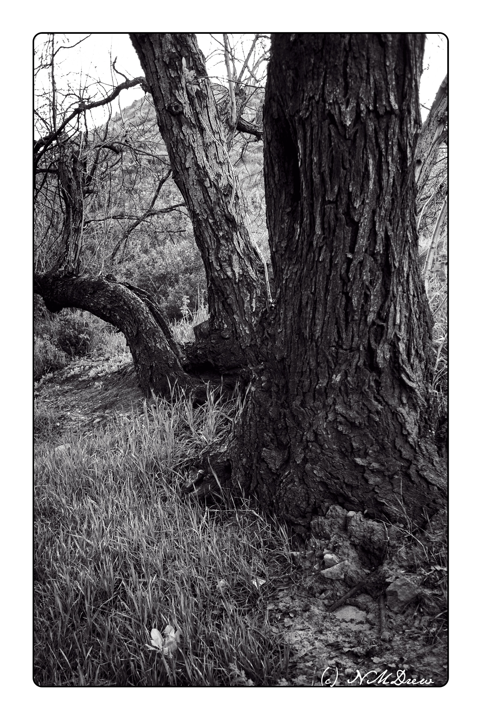
Several years ago a friend took me to a park tucked into the hills and canyons of Los Angeles County. We were there on a photo shoot, to enjoy one another’s company, as well as to enjoy the beauty of back country. Oaks predominated the scene with sycamores and other native plants. There is such beauty in oak trees! They always fill me with a joy that cannot be expressed, but perhaps a photo can help in that expression.
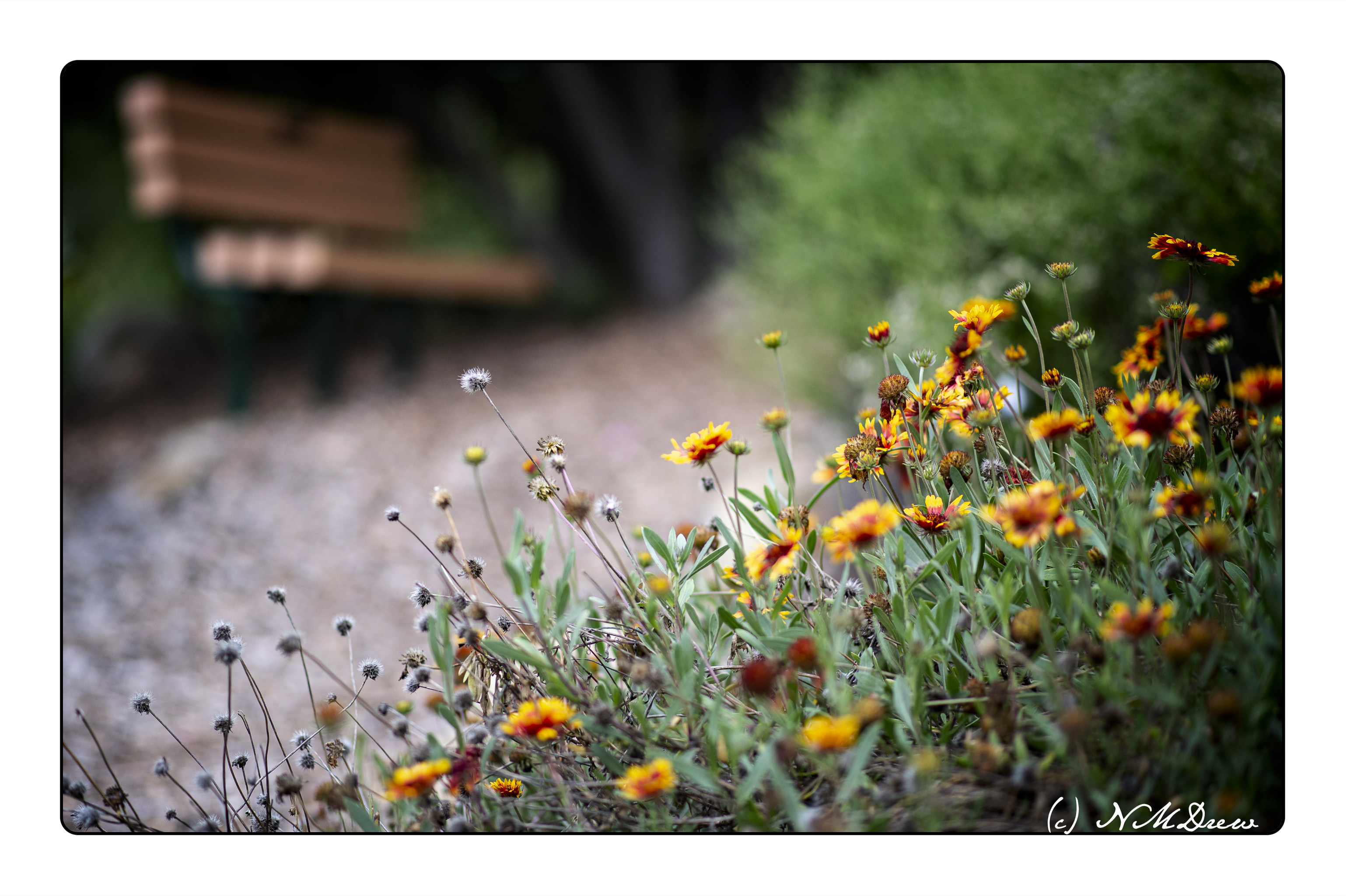
It’s always fun to go through your library of photos. Nearly every time I find something I hadn’t considered before. Here, a few bright flowers from the local botanical garden – perfect for brightening the gloom of winter rains.
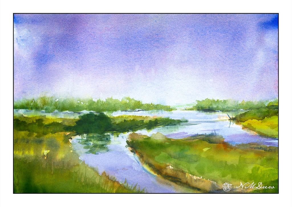
This wet-in-wet is drawn from imagination and inspiration by the Dutch watercolorist Edo Hannema. I just love his mastery of water and color and wet paper! There is a peaceful quality to his paintings of the Dutch landscape.
Painting like this demands thought and deliberation and patience. Timing is also critical. Painting wet-in-wet requires risks and experience. Too wet, everything just blurs. Paint wet paint which is wetter than the still damp colors result in blooms which can destroy a painting in now time. The rule is drier paint into wet paint – that on your brush must be drier than the stuff on the paper. Blot your brush if in doubt.
Oops! Just noticed that the horizon is dead center . . . compositional error! And that big green blob is also a mistake – tried to fix it – but since this is time for true confessions, I may as well own up. 😉
This is one of my more successful wet-in-wet paintings. Usually there is a big cauliflower bloom somewhere – sometimes I can hide it, but it feels really good not to have one this time! Remembering the trick of drier onto wetter was a good thing.
For the first time, I am painting on 300# paper. This is Kilimanjaro CP from Cheap Joe’s. With such a heavy paper, lots of water can be used. 140# warps but this stayed virtually flat. I like this paper a lot – certainly will be getting more of it.
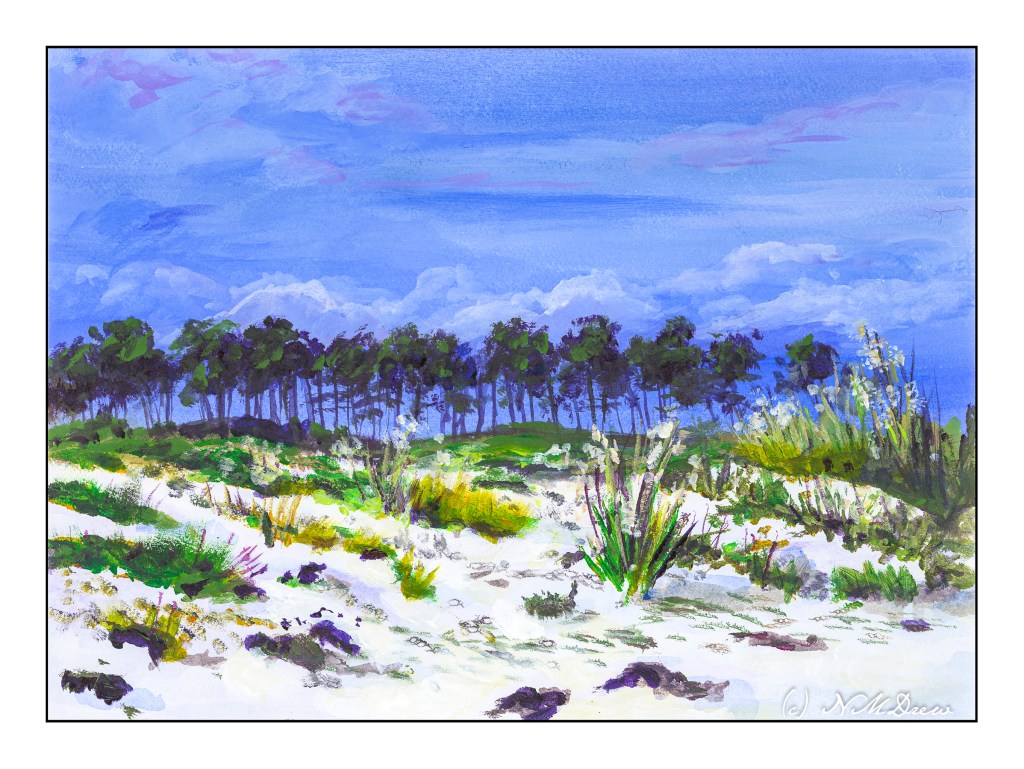
I enjoy gouache a lot because you can rework places and easily blur edges to soften them. That is a lot harder in acrylics. I decided to give it a shot. It worked rather well for the sky, but like gouache, the whites in the clouds darkened more than I thought they would. On the other hand, I did work on the sand a bit, using very thin water glazes for the shadows. That worked out pretty well.
I realize the key to “getting” acrylic painting is to just keep doing it, experimenting, trying. Each painting, successful or not, is a lesson.