A Man from the Mountains

In between life and knitting disasters and housecleaning and purge-atory (I got rid of a lot of junk last week), I have been painting a portrait in acrylic over the last few sessions of my figure painting class. I used one of the many wonderful portraits available from Pixabay.

Painting this portrait was a challenge. I did not want to do a photographic reproduction. My idea was something moody and a bit sketchy, more so as I think such a style is more easily done in acrylics (which I swore to work on!) than a realistic rendition of the person himself. I painted using more transparent paint and scumbled a lot of the paint onto the canvas. Some areas don’t even have paint on the surface, or very little. Layers and glazes were built up. The quick drying quality of acrylics makes this easy to do in a classroom.

My palette was pretty limited, too. I used carbon black, ultramarine blue, raw umber, cadmium red light, titanium white, and yellow ochre. First step was to sketch in the man, working on proportions and then mixing general areas of color, slowly moving into details. I stepped back and forth to look at my painting.

What really attracted me to this portrait was the lighting, the expressiveness and rather mysterious quality of the man – he could be from so many places. My first impressions is he is a man from a remote part of the world, a man who works hard and labors with his hands to provide for those he is responsible. I wanted to catch this quality – a rugged ability to endure.

I think I will hang this on my wall to enjoy. Yeah, pretty pleased! That is after I correct the mistake under the man’s mustache . . .

Heavy body acrylic paint, cotton canvas panel, 11×14.

Christmas Stocking, 2

Ten days ago I began a requested Christmas stocking for my SIL. Started out fine – as you can see from the previous post. Disaster hit soon after – yarns tangled, knots, and total frustration as dropped stitches occurred and, and, and…I took it off the needles to ravel and begin again. More knots, more disaster, and my angry solution was a pair of scissors and the trash.

Total stop.

A break.

Begin again.

I returned to the pattern once again, cast on my stitches and began. This was couple of days ago. Things are proceeding in a more orderly and much more happy manner. I’ve continued to change things around as far as color and patterns to a degree, but am happy with the results. Sitting in the afternoon sun, coffee and audiobook for breaks, make for a pleasant and non-stressful knitting time.

Onward!

Christmas Stocking

Back when dinosaurs roamed the earth, my mother knit each of the kids in the family a Christmas stocking to hang above the fireplace, waiting for it to be filled by Santa on Christmas Eve. It worked, too!

We each had our own in a different color – mine was purple, my brothers and sister had red, green, and white. Mom embroidered our names on them, and then added fun little items like jingle bells, angels and snowmen she made by knitting them, and crocheted snow flakes. For years, even into adulthood, we continued hanging these stockings. Then, brilliant me, hung mine too low over a hot fireplace. Being of acrylic yarn, it melted a bit!

And, as time goes by, we are dispersed and gone from the world. We don’t see each other as often as we could as we are thousands of miles apart – or at least hundreds – in California, Wisconsin, and Colorado. My youngest brother’s wife put in a special request this year – she would like her own hand-knitted and personalized stocking. Challenge is now being met.

I looked through a lot of free holiday stocking patterns – some meh, others too much. Stranded color work is my favorite “fancy” knitting (forget lace and cables), and the one I have settled on is this pattern from Yarnspirations: the Festive Fair Isle Stocking. I am doing my own variant of it – already found a pattern mistake, but who cares?! As long as it looks good, and is enjoyed by the recipient and the maker, nothing is wrong.

The pattern itself is red, grey, and white, but my brother’s stocking is red, so I have to use green in his wife’s stocking to complement it. Yesterday afternoon, lounging in the afternoon sun on the patio, I began. If you follow the link to the pattern itself, you will see that “fur” yarn is at the top. I couldn’t find any so I made an I-cord, picked up the requisite 60 stitches, and made sure I had enough I-cord for a generous loop.

And so, the holiday season has officially begun for Christmas. Thanksgiving is past – and ours was nice – and this little project is a pleasant way to listen to audiobooks, relax, and watch the stocking grow.

Black + White = Grey

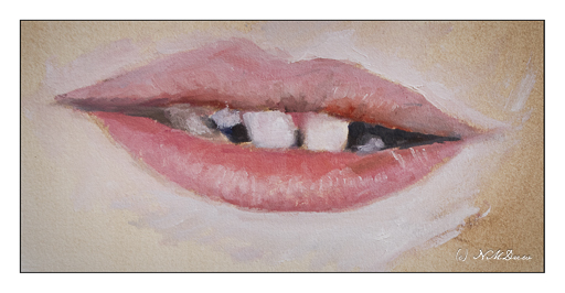
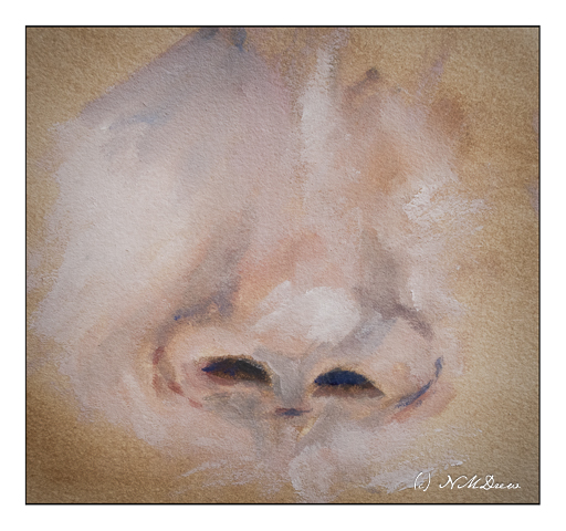
Yesterday was the beginning of new portrait class session with my favorite teacher. Having done 2 sessions with her, mostly with media within my comfort zone, I decided that I am going to conquer my general dislike for acrylic paints and portraits by painting them. So, armed with a black and white photo from Pixabay, I found an interesting man’s face as subject matter, zoomed into one eye, the nose, and the mouth.

For the surface, I am using Canson’s paper for acrylic and oil paints. It has a smooth, linen-like texture and responds well. The bit of tooth is pleasant under the brush. My colors are heavy-body acrylic paints from Golden and Liquitex and are simply ivory black and titanium white.

I consider this study to be a WIP – work in progress. The mouth is too small and needs to be re-worked. The guy’s nose looks like it was broken a few times in the photo and I have tried to capture its asymmetry. The paint under the eye of the skin is heavier and more opaque than a lot of the rest of the painting. It was applied first but then I realized that working in thinner washes of black and white might make for better shadow and light rendition. This is such a learning process! I am also using smaller brushes than I might otherwise – I want the details to be details, not big blobs of paint for this man’s face.

Overall, I am really pleased with how this is coming along. A couple of fellow students in my general painting class do such wonderful portraits and people that I decided to push myself. Acrylics will be my primary focus for awhile. I want to master them, learn how to work with them, and like them rather than cringe when faced with a tube of plastic paint.

Heavy-body acrylic paint by Liquitex and Golden, limited palette, Canson’s acrylic / oil painting paper, 9×12.

Shades of Grey?

Recently it has brought to my attention that my watercolors have very intense colors with strong contrast – too strong colors and clashing contrast. It is an interesting thought. Often I feel my colors are a bit over the top, but after working hard to get rid of mud and blandness, I worked to have more pure colors. Now that I can do this, perhaps it is time to scale back a bit. This means, the way I see it, is to create more middle tone values in general throughout a painting, and then have areas of light and dark.

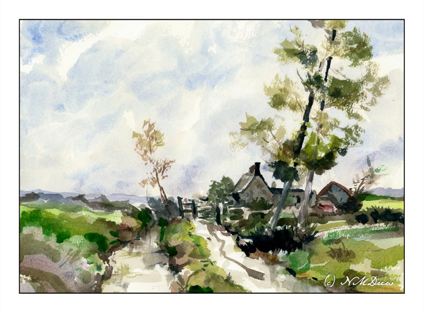
So, let’s begin. On Pixabay I downloaded an image which was not too complicated but, in color, provided a pleasant array of colors and a few areas of bright and dark while the overall tone was middle values

As you can see, the shadow in the left middle ground is strong, as is the tree on the right, as well as bits of the buildings and trees. I converted this to grey scale to see how well it held up to my perceptions in color to actual black and white.

My suspicions were confirmed! My eyes did not deceive me! And, if you are interested, I simply desaturated the photograph by reducing the vibrancy and saturation in Lightroom Classic.

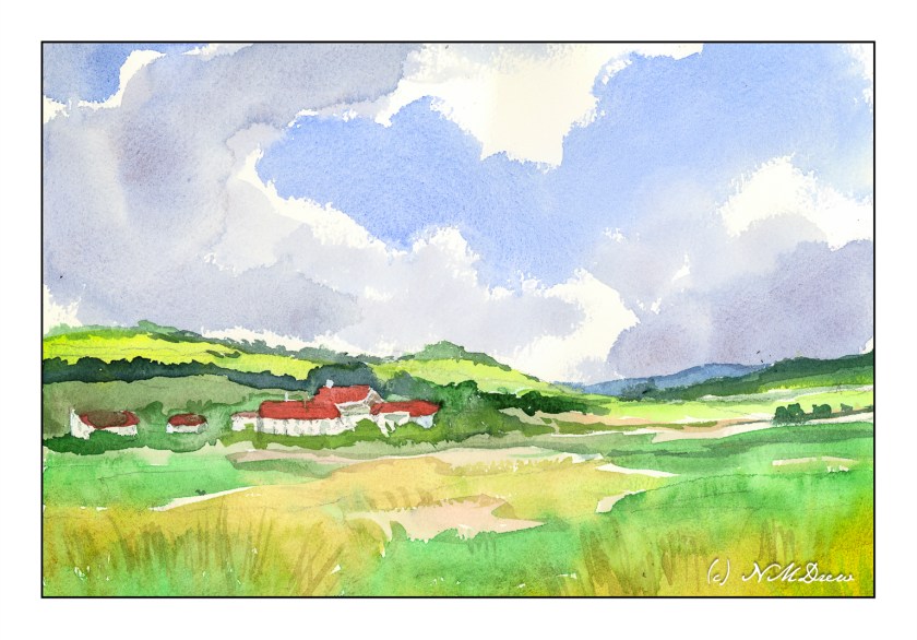
From here, on to my watercolor. I chose a limited but coherent palette of about 6-7 colors – yellow, green, red, blue, browns. Which ones I chose, I don’t recall, but I worked to create secondary and tertiary colors while I painted. My painting is meant to replicate values in the painting as well as make it recognizable without painstaking details. Below is my color rendition.

My painting looks a bit more dynamic than the photograph, I think, but it is interesting to see how it looks in black and white – again done in LR by reducing vibrancy and saturation.

Overall, most of this painting is in middle values of grey with some areas of bright and dark. So, I did achieve what I set out to do. I plan to work on this a bit to see if I like my paintings better – and, I expect I probably will. Working with color is challenging as colors distract so easily from value!!

Thoughts?

Watercolors, Hahnemuhle CP paper, 9×12.