
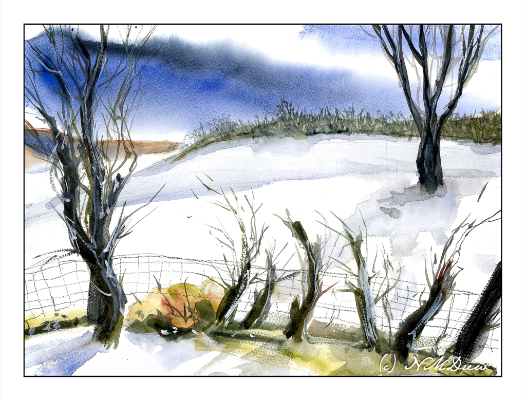
I am working really hard to simplify my paintings. Winter scenes are perfect for this as I have to keep large swaths of paper white and untouched. Contours of the land are suggested by some blues and such for shadows. Additionally, I am trying to keep my brushwork fairly direct and using the brush’s qualities to dictate the result. A bit of a challenge!
This scan seems to be decent, too, as far as matching the painting’s colors.
I added some new colors to my palette for this painting. In addition to ultramarine blue, burnt sienna and Payne’s grey, I added some Winsor Newton brown madder and olive green, and McCracken black by Daniel Smith. I also used some white gouache for the snow on the right hand tree and in the viney-like things in the foreground along the fence. Altogether I am working toward getting comfortable with a limited palette. Winter lends itself well to this.
The wire fence was drawn in with colored pencil – a warm and cool grey.
St. Cuthberts Mill, Bockingford paper, 140# CP, watercolor.
A Bit Later
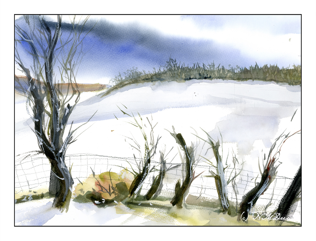
Now, a bit later, I wondered if that tree on the right was okay. I wondered if it was needed. I don’t think so. Here is the painting without the tree!
Thoughts?

I like the painting with the two trees.
I prefer it with the background tree. It feels more balanced as a composition, I think.
Lovely capture of a a wintry scene though.
Put the tree back! 🤣
Thanks, FishyFish, for the thought about the painting. I still don’t know. Maybe I’ll putz a bit with.
Thanks for the vote, Anne. I’m still wondering!
Haha, Fraggy! The tree remains as it is painted on the paper, but the digital tree removal remains as well!