
Quite a few years ago I read a really great spy novel that took place during WW2 in Norfolk, England, and this just happens to be the place Edward Seago lived most of his life. Looking at a lot of his paintings, I get the feeling that sky is quite amazing and huge over relatively flat countryside. I’ve never been there but a bit of research shows it is largely rural and has about the same population as my own county here in California.
Once more, a study from a watercolor Seago did. I think, as with the one yesterday, the paints have faded a bit and so I tried to replicate them to a degree, but also chose to make them a bit more intense, as perhaps they were when he originally painted the farm.
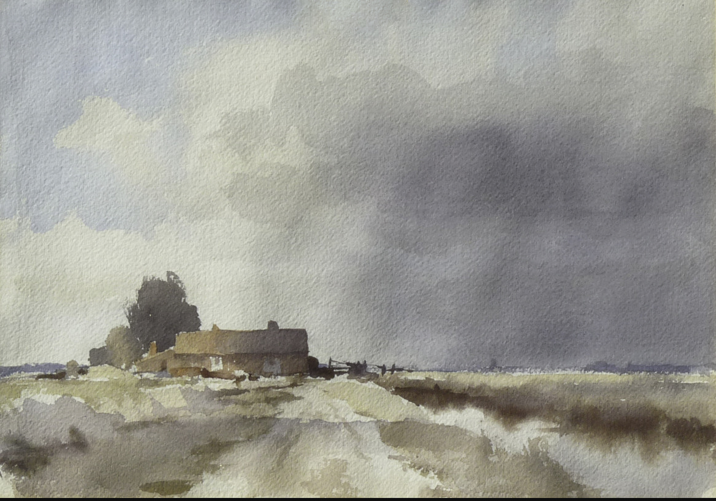
The use of wet washes works really well here. In the building, the light from left to right on the roof and building show excellent control – the gradation from light to dark is subtle. This take a bit of work – getting the paper and paint at the right stage of moisture to make this work. My own attempts were quite awkward and it shows. The sky to the right of the building has what appears to be very gentle streaks of rain coming down – maybe it is just warped watercolor paper – but I thought I might as well give it a shot! What I find especially wonderful is the foreground – a cloud shadow drifting across the scene.
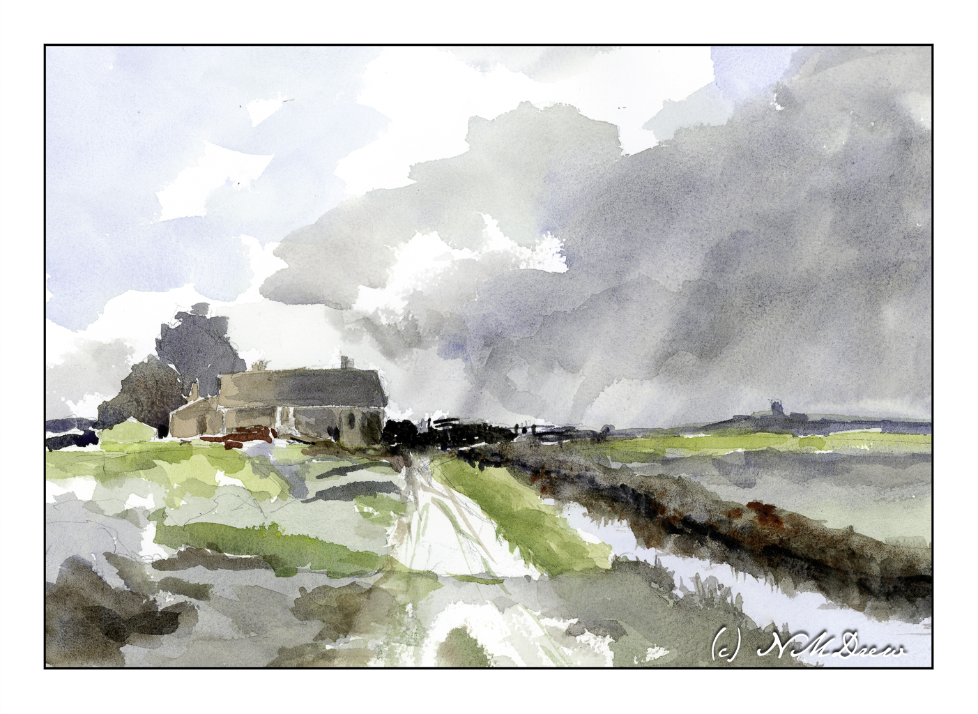
In many ways I am pleased with my master copy of Seago’s “Norfolk Farm”. I managed to maintain a bit of subtlety in color. I also tried to match the values of light and dark and mine is a bit stronger than the reference image. As well, my steeple or whatever to the right of the farm house is a bit too big and a bit too dark. The simplicity of Seago’s painting was challenging to replicate but I think I managed.
The colors I chose are ones I know to be available in the time period in which Seago painted this watercolor. I used cobalt blue and ultramarine blue for the sky and water reflection. Burnt umber and burnt sienna are my browns. Yellow ochre and cadmium yellow helped make greens, but I do use Hooker’s green a lot as a stepping stone for green, and my preferred on is made by Winsor Newton. Additionally, the info I have on Seago’s painting indicates it is about 10×14 inches, so I used rough 140# Arches paper in the same size.
Master copy, Edward Seago, limited palette, Arches 10×14 rough 140# paper.

Wow, I’m certainly getting an education in art. Each painting has a different vibe and tells a different story. You did a great job with your interpretation.
Thanks, Anne! These are just my observations mixed with a bit of knowledge. I appreciate your comments!
😍
Thanks for posting this. I was unfamiliar with the work of Edward Seago, but his art looks right up my street. I think your painting works well. It captures the location of the original without being a rigid copy, almost like a similar scene in subtly different conditions, one perhaps a little closer to the church.
I don’t visit Norfolk often, but it’s somewhere I’d like to visit more (and, to be fair, it’s only a few hours drive). It’s one of the counties that forms East Anglia which is a low lying area of England, mostly very flat with large swathes of agricultural land that was reclaimed from fens and the sea in centuries past. The lack of hills makes for huge skies. Parts of Lincolnshire, to the north, also feature similar topology. Living in a hilly place means there’s a definite attraction for me. 🙂
Glad you like this, FishyFish. The English watercolorists are really interesting to me as they are rather unique I think. Edward Seago and Edward Wesson are older ones while others, such as James Fletcher-Watson carry on the tradition. John Haywood is another English watercolorist I admire. In Holland, Edo Hannema inspires me, as do Shari Blaukopf and Poppy Balser of Canada. Art is always a transitory world, fashion changes, etc., but doing it is the key for me – learning, creating, etc. ad infinitum.
Thanks for the info. I’ll look up those other artists too. I agree – the more you create art, whatever form that might take, the more accomplished you become, whether that be refinement of technique, broadening your style, incorporating the feel of other work that has inspired you etc.
If you’re interested in a different view of East Anglia, there’s a British photographer who’s work I admire called Paul Hart. He focuses on the modern landscape using black and white film photography (he’s a master printer). I find his work atmospheric and evocative.
https://www.paulhartphotography.com/
Thanks, FishyFish, for the link. The photography here is just beautiful and I can see why you find it so beautiful. The fact he prints his own photos adds to their quality. Really lovely stuff.