
Two different scans, and neither is truly exact. That was planned. I decided to change the mood of the scans – one in Epson Scan and the other in VueScan. Don’t remember which is which. The moods were to be bright and sunny, breaking through rain clouds perhaps, and the other just rather cold and gloomy when the sun has vanished behind heavy clouds.
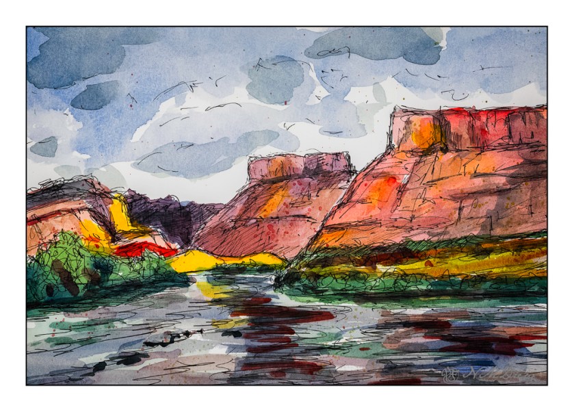
Above, the warm colors are being pushed – yellow, orange. A bit of glow to try to express that sudden brightness you see when the light changes rapidly because of the weather.
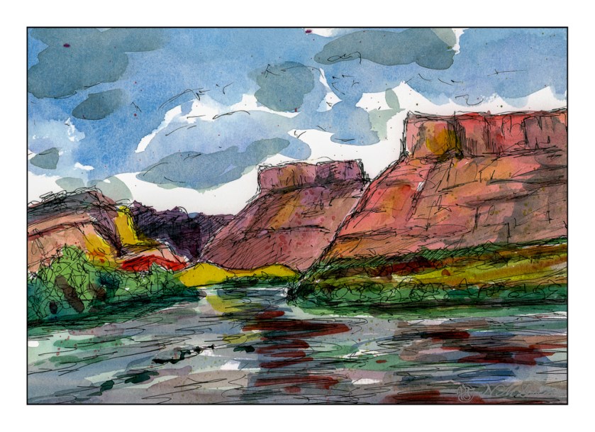
And now the light has changed – potential rain and bad weather. I expect there is a bit of wind, too!
Technically, I drew in the landscape with a waterproof pen, painted, and then drew some more. The mesas’ slopes are a bit steeper than reality as these are about 45 degrees, and in real life, I think they are more shallow, about 30 degrees. Artistic license?
Watercolors, ink, Hahnemuhle 300gsm CP paper, about 9×12.

I like the mood of the second one.
They both look good! Which one is more like the actual painting?
Thanks, Fraggy! The second one is closer to the original but the sky is a less intense blue.
Thanks for your thoughts, Anne. I agree with you.
Both are great, but the detail on the water surface in pic #1 is more pronounced. I do miss that landscape!