
With the threat of fires and losing our house, I feel a bit crazy. We ordered a generator, but it would be ironic that it gets burnt up and our house. No, our house is not in danger, but it is so scary to be contemplating its loss, as well as realize people have died and lost everything. So, it is as if I have to grab onto life and what I love, from people and pets to things I love to do. Watercolor painting is one of them, and the artist whose work I enjoy the most is that of Canadian watercolor artist Shari Blaukopf. Her colors are fresh and cheerful, her personality soothing and calm, and her mini online workshops are always a pleasure.
So, today, her most recent one: Expressive Triads. In painting, a triad is three colors, all primary, but within that the colors vary. This first one, for her tropical scene, consists of Cobalt Teal, Hansa Yellow, and Organic Vermilion. We begin with mixing color swatches.
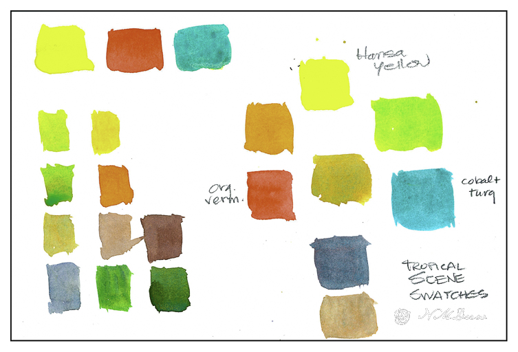
She also adds ultramarine blue at times, toward the end, to mix really dark values which can vary depending on how much yellow or vermilion you add to the mix. I normally don’t swatch but today it just seems so important to attention to details and savor them.
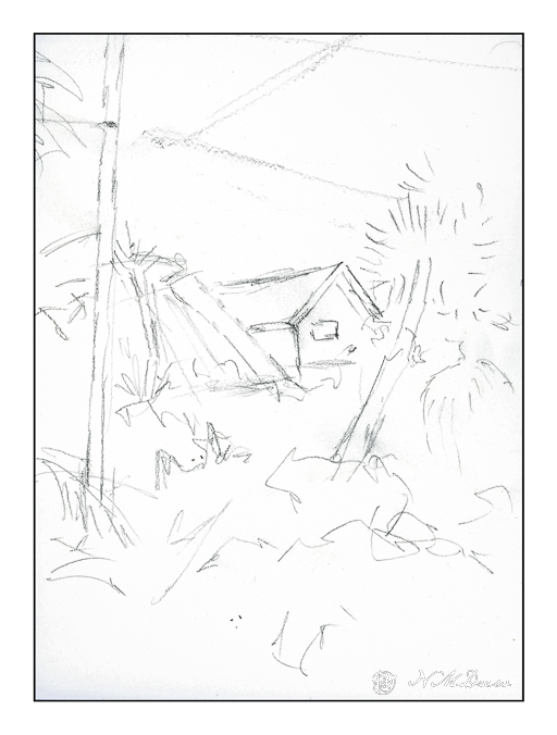
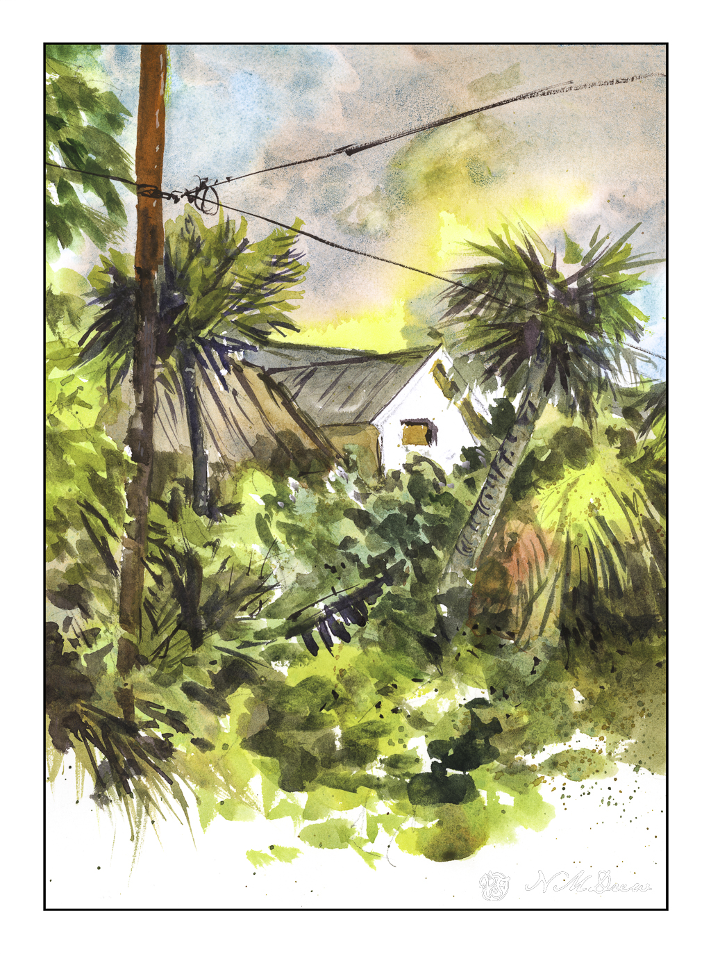
From there, a piece of 10×12 paper and a pencil sketch for the general shapes of the scene. This is from a trip Shari took to Florida. She points out the warmth and colors of the scene – yellow clouds, teal sky, grey sky / clouds. As she paints, she explains what she does, colors used, brushes, talking as she paints. She suggested that you watch her video and then paint along after watching it. It is a good idea!
Her first scene – one of three – is this one. Her videos explain each section as she does it. So this scene itself has three sections – the sky, the foliage, and finally details. I don’t want to give away her course details, but suffice it to say she is clear. I learn a lot from watching and then doing. The beauty of her video courses is their clarity and brevity and extremely reasonable pricing. I spent about 2 hours with this first painting – watching and then painting.
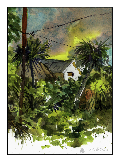
While her sky is representation of the tropical skies in Florida, here, in the midst of the fires in LA, this sky makes me think of the conflagrations flooding the news. Palm trees and semi-tropical vegetation is common here, so the yellow clouds and sky mixed with grey make me think of smoke and fire on the horizon. Our sky is clear, and let us hope it stays that way. The above picture is scanned unedited with Epson Scan software.
The above scan is with VueScan and is less intense – especially in the yellows. I wonder if I need to permanently switch the software to VueScan as it seems more accurate, at least with this painting.
Final Touches
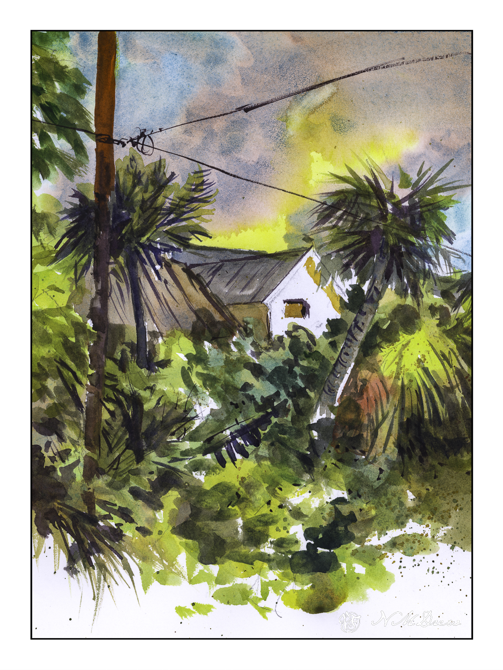
Below, some final touch-ups to the painting. I blurred out the bloom in the sky below the upper telephone wire, added shadows to the eaves of the house, and painted in some lines to the trunk of the left side palm tree. Once more, scanned with VueScan.
Watercolor, Arches 140# CP paper, short course by Shari Blaukopf.

Your painting is beautiful and an excellent outlet for your feelings and concern about the fires.
Here I am again. I want to tell you what I see and feel in that painting. I see a paradise that is threatened and inhabitants fear all may be lost should the fire come closer.
Lovely job! I like the epson scan for the vibrant and deep colours, but all are sweet!
Good plan to distract yourself as best you can when there are serious things you can’t control. Fascinating to keep seeing scan/post-process results from paintings. Reminds me of when I scan Polaroids. I try to make the final image look like the print. But is my monitor “true” and showing me actual color? It all feels so imprecise.
Just know that your friends out here in the computer universe are anxiously pulling for you. Be strong. Many hugs and positive thoughts.
Beautifully captured.
I hope you are safe.
It is just a little disorienting to start with the fear of conflagration, and then to segue neatly into a color lesson. Stay safe.
Thanks, AV – the seque is really great for the mental health! We are doing fine for now, and grateful for our own good fortune, though who knows what the future may bring. Thanks you for the thoughts.
Thanks, tagpipspearl. Yes, we are safe. We have a home, food, and other modern necessities. It is very easy to take all this for granted . . . and glad you like the painting.
Thanks so much, Kit. I appreciate it. We have been fortunate, and hope it continues. In some ways I am resigning myself to the fact my home can go any time a fire comes up, and in a way perhaps that is for the best as doing so makes me think about what I would want to take if I need to flee. Certainly my husband and dog!!
I agree with you very much about the importance of distractions, Jim. They are necessary for mental / emotional health and perspective, too. Life continues and must be lived. As far as the monitor – yes, they do vary even with calibration. What I am doing is matching my final image to what is in the actual painting, as in my most recent post of “Foxglove & Milkweed”. I held the drawing up to the final image in the monitor and it worked out pretty well. In the printing industry, colors can be changed, so I always see post production to be a very fun process – and artistic!
Thanks, Fraggy! I learned a lot from this little class – but my next one, on my own, was a total mess!!
Thanks, Anne. Ironically, the sample for the study is a tropical scene in Florida, and the yellows in the sky were not as intense as I made them. Ironic, huh? Funny how our environment impacts us so much.
Thanks, Anne. And yes, good outlet for all those feelings and concern. Thank you for the thoughts!
you win some and lose some I guess, same as photography.