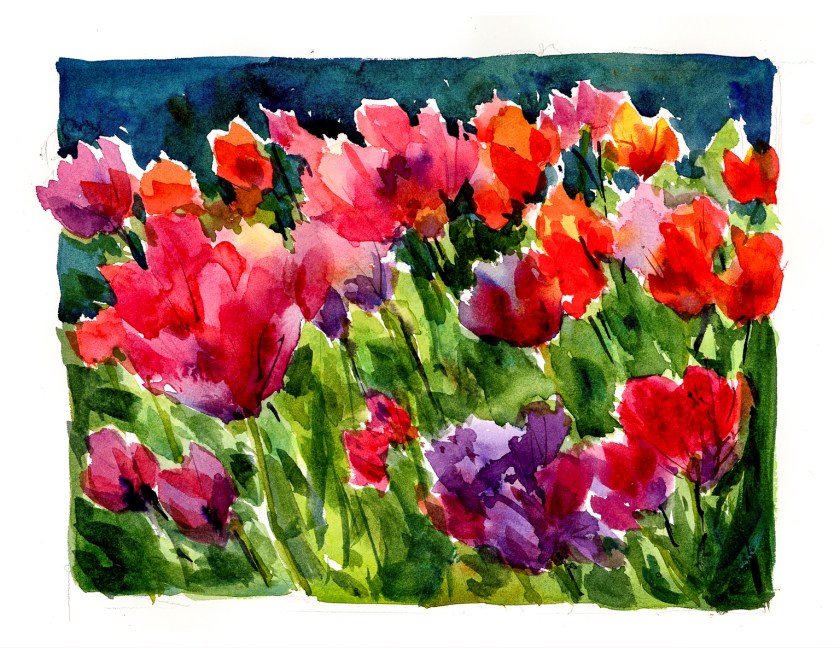
As I mentioned yesterday, I finished up Shari Blaukopf’s short course on painting spring flowers in watercolor. From crocus, we moved onto hyacinths, and today we have a field – or certainly a large patch – of tulips.
Shari’s tulips are more rounded at the tops, as are your standard tulip. Me, in my messiness and lack of attention to shapes, created ones which have more ragged tops, more open in bloom, and any other excuse you can think of for not adhering to recognizably-shaped tulips!
With that out of the way, this painting was a conclusion to all three studies. Out of all of them, for me the crocus was the biggest challenge simply as I am not familiar with them in reality – only pictures. The hyacinth was difficult because the flowers are small, 6-pointed, and blur into one another. Working with them as color masses, light to dark, with an occasional recognizable flower made for success in painting a complex subject. These tulips, while not especially tulippy, were my favorite to paint.
If you enjoy watercolor, I recommend Shari’s short courses – as I have before. They are reasonably priced, some are better than others, but in each one there is a clear subject and a clear goal. She has put together some “series” of online classes, too, which cover related topics. Many classes have a section for the student to upload their studies, and Shari is very good about getting back, even if it may be a few weeks later because she is away teaching in-person workshops.
Watercolor, 10×12, CP paper.


The tulips are really vibrant. and your colors are really great on all three class samples. I am back at the tree course after months on gouache, struggling with saturation. I did the live oaks, but I might make some fixes before posting tomorrow. It looks like I never finished the snow scene course, but I might wait on that until December. There is one more course in that sale bundle that I haven’t started yet.
I am glad you like paintings, Sienablue! If I remember right, watercolor dries 30% lighter than what you see. I have found that really exaggerating the color intensity helps with the colors in the dried painting. One way to consider this is the thickness of the paint. Marc Taro points this out somewhere – watery and thin will result in lighter, paler colors. Watercolors saturated to the consistency of cream will dry darker. To achieve either, add more or less water. Give it a shot when you play, either with Shari’s courses or elsewhere. I have a travel palette like she has loaded with the same colors – not all the same brands – but close enough to achieve the results, or close to the results, she did in her demos.