Water Study

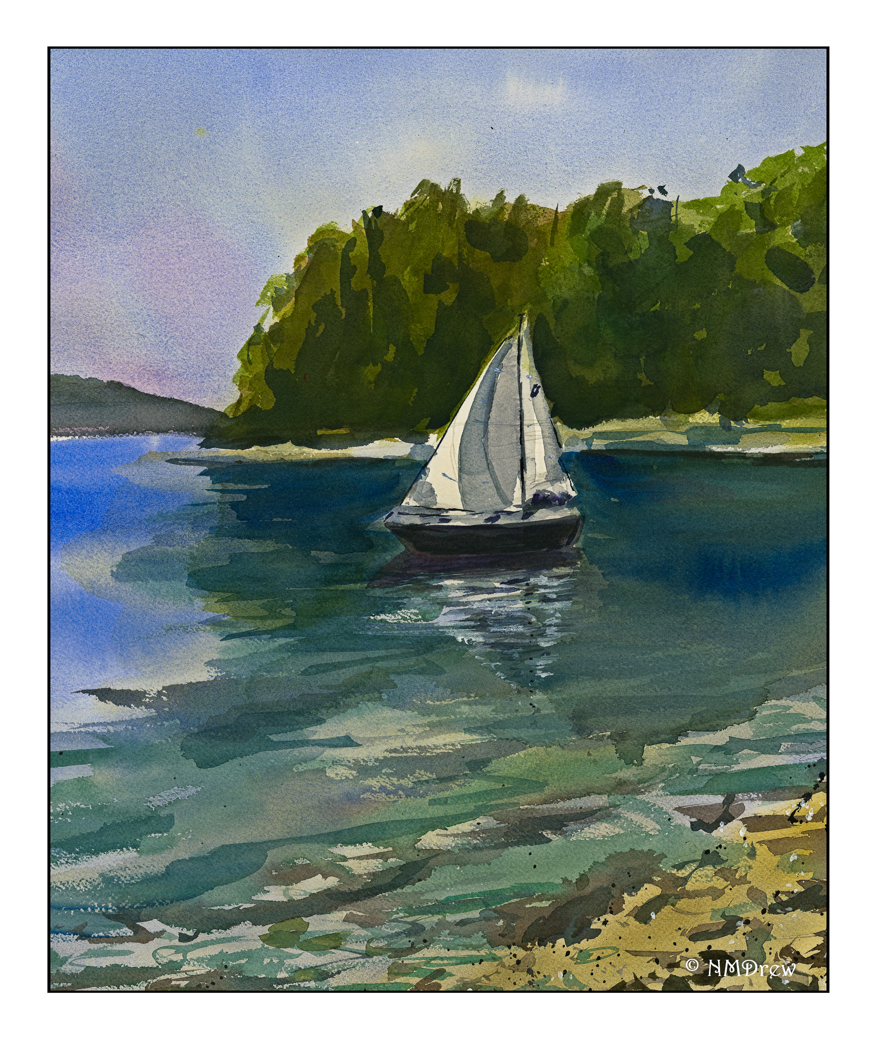
Another study with another excellent watercolorist, Eric Yi Lin, whose YouTube channel is called Cafe Watercolor, a very low-key but very informative channel about – what else?? – watercolors. His demonstrations are clear, and especially compelling, is his narrative. How, why, how come – so many answers to questions not answered in a lot of demonstrations. Truthfully, I think he has some of the best “explanations” or reasons why this, or how to consider that. An example is in the video below, from which the above painting is derived, is his statement that “water is a surface.” Have you ever considered that when painting? Suddenly it becomes more comprehensible.

The major point of this study is to look at water and observe how to paint it. In his video, Eric describes how water “works” in different settings. In fact, he demonstrates and explains different ways to look at water – smooth and glassy, foggy and still, and the ways in which the ocean is not at all like a lake or river. This is all in the first half of the video. Then, from a photo he took, he spends the last half showing how he painted the photo. Takeaways include that the first wash is the color of the light, simplicity in the distance, more complexity in the forefront. Order of working is light to dark, soft to detailed.

I’ll let you look at the video to see what I mean.

I expect I will be visiting his site a lot for now!

An Afternoon’s Study

After spending the last month working small – on 7×10 paper – and using both gouache and regular watercolor, I felt the need for something big and expansive!  This means broad strokes, rapid washes, focusing and thinking ahead at the same time.  That is what I find when I work with really wet watercolors, and much of this study was done with washes bleeding into another.

Not feeling especially original, and totally delighted that Edo Hannema uploaded another tutorial after a few months absence from YouTube, I decided to follow along with his video.

If you are not familiar with Edo Hannema, he is a watercolorist located in Holland. As Holland is a very flat country, he is much influenced by skies and extensive landscape. Water is also a strong element in many of his landscapes.

For me, it is a real pleasure to follow his practice videos, in part because I live in such a dry part of the world! Additionally, he is candid about what he is doing. For instance, if he doesn’t like a bit of his painting, he says it right out loud. As someone who struggles to paint and make my watercolor look good, it is so reassuring to find other painters get as frustrated or annoyed as I do when something doesn’t go the way I want it to. At one point in his video he talks about the tall tree in the left center of the painting. “I hate this!” I can understand that frustration. When the houses nearby don’t go as planned, he tells the viewer to make the best of the situation. That is what you have to do in watercolor.

As you can see, my sky is quite violent compared to his gentle one – I kept getting blooms for some reason, and struggled to get rid of them.  Another element of my own painting was my determination to keep my brushes clean!  World Watercolor Month 2019 really brought that point home to me.  I managed to do it pretty well.

Daily practice takes work.  Tomorrow, I hope to work on gouache color swatches, using whites to create variations in tonality of a given color, as well as working with complementary colors to achieve greys.  That should prove to be an interesting adventure.

The Art of the Written Word

This past week or so has found me wandering into another element of water-based media:  Ink.

Ink is used in drawing, but it is also used in writing, whether using the Roman alphabet, Cyrillic, Arabic, Hebrew, Chinese, Japanese, or any other form of an alphabet for any one of the myriad of languages found throughout the world.

Making ink is an art, and that means knowing something of chemistry (no matter how simple) and permanency.  Ink is black and ink is colored – as are paints.  This past week has found me suddenly distracted by the making of iron gall ink, also known as oak gall ink, and cutting quills from feathers.  You can read about my adventures here, here and here for starters.  You can return to Ink, Yarn, and Beer for more updates, too, if you want.

Consequently, I have not had much time to paint or draw as I have been spending a lot of time reading about ink and quills in particular, as well as watching videos on the same.  This morning, I came across one which rather blew me away as it is global in nature, but local in artistry.  Huh – what does that mean?  Take 30 minutes of time to be quiet and to watch . . .

“Waiting for Spring” – from a Rick Surowicz Study

This morning I went out and bought plants for the flower beds, had lunch and a nap, and then decided what I wanted to paint.  Rick Surowicz just posted a new video on his YouTube channel called “Waiting for Spring.”  On his personal website, he posted a sketch of the study as well as a photograph of the actual barn, and his final watercolor.  If you haven’t checked out his channel, you should.  He has so much valuable information.  When I am feeling more focused, I want to try out his two classes as they are more detailed than his YouTube presentations, although they are detailed enough for anyone who wants to learn.

This video appealed to me for a number of reasons.  One, perspective.  This is a frontal view, so the roof line is pretty much a straight line across the top, parallel to the top edge of the paper.  I got out my ruler and made both straight horizontal and vertical lines.  From there, I roughed in the trees and shadows and bushes.

The palette was pretty simple – Rick posts the colors he used at the beginning, as well as mentioned that his Cerulean Blue is PB36 as opposed to PB35 – PB35 apparently is more greenish than PB36.  This would be either DaVinci Cerulean or Daniel Smith Cerulean Blue Chromium.  Of course, if you don’t clean up your paints, you could have just about anything.

What I learned from this video were a few things.  One, mix colors on the paper as you move along.  Specifically, on the roof, I moved from one color to the next, picking up paint and working it into the paint on the paper.  This gave a nice effect.  Another important thing was to realize that while I have flat brushes, most of mine, if not all, are rather stiff.  Painting with them at times created problems as a softer flat brush would be a better choice in some areas.

I also realized I need to sort out my brushes better – put rounds in one area, flats in another, and riggers and other specialized brushes in another.  I have a stand, and perhaps I shall use that next, or else I may just get individual holders – like jars or tins – to hold specific brushes in specific areas.  I continue to learn!

As I look at this painting, I can see my confidence in handling color has come a long, long way.  I plan to do a few more barns in the coming week, using photos from Pixabay.  This way, I can practice perspective, use my ruler, and try to paint more confidently than I seem to do when I don’t have a video to follow.

FYI, below is Rick’s excellent video: