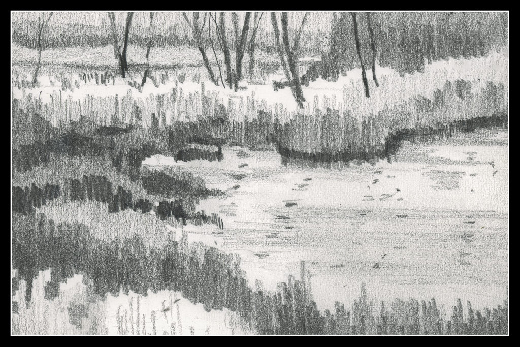
A couple of takeaways from last Saturday’s Zoom meeting for this class. First, a suggestion to make marks simpler – horizontal and vertical. Done. It creates less noisy masses.
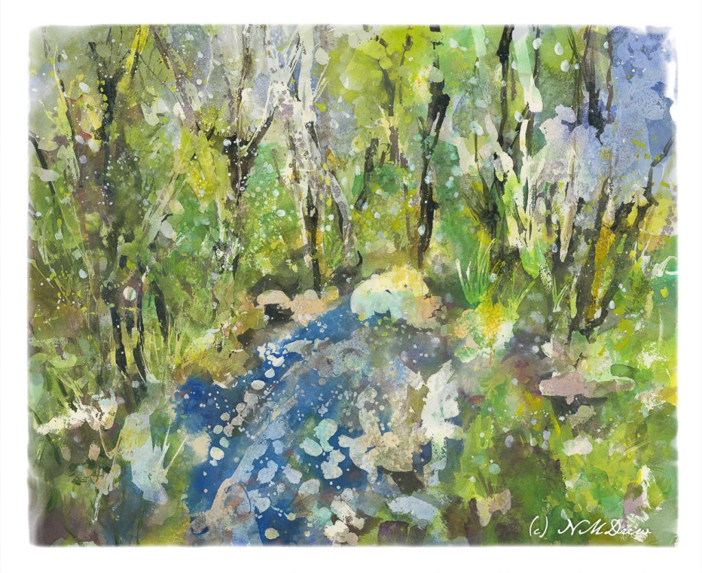
Obviously this is some kind of wetland. I sort of made it up. It’s missing a focal point. I should have done that, but this is sort of dashed off as we are soon to leave for a birthday party and I would like to put on my frippery!
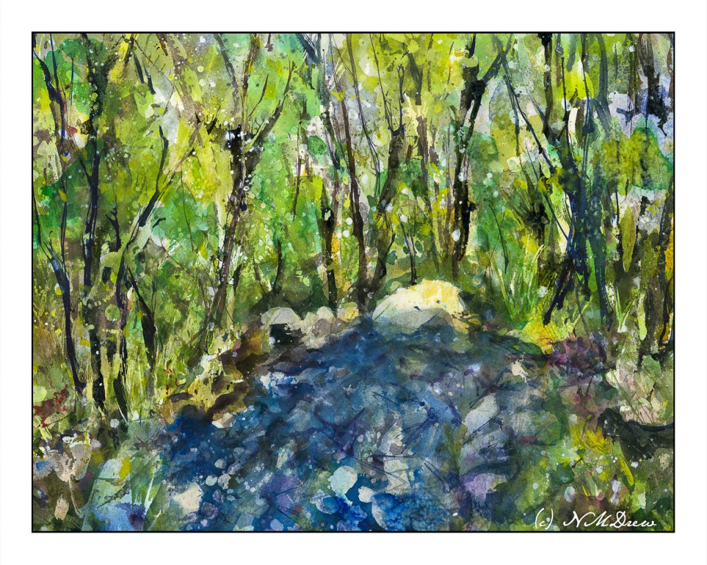
Anyway, as I mentioned yesterday, more blue in the lower front, some other touches, and then let it sit overnight.
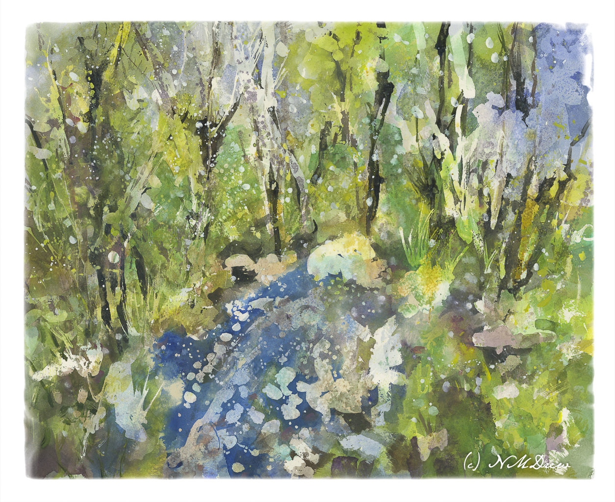
This morning I took another look at it, and the only way I can describe what I did was to refine it. I increased contrast in some areas to create harder edges. Other things were designed to lead the eye toward the center of the painting, toward the whitish rock at the top of the water. I also looked for areas that just didn’t look right, somehow too symmetrical or distracting. In the end, little bits here and there made it better to my eye. But – that was during morning coffee when I was trying to wake up!
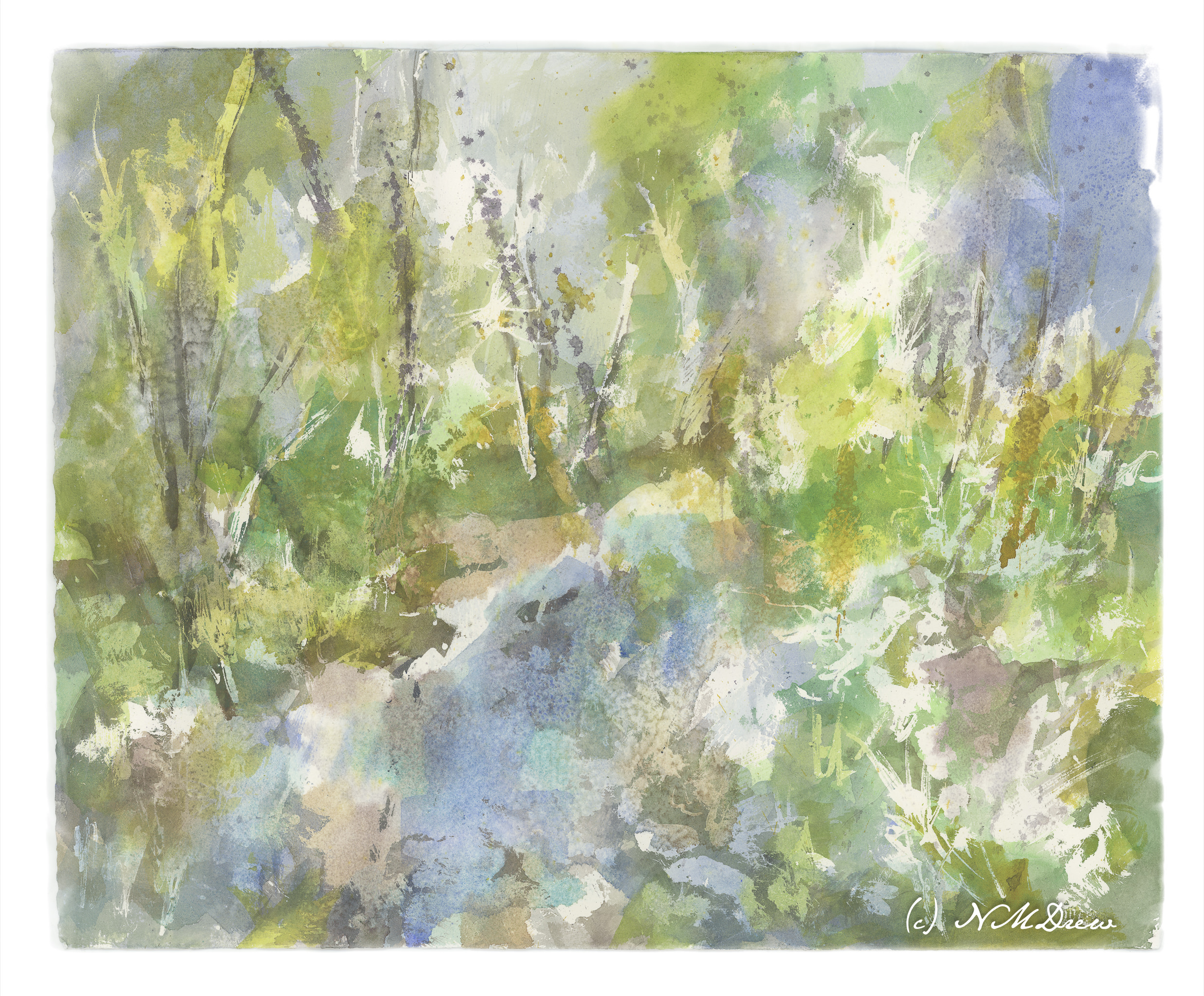
I have never worked on a painting – a watercolor – for this long a time period. Total time is probably 8-10 hours. Time was spent laying down frisket, colors, letting things dry. Then frisket was rubbed off. Water was sprayed at different times and salt sprinkled. Rubbing alcohol was also sprayed on. I think the last round of frisket took about 30 minutes to rub off, along with salt. The result, though, are transparent layers of color which I could not have accomplished otherwise.
While the perspective seems a bit off – or maybe we are looking down into the water from above? – I like this painting. It’s a new adventure for me in watercolor, and while bright, I don’t think it is overly so. I deliberately did not use any orange!! New ideas are coming to mind for painting in a transparent medium. Mood and impression work here for me – not realism, but suggestion. So, spring thaw, melting ice, new leaves.
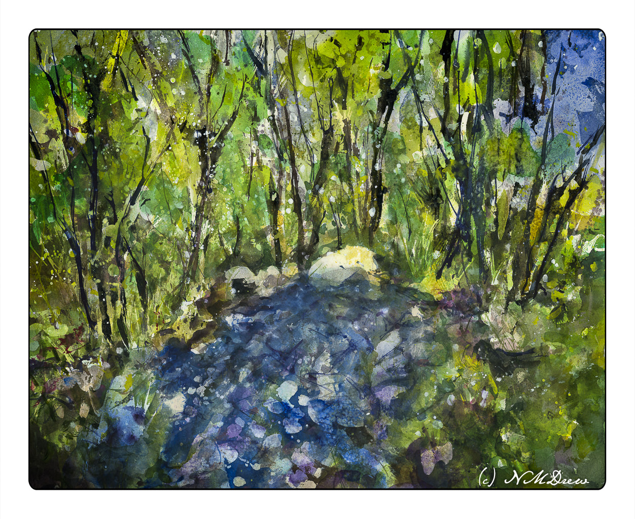
In this final version, I cropped it and changed the perspective a bit in Lightroom. Post-processing artwork is much like post-processing a photo, an din the printing industry it is done all the time. You can see the uncropped version in the gallery below.
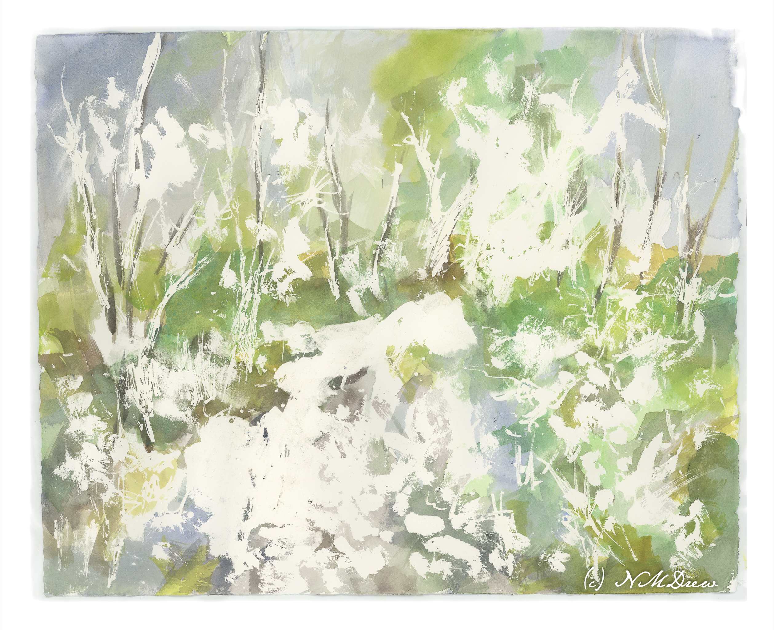
I added more frisket, colors, salt. I also began adding acrylic paint thinned down quite a bit. Now, another night of letting it stew, but I already think I know what I want to do with it. For instance, I want to add more blue in the lower left foreground in that rather large white blob. Perhaps some sense of geometric texturing by adding tape and then painting over it. White streaks for snow on trees? It’s hard to tell.
As I mentioned in my last post, I am trying to change my de facto style into something a bit lighter in color, less intense, and more abstract. This round I am working in layers with an idea in mind. The idea is the spring thaw – frozen water broken up (perhaps), or a stream suddenly overwhelmed by waters pouring down from mountains, as spring warms and melts snow in the higher elevations
I used a liquid frisket with a bamboo pen, drawing with the resist, smearing it around, and finally using a brush dipped in detergent to create different shapes. From there I painted using a 1.5″ flat brush to place colors where things could be. Above is the result with the frisket removed.
I am not really sure what I am doing these days. I don’t really like what I am painting. Moving into abstraction to some degree, trying to loosen up, trying to be more suggestive than representational. Like anything new, or different, it can be very uncomfortable. A part of me wants to work with less intense colors, and for me, that seems like an impossibility! So, I keep trying. Let’s see where it all goes.