Tanglewood (Acrylic) – the Final Rendition

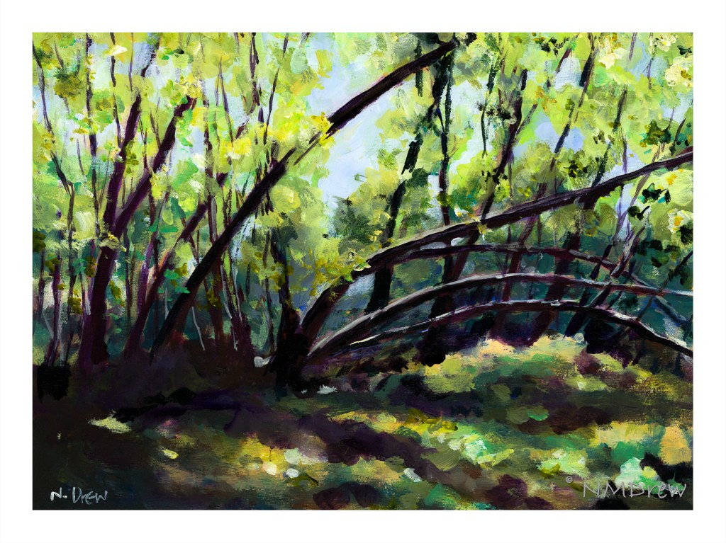
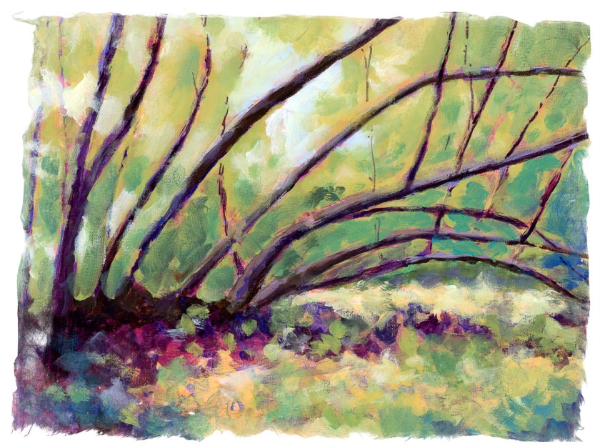
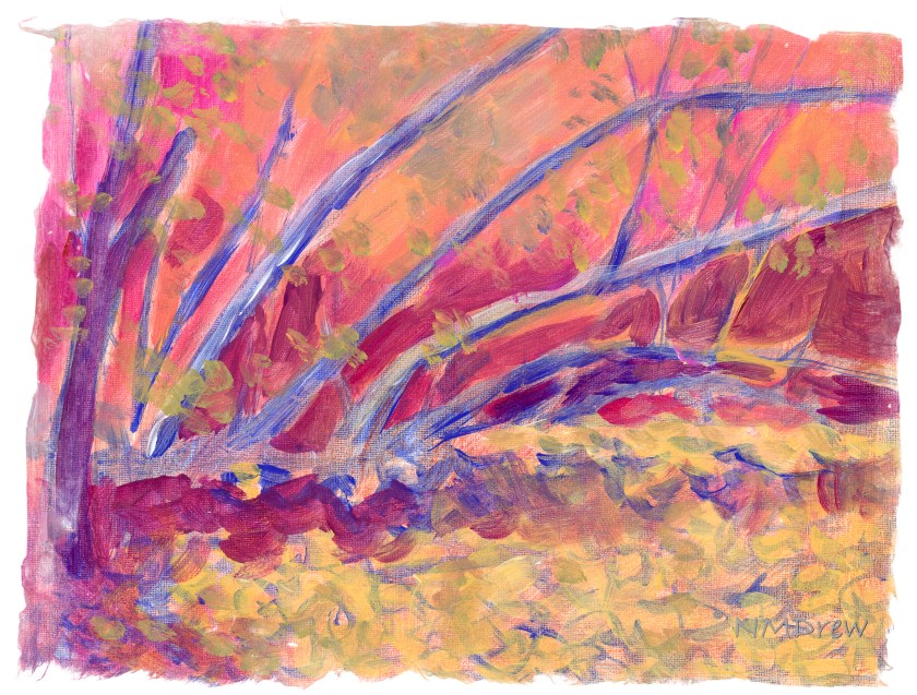
Here is the finalized rendition of Tanglewood in acrylic. If you look closely, you will see highlights added to the trees on the left nearer the trunks, and along the trunks in the upper area of the painting. I did a few other things, too, but don’t remember.

It is always interesting to see what people think about a painting or drawing. My husband says this version of Tanglewood looks like Mirkwood, from that famous trilogy, and the darkly spotted foliage in the upper right makes him think of lurking goblins. Success? Hmm. But, the photo I used really did make me think of Mirkwood myself, so there ya go!

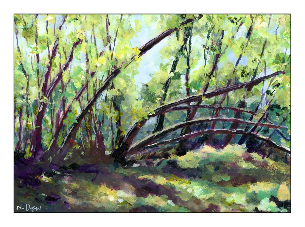
I always like to have an extra set of eyes for the “final” viewing of a painting before the “final” edition. I am too involved, so another set, or two or three sets, of eyes is a big help. My sister and my teacher both brought up the need to lighten up the trees on the lower left, and to add dappled light on the trunks both high and low.

No goblins were used in the painting of this painting of imaginary goblins.

Tanglewood – Done or Not?

I think I am done with this painting. A few areas stand out in the current scan that I will attend to tomorrow most likely, but by and large, I think it is finished.

A few things, though, I am thinking about that may need more work. First, the two lowest arching trees look like a bridge because of the highlights on their upper surfaces. The second is, should the tree that is in the right crossing over the lowest arching tree correctly placed?

I find scanning a painting gives me a different viewpoint and what I don’t see when it is right in front of me become more apparent when seen on a monitor as a digital image.

Ccoments?

Tanglewood Underpinnings (III) and Tree Removal

Above is where I currently stand with my acrylic version of Tanglewood. I changed the foreground and began adding colors to the leaves, hoping to indicate dappled light. The foreground was similar in texture and appearance to the leaves, so I applied paint and mushed things around.

In looking at it, I thought this was looking okay, but so boring. Teacher and I both agreed the trees were too symmetrical and their pattern to repetitive. Time to fell some trees!

Home, the painting was scanned, and then sent to LR or some other program to remove the center tree. I didn’t even need to get out my saw! This definitely makes the painting better already.

More tree removal, but not as well done as the first one. The hint of the upright remains, but in that glimmer of a tree comes some new ideas.

First, the removal of just one tree is my preferred one of the two. The second one shows that suggestion of an upright, perhaps more subtle (i.e. obscured by foliage) works, too. More upright trees in the background, hidden by foliage, will add to the visual interest of the painting without creating a yawn-worthy one.

So, this is where I am right now. Not finished, but getting close. If you have an opinion, let me know!

Tanglewood Underpinnings (II)

A paintings is rather like rocket ship – different stages as it takes off.

I did this in yesterday afternoon’s class, trying to focus on both light and dark, warm and cool. Acrylics seem like a rather unforgiving medium insofar as they dry quickly and can have very hard edges. That makes it a bit of a challenge for someone like me who prefers blending and mushing painting. It took me a bit to figure out how to do it.

The fun thing about an art class is the class members and seeing how they paint. Perceptions and styles are all so individualistic. Naturally you prefer this to that, but admiration for an individual’s work doesn’t mean you have to copy them. Add to this, people are so full of information and stories, and this adds to the value of their art – you get to know them.

So, this may be put off for a few days as I have some other things I need to do – and it never hurts to take a break. I hope I don’t start more than one painting at a time, though, as then I will fall into my habit of UFOs lying around, sobbing for attention.

Tanglewood Underpinnings (I)

Back to “Tanglewood” – done already in gouache and watercolor and pastels. Now it is time to do it in acrylic! (If you want to see these, and the photo, click on the tag “Tanglewood”.)

Here I decided to work on setting up values – light and dark, warm and cool. I thought it might be fun to set up areas in complementary colors, but who knows. The whole thing could end up very odd looking, certainly for me and my boring outlook and driveness to reality. I am seeing this as an adventure. The photograph itself is rather dark and murky.

Colors used on Fredrix canvas pad are cobalt blue, Naples yellow, quinacridone magenta, and zinc white. These are applied atop 2 layers of gesso and then a substrate of yellow ochre mixed with Marigold (Holbein’s cadmium orange).