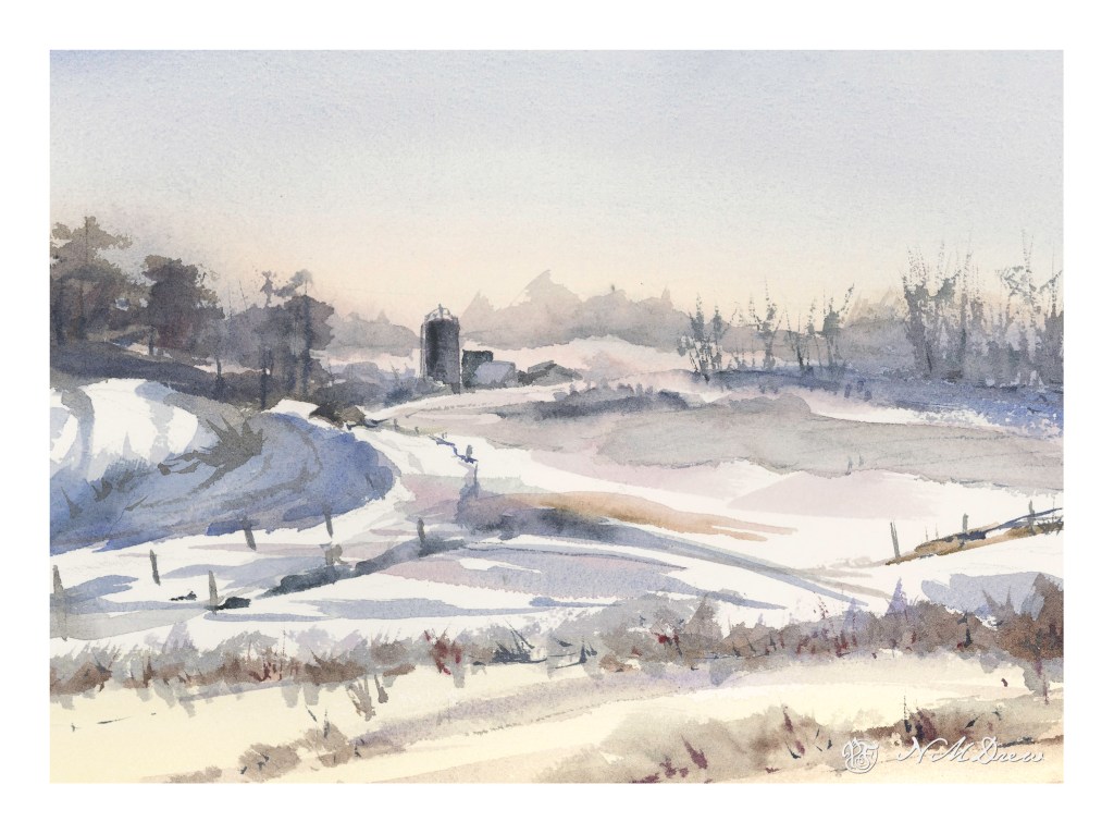
I needed a change of pace – a way to relax – after yesterday’s very intense painting of buildings and people. It’s nice to visit familiar territory. But, I was not without goals. Here I worked on subtle gradations and color change in the sky; misty / soft trees in the horizon using moist paper to blur and indicate distance; a couple of buildings with subtle rooftops; snow. On Arches CP 140#, 9×12.
Up the Hill – Final Painting – Signed on Lower Left in Liquitex Acrylic Black Marker!
Finally! I am dee-oh-en-ee. I took the painting I thought was sorta done, talked with my teacher, and we decided to add a few more flowers. So, I did, and signed my name on the left. On the right I have my digital signature.
I really enjoyed doing this painting. It is on 12×16 Fredrix canvas pad, primed with gesso, and painted over about a 3-4 week period. It is a pleasant break from monochrome – but that is for another time. Today, let’s enjoy Spring as we go up the hill.
I started this painting a few weeks ago, at the first class at the local adult school with a new teacher. This is from a photo I took some time ago. I was at the bottom of a hill, looking up.
This painting has taken a lot of time – several hours – but the work has been worthwhile. I have been applying the various principles I am slowly garnering from hours at the proverbial grindstone, memorizing techniques, concepts, whatever. For instance, I think this painting actually has a nice sense of depth and perspective – something I have struggled with for a long time. The light on the trees also pleases me, as do other bits and pieces of it.
I have also learned just through doing how to get the heavy body acrylic paint into a more viscous and enjoyable mess to paint with, and that is a big help! It’s a combination of matte medium, water, and the paint itself. I dislike the plasticky quality so often that accompanies acrylic paints, so even thought my colors are bright, I think they moosh together fairly well.
I’ll ask my teacher’s opinion when I see her next week. Meanwhile, here is (to my eye at present) finished work. Below is the photo which is the basis for this painting.
Module 2 – Study 2 – Andy Evansen’s “Watercolor for All Seasons” Class
This is my second foray into the series of photos Andy Evansen has posted for studies in the second module of his watercolor class. Here the focus is on value studies.
One of the things I am attempting to do, from both my classes with Evansen and with Ian Roberts, is to work on value. Evansen is a watercolorist and Roberts is an oil painter. Evansen demonstrates the use of a value study on his YouTube channel by creating the middle value(s) as large shapes. Roberts emphasizes shapes rather than things as well. Unlike Roberts, though, Evansen begins his value study with simply the middle value, leaving lights as white. After he has painted the middle values in his painting, he returns to the value study to put in darks and perhaps details.
I managed to do the middle value study, and then painted in what I considered to be the middle values, working left to right as I am right handed. But, before that, I laid in the sky with paper turned upside down as I wanted to have a darker value at the horizon.
I am not sure if the paper is improperly sized, but the paint and paper did not interact well. This is a 300# CP Kilimanjaro paper, natural white, and the first time I have used it. I also wet both sides of the paper, which is a habit I have for watercoloring with 140# paper. I need to see what happens in the future with other paintings.
I don’t really think this painting has a focal point, but that is not the purpose of this study. This module is to paint left to right, working in midvalues and sky first and leaving areas of white or light colors intact. From there, darks.
Evansen has provided a number of photos as references for the basis of a painting, and for values, I think I will work on that and try to apply what I am learning from Roberts and Evansen to create some things worth the time I spend. The reference photos range from landscaapes to cityscapes – animals and people. I will begin with the landscapes and then try the harder subjects for me. Here, there are cow shapes – blobby things. I have also done geese – more blobby things. All thesse blobs have characteristic shapes for the critters.
So! I am dipping my toe into new territories . . . let’s see where it takes me!
It is always worthwhile looking at the works of various painters, regardless as the medium in which they are creating. The works of Edward Seago have a charm to them which is old world, peaceful, and hearkens to a quieter and simpler time. This painting is based loosely off one of his oil painting of the eastern English coastline. What attracted me was – and is – his vast skies. The low lying shoreline beneath such a magnificent sky is worth trying out. The same may be said of the watercolors of Edo Hannema – he, too, finds the work of Seago, and Edward Wesson, as sources for inspiration.
In Southern California, the sky, where I live, is almost always blue. No clouds, little haze. Humidity sits at zero. (I won’t discuss the vast amount of lotion I use!) However, the big skies of the midwest with towering clouds, or the piles of clouds over New Mexico, are in my memory, and so the clouds and moist skies of a wetter clime draw me.
Here, I used the 1.5 inch flat brush for 90% of the painting, resorting to a small flat brush – 1/4 inch – for some detail. Large washes, wet into wet, some glazing. Paper is Arches 140# CP, 16×20. The large brush is becoming a favorite for sure!
The large brush helps me keep my colors clean and think about masses rather than details. Big to small. I am also refreshing my water as I move along – this took about 2 or 3 refreshes – and cleaning off my palette, too. With a large brush, large washes, a lot of color is used. Clean palette, clean water, and, of course, a clean brush. The results are beginning to be seen.