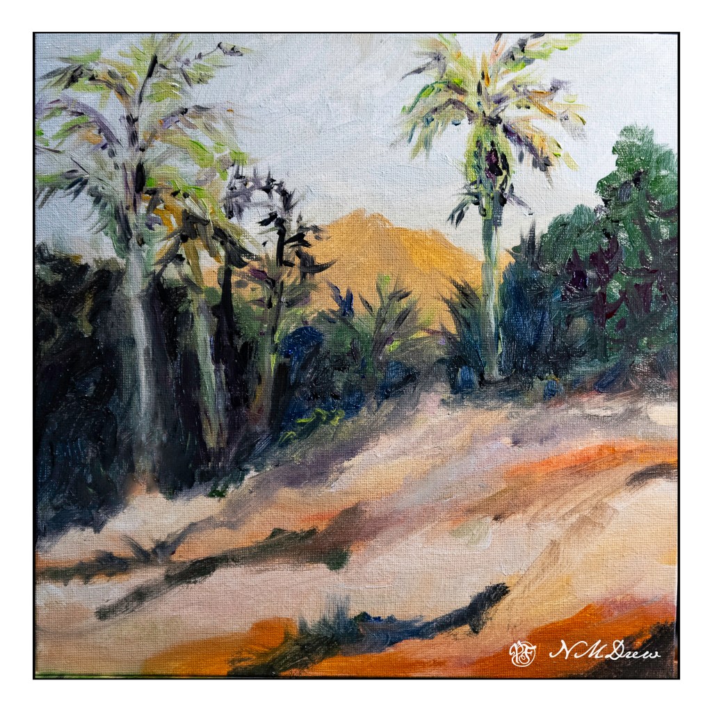
Today I decided to just paint and take it from there. No prelim sketch, some reference to this or that, but the point was to just paint and see what happens. It is really practice, and here I used oils. I just need to get comfortable with them and how they handle. That was the whole point of today’s painting. I think I will do more of these, just for practice. The masterpieces can wait.
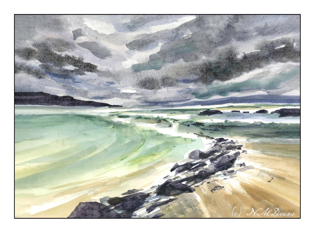
I got a few painterly goodies for Christmas, and one was a new tablet of watercolor paper, one which I have never heard of before. Of course, it needs checking out. How does it handle wet paper and washes? Dry brush? Bleeding? Etc. It is not an expensive paper – $20 for 32 pages of 9×12 pure cotton paper – but it is actually a decent one. I can lift colors from it pretty easily, too! It is a rather nice bit of paper overall, and while not Arches or Fabriano, I think it will do quite well for studies, and probably gouache as well.
Besides playing with new paper, I have also attempted to lead the eye in the composition to a small area of white. Rocks, waves, clouds, land masses, sand, whatever are all designed to catch your eye. I think it worked out pretty good. I also am rather pleased with the movement of the sand in the lower right hand corner.
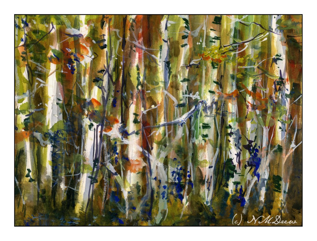
Another adventure in negative painting. As I have mentioned earlier, trees are a very good way to practice negative painting.
Here, I painted around the white trunks, and then more tinted trunks. I couldn’t find myself getting rigidly graphic with this, and just did a splish-splash approach. I also think I did a fairly decent job of moving from a dark, shady forest floor to a more sunlit canopy.
In the end, I used some white gouache, too, and rather like the vibrational energy of it all.
Today I refilled my gouache palette with colors, and then some more colors. I threw in some retardant, too. And I tried to paint. Gosh, it is amazing how you have to reacquaint yourself with something!
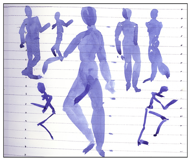
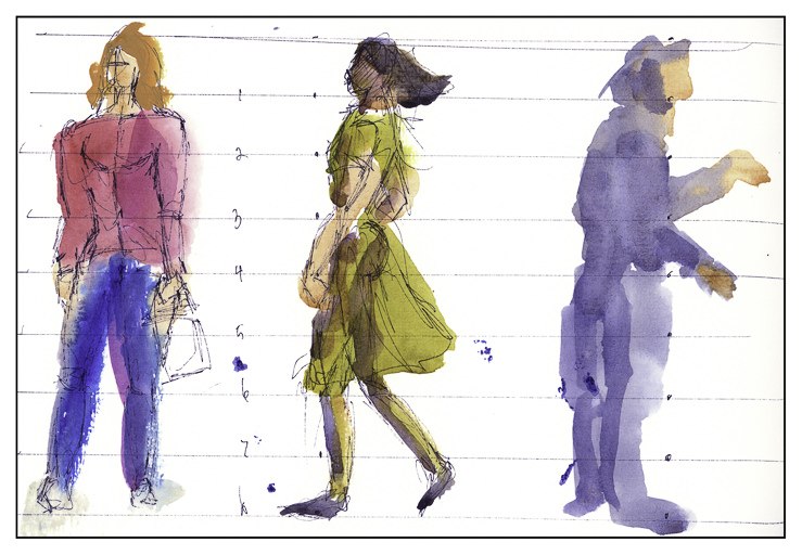
I never paint people in any form. Draw them, yes. Now it is time to add them to paintings so that I can pretend to have a social life!
Watercolor is the first area to which I am adding them. The reason is that watercolor in many ways is very forgiving. As well, there are a lot of photos with people in them in Andy Evansen’s class, so I figured I better stop being intimidated.
And you know what? After watching a lot of videos, and hearing that the general shape of people in a crowd is that of an elongated carrot (supposedly said by Frank Clarke), I had a laugh, and then it began to be fun, not a horror story I had to live.
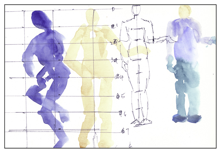
Before beginning though, I felt it was important to get an idea of where things belong. Yes, I do know the general proportions of the human body – 7.5 to 8 heads tall, depending on your source. But where do elbows go? What level is the wrist? And so on. A bit of research and then the fun began.
Different ways to portray people, too. Blobs of color with some suggestions added, such as darker color to separate figures. Negative painting to show off highlights, back lighting, or light-colored fabric.
And so, people are showing up in my watercolor life. It was a lot easier than I expected it to be. Proportional formulae help and just playing around, letting go, and practicing.