If you follow my photography blog, The Glass Aerie, you will know that I have spent the last year posting black and white photos I have made. Some were edited from color images, both digital and film, and changed to black and white, and others were from black and white film. It’s been quite a journey!
There is a lot to learn from doing black and white. For one thing, it has changed my perspective – or viewpoint? – concepts – preconceived ideas – about what to look for in a black and white picture. The simple takeaway is contrast, meaning light against dark. By asking myself how the light is working I begin to see differently. This simple question really helps as I see colors far more readily than I see contrast. I tend to prefer strongly contrasty and graphic expressions of black and white photography, too, and that has been a hindrance in the past.
Let’s take a look at the image below. Other than adding my name and a frame, this is SOOC. I made it last night when I was out toward sunset, enjoying the world after the week’s rain, and just for the pure pleasure of taking a camera out on my walk.

As you can see, the above picture is really low key. If you like subtle black and white images, it could work. The thing I like about the picture is the line of the trail – straight, and then curving around the bush into the hills and canyon beyond. Other than that, it holds little interest for my eyes. To me, the only thing to make this a worthwhile black and white picture is to really create a mood in it of some kind. Playing will help. However, before moving into black and white, I also like to see what I can do with color and contrast in LR or other editing software.
Using Lightroom, color in the image below was enhanced, as was contrast by moving the highlight slider down, increasing blacks and whites, and opening up the shadows. Vibrance, clarity, and saturation were also changed. I did not think my first image (above) caught the light at all, nor the rich tints of green that come out after a few days of rain. As it was also sunset, there was a glow to the environment, too, but the sun was blocked by vegetation. To catch this glow, I warmed the image up a bit. The result is still subtle, but more expressive of what I saw and felt when I was out. 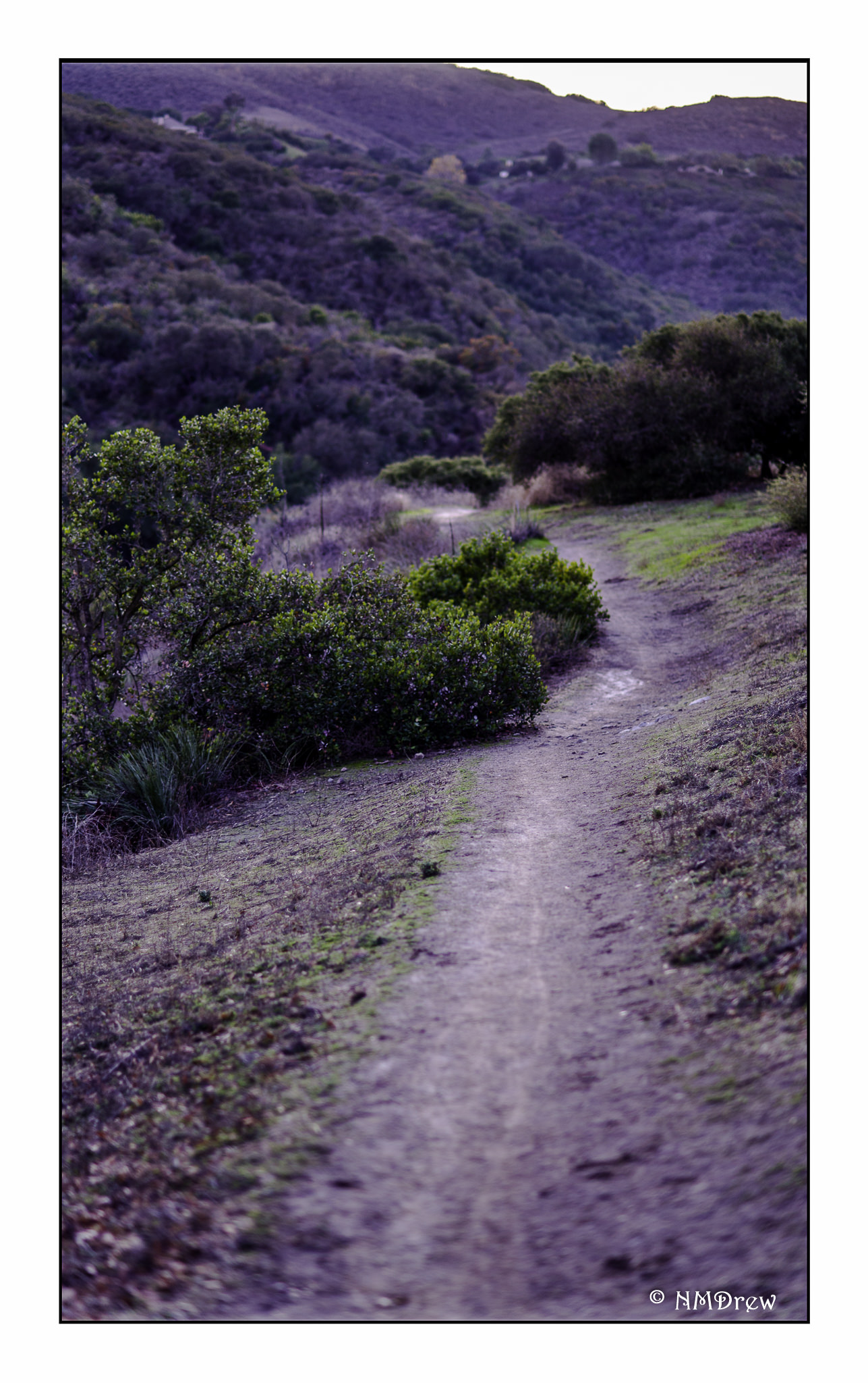 Now, on to the black and white conversion. The image below is the SOOC with vibrance and saturation set to zero.
 Next is the second color image with saturation and vibrance also set to zero.
 Of the above, the second one is far more interesting to me than the first. This is why I find increasing and decreasing varying elements in a color image so important prior to converting an image to black and white.
  And, at last, my final image of the trail in black and white. This is the one I prefer to the other B&Ws, and to the original color one as well. More punch, more contrast, a bit of blue.
Mood is enhanced or created by using contrast to define shapes, and texture. The play of light is easily lost for me when what I see first is color. Playing with color in post helps me begin to see the contrast of light play itself. It is then that I consider the subtlety of long-scale contrast (lots of greys between the black and the white) or strength of short-scale contrast (fewer shades of grey). The result is by studying black and white and forcing myself to edit in black and white, my ability to see light and its workings has been strengthened. It is still a weak area for me nonetheless.
Perhaps next year’s project will be to post color pictures, and then a conversion to B&W.