
For 35mm film, you cannot go wrong with a Pakon scanner – it comes in a lot of flavors and price ranges. The problem is that it is no longer being manufactured. Models vary in price and availability, usually on eBay. On the other hand, the Epson V600 scanner is still being produced, and is about $200 US, depending on where you shop. It is a great way to scan your own medium format film.
As we all know, YouTube is an endless resource for information, opinions, silliness, and instruction. One photographer whose videos I enjoy, and learn a great deal from, is Matt Day. In particular, his video on using the Epson V600 is invaluable. The video below is for scanning black and white film.
Scanning black and white film is easy, but one of the issues you might find is that the Digital Ice is not useable with b&w. Digital Ice is the software which reduces scratches and dust on negatives as they are being scanned. It works great with color film – scan the same color negative twice, and you will see the differences. The reasons why are found on the web, but essentially it is because the chemical content of color and b&w film are different. Therefore, having a very clean negative for b&w scans is necessary, although you can remove dust manually through software, such as Photoshop or On1 Perfect Photo Suite / Photo 10. NB: Digital Ice will work with b&w C-41 processed film (color film is C-41).
The Epson Scan software is quite robust. It does a great job, and has a lot of tools to help the end user modify individual images prior to the final scan – yeah, use the preview for sure! Below is an image of what my settings are in b&w.

The best way to use the software is to just explore it. Check or uncheck boxes as you desire. Take the time to play with it, to get used to what the software does. Matt’s out-of-the-video settings are very good. I checked the “dust removal” box for a particularly nasty set of negatives – don’t know if I saw much difference, but I didn’t look too closely.
Color negatives have different configurations – as you can see in the image below.
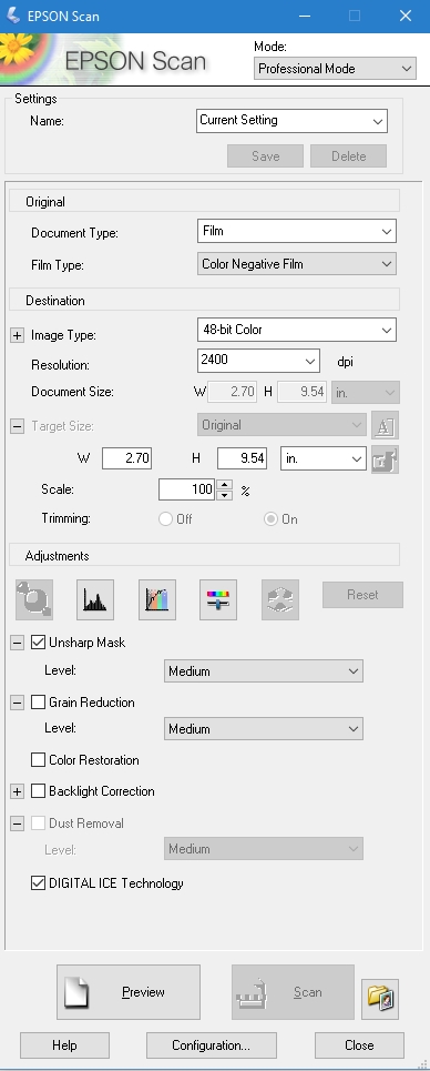
These are what I use, and am fine with them. In the middle of the screen are adjustment buttons – check them out to see what they do (try reading the manual, or googling them, if you need help!). The two items checked are the ones I use – unsharp mask, per Matt’s recommendation, and the Digital Ice, per my recommendation.
Also, do not be lured into much more resolution than 3200, as the files can become very big, and perhaps not worth the size for post-production work. Some people have noted that beyond 3200, quality begins to degrade.
Directly below are three items which are important to look at. The “Preview” button lets you see what you are going to end up scanning. If you watch Matt’s video, you will see how he uses the previewed images to make adjustments. The button labeled “Scan” will be activated once you are ready to roll, but BEFORE YOU SCAN, go to the button directly to the right of the “Scan” button. You must use this to give the final info to the scanner – where to send your scans.

I always save my images to specific file directories, where I keep all my photos that I later import into Lightroom. I save as Tiff, and try to renumber to 001, but if I rescan, I change the file number to 100, and so on. I like having the image folder opening after I scan because then I can double-check my foggy brain and make sure I have done this job! I don’t want my Ektar in my Portra scan folder.
Also, while I think the Epson Scan software automatically detects the film size(s), if you notice anything weird, go to the “Configuration” button on the bottom of the page. Here you will find info for Preview, Color, Film Size, and Other.
Altogether, I like my Epson V600. The price is right for me, and because I am just getting into film in a bigger way, I don’t want to spend too much money – film costs add up quite quickly! Other software helps develop an image to your final liking – as you can see below. The first picture is directly from the scanner, and the second one has been manipulated to the nth degree because it was so crappy (an image from my previous post, Catastrophe in the Darkroom.


Click on the images above to see the crap in the first, and the final clean up in the second.
To clean up the final image above I did the following:
- exported image from LR6 to On1 Photo 10 Enhance and used the spot removal tool (this is better than the one in LR as it does not search for an area similar to the one being fixed, and as a result, does a better job). More post, if desired, in On1 Photo 10 Effects, or whatever else I want to do.
- Return to LR6, and exported to Photoshop, using the Noise / Scratches and Dust filter (or whatever it is called). To use this, find a video – there are good ones for us unsophisticated Photoshop users.
- Return to LR, and do final export with signature.
And there you are – a brief review and some post-processing steps.


