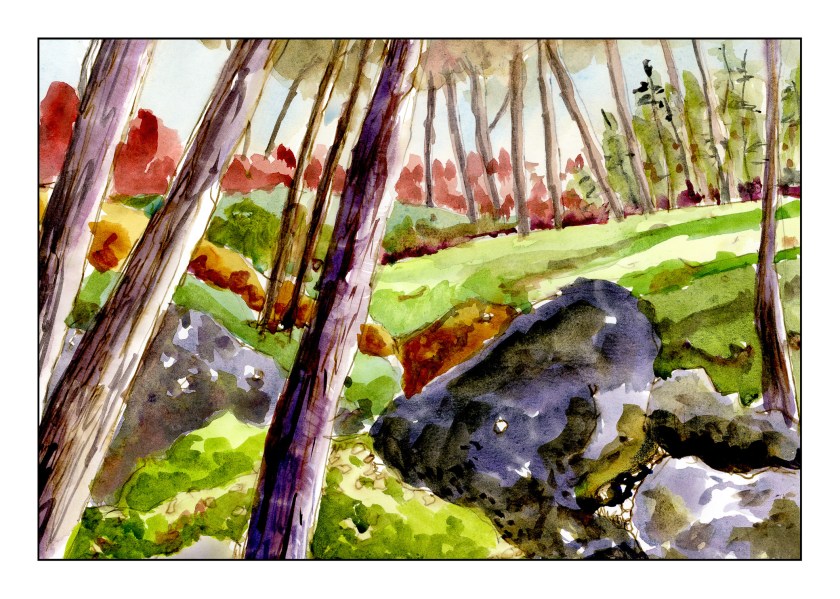
I refilled a pen with some Private Reserve Copper ink, a water soluble ink, to see how it works as a sketching ink. The pen is an Aurora with a medium nib, one which I like to use when I need a broader line. For some reason, maybe it’s just me, but the pen is not writing quite like it did with a different ink. (Hey, maybe it’s the ink!) The idea is to see how well the ink blends into the watercolors or affects the colors themselves.
From what I can see, it just merges into the paint without polluting the clarity of the colors. If you look at the trees on the left, you will see a lot of lines representing the directional flow of the bark. In other areas, I used the pen to outline white spots or fallen leaves. In the background, you can see the outlines of the tree trunks.
Besides just playing with ink, I am trying to use simpler swaths of color in my painting to convey a sense of depth. I struggle with depth – and maybe it is because I don’t have any depth perception – and too often I think my paintings are rather flat in appearance. Luckily, there are “rules” out there to help me, such a lighter colors in the distance, which I do see. I just don’t have a sense of dimension.
I wonder how many people really do have eyesight problems – just recently I read that Da Vinci may have eye issues, having one eye which turned outward. Degas, too. Others? Interesting thought.


