Into the Blazing Hills

One thing I enjoy about a retrospective show of an artist’s work is to have a sequential progression of his / her development. As an erstwhile “artist” I find myself is bopping around. It is my erratic personality – my magpie personality – drawn to this and that. That is probably why I like Hawaiian print shirts – colorful and rather crazy. When I look at my own paintings over time, color is always the primary theme. Sometimes my color usage is quite bad – nay, awful! – and sometimes very much to my liking.

In this vein, I decided to just paint with the Golden fluid acrylics, spreading around colors and creating shapes. I figured it would make itself known to be whatever it is to be. As someone who likes landscapes, I figured it would become one. My thoughts were, as I progressed, a flower meadow, hills of flowers, trees, and then just putz. Using acrylics means putting paint down in a way which works with their quick drying qualities, but I did use matte medium. A lot of times I just dumped color on the palette paper, mixed, added white, and then mooshed it around on the paper. The matte medium creates a bit of transparency, and it makes a sort of glaze over underlying colors.

Painting was done with wide, flat brushes – 3″ and 1″ flats – later a large round – and my fingers encased in nitrile gloves. It took about 3 days and 6 hours to paint this on 15×20 watercolor paper. Golden Fluid acrylics, matte medium.

Colorism is something that truly appeals to me. Not Fauvism, which I find a bit too loud for my taste, but colors to create an emotion or feeling more than reality, with a bit of a suggestion of reality.

The Strange Edges of the Sea

I got a few painterly goodies for Christmas, and one was a new tablet of watercolor paper, one which I have never heard of before. Of course, it needs checking out. How does it handle wet paper and washes? Dry brush? Bleeding? Etc. It is not an expensive paper – $20 for 32 pages of 9×12 pure cotton paper – but it is actually a decent one. I can lift colors from it pretty easily, too! It is a rather nice bit of paper overall, and while not Arches or Fabriano, I think it will do quite well for studies, and probably gouache as well.

Besides playing with new paper, I have also attempted to lead the eye in the composition to a small area of white. Rocks, waves, clouds, land masses, sand, whatever are all designed to catch your eye. I think it worked out pretty good. I also am rather pleased with the movement of the sand in the lower right hand corner.

9×12, CP 140# paper, watercolor.

Trees, Late Afternoon

Third and last of a photo I took earlier this month in Independence, CA, before being driven back home because of Covid. I am not sure which of the three of these paintings I did of the same photo I like best (you can back track on this blog if you want to see them, or go to Instagram!), but this one, in acrylic, was by far the most time-consuming.

I used 16×20 Arches 140# CP paper and a variety of acrylic paints, but first I laid down a few layers of gesso to prep the surface of the paper. The first layer of gesso was thinned with water and brushed on quite firmly to work it into the paper itself. The paper warped as watercolor paper does, but I was really happy to see it flatten out with the second, thicker layer of gesso.

Most of my brushwork tends toward dabbing on dots, which is great for pointillism and impressionistic painting, so I worked at creating lines, as seen on the grasses in the background, along with using a flat brush and using its tip or sides to work paint in a more up / down, side-to-side manner. My next painting is going to include these types of brush strokes, just because. It never hurts to try things you don’t usually do.

Every type of media – watercolor, gouache, acrylics – has its own “language” – that is, the way you have to work with it. Acrylics are rather heavy on paper and I need to think ahead for what I want to do. I tried the slower drying acrylic paints, and just did not like them. As a result, the ones I use tend to dry rather quickly. Filling the palette with every color I think I might want to use is a waste of paint. Instead, I have to plan, not like a general, but certainly I need to anticipate what comes first, what comes next, and so on. I also have to think about brushes and brushwork. Painting can be spontaneous, but it also needs experience to allow for more success (however you want to define “success”) than failure.

One thing I considered for this painting, but did not do, was to lay down a glaze to unify it. Chicken! Maybe I will come back to it later. Now, two things are on my next painting agenda: buildings and no dabbing! And maybe a glaze . . .

An Afternoon’s Painting Practice

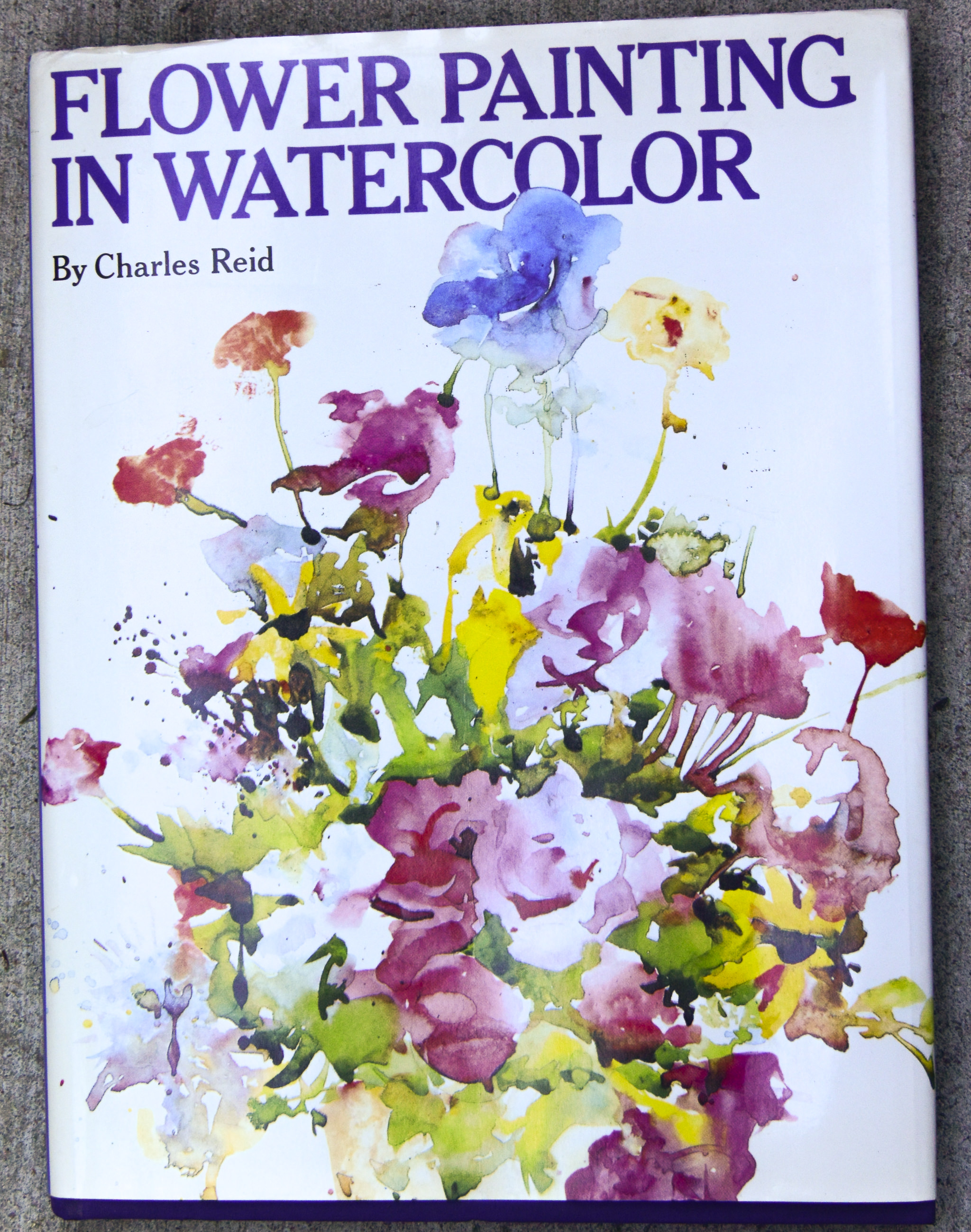
I am an unabashed Charles Reid fan when it comes to instruction books and videos and style in watercolor.  I love his loose style and the way his colors flow in and out of each other without getting muddy.  Honestly, I am really a novice when it comes to watercolor painting – and mud is my usual result.  Somewhere in the past 6 months a part of me just quit worrying about what I produce, and this gave me the freedom from self-criticism (and condemnation) about what results I get.  I don’t care anymore, and this freedom is opening up doors which have been slammed shut by my unrealistic and unrelenting worrying.  It’s a great feeling!

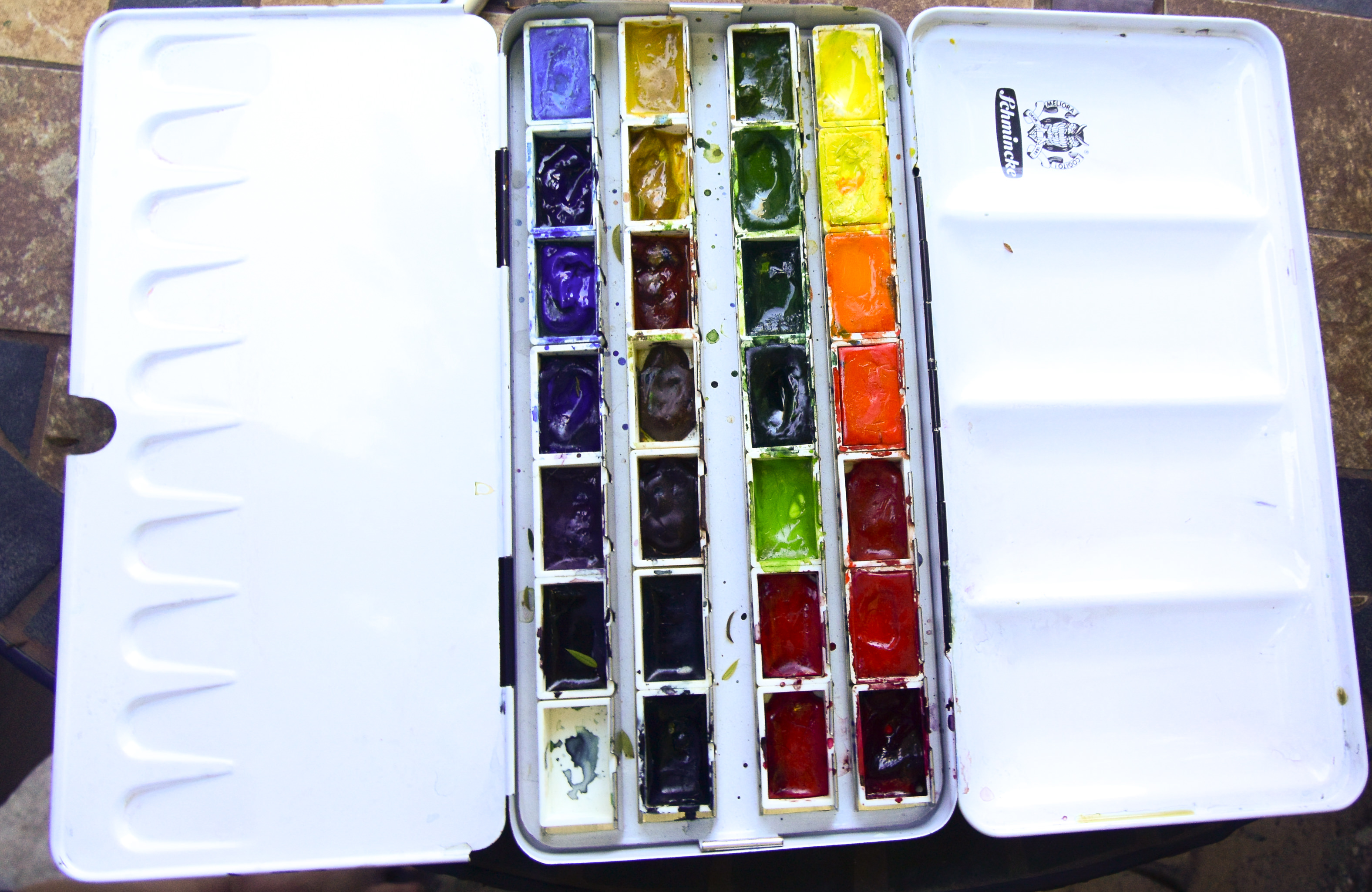
Having a bunch of watercolors and supplies on hand, I dug out some water brushes and my traveling palette.  Out on the patio, with earphones on to listen to a spy novel, a bunch of paper towels and some water, I pulled out Reid’s book.  My watercolor pads came along with me, as did my coffee, water bottle, drawing pencils and who knows what else.  The verbal distractions of the audiobook keep me from getting too emotional about my practice pages.  I propped up Flower Painting in Watercolor and got to work, reading captions and color suggestions, drew some rough sketches from Reid’s exercises, and got to work.

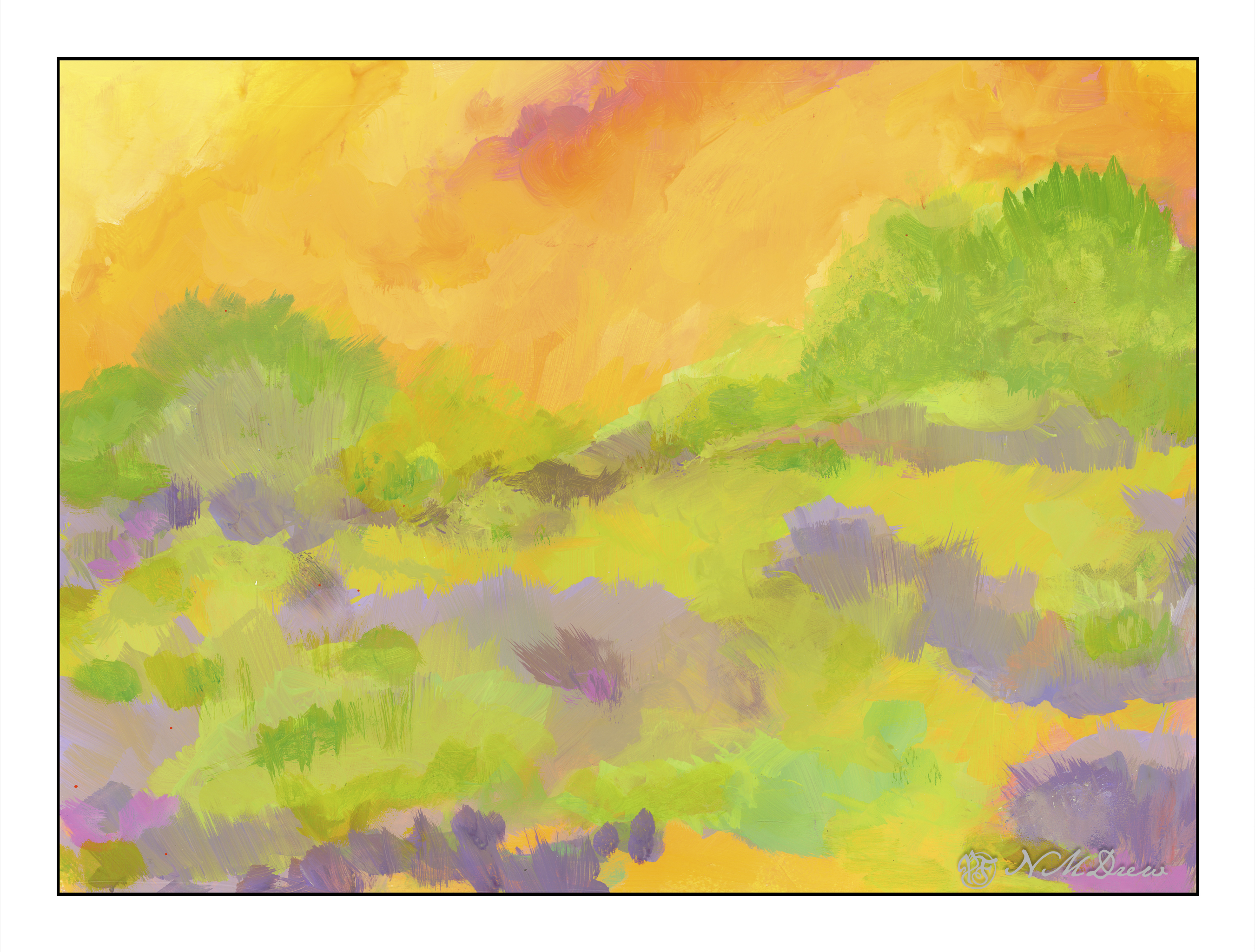
I think one of the hardest things to do is to leave white paper.  I just want to paint it all up.  And I also want to just keep going on – and this creates mud – without pause for paper to dry and paint to settle.  Rush, rush!

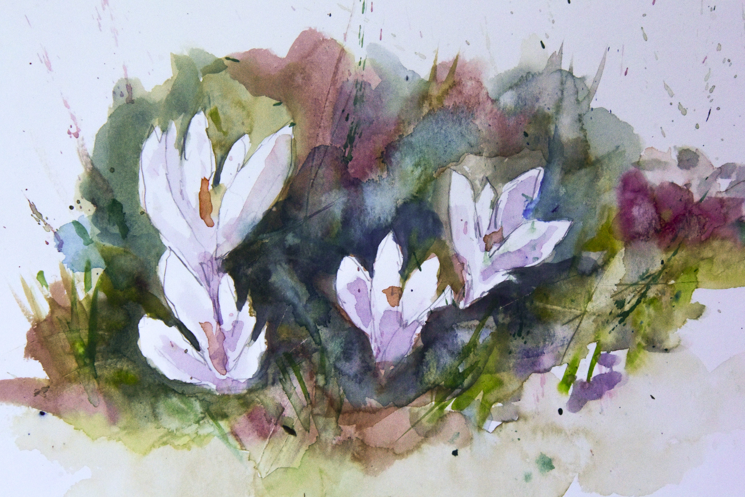
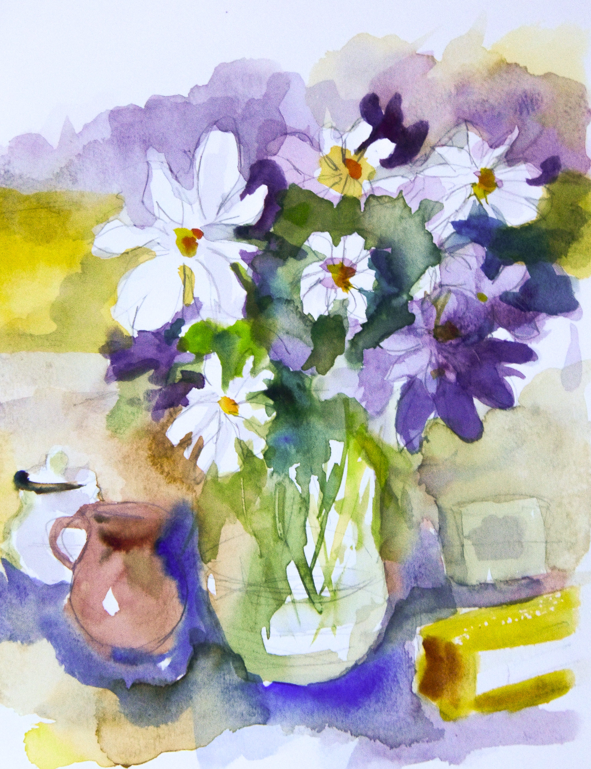
Well, I did succeed somewhat.  The crocuses above are one of Reid’s studies, and I was pretty pleased with it.  In reality, it doesn’t look half as good as the photo, but then it is on a piece of messy paper with scribbles on it and test swatches of color.

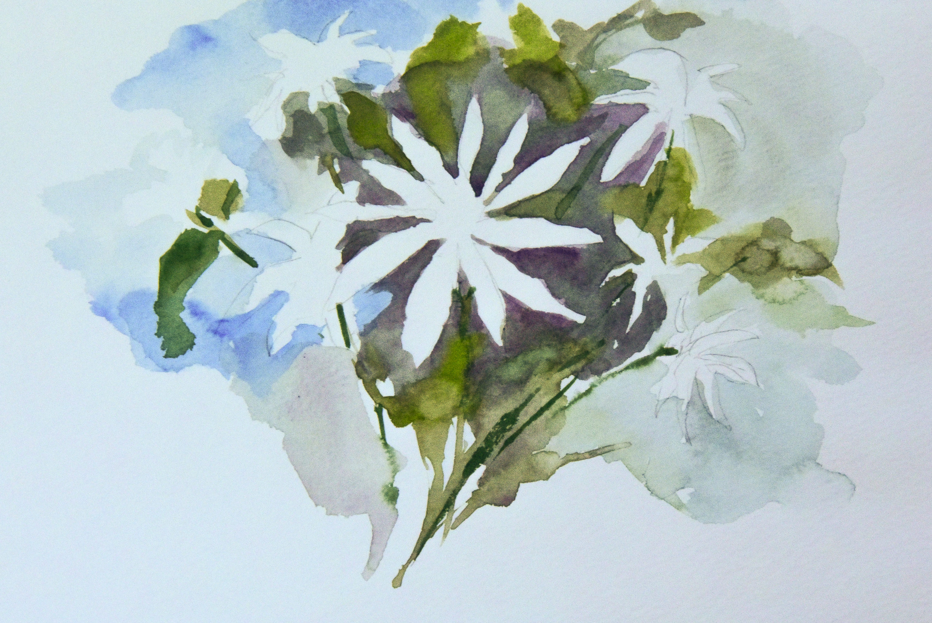
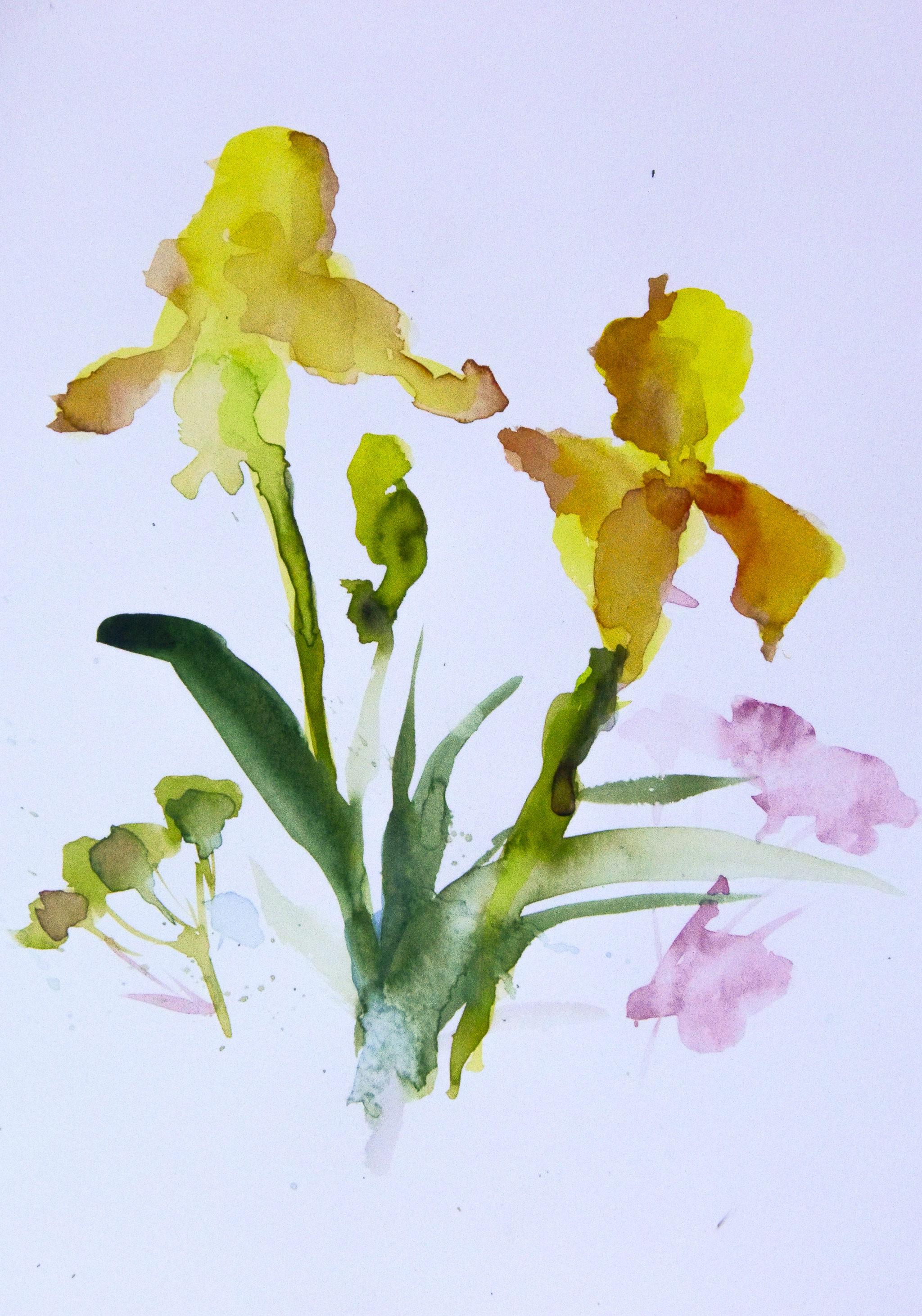
This was a quick study, more white space being left open.  I went back after I finished this study to use my pencil to add some shape to the white flowers.  I like lines – and it is a problem I find with my own sense of a “successful” painting – I need lines to define things.  Sometimes lines work – sometimes they don’t – but I do love the Renaissance ink studies I’ve seen, and lines have always held my eye.  Lines are expressive – but so are shapes of color.

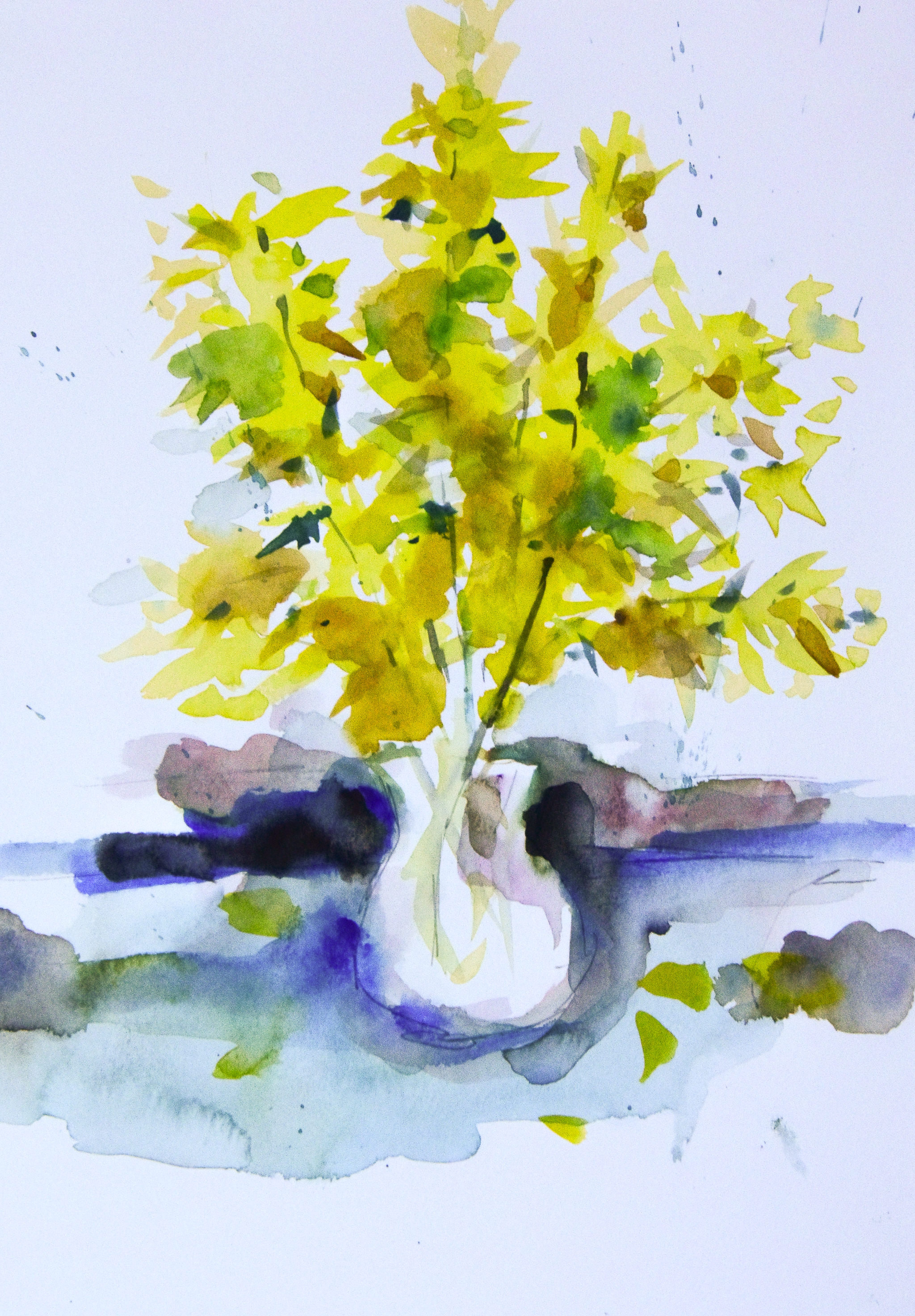
Here, simply color shapes to imply a flower or a leaf.  My experience in sumi-e brush painting makes my understanding of controlling a brush – even an inexpensive water brush with nylon bristles – much easier.

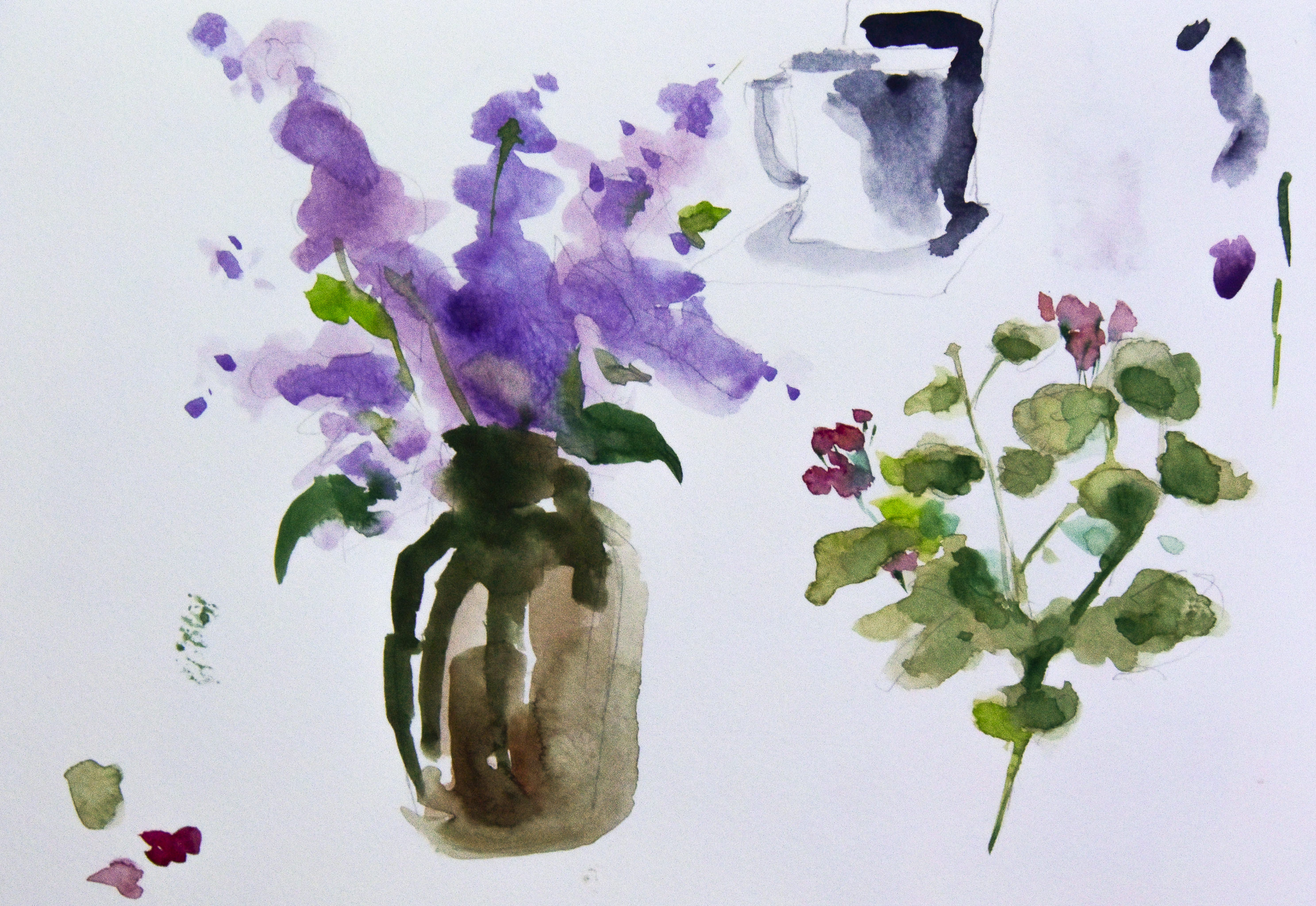
One thing Reid pulls out is shapes without definition – just implication of form.  This is great practice for my line addiction!

Another issue I find is contrast and value.  It’s hard for me to really get these right in a painting.  Reid mentions he makes his dark not super dark – not black – but installs a medium dark early on to establish value.  I struggle with this but with more practice I think I will get better at this.

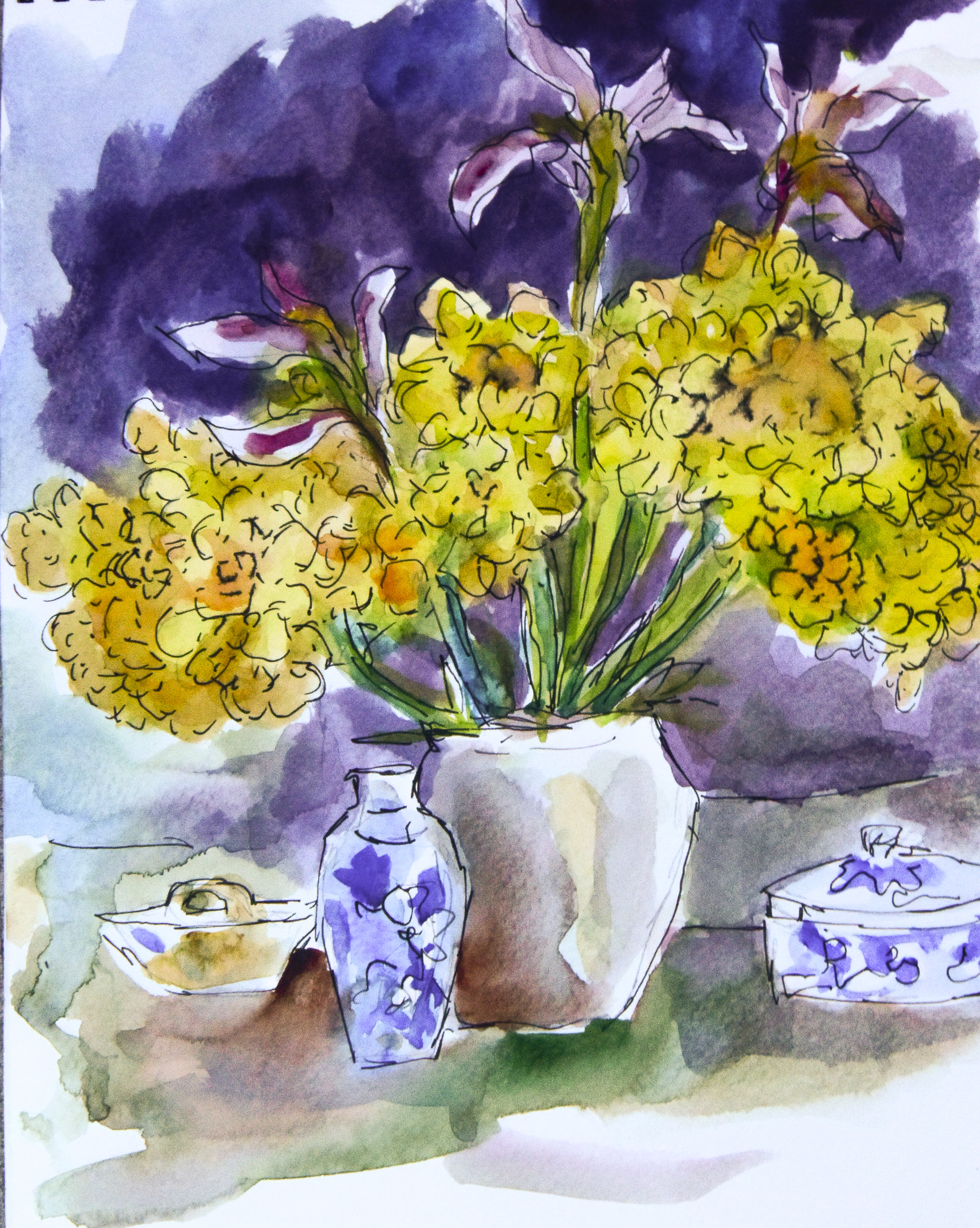
And here is the last one . . . not the best, but one which does have some good areas of contrast, and black lines from an India-ink pigmented pen.  Sketchy, painterly, and totally fun to do!

Quality paper is a must-have.  I have some tablets that I bought which I absolutely hate because of the texture and sizing in the paper.  However, I used them up and ordered more of the Canson’s Montval paper, in a spiral booklet form, 9×12 with 20 pages.  It’s a good working size – and it’s good paper, with a nice texture and sizing which doesn’t blotch up and look horrible.  It’s also very reasonably priced.  The Schmincke paint box may have Schmincke paints in them – or not.  My paint supplies include Schmincke, Winsor & Newton, Daniel Smith, Holbein, and M. Graham professional-grade watercolors.

I’m glad I sat down to paint – it’s such a wonderful feeling and one which gives me satisfaction.  Did I produce anything worthy of framing?  Not at all.  But working with my hands, seeing some success, is something which cannot be described – only experienced.  You know what I mean!  It’s like love!