

Sunday, 3 September 2017
It’s sort of a quandary. Should I blame myself, the weather, the paper?
First, we have been housebound, not by hurricanes, but by interminably hot and stinking weather, weather so fiercely hot that heat stroke is easy to come by. Temperatures have been soaring to 112 F and 30% humidity – for a desert gal, this is not fun. Dry weather and moderate heat is okay, but living in the darkened house, in a house filled with air conditioned air, and melting outside, is getting old very, very fast. Tempers are short around here, and hopefully the weather will break tomorrow with 85 F and begin to cool. I hate being inside and being inactive. I don’t belong to a gym, but it is too hot to go for a walk or a run, probably even in the middle of the night. So, it pisses me off!
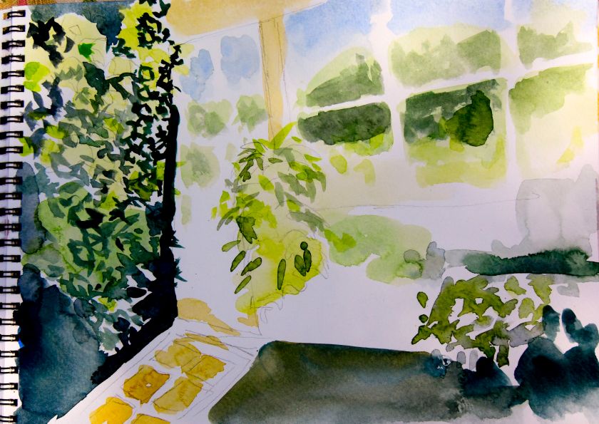
Next, I am impatient and annoyed – a lot because of forced inactivity because of this disgusting weather. This doesn’t help when watercolor paper needs to be used up for practice, but the sizing is so crappy it buckles and creates weird areas that show poor quality – and possibly poor quality control. And the practice itself is hard to do – in part because of my monkey mind and my need for some good aerobics to rid myself of the wiggles so I can focus.
Oh, poor me!
But now that I’ve bitched a bit, maybe I can look back at what I am doing . . . working on my ever-present nemesis: contrast.
Monday, 4 September 2017
Okay, I got over myself. I tell you, though, that a week of unrelenting heat and humidity of 110 F and 35-100% humidity is not fun. Today, humidity has dropped because of rain, the temperature is down to about 85 F. I am in a much better mood.
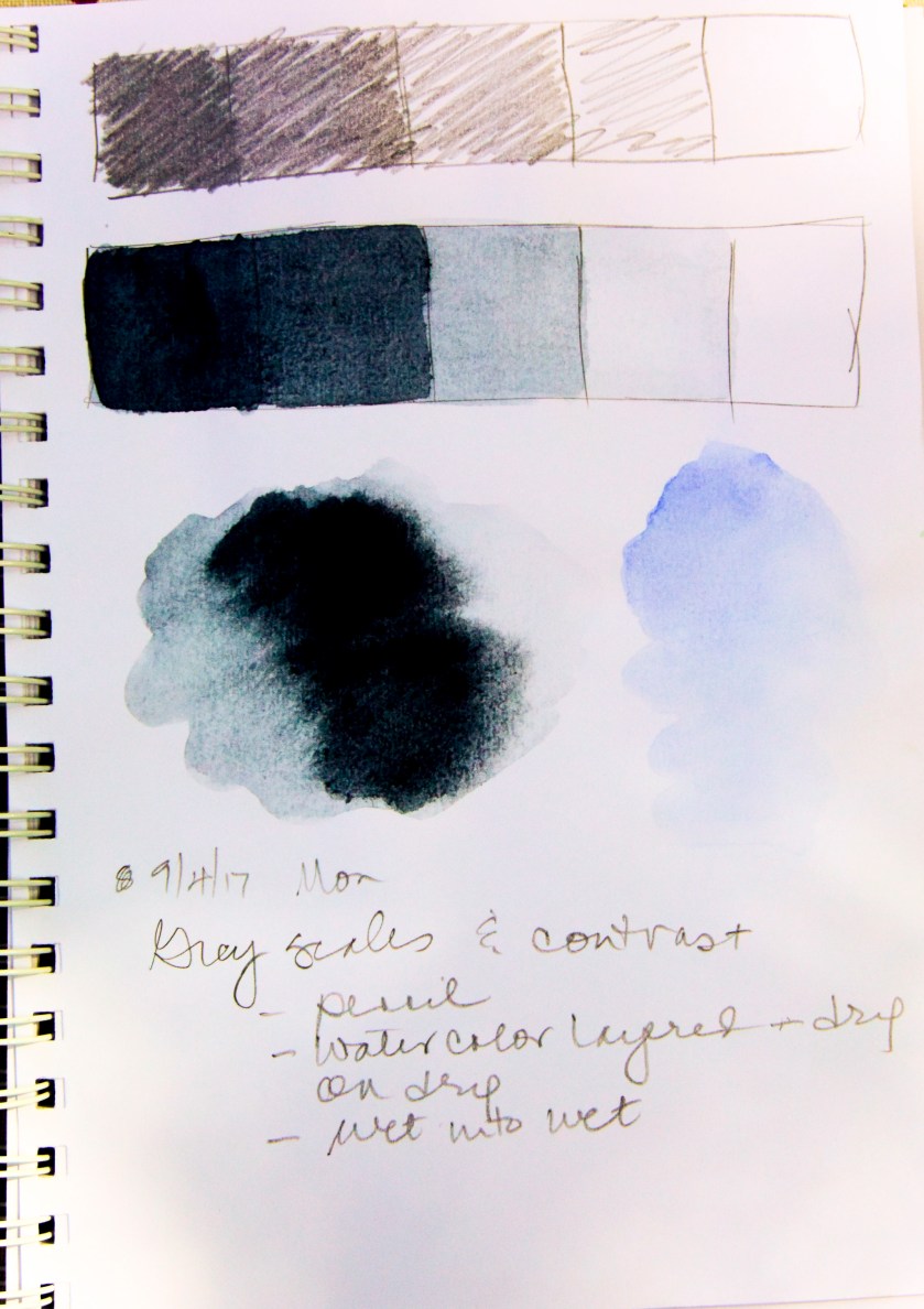
Yesterday, I walked away from my abominations, knowing full well that contrast was the real issue I have. Like I have said many times, I am drawn to color. Color. COLOR! I don’t like doing the “basics” in knitting (i.e. swatching) and I have never given much credence to monochrome studies, even though it has been stated and re-stated multiple times. Finally, I gave in, and did some grey scales in pencil and watercolor. In watercolor I did some wet-into-wet, and then layered washes.

And finally I did a watercolor. The grey-scale study was invaluable – lesson learned!
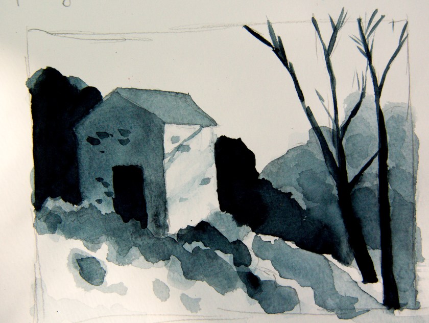
There are parts of the preliminary drawing and final grey-scale study which are good, and some which are bad. I followed a video on YouTube by Paul Talbot-Greaves that was very clear. He has a few others I will look at as well. Seeing something done always helps me to learn. A book is good, but watching the steps a painter takes is even better, especially when recorded and you can go back again and again to do the studies.
The steps I took here began with a simple light wash over all parts of the building – very, very light – into a lot of other areas in the picture. Then I did some medium layered dry washes, just to do them. These are on the bushes and foliage behind the two trees on right. the building had wet-into-wet, moving it into the bushes in front of the door. At this point, I had my white and middle value established, so I thought it would be fruitful to do the very darkest areas next. I think it was a good idea as it then allowed me to then return to shades between the whitest and darkest shades. This study was in Payne’s Grey on a student-grade Strathmore paper.
I also found another video, but cannot find the link for it. There was an excellent suggestion of creating a grey scale, and holding it against colors as you paint. What shade is your yellow or red? That will help with the contrast. Right now, let’s see what I can do with a few colors . . . this is gonna take a lot of discipline! But, I am doing it, which is more than I was a few weeks ago. Yay!


