Waiting for the Tide: A Boat Study

For most people, like me, who like to paint or draw but have little formal training, shapes can be challenging. I’ve taken art classes when I was in college, but the fact is, most American colleges fail terribly at providing practical knowledge to their art students. Too often the dictum is essentially “Go forth and create!” without any foundational information. In my adult school art classes, there is far more information to be had, and when I see fellow classmates from Asia and Europe with superb technical skills, I feel overwhelmed. How the heck do I get that?? But, on the other hand, they like my messy art and wonder how the heck to get that!

So, we are stuck. All of us. We all face challenges in how to do or express things with whatever medium we use. For me, shapes are most often the biggest challenge, and maybe that is because I prefer landscapes to people or buildings. I am working on meeting these challenges, and YouTube provides a lot of help in all areas confusing. My current challenge is to paint boats. I don’t have an easy way to get their correct shape.

So, enter YouTube and three methods to get a boat shape: figure 8, blocks, and a petal shape with lines and crosshairs. All work. The simplest is the figure 8 method, and that is what I applied here. I used a reference photo and then superimposed the figure 8 method to the boat. It took a bit, but below is the boat – a simple sailboat anchored at low tide.

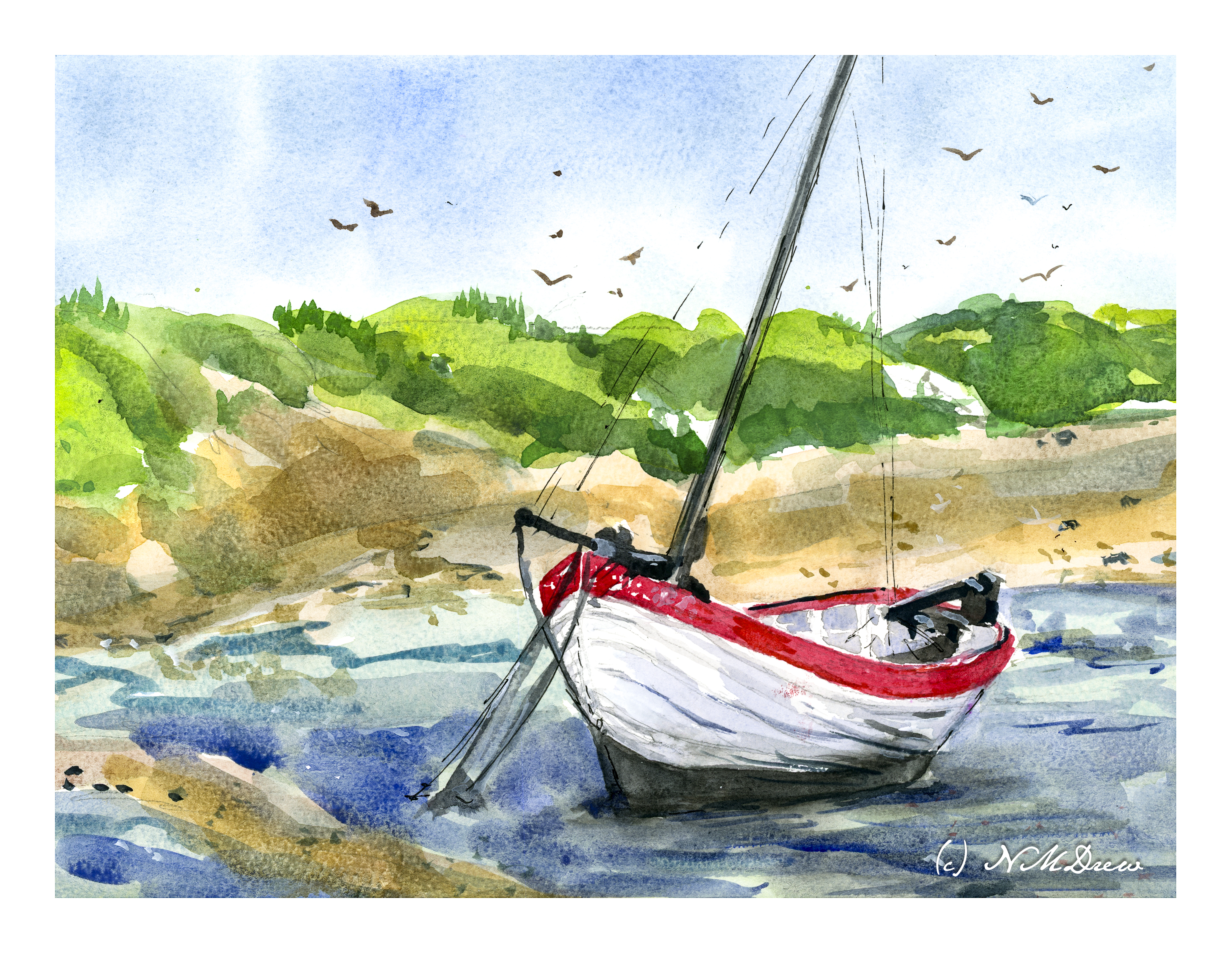
I drew several figure 8 boats with pencil and paper, but painting one proved a bit of a challenge. It took awhile to get my mind wrapped around the image and then the figure 8. Going from figure 8 to boat with pencil and paper was easy, but looking at a real boat required more work. Still, not really displeased with the end result of the boat – she’ll float – and that is the point of this painting: a boat that looks real(ish)! As far as the rest of the painting? It’s just there for filler.

Watercolor, Bockingford 140# CP, 9×12.

Along the Shore

It is always worthwhile looking at the works of various painters, regardless as the medium in which they are creating. The works of Edward Seago have a charm to them which is old world, peaceful, and hearkens to a quieter and simpler time. This painting is based loosely off one of his oil painting of the eastern English coastline. What attracted me was – and is – his vast skies. The low lying shoreline beneath such a magnificent sky is worth trying out. The same may be said of the watercolors of Edo Hannema – he, too, finds the work of Seago, and Edward Wesson, as sources for inspiration.

In Southern California, the sky, where I live, is almost always blue. No clouds, little haze. Humidity sits at zero. (I won’t discuss the vast amount of lotion I use!) However, the big skies of the midwest with towering clouds, or the piles of clouds over New Mexico, are in my memory, and so the clouds and moist skies of a wetter clime draw me.

Here, I used the 1.5 inch flat brush for 90% of the painting, resorting to a small flat brush – 1/4 inch – for some detail. Large washes, wet into wet, some glazing. Paper is Arches 140# CP, 16×20. The large brush is becoming a favorite for sure!

The large brush helps me keep my colors clean and think about masses rather than details. Big to small. I am also refreshing my water as I move along – this took about 2 or 3 refreshes – and cleaning off my palette, too. With a large brush, large washes, a lot of color is used. Clean palette, clean water, and, of course, a clean brush. The results are beginning to be seen.

Winter’s Day in the Dunes

There are days which are blustery and cold, the wind whipping through your hair, and a walk on the beach, slogging through sand, and enjoying the wild freshness of the sea is not a bad way to begin a new year!

Wishing you and yours the best in 2022.

Across the Dunes

I enjoy gouache a lot because you can rework places and easily blur edges to soften them. That is a lot harder in acrylics. I decided to give it a shot. It worked rather well for the sky, but like gouache, the whites in the clouds darkened more than I thought they would. On the other hand, I did work on the sand a bit, using very thin water glazes for the shadows. That worked out pretty well.

I realize the key to “getting” acrylic painting is to just keep doing it, experimenting, trying. Each painting, successful or not, is a lesson.

Acrylic paint on unprimed Arches 140# CP. 9×12.

Church in the Dunes

Southern beaches, from the Carolinas around Florida and along the Gulf of Mexico coast, have a quality very unlike that of California or New England. Soft white sand, beaches beautifully wide and flat, sea oats, and dunes that catch the breath. The sky is vast and expansive, clouds build up, and there is something grander than can be described. I am trying to capture this, from reality and from imagination.

If you have noticed, over the past several months my paintings, in pastel, gouache, and watercolor, have been centered on the theme of water. Rivers, ocean, lakes. I am beginning to feel comfortable with water now, and it is time to expand the subject matter. Now, simple buildings are going to be included, and sand. Sand is remarkably hard to paint! It varies from dark beige-brown to incredibly bright and white. There is also black sand, but I’m not there yet!

Today’s painting is a church, tucked in the dunes of some coastal island. Sandy, dirt roads run between dunes with scrubby vegetation. It works.