Sketching with Shari, iii

Another pleasant break to be had yesterday afternoon! Tasks and chores shucked and done; dinner to be prepared. In between, back to Shari Blaukopf’s short course on ink and pen and drawing.

I tackled the section on drawing people, and I think I accomplished my task quite well. As always, a few good tips really helped move my sketches into more successful areas – in particular the one about getting the shape of the shoulders correct and then moving up and down the body as needed.

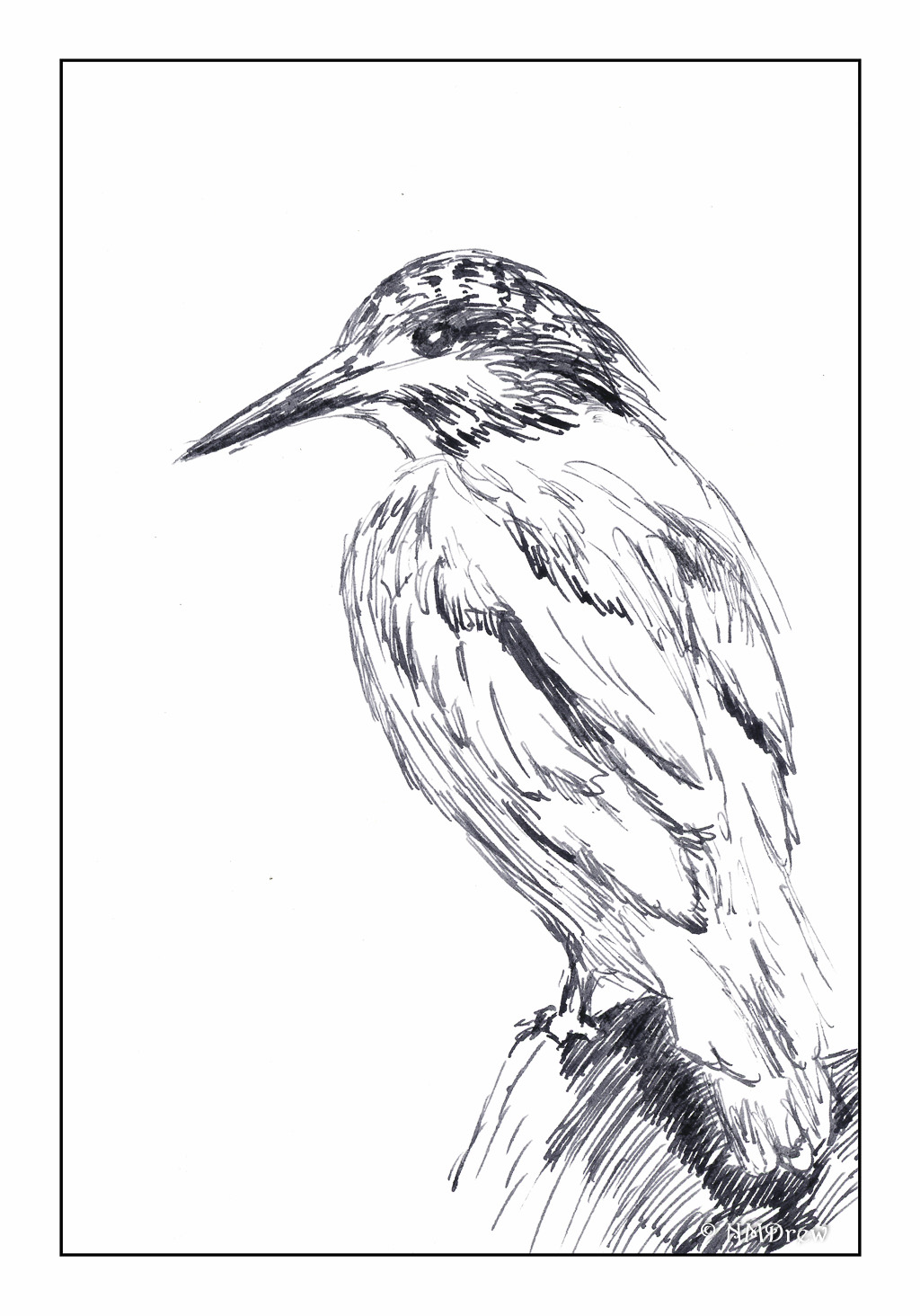
The hands in the above drawing are not at all good, but such is life. The basic drawing was done in pencil, which I did not erase after applying the ink. The line drawing was done using Sailor’s black pigmented ink, and the washes were done with India ink, diluted to make the washes.

From there, we moved on to water soluble ink in color. The color Shari used, and which I bought, is called Ancient Copper. The pen I used is my trusty Spencerian nib in my vintage Edwardian pen hold made of silver (yeah, posh!). The Spencerian nib is great as it provides a very fine line, but with pressure yields a good thick line.

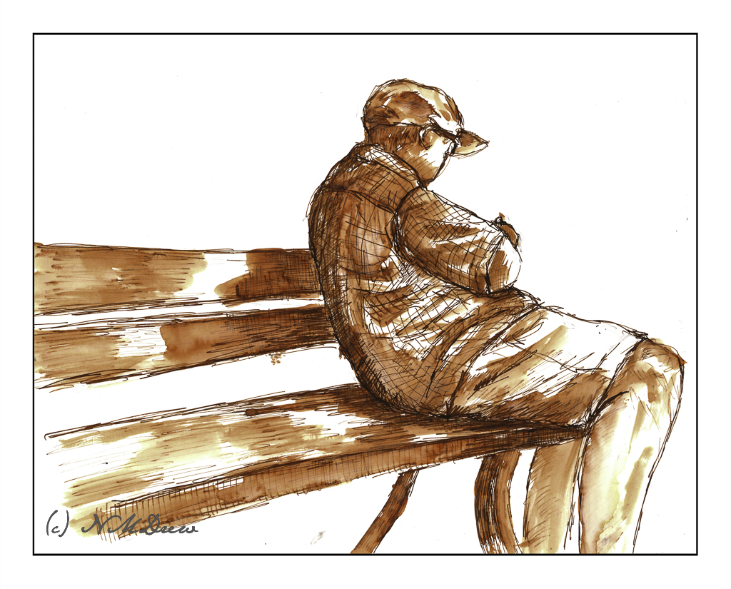
Looking at my signed and scanned image, it looks like there is black ink used here, but there is none. It just shows how scans can mutate color, but also just how variable the ink itself is – from on the nib, to dissolved with a brush dipped in water and applied across the lines.

First a pencil drawing, then outlines and cross-hatching with the pen. Darker areas have more hatching. Then, let the ink dry and erase the lines with a kneaded rubber eraser. From there, a brush dipped in water to create the lights and darks by applying it over the lines. Areas with more lines = darker areas. Then, while the paper was damp or dry, I used my dip pen to apply more ink. In particular, I used it to outline the man, his clothes, and the edges of the bench. This helped emphasize contrast and to help separate different areas of the drawing from other areas.

Bristol paper, 11×14, India ink, Sailor pigmented black ink, Ancient Copper ink, Spencerian dip pen, brush.

Pen in Hand

I am a firm believer that handwriting and its practice is important for a lot of reasons.  It is an excellent way to learn fine motor control.  It has been shown to improve thinking skills in children.  You do it with a pen – no need for a computer – paper, too.  Writing implements and paper run from super cheap – hey, steal that pen you use at the office! – as is paper – to crazy expensive.

Jake Weidmann’s Ted Talk is worth the watch – so many reasons presented as to why penmanship and writing are so important.  There is history, there is pleasure, there is beauty, there is – there is – there is.

And then, yesterday, for whatever reason, I came across a 7-day course on learning Secretary Hand, the hand of scriveners, scribes, clerks, and everyday people who needed to write things down 500 years ago.  I began today..I thought I would write down my thoughts about it using my homemade iron gall ink and a genuine, hand cut quill. Read it if you want some more information.  The recipe I used to make my own ink is here – and it is still fine a year later!

This is my first exercise, with notes to myself as to how various letters were made in the 1600s as opposed to in the 2000s. Back then, the alphabet consisted of 24 letters, not our 26. I and J were interchangeable, as were U and V. There are different ways to make various letters, such as the S, depending on the letter’s location within a word. H can be made in the way we recognize it today, or in a form of shorthand that lends itself to quicker, more casual cursive.

And finally, here is a sample of my alphabet in cursive. The top sample is using my homemade ink and using a dip pen nib from the 1800s along with my nib holder from the same era. The bottom sample is with the same ink but with a quill pen.

My own lessons in cursive began in third grade.  The style we learned was very typical for American school children, based on the Palmer Method of handwriting, the goal of which was a clean, functional, and easy-to-read handwriting.  I’ve changed a few of the letters around, to suit my taste, such as the capital A, M, N and Q – they are based upon the letters in the Spencerian alphabet.  Additionally, they lend themselves more readily to writing with a dip pen, fountain pen, or quill in my opinion.

Cursive is designed for speed in writing.  As someone who taught for several years, I find it appalling that kids today say, “I can’t read your handwriting,” meaning cursive.  They print.  Sometimes they are told they have to print since their cursive is abominable, and a computer and keyboard and printer are not available.

So, Secretary Hand will continue to be practiced.  It’s fun to learn something new, as well as by learning how to write it, I will actually be able to read documents from the early modern times of the 1500s-1600s!  Sounds pretty cool to me.

More to come!


Documentation

Over the past week, I have been fermenting iron gall ink. Today I decanted the mixture, and here is my first attempt using it. I used a quill pen I cut from a turkey feather, and a dip pen using a flex nib. The paper is a Clairefontaine notebook with very smooth paper.

I am documenting this historical moment with some documentation . . .

Iron Gall Ink – A Quick Update

I spent most of the day dyeing with indigo on yarn . . . and some silk. A long day! But, on the list of things to do was to decant the iron gall ink I have been making over the past week.

Success! It is a really beautiful ink! It flows well off the flex dip pen nib as well as the quill I cut a few days ago. I’ll blog a bit more about it later, as at the end of a long day, I’m really tired, but really content with both the dyeing and the ink.

Kingfisher (Drawn with Iron Gall Ink)

This morning I did a quick sketch of a kingfisher using iron gall ink using a dip pen.  As you can see, there is a bit better variability in lines than when drawing is done with a quill pen (see yesterday’s post).  Both have qualities I really like – expressiveness, boldness, delicacy.  As I am used to using fountain pens, a dip pen is no problem once I learned how to control the amount of ink on nib.  What must be remembered is how to load the nib, and as nibs are all different, a bit of testing on scratch paper helps.

At present, I am deciding if I want to colorize this drawing – which is why for now, it is not!  If I do, I want to use very dilute but vibrant colors.  It is my hope that the ink will shine through the paint without my having to re-ink parts of it.