Nowhere Barn

Addendum!

This is the second scan from the final one below.  I changed a bit of the elements after doing a preview scan – don’t know why the one on the bottom of this post is so, er, intense!

Now, let us continue . . . 

More perspective studies!  Today I did a single point study.

This time I created a single vanishing point.  This one is below the building, and above the road.  The idea for this is that the road ends up going over a hill or slope before the horizon, at eye level, is met.  I did a pencil sketch and erased it a billion times.  Finally, when I liked what I did, I erased most of the lines after inking it in.

Sort of a value study combined with a color study to see what I might like for color mixes in watercolor.  This paper is mixed media paper, so it is not the heavy Arches 140# cold press I like for most work.  I think the perspective works pretty well.

Well!  Aren’t these colors intense!  The scan for some reason just came out like this – the original is a bit more subtle – but I rather like it as I think it expresses the intensity of color that sometimes comes with lowering clouds and a storm.  Makes me think of my time as a kid on the plains of the midwest.

So, the final study does have decent architectural perspective, and perhaps even some atmospheric (lots of atmosphere, but more like pressure type!) insofar as I tried to simplify things.

I will continue my focus on perspective, and using it in different media.  Watching videos, referring to books, and just doing it is helping.

Perspectives

As the watercolors were still out, I decided to play around with perspective, specifically architectural perspective.  I think I get atmospheric perspective now – cooler colors, less detail, etc.

I did this one above some time ago in 2019.  I focused on the roof of the hut, but also wanted to try a bit of the atmospheric element of perspective.   It worked out okay.  Broad strokes, too, were worked on as I tend to do fiddly little dabs with a brush.

Here I did a few buildings linked together from somewhere in Maine.  I tried to use one part of the painting to connect the other parts.  By this I mean I looked at the roof slope of the building on the right in the picture, and tried to match in my painting.  From there I tried to create perspective and proportion in direct relationship to it – walls, windows, etc.  The road, too, was important as I wanted to show it narrowing the further away from me it became.  One thing I found intrinsically challenging was the roof line on the right – the slope of the roof moving onto the side of the building.  From one angle to another angle, yet no roof on the right showing.  That was a real eye-opener when I realized what was going on.

Finally, architectural perspective mixed with the natural landscape.  What a bit of building this is!  Boat launch / beach moving up a hill with a roadway that hairpins right and left, as well as castle or fortress walls descending into the hillside.  I rather liked this one – and it was fun to do some pen with watercolor drawing.

Altogether, I can see some progress, as well as areas for improvement.  Lately, I am so unconcerned about the final results of what I paint.  Rather, if there is an area that works or I see improvement, I am thrilled!  Wabi-sabi.  And if the whole picture works, man, that makes my day!

The Slough II (Gouache)

A different view of The Slough, gouache, and some perspective problems, both atmospheric and size.  Sigh.

Still, I will say parts of it I really like.  One thing I enjoy about gouache is the colors are so cheery if you don’t turn them into mud.  Mixing is such a challenge with this medium – you need a lot of white to make light colors unless they come like that out of the tube.

WWM #20: Buildings

Where I live, a building is a house surrounded by the rest of suburbia.  I don’t live in a city.  I don’t live in the country.  Sometimes I wish I could transport myself to someplace so very different than where I live now.  That said, one can travel in one’s imagination, and that is what I have chosen to do here – a street in the early evening somewhere in a gracious part of an old city.

While this is not a perfect painting, I did have some goals in mind while painting “buildings” for the #WorldWatercolorMonth2019 prompt.  One was to really work on perspective.  It’s pretty well nailed here.  Another was negative painting – keep some paper white.  Here, the chimneys up in the sun.  I wanted details to show perspective – the closer to the viewer, the more details, as can be seen the closer to the right the buildings become.  A lack of detail to show there is distance.  Finally, I wanted to use light glazes to designate where the sun is on the upper buildings, and not on the lower part.  Here, light quinacridone gold on top, light cobalt on the bottom.  I rather like the way the street is striped in shades from dark to light, but as to whether it is realistic is not a question I care to answer.  In general, I think the sketchy elements of the watercolor work well with the colors and lines to convey feeling and mood.

For “buildings” I knew I wanted a loose, light painting.  This one is on a small sheet of paper, and I expect the final image is about 6×8 inches (could measure, don’t feel like it!).  I used both small and large brushes, a bit of imagination, a bi of memory of previous reads on perspective.  I found the most interesting thing I did was to do the sky last!  I really think it works well with most o the painting.

Later!

Atmospheric Perspective, iii

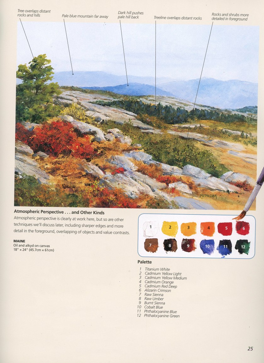
This is the end of the first section of Phil Metzger’s book on perspective, which is all about atmospheric perspective.  This means, colors demonstrate depth.  Cooler colors and lighter colors recede, warmer ones move forward.  Of course, this is not a hard and fast rule, but one which is generally true.  For instance, warm colors become muted with distance and atmosphere.

As you can see from this scan, page 25 of Metzger’s book, he demonstrates this principle.  While I work in watercolor, he worked this particular study in oils.  The palette is very close to many palette choices by watercolorists.   As you can see from the study, cooler colors are in the distance, and while there are some warmer colors – namely yellows – in the mid-to-distant areas, they are muted.  Further distant mountains are paler than ones closer.  Pine trees in the distance are blue-green – atmosphere at work.  Detail is less in the distance, and greater the closer the painting is the viewer’s eye.  The same with colors – warmer to the front.

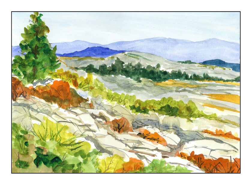
This is my quickie rendition of Metzger’s study.  My colors are similar although not the same in all instances.  To move the middle ground further away, along with the mountains, I glazed the entire area with a light blue wash; I also did this to unite the areas.  The yellows in the midground are dulled with violet as well.  The closer I got to the front of the painting, the more pure my colors became.  The oranges were sometimes straight from the tube.  The greens were mixed with yellows – that is green with yellow, green with raw sienna.  Oranges and greens were also used.  I added detail to the foreground using a rigger brush to create rock cracks and branches.  Watercolor is not oil painting, so my techniques were a bit different.

Some Thoughts

Metzger’s book continues to hold my interest.  In part it does because it is practical in its approach, beginning with color as that is what most painters “get” immediately.  From here, we will be moving on to other elements of painting.

I am enjoying the exercises and Metzger’s explanations.  There is enough detail to explain, but not so much I am bored or overwhelmed or both.

Finally, there is a freedom here – so far I am not doing horrid barns that lack perspective!  I have done a lot of those (which shall soon be posted), and am looking forward to the day that my grasp of perspective will be second nature.