

Loquats for the Picking
A couple of weeks ago I took a photo of loquats, not really ready to be eaten, but certainly not too much sooner!
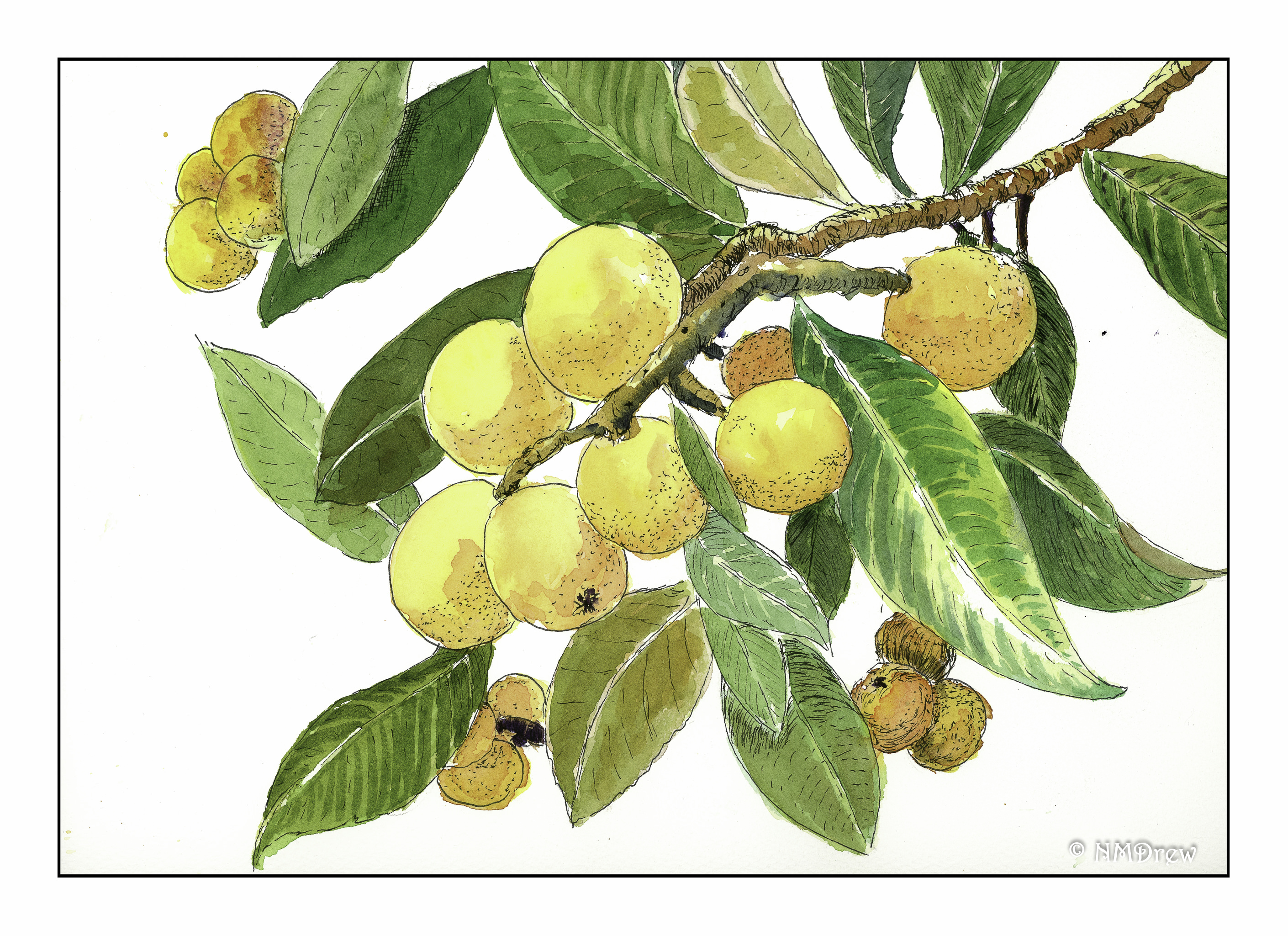
The loquat is a fruit tree indigenous to southeastern China. It is frequently grown in California gardens for its fruit and decorative qualities. The fruit is a pale yellow to a golden color, and the leaves are stiff and dark green. The contrast of the roundish fruit with the wide, pointy leaves makes for an interesting painting subject.
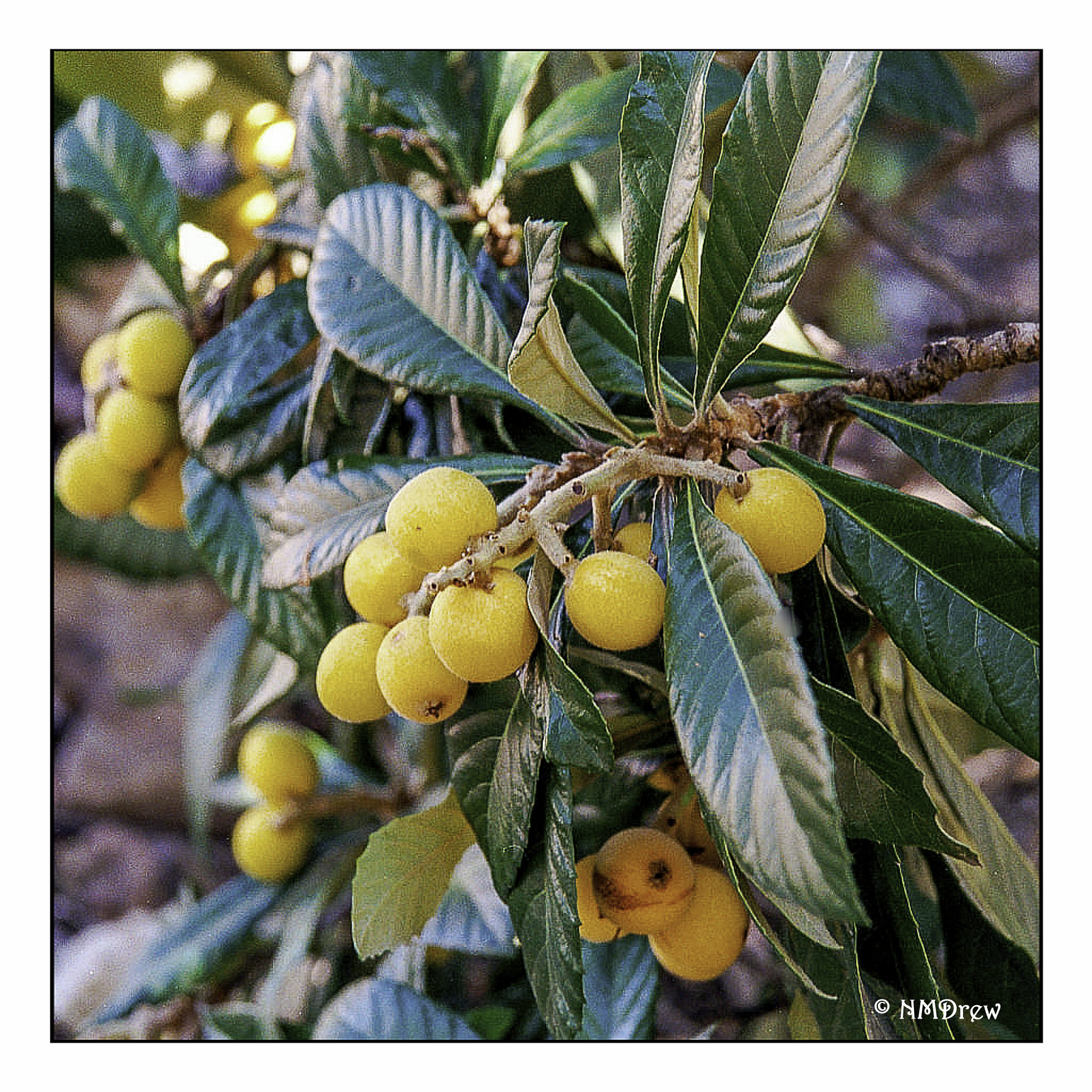
The photo from which the drawing evolved:
Painting the loquat has a bit of cross-cultural history behind it, too; ink painting tradition honors the loquat in Asia.
It would be easy enough to paint a loquat in watercolors, without ink, as well.
A Bit of Color: Loquats for the Picking

A break from the silent 365 project.
Spring is here! In my area, orange trees are in blossom, filling the air (i.e. my back patio) with sweet smells. Flowers are blooming, bulbs are emerging, and the butterflies are flying around! We have not seen such abundance in nature for years here – drought and fire. Today, it is cloudy and overcast, the sky is ominous. It even rained while I was out for a short hike through Wildwood Park to catch what remains of the super bloom. I took my trusty OM-1 and 55mm macro lens and a roll of Provia slide film. I’ve really begun focusing on using film, and enjoying it a great deal.
This image was taken with Fuji Superia 200 and a Niikon N90S camera, and my first roll through this new-to-me camera. The lens is likely my 28-85mm macro lens. Having a film camera with autofocusing is a new one for me – I have an F100 but it is a little quirky – and it performs beautifully. ITh just finished a roll of Ilford HP+ 400 iso, shot at 800, and in development (if the lab doesn’t screw it up) at +1. We’ll see what happens!
Anyway, a few words from yours truly, in need for a spot of color!
St. Inky

Crocus
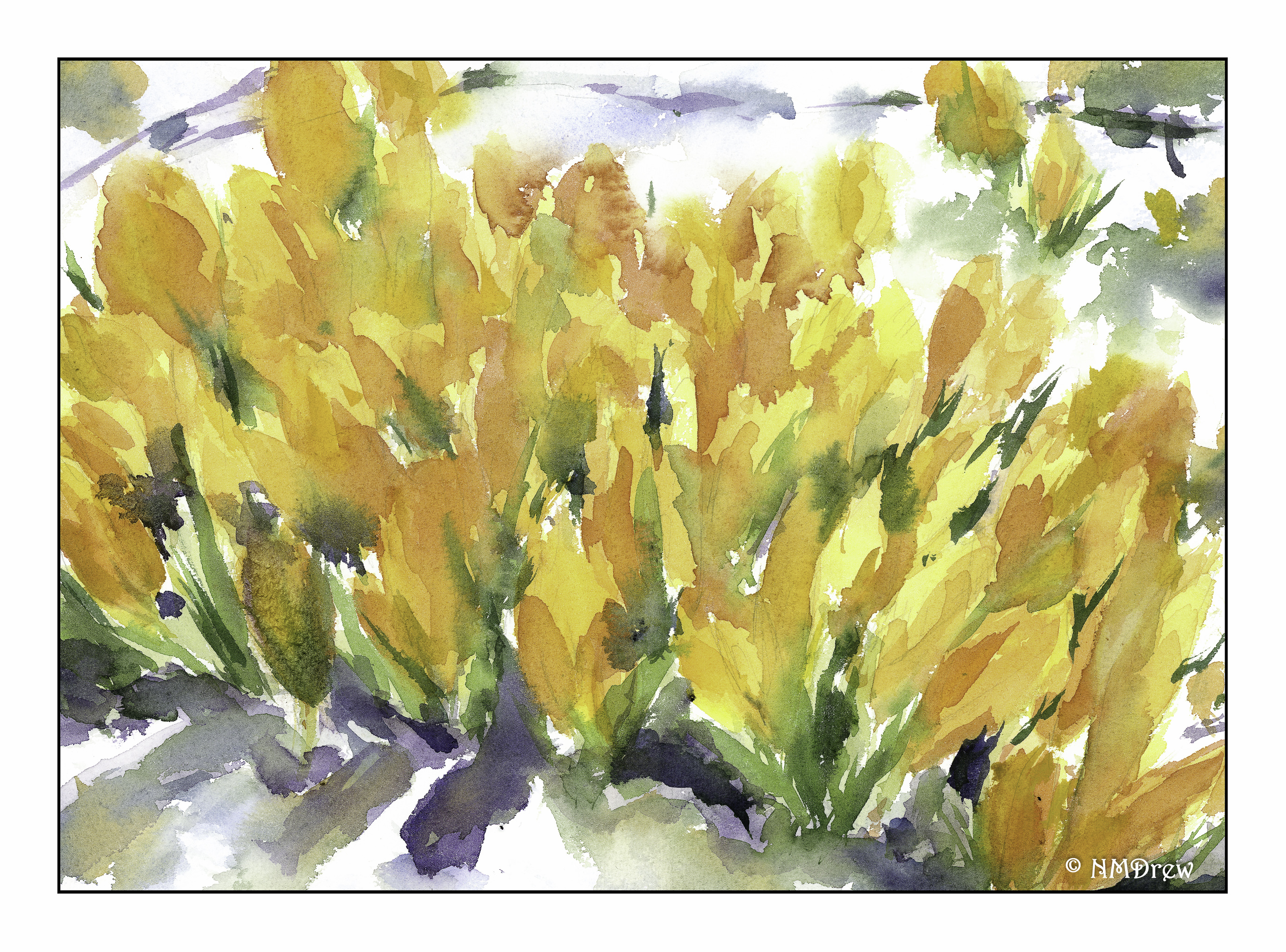
This became more of an impression of crocus rather than a detailed study. To tell the truth, I have never seen a crocus in my life! I can imagine the joy they bring, though, as they peek through the last of the winter’s snow. Hyacinths were the bulbs that bloomed in the snow in the midwest, soon followed by tulips and daffodils. I tried to work with negative space to define the flowers, as well as blur the background and put a bit more detail in the foreground – perspective in action on a conscious level!
This is the reverse side of the paper I used yesterday, St. Cuthbert’s Millford. This paper has a really nice tooth, not smooth or CP, and smoother than rough. It catches the brush bristles rather nicely. Colors are dreamy when blending together. It also lifts well – some color ran into another area and I was able to lift it out and recover to a degree from the mischief. I don’t know if Arches would handle it as well as this paper, but that is something I should check out.
In addition to no longer making masses of mud, I find I am actually remembering things – make long brush strokes, lay down large areas of light colors and leave the whites in the process; think about the direction of the light; a few rules about perspective.
