WWM #22: Rain Forest

I don’t know about you, but rain forests belong in the tropics, filled with tigers and monkeys and long, poisonous snakes.  At least, that is my fantasy.  The French painter, Henri Rousseau, has a number of paintings which are of the jungle, and always make me think this is what a rain forest looks like.

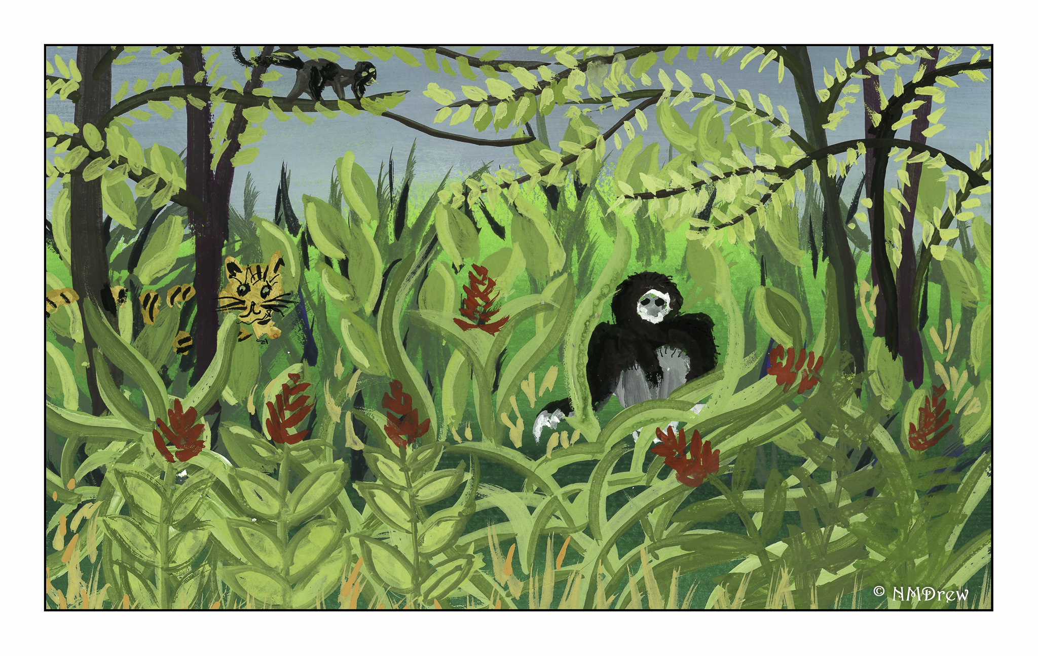
This gouache is a tribute to the wonderful work of Rousseau, and while certainly not on the same caliber as his work, I hope it does convey the richness of his imagination with a bit of my own.  

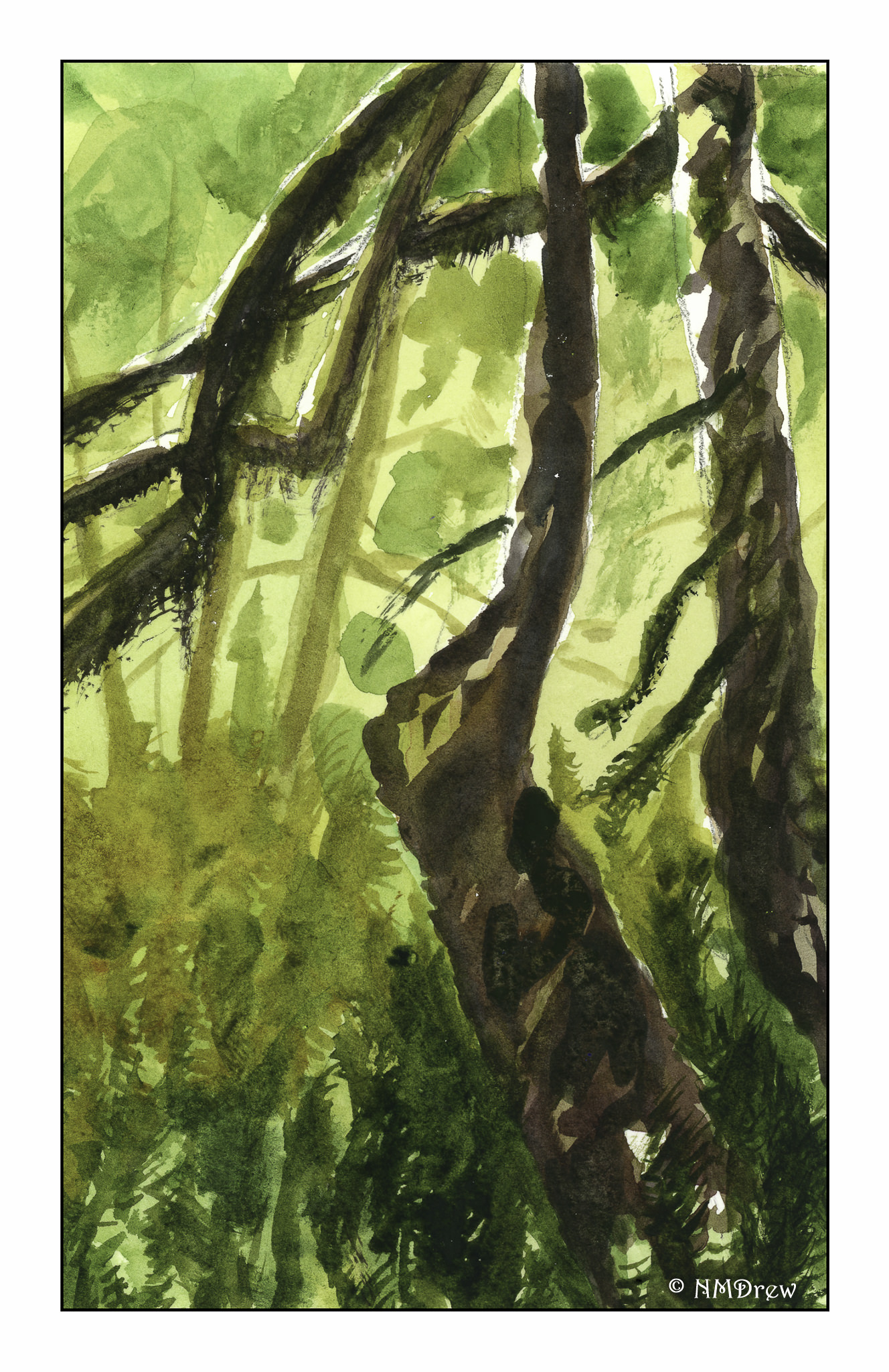
Within the United States, we have a rain forest, the Hoh Rain Forest up in the Olympic Peninsula area.  We went there several years ago on a road trip, and hiking through this forest was an eerie and otherworldly experience.  You cannot see the sky for the density of the trees, branches, and moss overhead.  Following the trail, which was clearly marked, showed you the wonder of a primitive world, bathed in its own soft gold-green light.

WWM #21: Patterns

First thoughts on patterns were patterns in nature, such as snowflakes, basalt rocks, fields as seen from the air, kaleidoscopes.  Nope . . . didn’t feel right.

And then it hit me – sewing patterns.  My studio is used for painting, photography, and sewing for the most part.  All my sewing stuff is in another room or scattered into another dimension as we finish the repairs from a water leak.

Thus, for #WorldWatercolorMonth2019, patterns of a different sort.

WWM #20: Buildings

Where I live, a building is a house surrounded by the rest of suburbia.  I don’t live in a city.  I don’t live in the country.  Sometimes I wish I could transport myself to someplace so very different than where I live now.  That said, one can travel in one’s imagination, and that is what I have chosen to do here – a street in the early evening somewhere in a gracious part of an old city.

While this is not a perfect painting, I did have some goals in mind while painting “buildings” for the #WorldWatercolorMonth2019 prompt.  One was to really work on perspective.  It’s pretty well nailed here.  Another was negative painting – keep some paper white.  Here, the chimneys up in the sun.  I wanted details to show perspective – the closer to the viewer, the more details, as can be seen the closer to the right the buildings become.  A lack of detail to show there is distance.  Finally, I wanted to use light glazes to designate where the sun is on the upper buildings, and not on the lower part.  Here, light quinacridone gold on top, light cobalt on the bottom.  I rather like the way the street is striped in shades from dark to light, but as to whether it is realistic is not a question I care to answer.  In general, I think the sketchy elements of the watercolor work well with the colors and lines to convey feeling and mood.

For “buildings” I knew I wanted a loose, light painting.  This one is on a small sheet of paper, and I expect the final image is about 6×8 inches (could measure, don’t feel like it!).  I used both small and large brushes, a bit of imagination, a bi of memory of previous reads on perspective.  I found the most interesting thing I did was to do the sky last!  I really think it works well with most o the painting.

Later!