Beach Study
I like the beach, in case you haven’t noticed. Grass, sand, cliffs, water, wind.
 I broke down and did a value study for this scene.

Of course, I did it on an accessible page in my sketchbook, but since I did the study before the painting, I knew where I wanted lights and darks. As I worked, I pulled dark areas together to contrast with lighter / brighter areas. I mixed my colors using zinc white, but this time used titanium white straight out of the tube to highlight the ocean waves.
I’ve been wondering why people say “zinc for mixing, titanium for highlights.” Zinc is a transparent white, so it blends with gouache and watercolors without distorting the values. Titanium is a more opaque white, and as a result good for highlights, but not recommended for color mixing.
Lamp

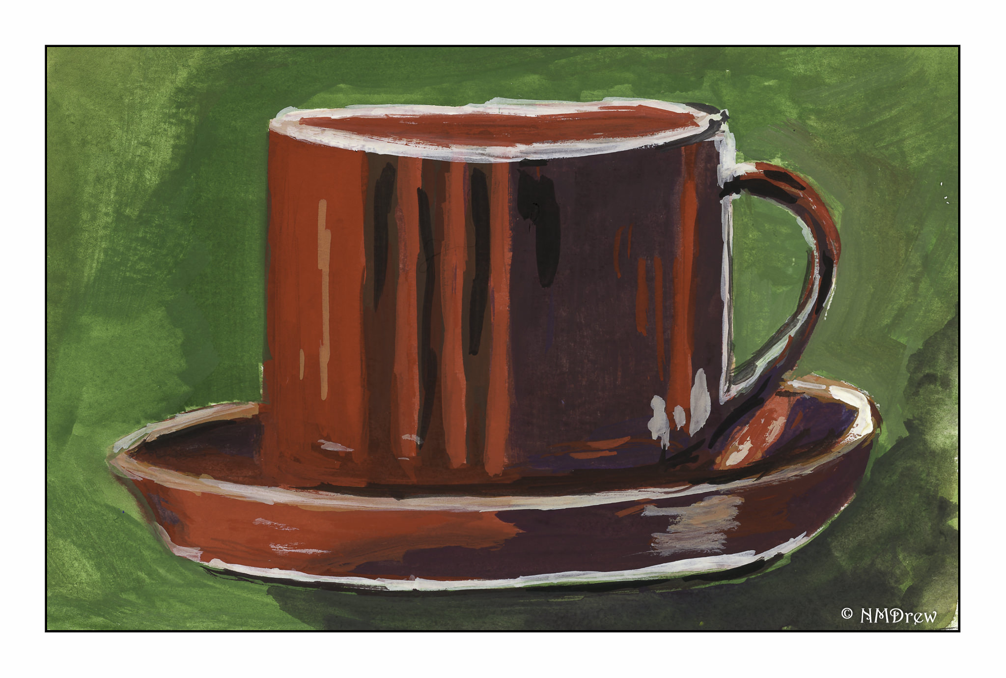
Coffee Cups
Coffee cups are simple, right? Hmm. Circles. Ellipses. Straight lines. Shadows. Reflections.
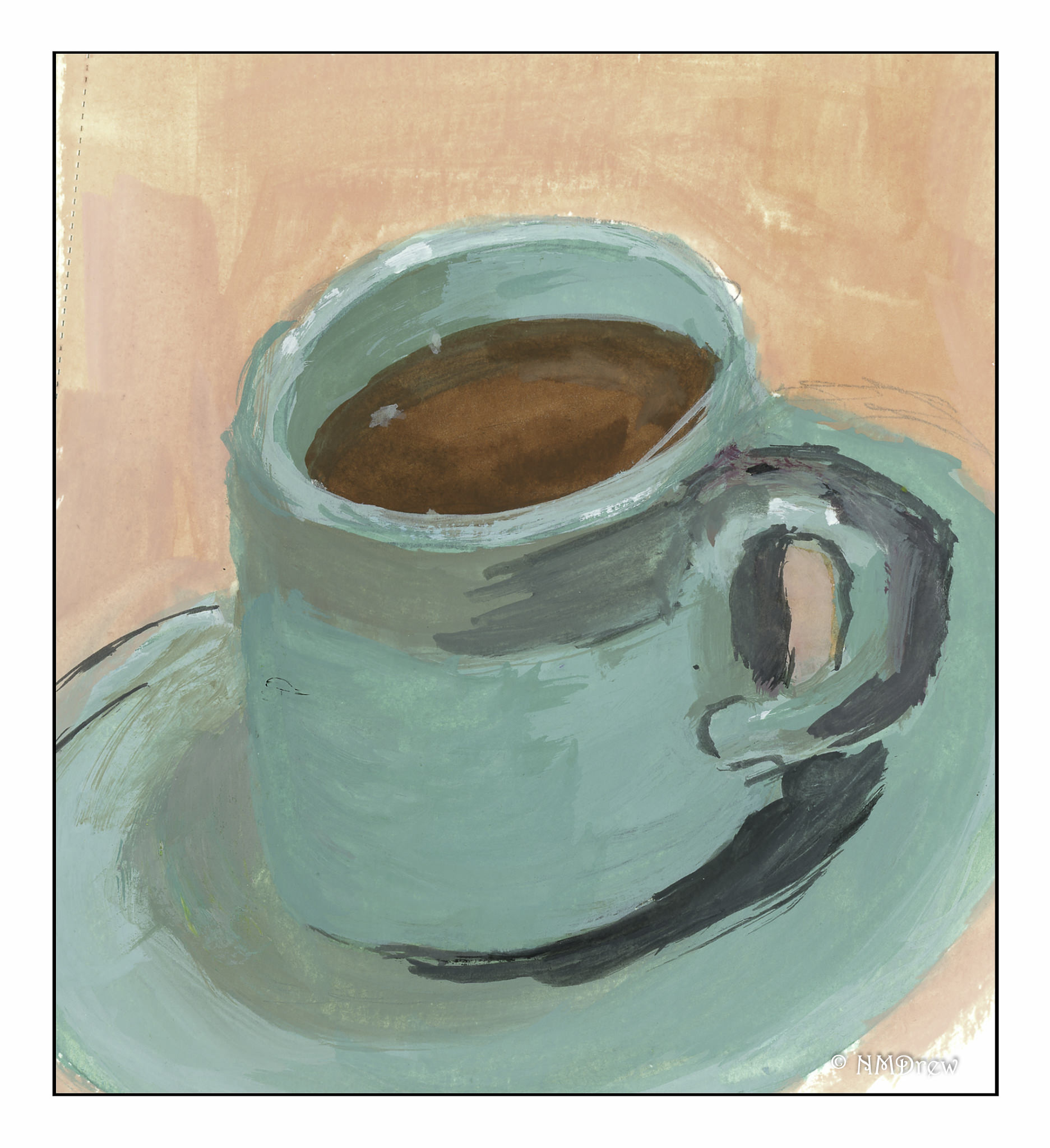
This one is tipping over!
Even with a straight-on viewpoint, the cup is lopsided.

Parts of things are easier to paint because they lack the reference points of a complete coffee cup.
In all of these, I tried to use complementary colors, either as shadows and / or background color.
-
- The first one is a green-blue, so the complement is red-orange. Adding reds and oranges to cobalt turquoise produced some interesting greys for the shadows of the first coffee cup.
- The second coffee cup is red (with some orange) so I used greens, but thought shadows looked better with some violet and deep blue added, with a smidge of black.
- The third cup is mostly a yellow color, with some medium blue for shadows. Additionally, I added purples, blues, and greens to the coffee beans in the coffee cup.
I really need to learn to draw better!
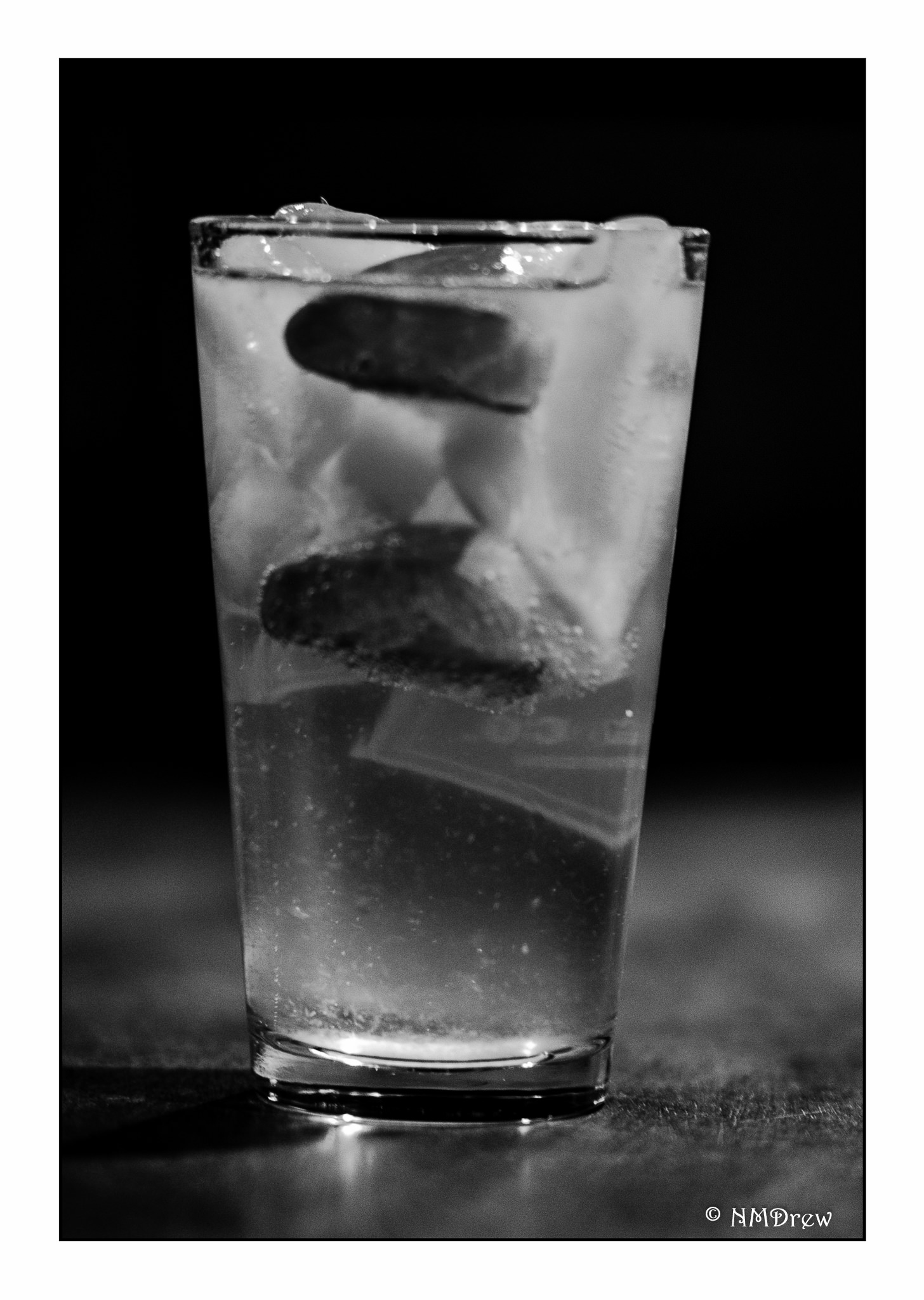
G & T