Anacapa Island

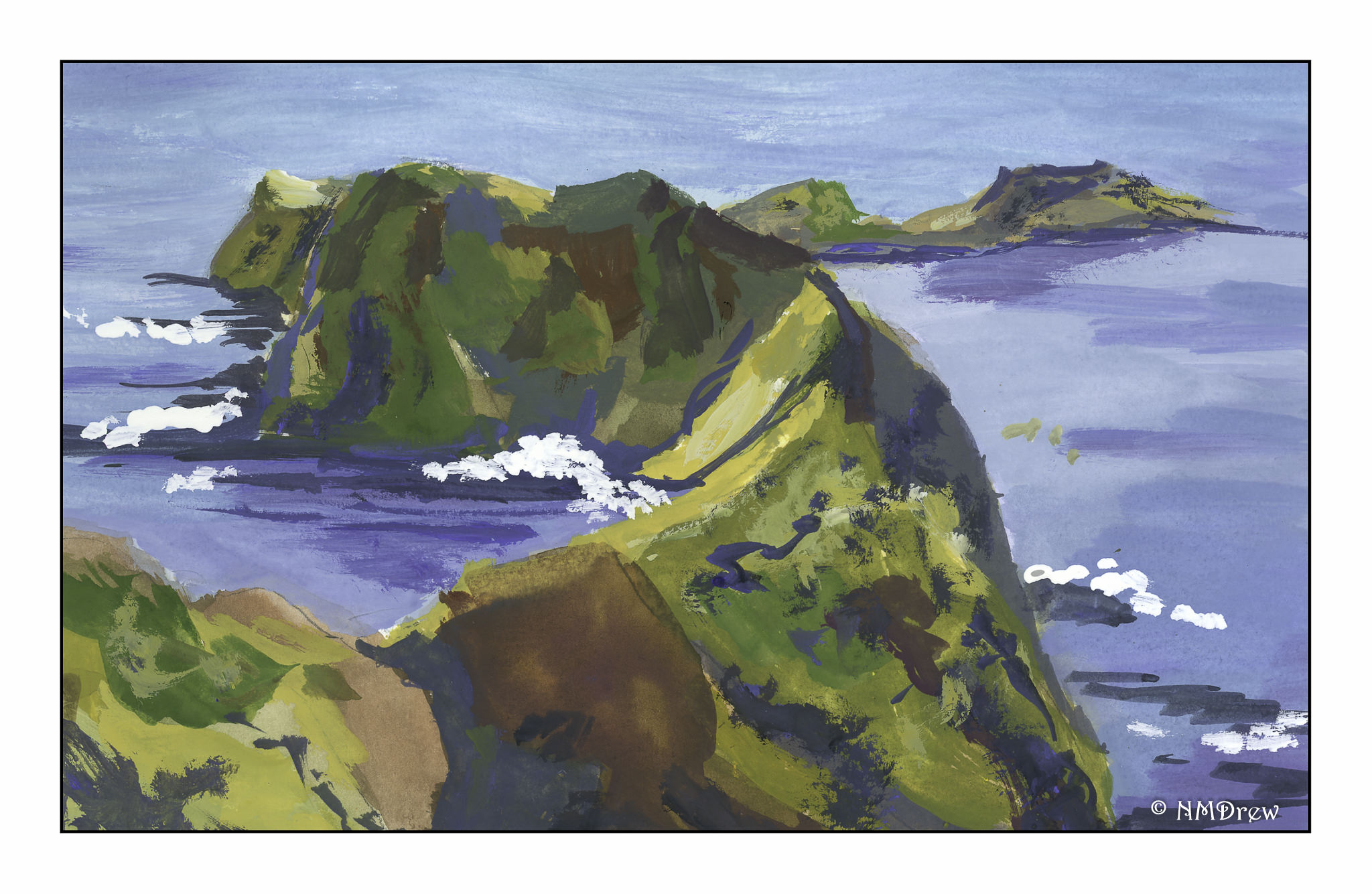
The Channel Islands off the coast of California are amazing to visit.  Only recently (don’t remember when) they became a national park, to protect both the islands and their flora and fauna, as well as to protect the waters surrounding them.  Anacapa is a very distinctive island.  It has an arch on one end, and zig-zags, snakelike, as it emerges from the water.  I have visited this island, both on the land, and in a boat sailing around.  It’s a truly lovely place, one worth visiting, painting, exploring, and photographing.

Here, I finished up using the available paints on my muddy palette.  The final painting with that mess!  As with yesterday’s painting, I have added white to the palette for colors, but for the most part, these are colors salvaged from the mess on the palette.

Truth be told, I really did not expect this painting to turn out at all.  My colors were just such a mess.  I simplified everything as much as I could.  I managed to get some sense of depth, which also surprised me!

Girl on a Bed

I have a fear of painting people.  I cannot even imagine doing a portrait.  For the past several days I have been debating on deliberately focusing on people or buildings and perspective.  Guess what won?

As with many of my paintings, this is from an image on Pixabay.  A girl is lying face down on white sheets; she wears a grey T-shirt and her face is not visible.  It would be easy to try to put in facial features and overwork a picture, and this is why I chose such an anonymous person.

At this point, I am simply looking at proportion, light, dark, shadows.  In general, this worked out okay – the right hand is a bit off, but that is not what I was aiming for.  I worked to keep everything simple, as well as use up paint on my muddy palette.  I added zinc white, of which I am using a ton, as that has been missing from the muddy palette for weeks!

Clouds Above the Fields

I don’t know about most people who paint, but I expect every painting to be a masterpiece.  Of course, this is silly.  I don’t think about practicing things, such as painting clouds.  However, I watched a few YouTube videos on cloud painting and decided to give it a go.  I found a picture on Pixabay I liked, filled with clouds, and a plowed field stretching to the horizon.  To me, it just seems a bit ridiculous not to try to paint a masterpiece each time – really, practice – so a finished picture it is.

Clouds really are variable, but there is a tendency to overwork them.  Here, I simply tried to get a sense of white-white-white and ways in which clouds have contrast, shadow, distance, and how they look in the sky.  These are rather poofy ones, without any defining characteristics other than that.

Since this was practice, I put in some black ink lines just to see how they “feel” in a painting.  Don’t know if I like them . . .