I have shot B&W film with a red filter, and a light yellow filter and have been pleased with the results. Recently I used an Orange 21 filter and got mixed results. The equipment was an OM-1n and Ilford FP4+ 125 asa film. The lens is a 50mm f3.5 Zuiko macro lens. I shot the film at 100 asa, but my battery was dead, so I did the Sunny 16 rule, and hoped that doing settings I think would work without a filter would be adequate. I did well with the yellow and red filters, but not so well with the orange. Admittedly, I still don’t “get” filters – I really need to study them in greater detail – but you (and I) can read about them here. And you can, of course, google all about them!
I take my film to a local lab to be processed, whether color, slide, or silver-based black and white. They do a fairly good job. I can have film pushed if I want it, too. I scan the film myself, whether 135 or 120, using either a Pakon scanner or my V600. The results are decent. I clean things up in LR or another program, depending on what I want. Sometimes I do more in post, such as noise reduction, vignetting, etc.
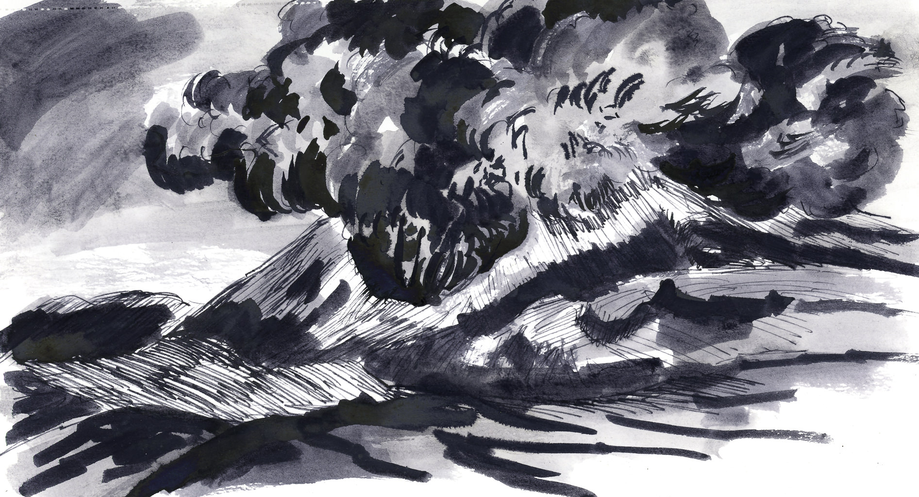
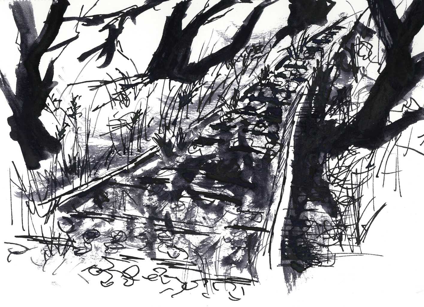
The Ilford FP4+ is considered to be an excellent film. When I scanned the pictures, they ended up with a rather reddish brown cast – was that the scanner, the processing, or the orange filter? You can see the totally unretouched photos below.
")
")
")
")
")
")
")
")
")
")
")
")
")
")
I am not really pleased with any of the above photos. The orange filter turned the red rose the same shade as the leaves. Contrast of light and dark disappeared. I plan to shoot another roll of FP4+, without a filter, to truly assess my like or dislike of this film.
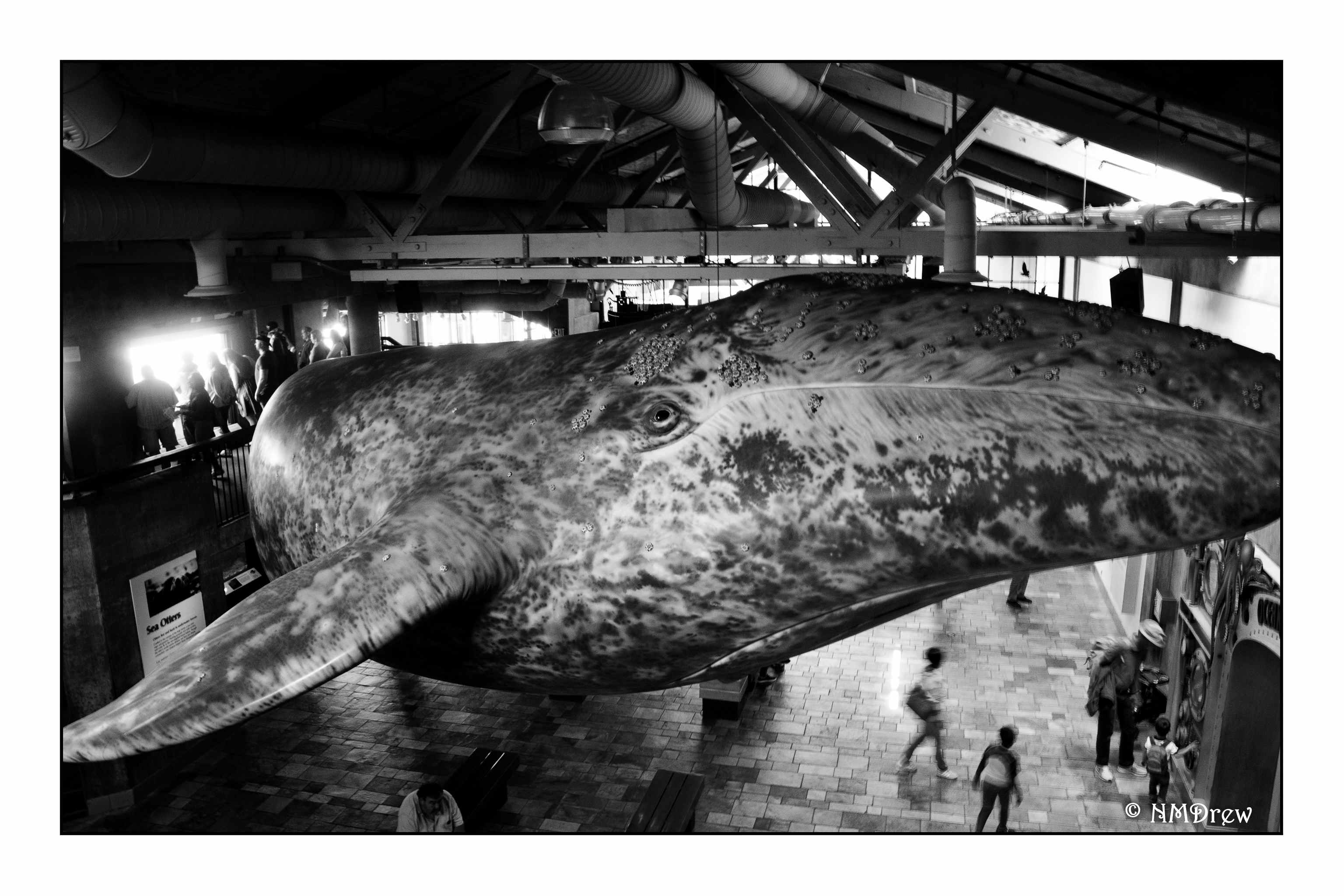
Post-processing can change an image immensely. Noise can disappear, dust and threads on the film can be eliminated, and contrast and exposure adjusted. I do these digitally, just as you could do in a regular film dark room. Here are some of the images I could clean up – and some needed a heck of a lot of work, let me tell you!


I even managed to one into a color picture using preset in On1 Photo Raw 2019!
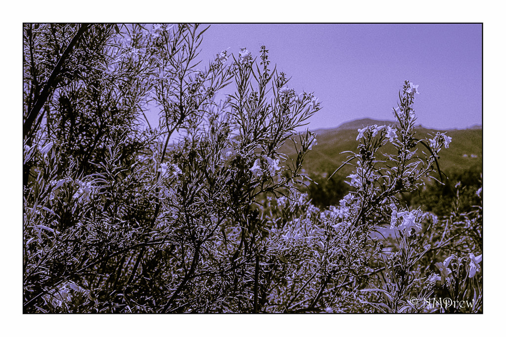
Crazy stuff! It will be interesting to try to reproduce this colored picture sometime in the future. Meanwhile, back to the film cameras!