A Pair of Pears

By far, this is the best of the 4 pastels I have done thus far.  It sort of came together.  Watching a YouTube video helped, too, to get an idea about how to proceed.

I used my fingers for most of the blending, and used a baby wipe in between to clean up dirty finger tips.  I also worked the primary background and foreground first, working around the pears before doing the pears themselves.  For the Saguaro painting, I had done the cactus first and then the sky – not really successful as the sky became a bit smudged with the greens.  Live and learn!  I used a torchon / stump for the areas closest to the pears and in the shadows to help isolate things.  I cleaned them off with rough sandpaper – 100 grit.

Another thing I did was consider color and complementary colors in the painting.  I simplified and did big areas before moving into smaller and more defined regions.

Of course, not all paintings will be this successful!  It’s fun to compile knowledge and start using it when creating a picture or painting.  The simplicity of this painting pleases me, but it was a more complex process than may appear because of the multiple layers of color put down.

Pastels

I have had a few boxes of pastels, hard (Nupastel) and soft (Rembrandt) lying around for years. I finally found a class on pastels through the local adult school. It’s 8 weeks long, so a lot can be learned in that time. The teacher is also good, organized, and capable of teaching a wide range of people. I am learning a lot about a medium I have never really used, and that makes me happy. I always think of pastels as “drawings” but it turns out they are actually considered “paintings” because of their being made of pigments. I guess charcoal and pencil produce drawings.

In each class there is a focus.  The one below was the very first one – paper and strokes, and a study on how to set up the Rule of Thirds in a painting.  The photo we worked from was quite different than what we were instructed to do.  Simplification of the overall photo along with placement of points of interest where the lines of the Rule of Thirds intersect.  We also experimented with different strokes, atmospheric perspective, and color.  I like the colors and textures I got here.

This one is one I did on my own. I tried to catch the coldness of a winter day. I used a blue paper for the base, and worked at keeping the distance simpler than the foreground. As usual, I really do struggle with depth and perspective, and had to work on this a bit.

Below is our study from last week’s class. The focus of this lesson was atmospheric perspective, meaning how distance and atmosphere change with distance. The sky is lighter at the horizon than higher in the sky. The further things are from the viewer, the more the atmosphere changes their detail and color. The foreground is brighter and darker (though I cannot quite get what the teacher means when she says that – I should ask – but I think she means the colors are more intense). Distance means paler colors and simpler shapes. I really worked a lot on this one once I got it home – my foreground was just a mush of color all in the same tonality. I laid in a lot of white and lighter colors to create the sandy soil in the foreground for the final image.

This next week we will be working on clouds during the day – not sunset, not sunrise. I saw a video on YouTube about this same thing, so I plan to watch it before next Monday’s class.

Spring’s New Leaves with a New Spring Camera: X100V

I was naughty and . . . “gear hound” that I am (and that was a great term from you-know-who-you-are), got the new Fuji X100V. I am a Nikon shooter, so this was an adventure into new territory.

So, why the X100V?

When the X100 series was started in 2011, I was drawn to it, but really could not justify buying it. The reasons then were partly financial, but also I was still learning photography and had Nikon digital and film cameras, with F-mount lenses. I like my Nikon systems and have no complaints about them at all – solid performers producing results I like. However, I am lacking something small and portable and sophisticated enough to challenge me.  YouTube videos were singing its praises. So, I bit the first day B&H had it up for pre-order.

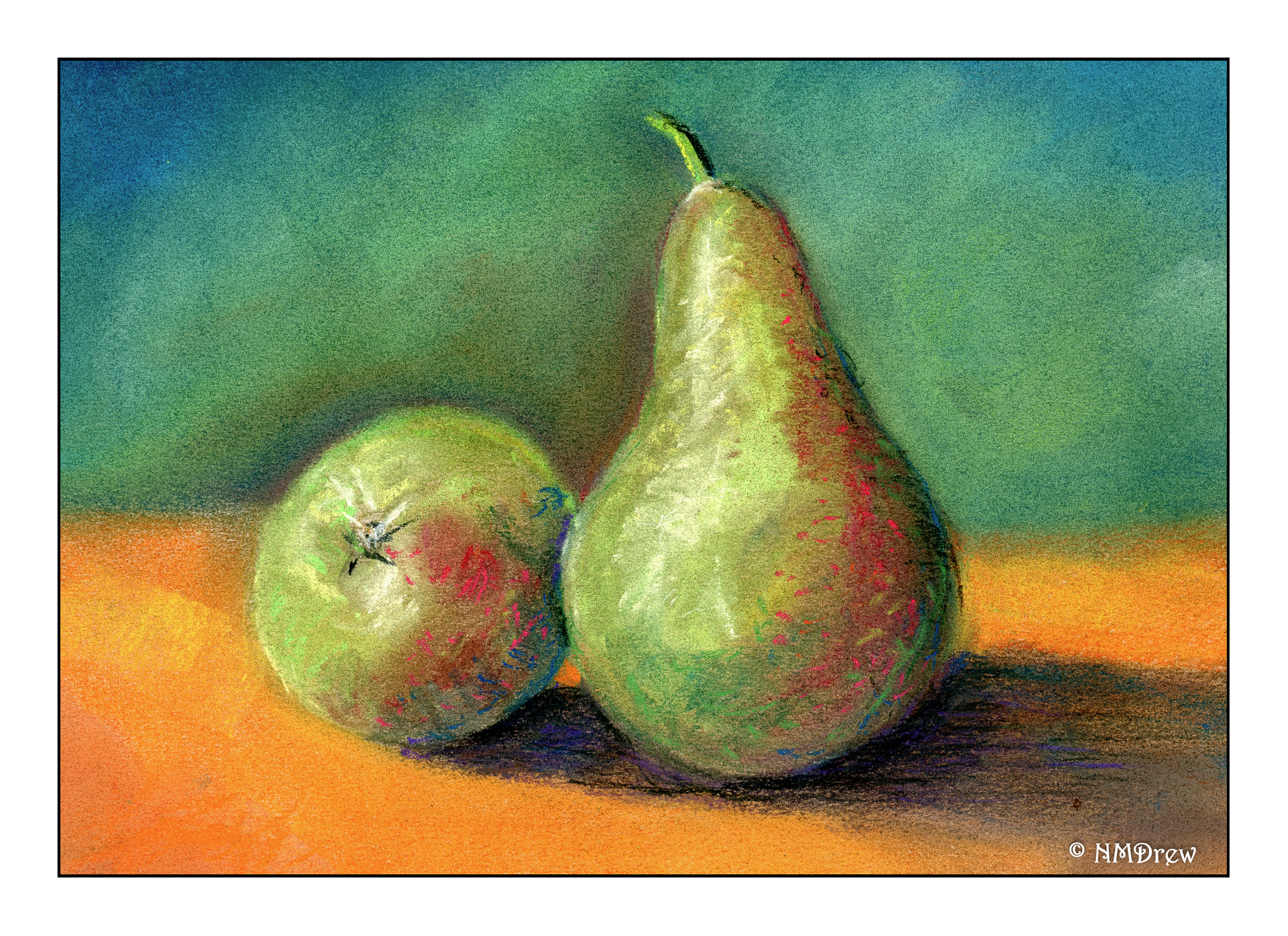
Beyond the hype of YouTube users discussing the camera itself prior to its official release, some yay, some nay, I am finding this to be a bit of a confusing camera.  Experience will lessen this for sure.  The confusion lies in its menu system  – all new to me.  As I play with it, I am finding a rich ability to customize images and aspects of the camera. I doubt I will use all of them, but it is intriguing – like a good novel – and makes me want to learn more. What I found I really like is that I can make more than 4×3 images – I can set the camera to make 9×16 and 1×1. Further, the X-Trans sensor (I think that’s the term) is different than Nikon sensors, so color rendering is different, and the visual differences are very nice.

The X100V has a new lens (23mm equalling a 35mm full frame), an upgrade from all previous models in the X100 series.  It also has the ability to replicate various Fuji films, and that is becoming an exciting element in this camera.  You can set color preferences (i.e. the Acros setting, with a red emphasis) to push the film in various directions, as well as add grain.  Creative fun in the camera settings – how cool is that?

In using it for a day or so, I can see this will be a take-everywhere-I-go camera.  I usually have a film camera with me, but the film speed can limit what I can do.  A fixed focal length will challenge me in composition, but the fact I can get within 4 inches of a subject is very attractive as I like macro photography, and this is pretty close.  The lens fall off (or bokeh) is very pleasant, and the lens is, as everyone has pointed out, very sharp at f/2.  The tilt screen is useful, too; I have one on another camera, but I never really think about using them.  I expect I will be more likely to now.  It is also a touch screen, as is the other one I have, and I do like that element.  The X100V also has the ability to use Bluetooth to transfer to other devices, but if you don’t turn it off, it gets warm and burns through the battery as it searches for a device with which to pair.  I turned it off.  I am not likely to use it, but you never know.

Finally, I found initially I could not use the RAF (raw file extension) files in my Lightroom set up.  Hmmmm.  I converted them to DNGs using Adobe Converter.  Later, a bit of research showed me I was using my old standalone version of LR.  I do have the annual account for LR and other Adobe products, but for some reason the Lightroom Classic CC had disappeared from my system.  An upgrade to it, and we now have visible RAF files!  Yay!  This is when you have to love the internet!

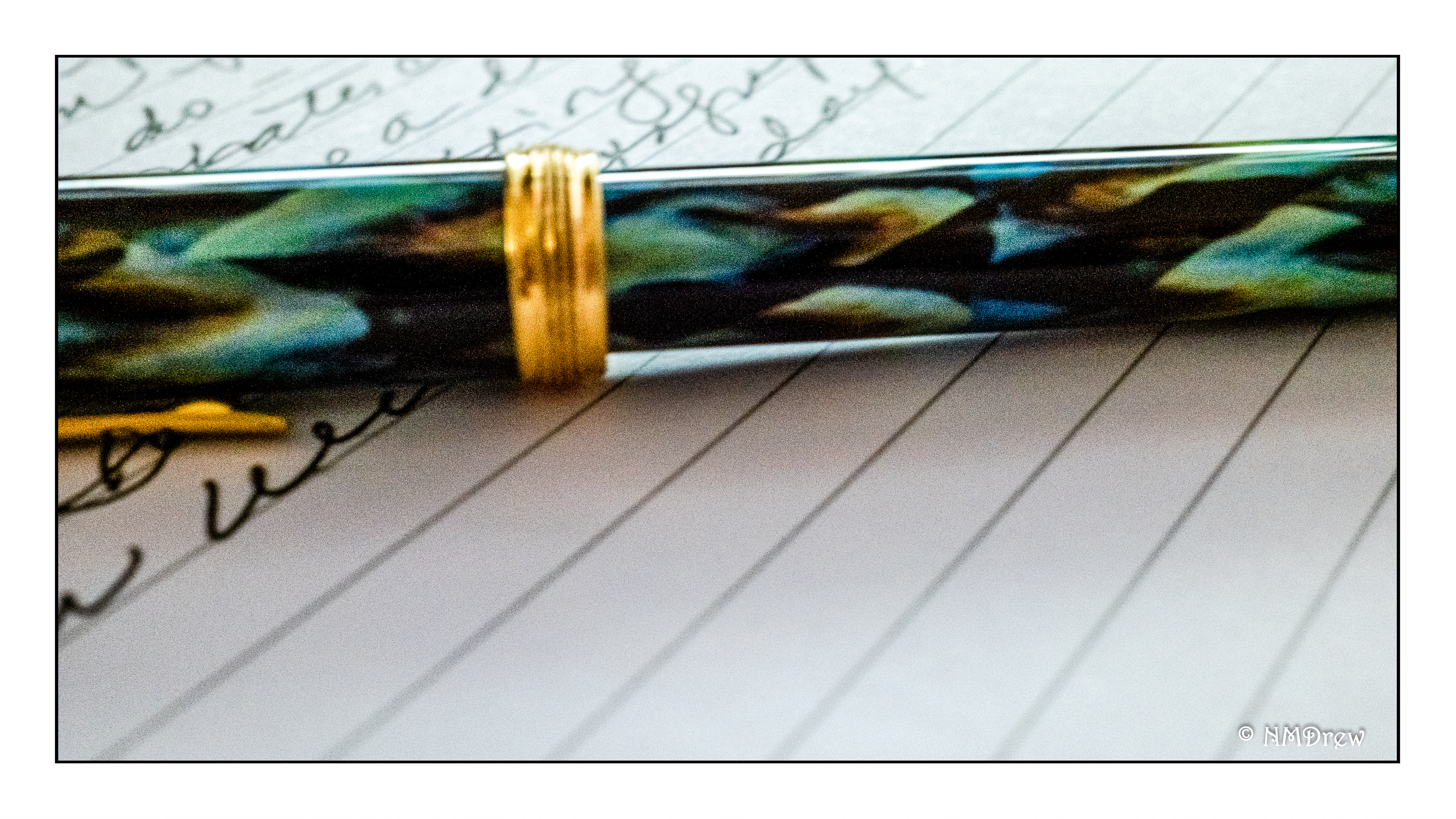
The image above is pretty much a simple edit of the RAF file.  I upped the lighter greens a tad, put is a soft vignette to lead the eye, and the usual framing and signature.  Very little work required.  The raw files really caught the bright green of the new leaves.  The jpeg did, too.  Here is where the Fuji sensor seems stronger than the Nikon ones.  The detail, too, is well caught.  Technique used, per LR, is 1/210 sec, f/8, iso 1000.  I posted the full version of the image just to show off what the lens can do.

Keeper!

Saguaro

This is my third pastel, and second subject from the class on Monday.

There are some things I learned in doing this pastel.  First, the large cactus has to be put in after the sky because it is just too big – the sky and the cactus – to work around.  The mountains and smaller cacti are fine.  I had to redo the sky a bit, and if you look, you can see halos of the cacti in the sky.  Live and learn!

I also had to totally redo the foreground – it was all the same tonality!  Midtoned.  So, I went in and worked in a lot, a lot, a lot of lighter colors.  It worked.  Before there was nothing leading the eye to the big cactus- now there is to some degree.

The foreground plants in the corner are also at issue here.  While they are lighter than the middle ground’s plants, they are not quite right.  I need to increase the contrast within them, I think, to help them become individualized from the sandy dirt around them.

Finally, it is interesting to realize the importance of fixatives in the process of doing a pastel painting.  Harder pastels don’t create as much dust (Nupastel) as do softer ones (Rembrandt).  A “workable fixative” is necessary as the layers go down.  A “final fixative” is applied when the painting is done.  I have both, but the final fixative still allows the pastel to be rubbed off to some degree.

So, third painting, and I am getting the hang of it.  Still very amateurish – my lack of depth perception always seems to get me.  “Look at the light!” is my constant reminder, as well as the tricks of creating distance in a 2-dimensional painting.  Gouache painting has proven to be very helpful here.