Perspectives

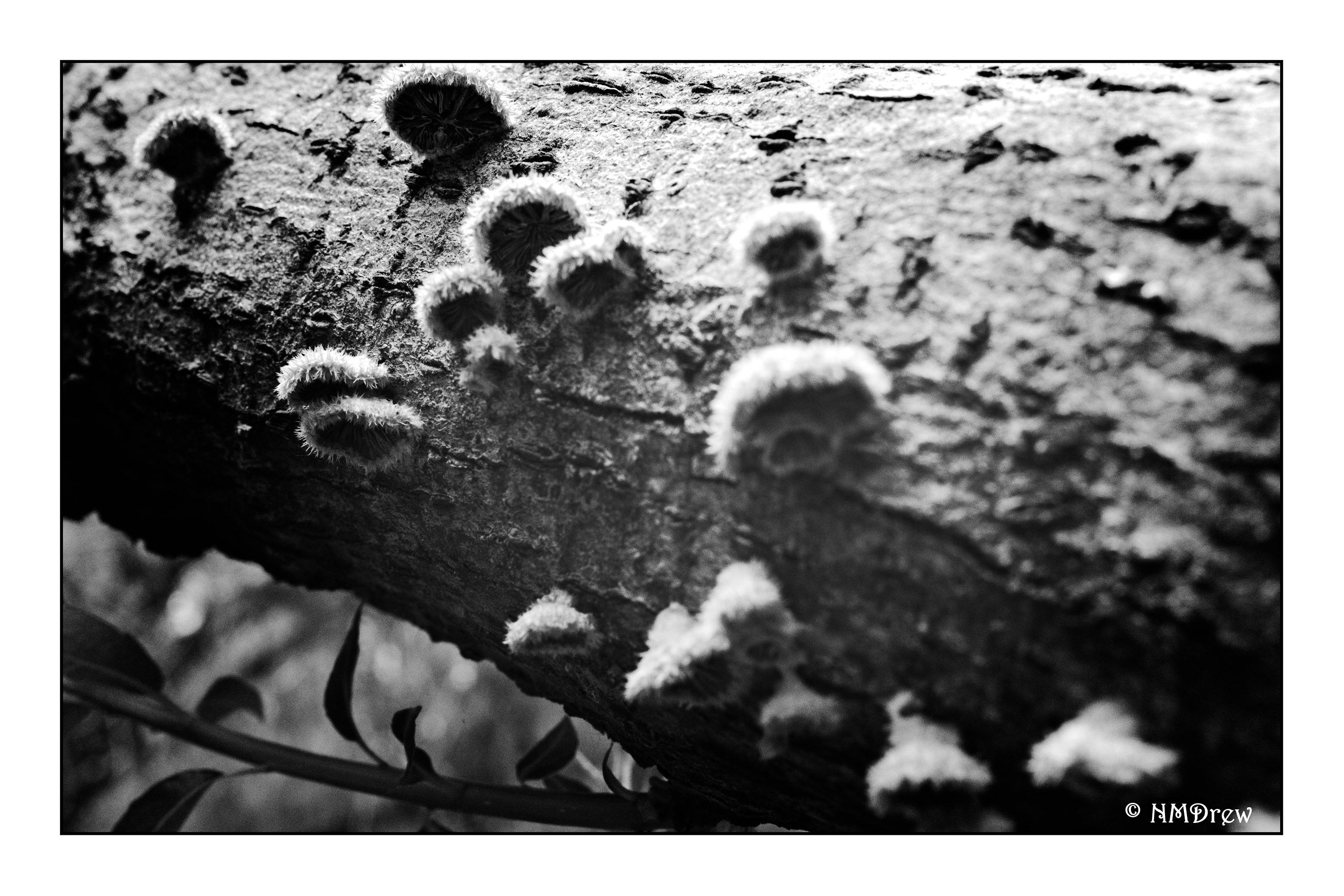
As the watercolors were still out, I decided to play around with perspective, specifically architectural perspective.  I think I get atmospheric perspective now – cooler colors, less detail, etc.

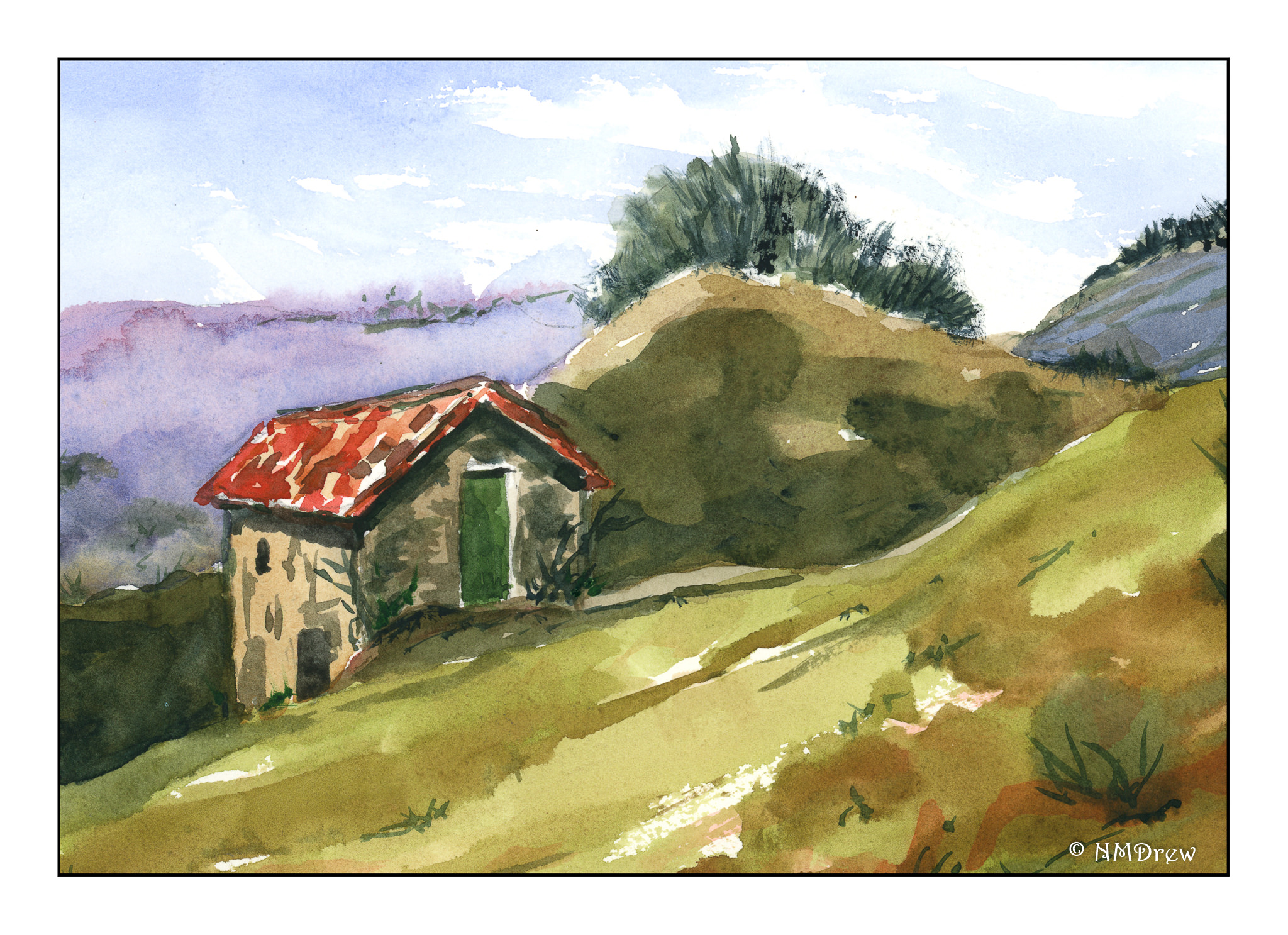
I did this one above some time ago in 2019.  I focused on the roof of the hut, but also wanted to try a bit of the atmospheric element of perspective.   It worked out okay.  Broad strokes, too, were worked on as I tend to do fiddly little dabs with a brush.

Here I did a few buildings linked together from somewhere in Maine.  I tried to use one part of the painting to connect the other parts.  By this I mean I looked at the roof slope of the building on the right in the picture, and tried to match in my painting.  From there I tried to create perspective and proportion in direct relationship to it – walls, windows, etc.  The road, too, was important as I wanted to show it narrowing the further away from me it became.  One thing I found intrinsically challenging was the roof line on the right – the slope of the roof moving onto the side of the building.  From one angle to another angle, yet no roof on the right showing.  That was a real eye-opener when I realized what was going on.

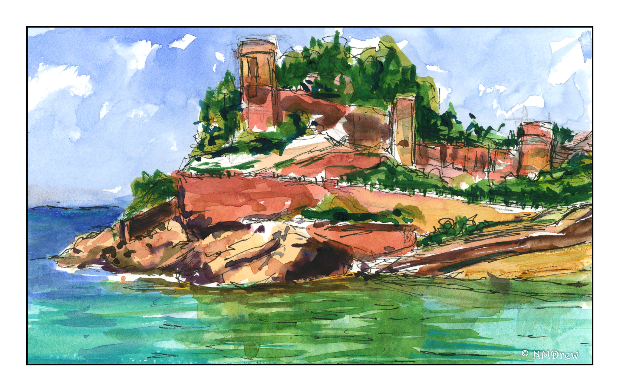
Finally, architectural perspective mixed with the natural landscape.  What a bit of building this is!  Boat launch / beach moving up a hill with a roadway that hairpins right and left, as well as castle or fortress walls descending into the hillside.  I rather liked this one – and it was fun to do some pen with watercolor drawing.

Altogether, I can see some progress, as well as areas for improvement.  Lately, I am so unconcerned about the final results of what I paint.  Rather, if there is an area that works or I see improvement, I am thrilled!  Wabi-sabi.  And if the whole picture works, man, that makes my day!

Death of a Bird

A couple of weeks ago I saw a fat rat run through the patio. We found droppings along a wall. The exterminator came and put down some sticky traps. A week later . . . a rustling sound under a tray. It sounded like feathers. A pause. Another rustle.

I am a coward, I admit. My husband deals with vermin. I orchestrate the traps or whatever. He came out, and I went in. He wouldn’t let me look, nor would I.

It was a bird, on the ground, caught in the sticky trap.

My husband snapped its neck, and I am crying as I write this. It’s evil to kill a bird. Not too evil to kill rats. I really don’t even like the idea of sticky traps for rats as it is an awful death.

Never again will a sticky trap be placed anywhere by anyone near me. Please think twice an three times before you put them out.

Tanglewood (Watercolor)

Here is the third painting in the series of three different media, this in watercolor.

For this painting, I used a piece of 16×20 Arches cold-pressed paper.  I laid down some frisket to keep the paper white for sunspots of leaves and the edges of the trees.  From there, multiple initial light washes to establish areas of color (ie sky, leaves, leaf mould, trunks) and from there just sort of let it happen until I was ready to remove the fisket.  Once that was done, greens and darks, and finally the rigger brush for tree branches.

Each painting has it good points and bad points.  Watercolor is the least forgiving of the three, but here I think I did a pretty good job as I do get a sense of the flickering light through the new leaves, and that really was the main point.  This painting and the gouache are my favorites of the three.

It will be interesting to perhaps try the pastel again as I ordered a set of 25 greens and just took possession of a Terry Ludwig Darks 2 set the other day.  The greens are Mount Vision and will arrive Friday.  The pastel was the first in the series, and now that I am comfortable with the values of the painting(s) more, a 4th try and a 2nd pastel may prove to be a good exercise!

Tanglewood (Gouache)

The second painting in my series of three, in three different media.  Today this is in gouache.  My previous post showed the photo from which these paintings are derived, as well as the pastel which I did the other day.

To date, I think this is one of the better paintings in gouache I have done.  Two differences here:  1)  I used hot pressed Arches paper rather than cold pressed.  2)  I made sure I kept my paints moist by spritzing them, and covering them with saran wrap between painting sessions – keeping the paints moist made the job of painting much easier.

Smoother paper (hot pressed) allowed the paint to move more easily on the paper.  Keeping the paint moist added to that experience.   I really put effort into keeping the paint about the consistency of cream and spritzed the paints when they stopped looking glossy.  The only area I rather wonder about is the right middle ground – I may want to redo that a bit.