
The Alabama Hills in California are stunning. Seasons are harsh and beautiful. Here, pen and ink to get away from perspective and buildings! Why is it that nature is so much easier and relaxing to paint?!

The Alabama Hills in California are stunning. Seasons are harsh and beautiful. Here, pen and ink to get away from perspective and buildings! Why is it that nature is so much easier and relaxing to paint?!

Let’s start with the flowers I did that I like. Spontaneous background, flat brush, working on edge of brush for dots and lines of stems and flowers. No pencil drawing. I liked painting this one a lot. Not so icky.

This one absolutely sucks. Pencil drawing. Overworked. I was ready to snap the brushes and burn down the house. I really hated doing this painting as it so uptight. Icky. Icky. Icky.
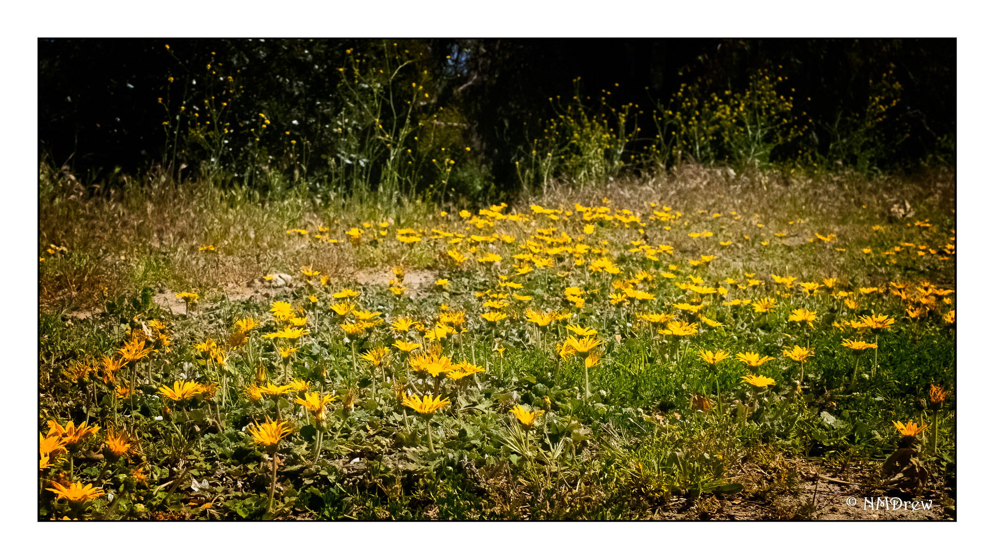
Whenever we get cabin fever during shelter-in-place Covid-19 orders, we get out and drive, and explore new bits around us. This was in a split-level park, with different plateaus connected by walking paths. Here, a bit of ground cover at the edge of a level, butting up against the spring mustard blooms. Not exciting as far as scenery, but a pleasant little neighborhood park we had not seen before. Well, sort of a neighborhood park – 30 miles away!
Addendum!

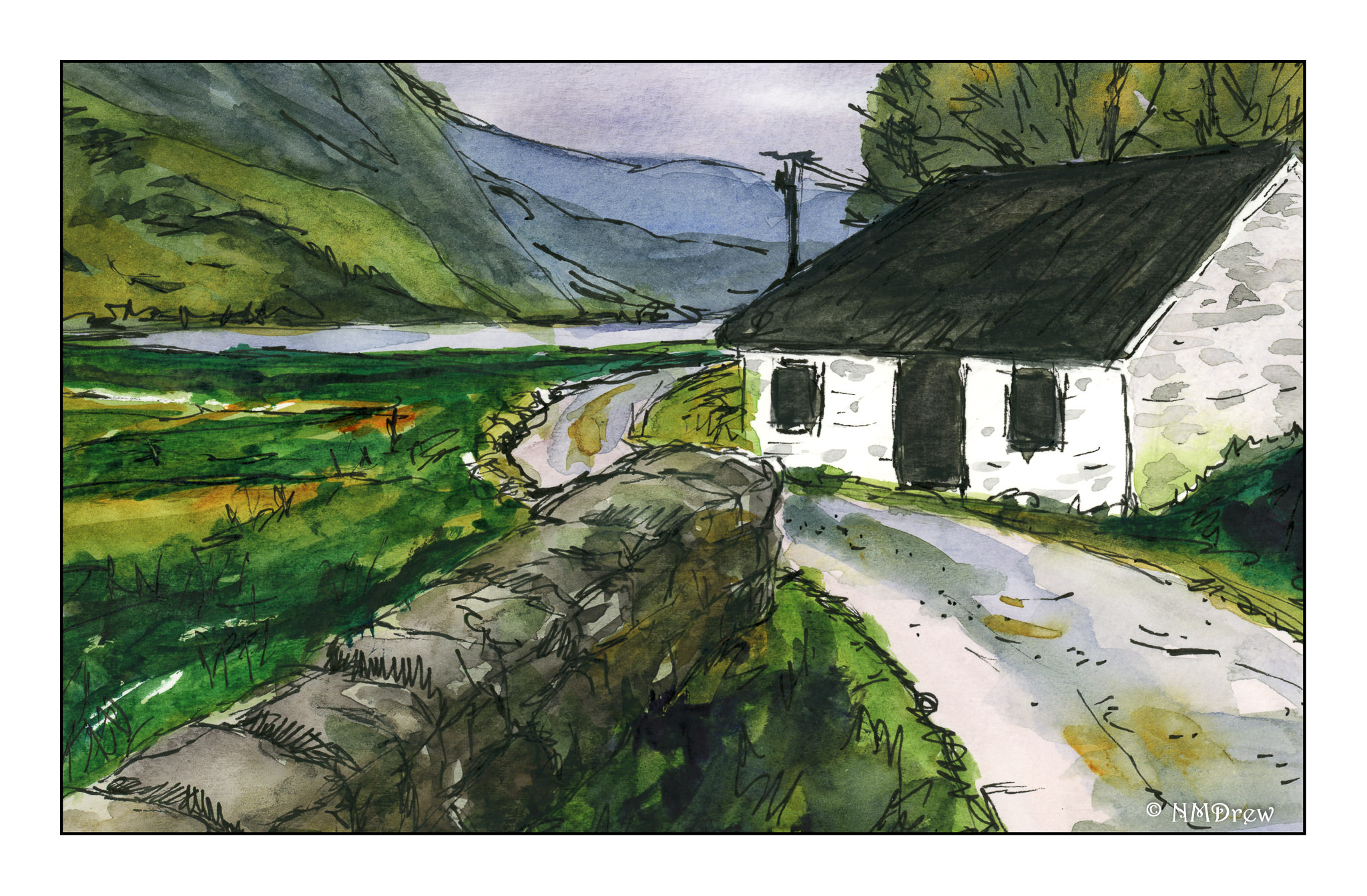
This is the second scan from the final one below. I changed a bit of the elements after doing a preview scan – don’t know why the one on the bottom of this post is so, er, intense!
Now, let us continue . . .
More perspective studies! Today I did a single point study.

This time I created a single vanishing point. This one is below the building, and above the road. The idea for this is that the road ends up going over a hill or slope before the horizon, at eye level, is met. I did a pencil sketch and erased it a billion times. Finally, when I liked what I did, I erased most of the lines after inking it in.

Sort of a value study combined with a color study to see what I might like for color mixes in watercolor. This paper is mixed media paper, so it is not the heavy Arches 140# cold press I like for most work. I think the perspective works pretty well.

Well! Aren’t these colors intense! The scan for some reason just came out like this – the original is a bit more subtle – but I rather like it as I think it expresses the intensity of color that sometimes comes with lowering clouds and a storm. Makes me think of my time as a kid on the plains of the midwest.
So, the final study does have decent architectural perspective, and perhaps even some atmospheric (lots of atmosphere, but more like pressure type!) insofar as I tried to simplify things.
I will continue my focus on perspective, and using it in different media. Watching videos, referring to books, and just doing it is helping.
Another perspective study from hell. Where do you put the vanishing point on paper where the horizon doesn’t provide one!?!
I used 2 point perspective here for the most part. To figure this out, I drew the basic sketch onto a piece of paper that was larger than the final sketch. I decided my horizon line. Then I drew the building, uprights and then angles for the roof line and base of the building, both on the left and the right. For the wall, I did the same thing, aiming it at the horizon line and trying to get the top and bottom to line up.
Ummm. Not sure. It looks okay in a lot of ways except for the wall – too wide nearer the building perhaps than it should be in the lower left foreground.
And getting into perspective. I don’t have depth perception – eye docs confirm this. But I do get distance – I can guestimate a distance and when it is measured, I am pretty accurate. This makes me think that a sense of distance and depth perception are two different things entirely.
