Pastels

I have had a few boxes of pastels, hard (Nupastel) and soft (Rembrandt) lying around for years. I finally found a class on pastels through the local adult school. It’s 8 weeks long, so a lot can be learned in that time. The teacher is also good, organized, and capable of teaching a wide range of people. I am learning a lot about a medium I have never really used, and that makes me happy. I always think of pastels as “drawings” but it turns out they are actually considered “paintings” because of their being made of pigments. I guess charcoal and pencil produce drawings.

In each class there is a focus.  The one below was the very first one – paper and strokes, and a study on how to set up the Rule of Thirds in a painting.  The photo we worked from was quite different than what we were instructed to do.  Simplification of the overall photo along with placement of points of interest where the lines of the Rule of Thirds intersect.  We also experimented with different strokes, atmospheric perspective, and color.  I like the colors and textures I got here.

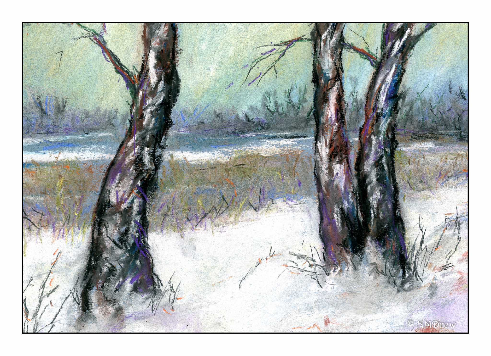
This one is one I did on my own. I tried to catch the coldness of a winter day. I used a blue paper for the base, and worked at keeping the distance simpler than the foreground. As usual, I really do struggle with depth and perspective, and had to work on this a bit.

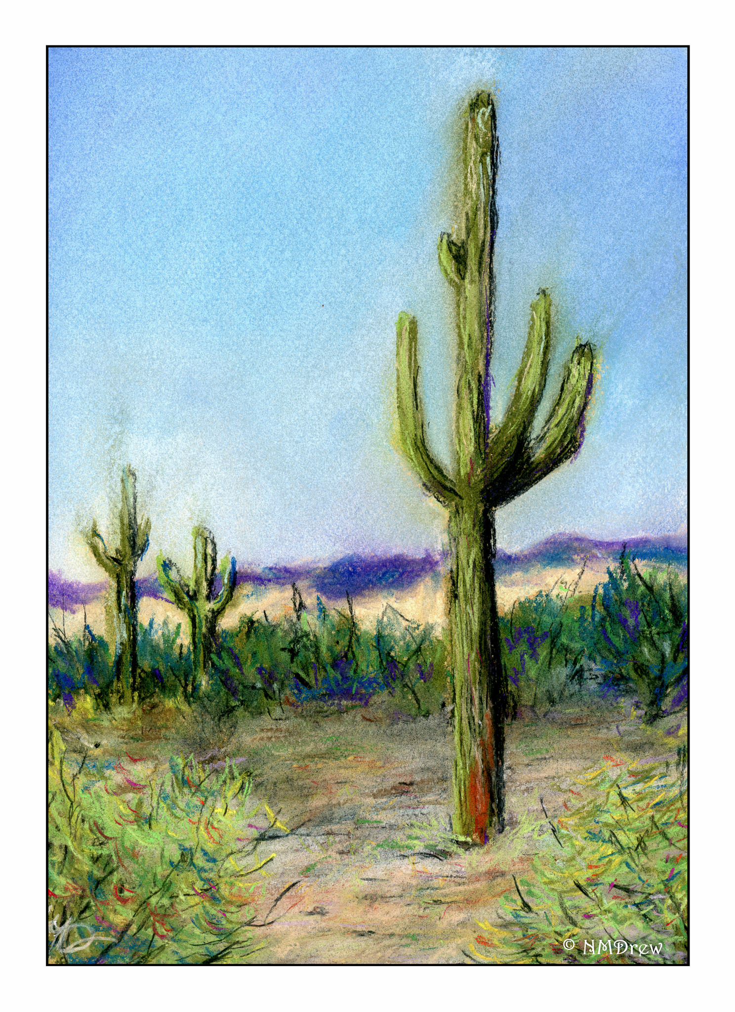
Below is our study from last week’s class. The focus of this lesson was atmospheric perspective, meaning how distance and atmosphere change with distance. The sky is lighter at the horizon than higher in the sky. The further things are from the viewer, the more the atmosphere changes their detail and color. The foreground is brighter and darker (though I cannot quite get what the teacher means when she says that – I should ask – but I think she means the colors are more intense). Distance means paler colors and simpler shapes. I really worked a lot on this one once I got it home – my foreground was just a mush of color all in the same tonality. I laid in a lot of white and lighter colors to create the sandy soil in the foreground for the final image.

This next week we will be working on clouds during the day – not sunset, not sunrise. I saw a video on YouTube about this same thing, so I plan to watch it before next Monday’s class.

Saguaro

This is my third pastel, and second subject from the class on Monday.

There are some things I learned in doing this pastel.  First, the large cactus has to be put in after the sky because it is just too big – the sky and the cactus – to work around.  The mountains and smaller cacti are fine.  I had to redo the sky a bit, and if you look, you can see halos of the cacti in the sky.  Live and learn!

I also had to totally redo the foreground – it was all the same tonality!  Midtoned.  So, I went in and worked in a lot, a lot, a lot of lighter colors.  It worked.  Before there was nothing leading the eye to the big cactus- now there is to some degree.

The foreground plants in the corner are also at issue here.  While they are lighter than the middle ground’s plants, they are not quite right.  I need to increase the contrast within them, I think, to help them become individualized from the sandy dirt around them.

Finally, it is interesting to realize the importance of fixatives in the process of doing a pastel painting.  Harder pastels don’t create as much dust (Nupastel) as do softer ones (Rembrandt).  A “workable fixative” is necessary as the layers go down.  A “final fixative” is applied when the painting is done.  I have both, but the final fixative still allows the pastel to be rubbed off to some degree.

So, third painting, and I am getting the hang of it.  Still very amateurish – my lack of depth perception always seems to get me.  “Look at the light!” is my constant reminder, as well as the tricks of creating distance in a 2-dimensional painting.  Gouache painting has proven to be very helpful here.

Winter Trees at Dawn

Second pastel.

Here, I used a medium blue paper and tried out different techniques, such as circular blending with the pastel itself, a torchon, fingers. I used vine charcoal and charcoal pencils for some of the finer lines.

The snow on the trees was an interesting challenge. To accomplish it, I scribbled some pure white pastel onto it, and then used the tip of the torchon to blend around it.

Compositionally, I think there is something missing here . . . I also think the midground could be a bit different to convey a sense of depth.

For a second bout with pastels, I can say I am enjoying what I am doing, even though I have to dress like a hazmat worker! (I wear a mask to keep the dust down.)

Dry Hills in Malibu

Yesterday I started an 8 week course in pastels. Already I am in love with the medium! Add to this, the teacher is a real teacher – she is a professional who teaches full time in an elementary classroom. She is organized, states what she expects, interacts, demonstrates, and all the things that are so important in learning something new. Some teachers just say “have at it” and you stumble along, not knowing what you are doing. Yes, experience is a good teacher, but explanations and clarity really help one understand what is going on. I am looking forward to more classes!

Here is a picture from the Malibu Creek State Park near where I live. We all had a copy of a photograph to use, and then she explained the Rule of Thirds, the Golden Mean, and explained how she changed the composition of the photo to meet the needs of the Rule of Thirds. Value studies, too, were done before even picking up a color.

We used Nupastels, made by Prismacolor. Inexpensive but very nice. I have some Rembrandt soft pastels that I will use later on, or in conjunction with the ones we have in the classroom. As I love colors and drawing, this is a perfect combination of “things” – and these pictures are not “drawings” but “paintings” in the lexicon of the teacher.  I never considered a pastel a painting.

I have not been this excited about a class in a very, very long time.