More paint slapping!
Here, the depth of field doesn’t match the photo I took at all! Still, it does work, sort of.
Pacific Grove and the surrounding shore.

More paint slapping!
Here, the depth of field doesn’t match the photo I took at all! Still, it does work, sort of.
Pacific Grove and the surrounding shore.

This is quick study of a tree I pass by on many of my hikes into the local open space. It stands against the sky, silhouetted, as the sun goes down.
I’ve decided to be just rather messy with gouache – slapping it onto the paper. I think I feel more at one with it (paint and painting). As well, I am using a big brush that is angled at the tip, rather a wedge shape. As a result, it is somewhat predictable, somewhat controllable. And not at all. Part of it depends on how dry or wet the paint and brush are. We’ll see how this goes over the next several days. Being away from home for several days, I haven’t painted at all. Slapping paint around is a good way to be come reacquainted with it!
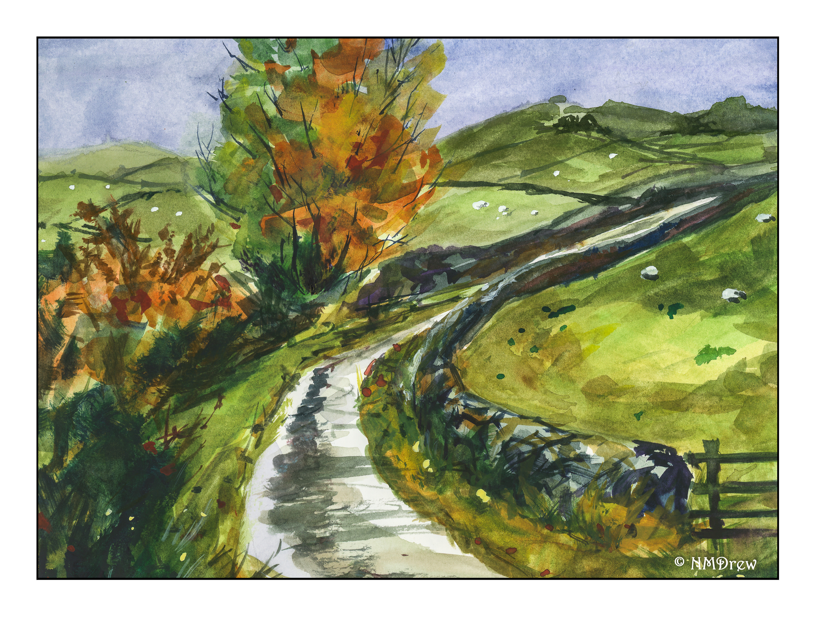 I decided to give A Lonely Road (Gouache) a try in watercolor as that was my original intention with the painting.
It was quite interesting to do so as I used the same paper I used for my gouache, but the paper had less tooth than my usual CP watercolor paper, being more like hot press, which is very smooth. This was American Journey paper, which is very nice, and is somewhere between HP and CP for texture. This makes a difference when painting with watercolors.
Once more I feel like my DOF is not working in watercolor. I am not quite sure why, but it seems to be I lay down a color and then lay down more, and more, and even more for the distant objects. Unlike gouache, watercolor’s transparency makes each succeeding layer darker. At times a glaze of very thin color can pull a watercolor together, but not here. The dark distant hills on the right suggest a spot of cloud shadow, and the brighter one on the left a bit of sunshine. The sky suggests otherwise. And it looks like there is a sleeping or dead sheep in the field on the right!
There are bits and pieces of this painting I like, and the colors really do evoke a rather damp day when autumn is beginning to set in. The fact is, I find watercolor inherently more difficult than gouache simply because more pre-planning and strategizing than with gouache. This why I enjoy watercolor so much – it is so hard! The colors are just wonderful at times, and that is one of the joys of watercolor. Gouache, while beautiful, when done with less water and thicker paint, doesn’t have some of the same light as watercolor
So, for the sake of comparison, I am lining up the value study and gouache from yesterday with today’s watercolor. Click on the value study below to click through the three if you want to do some comparing.
Maybe a pastel should come along tomorrow?
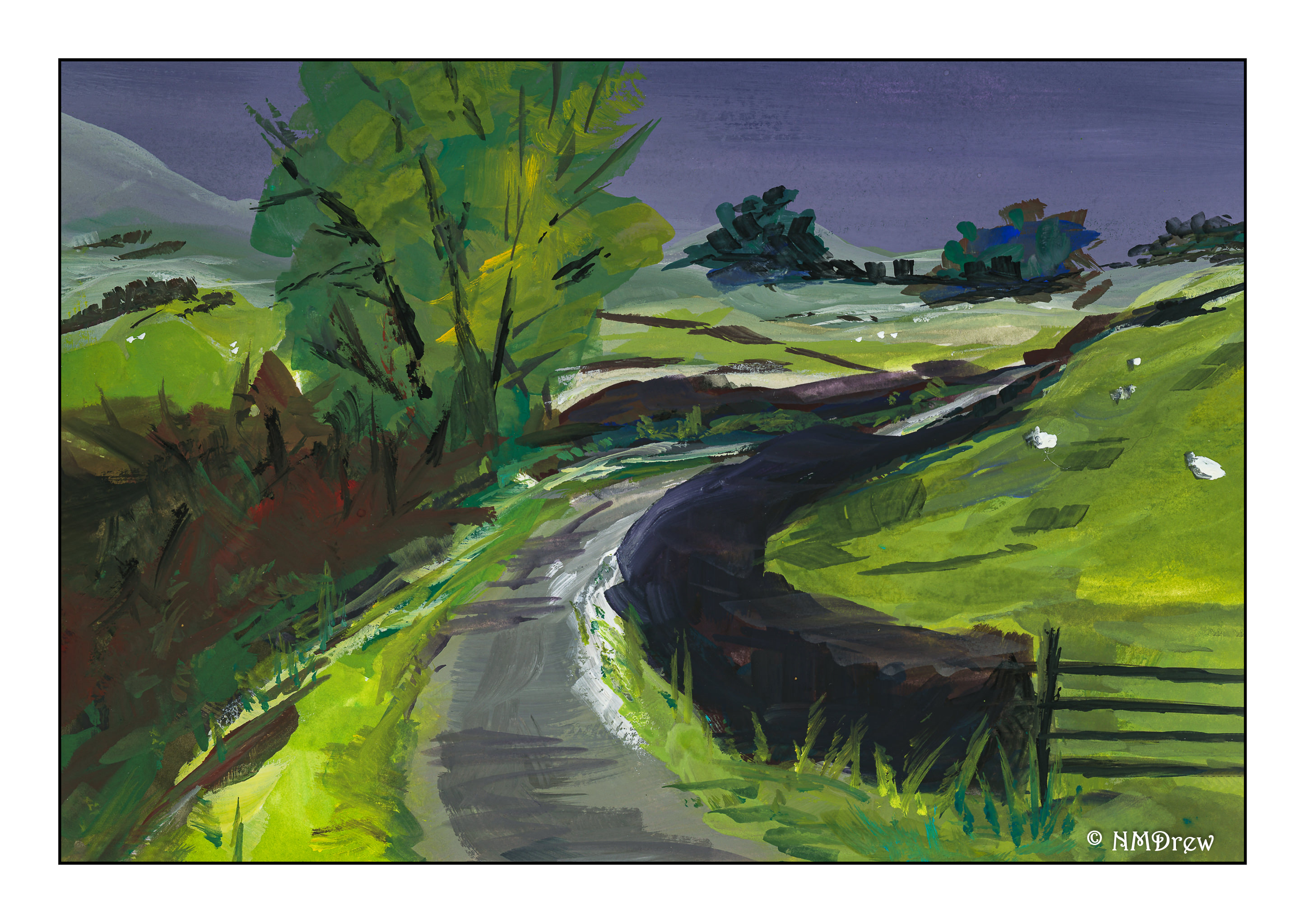
I started out trying to do a more delicate painting, but I think that would work better in watercolor. Instead of delicate and lighter, the colors became thicker and darker, and it turned from a misty, damp, rather gloomy day to one which seems filled with a foreboding storm.
I decided to just paint and not try for realism and delicacy. I went for emotion. Instead of applying paint nicely, I began to just slap it on directly from the color onto the paper rather than mixing colors on the palette. It was gloriously fun!
I used a 1/2 inch flat brush – nothing else. I rather like this splashing and letting go of things as I tend to be something of a prima donna and perfectionist – and this was like rollicking through the mud and muck!!
If I were to call this any “school” of painting, I guess Expressionism would be the closest I would come. The more I painted, the more I wanted to express a fierce and gloomy day portending rain and hail, or rain and hell.
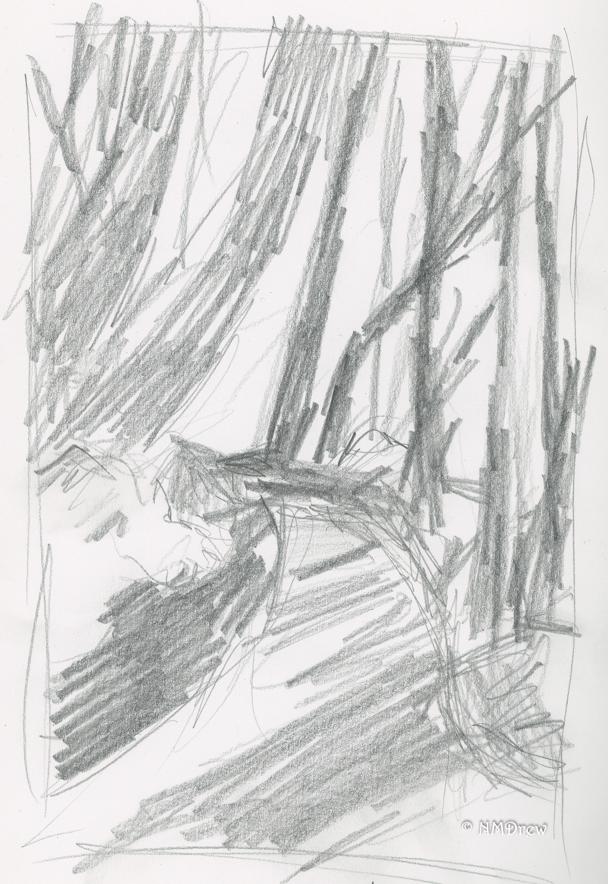
Another value study, too. Impressed?
Look! I put in some sheep!

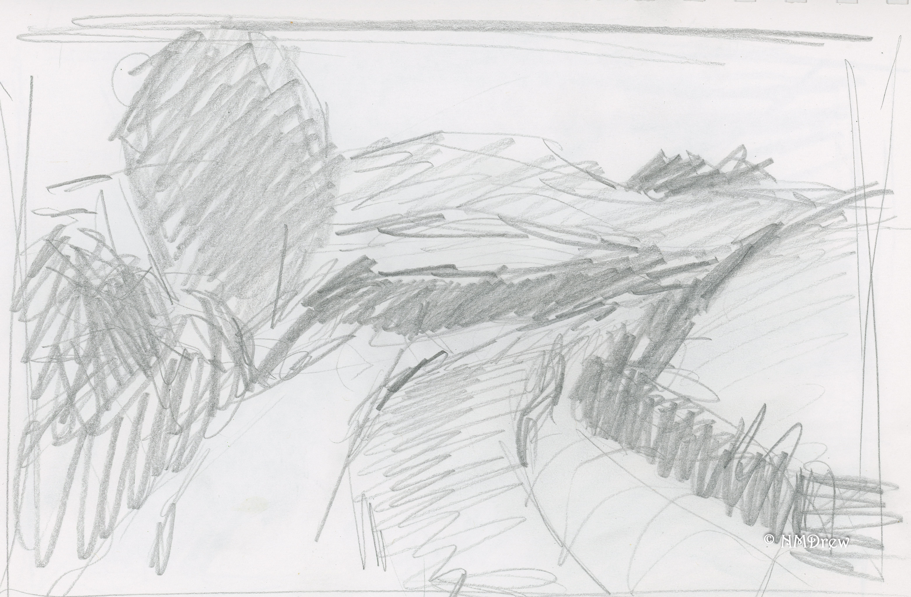
I’d forgotten how much fun painting with gouache can be! Today, a painting of a forest road running through a lot of trees, but not so heavy with leaves that light doesn’t shine through. I began with a value study – again, more for shapes I think in light and dark.
The first layer of the painting had thin washes to set up the light green in the distance. Then, general dark shapes were added after the road was limned. The trees were then painted, dark to light, using long strokes with a round brush. After that, a flat was used for broad sweeps of the road. Finally, dabs of color to create a sense of dappled light on leaves. Final touches included some dashes of white and a blackish mix (purple, green, black) for lines and bits of contrast. What I really liked is the ivy climbing up the trees, creating bright splotches of color. Altogether, I think it worked quite well.
The value study is becoming valuable. Yeah, really. It helps me see where strong shapes against light shapes create visual interest and leading lines. Value studies are general but the painting becomes more specific.