Moonlight Night in Boulogne – Gouache Study After Theo van Rysselberghe

One of the totally fun things about studying a school of painting is exploring its members! Who is this person? Oh, I like that painting! And then, off on a trail of discovery. I am finding a lot of painters I like, many from the post-Impressionist schools of Pointillism. These same painters move not only into Pointillism, but other ways, or schools, of painting that appeal to me in their composition and their colors.

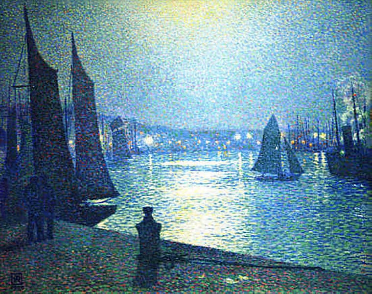
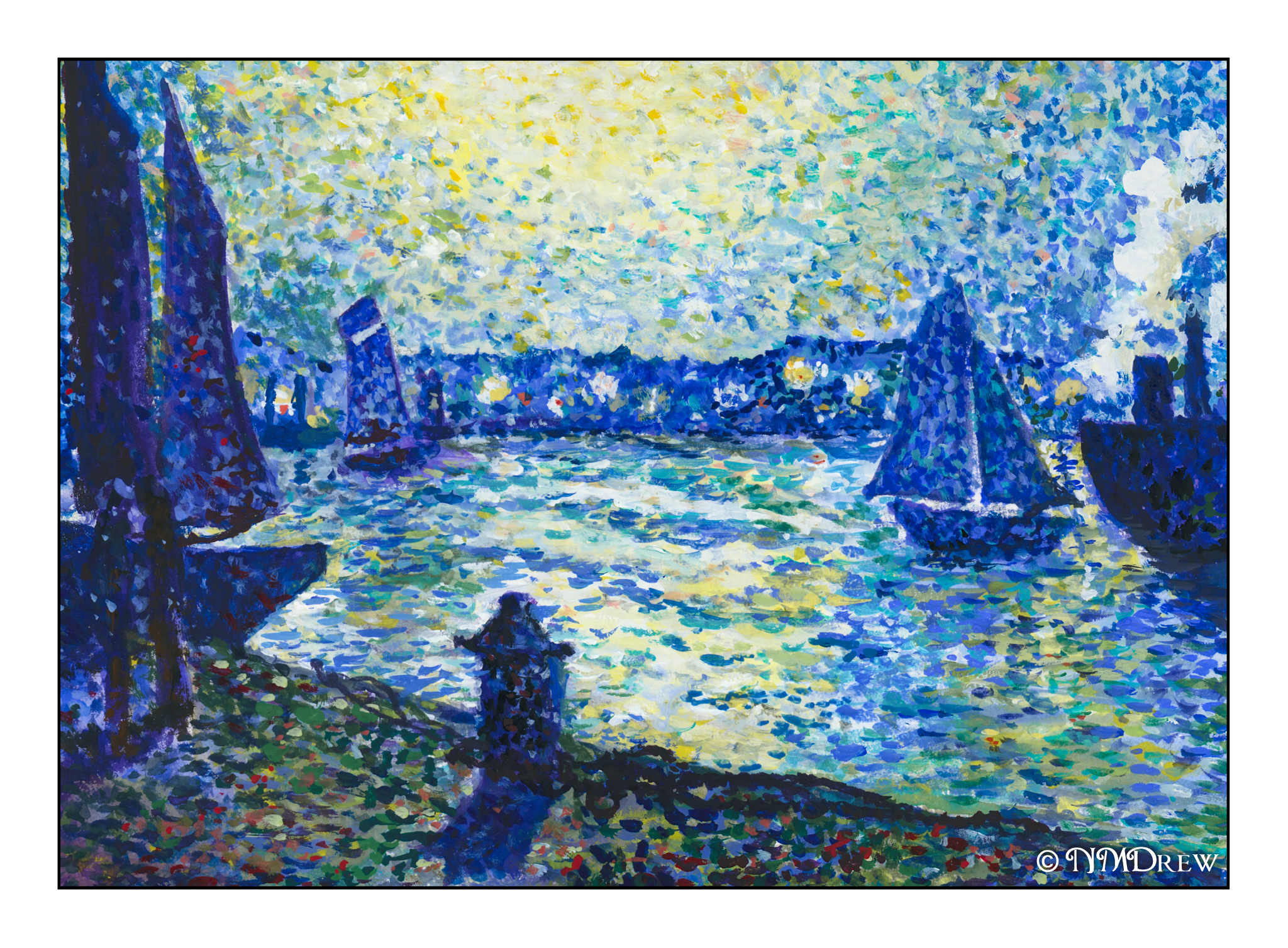
Still, sticking with Pointillism, today’s study is from a painting by Theo van Rysselberghe, a Belgian painter who does lovely work. Here, a study of a moonlit night of a harbor. Boats, sails, reflections, silhouettes, lights, and even a few human beings. Van Rysselberghe’s interpretation of the night, the light of the moon, and the colors used to express the night are so interesting. The lack of light, artificial light, and moonlight all create an atmosphere at once pleasing and rather mysterious. My own agenda has learning to paint the night effectively a high priority.

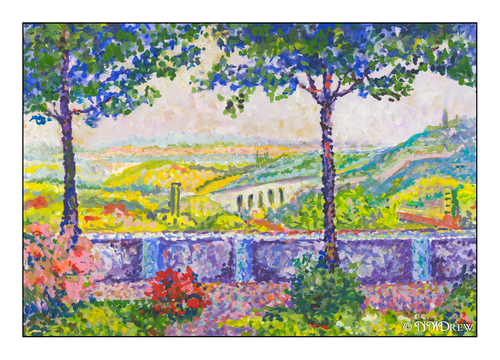
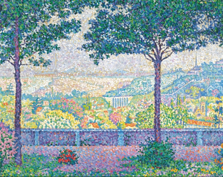
My own painting is nowhere as good as van Rysselberghe’s, but that is not the point. The focus is on the colors of the night, the blues, the darks – purple? black? phthalo blue? mixtures of all kinds? There is a luminescent quality to even the darkest colors, as well as a brilliance to the lightest that is not quite white, but a pale, pale yellow.

The dots are also more than dots. Brushwork is not only circular dabs of color, but also horizontal lines that are done perhaps with the side of a round brush (mine were!). When I copy a painting, I try to see the brushwork. Gouache does a decent job for copying paintings, but the paintings I have been copying are in oil and certainly oil paintings are much larger than my 9×12 studies, and consequently more subtle.

Terrasse de Meudon – Gouache Study After Paul Signac

I must say, Signac does make a lot of cheery, colorful paintings! Not only are his colors great, but his compositions are often so interesting. Here, another study, mine perhaps more colorful than the original.  It is always hard to tell when you look at something on a monitor.  Even my scans are often off, needing some color adjustments before a final jpg is created.  Age can often cause colors to deteriorate in oils, too, as the varnish yellows and dims the original.

What really attracted me in Signac’s work below were the lavenders, greens, and blues.  So many shades!  Additionally, I really tried to look into how he juxtaposed colors, such as the oranges mixed in the blues and lavenders of the paved surfaces of the foreground.  The warmth of the scene in the middle ground plays a pleasant contrast to the cool, shady canopy of the trees at the top of the painting.

I am learning a bit each time I copy a painting in the Pointillistic school.  Colors are distinct from one another.  Even when a work is not a “dot” painting, I am beginning to get a better sense of color and shapes, contrast, and so on.  Much of this is just sitting around in my subconcious, and sometimes, with an original painting, it manages to escape.

A Winter Morning

The last time it snowed where I live was like never. Up in the mountains it does snow – it did a year ago – but of late is relentless blue skies. Today and yesterday we have had clouds and chilly winds, so it feels like Christmas and winter, and even tomorrow, more of the same.

I rather like it!

Still, I think of those magical winter days when sun and snow and sky and trees all play together, your breath rises, and you keep walking to see all the miraculous beauty of the land.

And here is a tribute to those memories. Gouache, sort of pointillstic, sort of not. I did the underpainting with casein and acrylic gouache, to lay down a foundation which would not dissolve when re-wet. I think it worked out pretty well. Overall, I think this is my best original painting to date. It feels “like me” if that makes any sense at all.

Merry Christmas and a No Covid New Year!

Old One

Early last summer, or late last spring, I visited a park with a friend. It is in Los Angeles, above the 118 freeway, so if you frequent the area you might recognize the photo (below) and the painting (above).

It is the kind of park I like – open, easily accessible, and then winding away from the city into the canyons beyond. Since my friend cannot get too far, we never have gone deep into the canyons, but perhaps one day I will go further than I have. It has some lovely tended areas and then wilder areas, but what I particularly enjoy are the oak trees.

This is the view from the pathway returning to the city, and this tree never ceases to find a soft spot (hopefully a sharp spot with good focus in a camera!) when I visit. I think we all have trees or buildings or places we enjoy revisiting.

More pointillism, more gouache.

To the Lighthouse

A bad reference to Virginia Woolf’s novel, which is an interesting read.

This painting is a dedication to lighthouses worldwide. They have saved so many lives by letting sailors know of treacherous waters. Add to that, lighthouses are often found in spare and rugged places, all of which make for dramatic and wonderful photos and paintings.

I have often thought I would like to live in such a place, hearing the waves crash, watching the light circling through the night, and, of course, the sound of fog horns. Throw in some seal barks and sea gulls, and I would be pretty happy. Sleep could be a challenge though.

I made up this painting, amalgamating lighthouses and buildings from various images. My goal was to practice shading, such as moving from a sunlit side to the shadow side, using pointillism techniques. You can see this on the conical shape of the lighthouse as well as on the buildings. I have tried to give a sense of cliffs and housing sunk down a bit behind the green of the grass. Morning or evening light for the sky, or an intimation of fog and filtered sunshine is also attempted.

As I work more in pointillism, I realize that this helps me tremendously in sorting out colors. As far back as I can remember, mud has been my most famous by-product in painting. It could be that this is something I really need to use as a primary technique, though I am thinking of doing a pointillistic painting in gouache, and then re-wetting it to blend the colors applied in dots.

Now, on to other adventures!