Trees, Late Afternoon

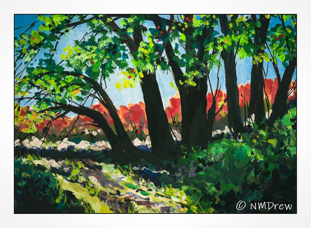
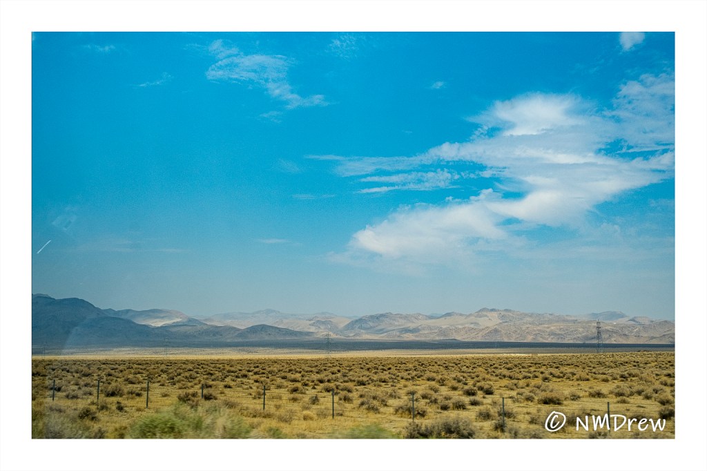
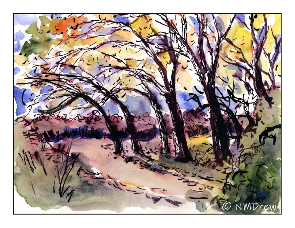
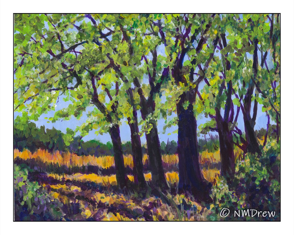
Third and last of a photo I took earlier this month in Independence, CA, before being driven back home because of Covid. I am not sure which of the three of these paintings I did of the same photo I like best (you can back track on this blog if you want to see them, or go to Instagram!), but this one, in acrylic, was by far the most time-consuming.

I used 16×20 Arches 140# CP paper and a variety of acrylic paints, but first I laid down a few layers of gesso to prep the surface of the paper. The first layer of gesso was thinned with water and brushed on quite firmly to work it into the paper itself. The paper warped as watercolor paper does, but I was really happy to see it flatten out with the second, thicker layer of gesso.

Most of my brushwork tends toward dabbing on dots, which is great for pointillism and impressionistic painting, so I worked at creating lines, as seen on the grasses in the background, along with using a flat brush and using its tip or sides to work paint in a more up / down, side-to-side manner. My next painting is going to include these types of brush strokes, just because. It never hurts to try things you don’t usually do.

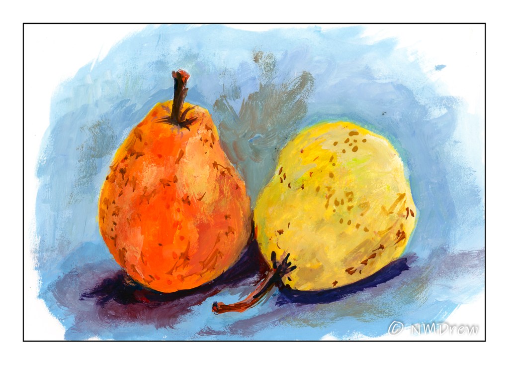
Every type of media – watercolor, gouache, acrylics – has its own “language” – that is, the way you have to work with it. Acrylics are rather heavy on paper and I need to think ahead for what I want to do. I tried the slower drying acrylic paints, and just did not like them. As a result, the ones I use tend to dry rather quickly. Filling the palette with every color I think I might want to use is a waste of paint. Instead, I have to plan, not like a general, but certainly I need to anticipate what comes first, what comes next, and so on. I also have to think about brushes and brushwork. Painting can be spontaneous, but it also needs experience to allow for more success (however you want to define “success”) than failure.

One thing I considered for this painting, but did not do, was to lay down a glaze to unify it. Chicken! Maybe I will come back to it later. Now, two things are on my next painting agenda: buildings and no dabbing! And maybe a glaze . . .

A Hint of Autumn

Independence, CA

Well . . . I got tired of pen, ink, watercolor. Watercolor just wasn’t in my head, so I dug out my gouache paints. They were rather fuzzy from mold – typical of gouache if you don’t use them often enough – so, I rinsed them off, and went to work. I really like the photo I took of these trees but did not like my earlier efforts.

I started out so klutzy – like, how do I use my colors? order or painting? All the usual stuff that goes with not doing something for awhile. The result is far better than I thought it would be!

Sky Above the Owens Valley

Sky Above the Owens Valley – Watercolor and Ink

Another sketch from a photo I took, this one snapped out of the rear car window! Having a camera can get some great stuff when you don’t have time to stop every 5 minutes.

Sky Above the Owens Valley – Quill Pen and Iron Gall Ink

This was my initial sketch, done with a quill cut with a finer nib as well as done with more attention to detail. After the sketch dried for a few hours, I laid in the watercolor. Some ink was still damp even after a couple of hours drying outdoors and blotting. Below is the original photo.

A Few Trees

A Few Trees – Dehy Park – Independence, CA

I am rather enjoying sketching as part of my morning routine. Today’s sketch is still in Independence, California. There is a trail that connects the native plant garden to a small park, Dehy Park, and I think I took this picture along the pathway. I found the repeated curved rhythm of the trees to be utterly charming – I expect the wind has a lot to do with the way the trees are bent.

Anyway, I decided to not use my Micron pens, as I have for the past three days, but to use a quill I cut myself from a turkey or goose feather and my homemade iron gall ink. First, I sketched the grove.

A Few Trees – Iron Gall Ink & Quill Pen

Then, I let the ink dry – or thought I did! – before adding the watercolor. Areas of ink were still wet. One of the drawbacks of iron gall ink is that it does take a bit of time to dry. The wet ink messed up some of the paints by blending in with the colors, muddying them.

Once I noticed that I decided to use dots and such with the watercolor, especially for the foliage toward the top of the trees. I dabbed the paint on, in between the black, inky branches.

I mixed colors with a water brush, stronger than the paler colors I have been using, and just applied them. The effect wasn’t too bad. In between the leaves I used blue, again, tapping the paint in, avoiding the dark of the ink.

After the paint dried, I went through a second time with the iron gall ink, both with the quill and then a defunct water brush. I think it helped out, but overall, the sketch is still quite messy, and certainly not what I intended. What I do like is the sense of dappled sunlight in the leafy canopy.

A Few Trees – Iron Gall Ink, Quill Pen, Watercolor

Takeaway points: First, the ink needs to dry before applying the watercolor paint. My quill has a wider tip on it than your standard dip pen, and thus makes bold lines. However, a bit more care could create a better combination of lines, and perhaps render the sketch more interesting. Adding brushwork and stronger lines after the first ink and paint applications helped to strengthen some areas. After I did that, I went about the morning chores while the sketchbook dried outdoors in the morning sun. I had to wait an hour at least – and then, the scan of the final sketch!