Tribute

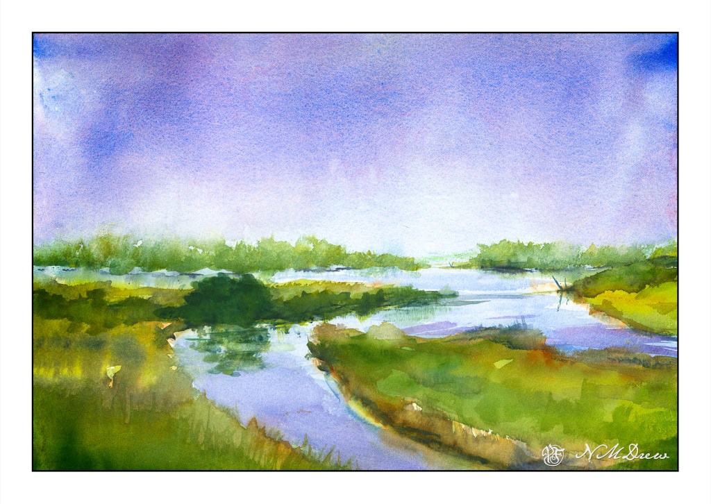
This wet-in-wet is drawn from imagination and inspiration by the Dutch watercolorist Edo Hannema. I just love his mastery of water and color and wet paper! There is a peaceful quality to his paintings of the Dutch landscape.

Painting like this demands thought and deliberation and patience. Timing is also critical. Painting wet-in-wet requires risks and experience. Too wet, everything just blurs. Paint wet paint which is wetter than the still damp colors result in blooms which can destroy a painting in now time. The rule is drier paint into wet paint – that on your brush must be drier than the stuff on the paper. Blot your brush if in doubt.

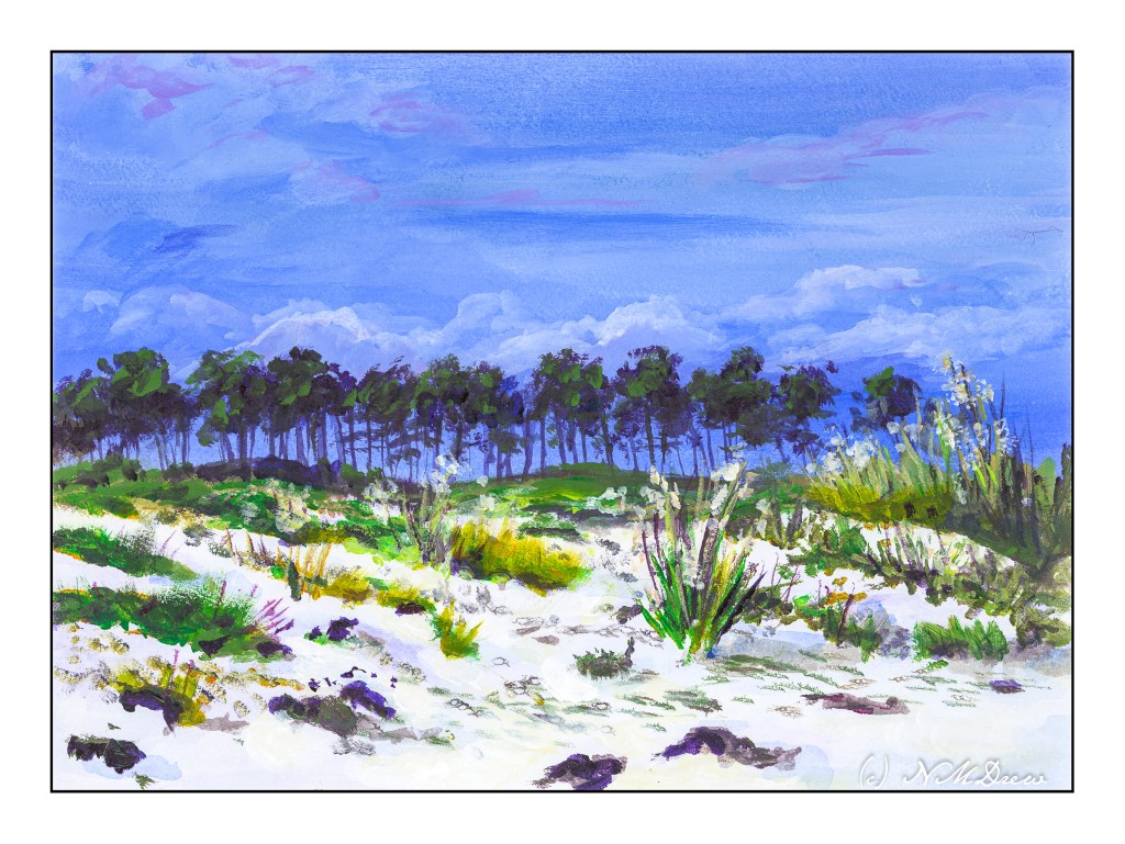
Oops! Just noticed that the horizon is dead center . . . compositional error! And that big green blob is also a mistake – tried to fix it – but since this is time for true confessions, I may as well own up. 😉

This is one of my more successful wet-in-wet paintings. Usually there is a big cauliflower bloom somewhere – sometimes I can hide it, but it feels really good not to have one this time! Remembering the trick of drier onto wetter was a good thing.

For the first time, I am painting on 300# paper. This is Kilimanjaro CP from Cheap Joe’s. With such a heavy paper, lots of water can be used. 140# warps but this stayed virtually flat. I like this paper a lot – certainly will be getting more of it.

Across the Dunes

I enjoy gouache a lot because you can rework places and easily blur edges to soften them. That is a lot harder in acrylics. I decided to give it a shot. It worked rather well for the sky, but like gouache, the whites in the clouds darkened more than I thought they would. On the other hand, I did work on the sand a bit, using very thin water glazes for the shadows. That worked out pretty well.

I realize the key to “getting” acrylic painting is to just keep doing it, experimenting, trying. Each painting, successful or not, is a lesson.

Acrylic paint on unprimed Arches 140# CP. 9×12.

Keep Dreaming

Another “fantasy” (hence “Keep Dreaming”) painting. Another mixture of gouache – white and black only – and watercolors. As before, 16×20 CP 140# Arches paper.

Using a mixture of watercolor and gouache, with color coming from the watercolor and opacity and darks from the gouache, there is an ease of painting which acrylics cannot touch. The reason is that acrylics dry quickly, and I don’t really seem to have a lot of success with retardants.

I guess I should try acrylics mixed with a retardant a few times more than I have and give them a chance. Experience is the best teacher. The combination of gouache with the watercolor lets me remix my colors later (gouache can be re-wet) and gives an opacity that is not possible in watercolor. I like this combination but still think I should work a bit more with the acrylics. I am also considering trying oils once more. With oils, I know it would be a way to have the colors remain wet long enough to allow reworking areas. Odorless mineral spirits add to the allure of oils.

Anyway, I am having a lot of fun with these fantasy paintings. We all have a tropical isle of some sort to which we would like to escape!

Another tribute to the dreams of the Florida Highwaymen.

Royal Poinciana Tree

Another tribute to The Highwaymen of Florida.

The Royal Poinciana Tree is native to Madagascar, but because of its vibrant red flowers, it has been transplanted throughout the world. It prefers temperate to semi-tropical climates, so the heat and cold of where I live make it an unlikely candidate. However, we do enjoy the vibrant purple jacaranda tree!

That said, I gessoed Arches 140# CP paper and used acrylic paint this time. I spent hours on this painting, and attempted to do a rather more primitive approach, working for a type of simplicity I seldom employ. Not having painted for some time in acrylics, I needed to work at it. One thing I did do was not the default dabbing I seem to gravitate toward with acrylic. I saved that for the flowers and leaves, in the tree and on the ground.

I am so tired I have no idea if this is a “good” or “bad” or “mediocre” painting – but does it matter? This painting took a lot out of me. The scan, too, is poor – the colors are too extreme – the reds and oranges and greens dominating. Adjustments are not really successful in LR. So, here I think we are limited by the software and its interpretation of such colors in the scan. Still, it’s here for your perusal . . .