Water Thaw – 3

Water Thaw – 3

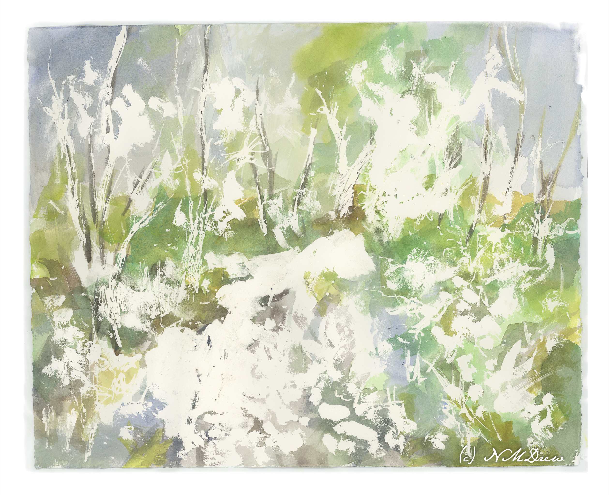
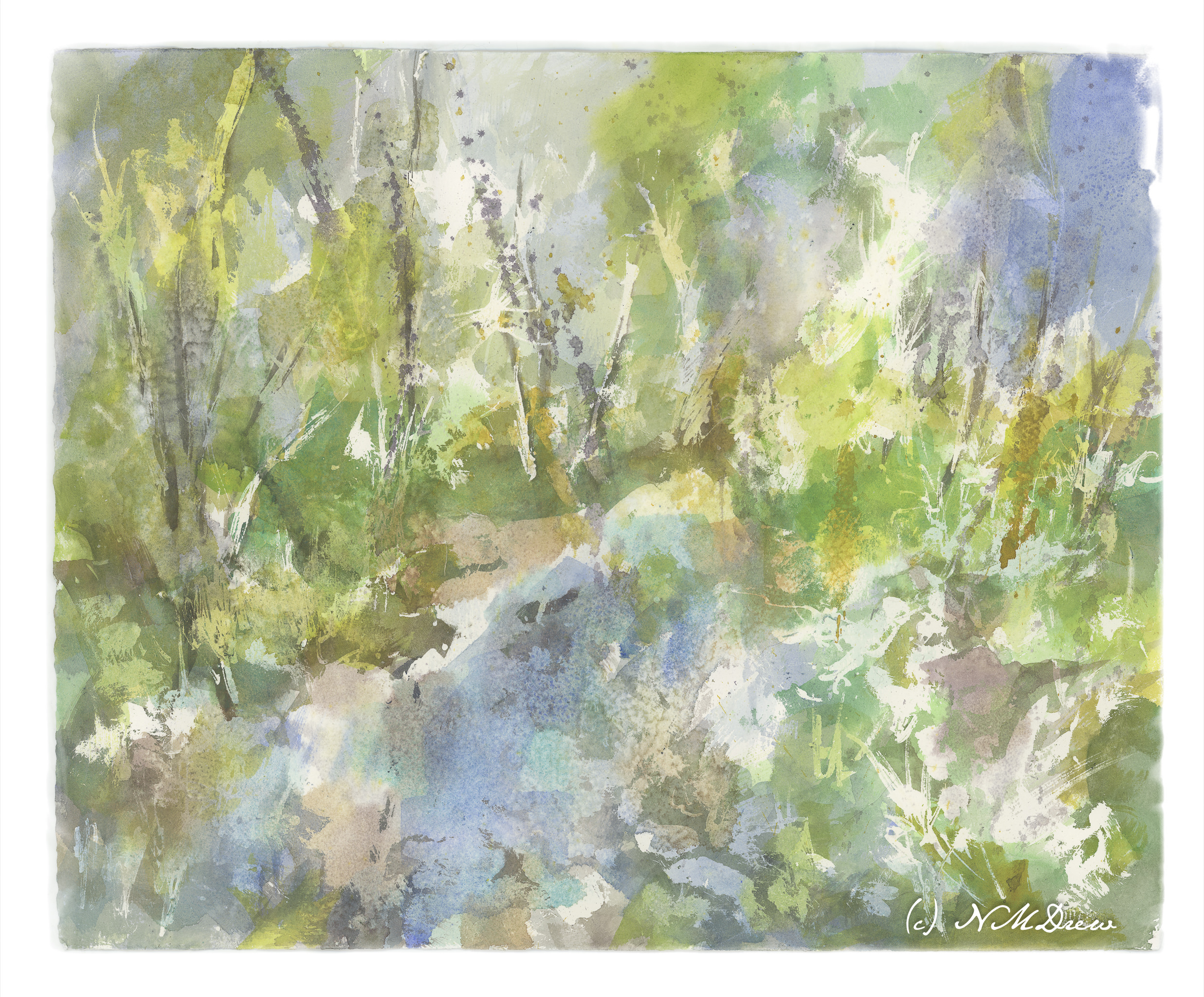
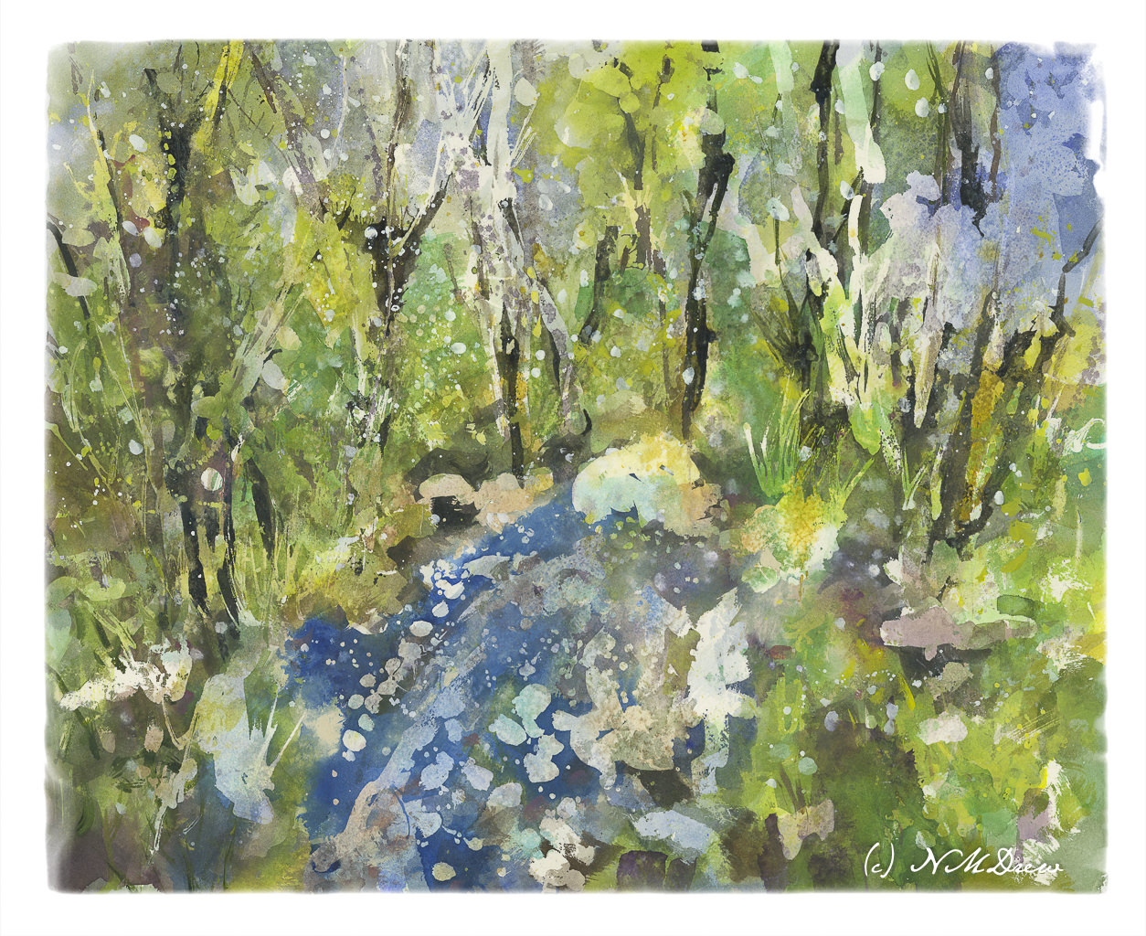
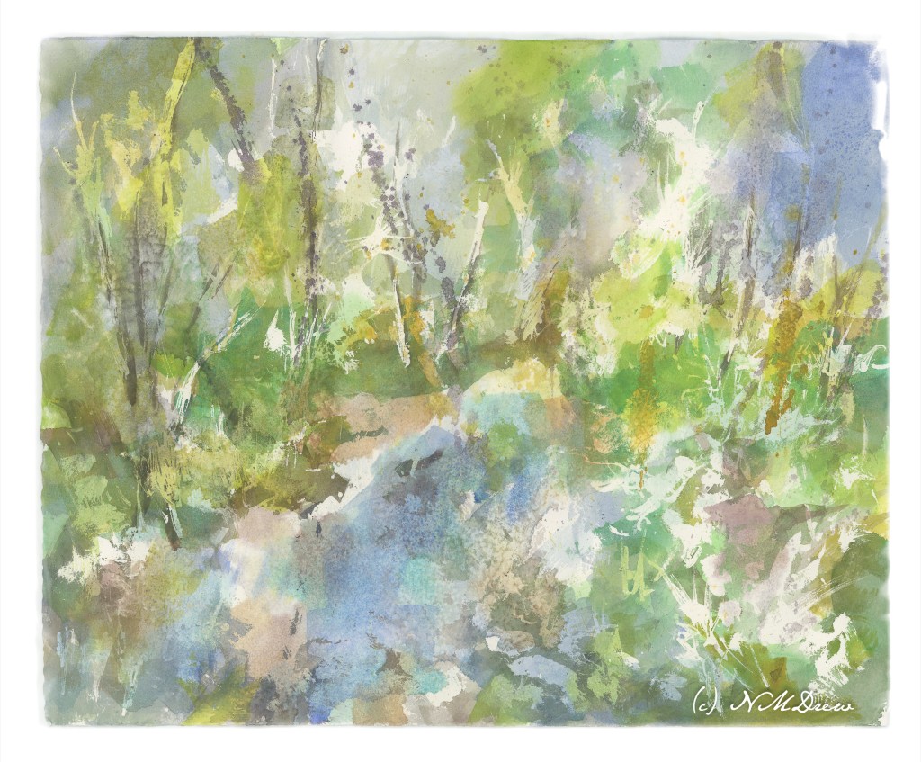
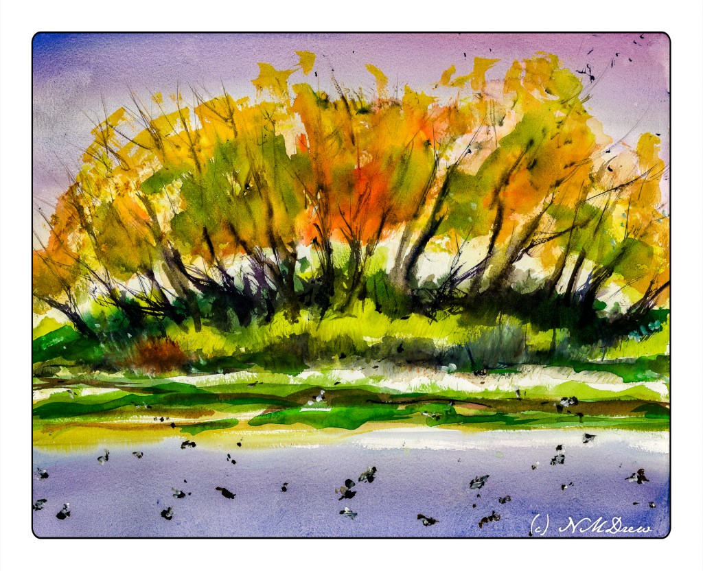
Getting there, but not quite.

I added more frisket, colors, salt. I also began adding acrylic paint thinned down quite a bit. Now, another night of letting it stew, but I already think I know what I want to do with it. For instance, I want to add more blue in the lower left foreground in that rather large white blob. Perhaps some sense of geometric texturing by adding tape and then painting over it. White streaks for snow on trees? It’s hard to tell.

Waiting is a good thing to do.

Water Thaw – 2

Round 2!

First, I removed the liquid frisket. From there I added more color to increase contrast, again using the wide 1.5 inch flat brush. While the paint was still wet, I sprinkled on some kosher salt. After letting it dry, I again added more color, salt, and then spritzed it with rubbing alcohol. This morning I shook off the salt and now am contemplating what to do next. The first step, though, will be to add more frisket to help preserve the existing whites as well as some of the areas of color.

Such a crap shoot at times!!

Below you can compare the first image to the next.

Water Thaw – 1

Water Thaw #1

As I mentioned in my last post, I am trying to change my de facto style into something a bit lighter in color, less intense, and more abstract. This round I am working in layers with an idea in mind. The idea is the spring thaw – frozen water broken up (perhaps), or a stream suddenly overwhelmed by waters pouring down from mountains, as spring warms and melts snow in the higher elevations

I used a liquid frisket with a bamboo pen, drawing with the resist, smearing it around, and finally using a brush dipped in detergent to create different shapes. From there I painted using a 1.5″ flat brush to place colors where things could be. Above is the result with the frisket removed.

Watercolors on 16×20 140# CP Arches.

Twilight at the Bird Refuge

I am not really sure what I am doing these days. I don’t really like what I am painting. Moving into abstraction to some degree, trying to loosen up, trying to be more suggestive than representational. Like anything new, or different, it can be very uncomfortable. A part of me wants to work with less intense colors, and for me, that seems like an impossibility! So, I keep trying. Let’s see where it all goes.

Watercolor, Arches 140# CP, 16×20.

Birchwood

I have been trying to work with thin washes to lay in color, moving into negative painting – such as around the birch trees – and building the painting from there. I used different color mixtures to suggest the birch’s black areas on the trunk, and then used the darkest color I could mix to create some outlines for the trunks.

Watercolor is such an unpredictable, but somewhat predictable, medium that it can drive you crazy and fill you with delight.

11×15 CP Kilimanjaro 300# paper.