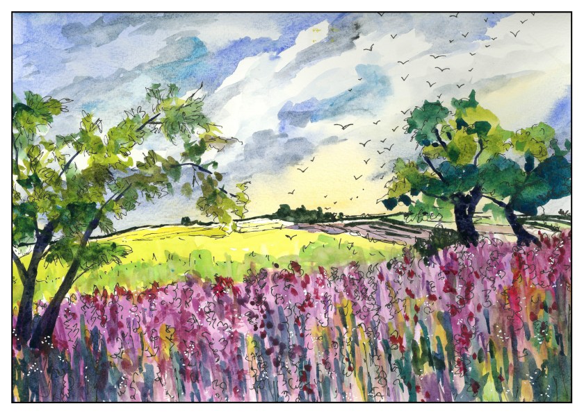
I am sort of fascinated by flower farms at present, whether it is bulb flowers or lavender or other types, such as daisies for bouquets. The lines of color and how to represent them is a challenge. Here, we are looking across the fields – the rows are running parallel to the horizon. Still, there is depth here, and I would think the rows would be evident, however subtly. Well, I didn’t accomplish what I wanted, but decided to add ink and some white to it, along with a lot of birds. In looking at it, I realize the foreground needs to simplified and in my mind’s eye, I have some ideas.
Category: Chatter
Field of Flowers
Up the coast a way is a town known for its flower farms – a big industry locally. The climate is varied, so a lot of different flowers may be grown, both for florists as well as seed. Agriculture isn’t all cows and Brussel sprouts!
This was a fun study – I did a lot of lines as a practice exercise (I forget about lines because I have color to use – in ink painting it is so much about lines) and decided to focus on lines as the raison d’être for the painting. Wet lines, dry-brush lines, wash and lines, wet on dry, dry on wet, etc. Dots, too.
Path
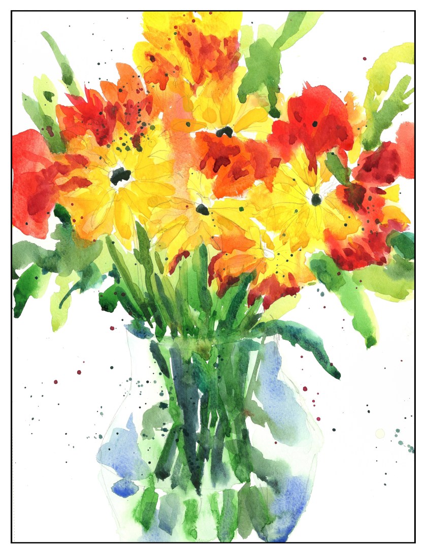
99. Carnations & Chamomile
The other day at the store I picked up small, individual bouquets of chamomile and red carnations (probably really dianthus, a member of the same flower group). The leaves of each are vastly different, with the chamomile more “leafy” and the carnation’s longer and pointy. I took my time with this painting this morning – took a photograph of the flowers – and studied things a bit before diving in. I didn’t do a value study, but tried to determine value from the photo.
I began with an overall wash for most of the areas with color – greens, reds, and yellow dots. From there, negative painting and deepening colors in an attempt to show depth. Not quite there – a bit too tight for my tastes – but I do feel it was a moderately successful study. Waiting between the washes was a bit trying on my patience!
Yellow + Red = Orange
Yesterday’s tulips were accompanied by red and yellow flowers, some negative painting, and color combining. I used reds and yellows (which ones, I forget) and some Pyrrol Orange to make the flowers. Thinking of black-eyed Susans, I used black for the flowers’ centers on the daisy-like ones. What are the red ones? Good question!
What I did here was try to work from large masses of color to details, top to bottom, and having things dry to a certain point before adding more color unless I wanted them to bleed. White space, too, was thought about. Near and far, even with a rather shallow depth of field, was pondered, and the idea was to use cold colors – such a cold yellow or green – to make something recede – and warm colors to bring things forward. Light and dark were also used in an attempt to achieve this effect.


