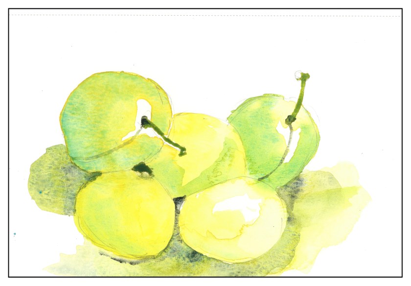
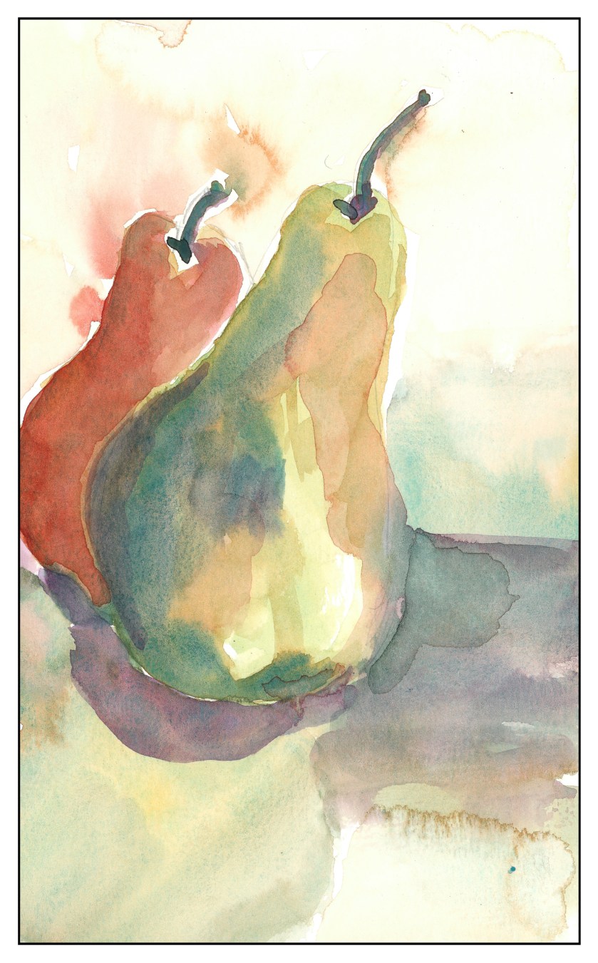
Plums are appearing in the markets, and they are great to eat out of hand and to paint. I used Hansa Yellow, Cobalt Teal, and this time, Lamp Black to see how it would work with the other two colors. No reds in this triad.
Category: Chatter
Three-Color Study: Pears
Three-Color Study: Apples
Going through a period of disliking much of what I have been doing, it occurred to me that in addition to simplifying color detail, maybe it would also be a good idea to simplify my palette of colors.
Here, apples in a primary triad of sorts: Quin Gold, Cobalt Teal, and Permanent Alizarin Crimson.
I was quite surprised at how deep I could get the shadows using the alizarin and teal, as well as how delicate the pale shades could be. A bit overworked, too, but the lessons are sinking in if I am lucky!
Peninsula
Islands form chains, perhaps peninsulas. Off the coast where I live is an island that reaches out into the sea. It is more like a series of islands connected by narrow bits of land – I expect these will disappear over the next century as waters rise, and then one island may become three or four.
In the pursuit of simplicity, I used a large brush and chose the major colors. I put in verticals to suggest cliffs. Parts of this painting work – and others do not – in particular with a sense of dimensionality and depth of field. I tried to create greys using opposite colors, such as cobalt blue and pyrrol orange. Despite that, I did learn a few things. One, wait and think. Two, use colors far darker than you think are necessary. Three, keep it simpler than you think it should be.
Poppies in the Field
Images of the Palouse or vast fields of crops, such as rape seed, extending to the horizon, provide an abstract element of design. Here, the colors and lines become the focal point, rather than the items themselves.
As I mentioned yesterday, simplification is something I want to work on. Here, simplicity and abstraction go a bit further than I want, so maybe I’ll find a happy medium in between the two!


